Shop the look: product slider section
The Shop the look: product slider section in Seventh shows an image with hotspots next to a slider of the products they point to.
Applies to: Seventh 4.0.0 and later. Added in: Seventh 2.0.0. Last checked: 2026-10-12 against Seventh 4.0.0.
The Shop the look: product slider section shows one image with product hotspots next to a slider of the same products. Selecting a hotspot moves the slider to its product, and the hotspot of the product in view is highlighted.
Where to find it: select Add section in the theme editor, then choose Shop the look: product slider. In the section list of the editor the section is called Shop the look.
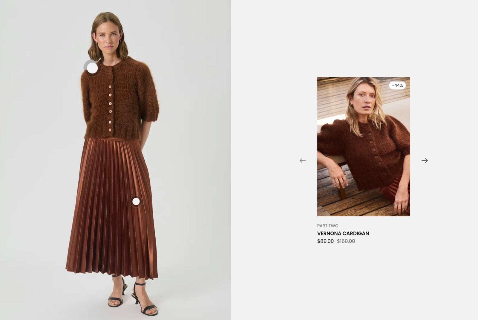
What it shows
- An optional section header, for a heading and text. See General section styling.
- One Shop the look card with the Image, the hotspots and the product slider.
- Hotspot blocks inside the card. Each Hotspot points to one product and adds that product to the slider.
- A product card for every product in the slider. You edit one product card (thumbnail, vendor, title, price, compact variants) and Seventh uses it for every hotspot product. See Product card.
On desktop the image and the slider sit side by side, each taking half of the card. On tablets and mobile the image sits above the slider.
Shop the look card
- Image is the image that holds the hotspots. Image aspect ratio sets its shape.
- Image position puts the image on the left or the right of the slider on desktop.
- The Card style settings set the overlay, padding, corner radius and Color scheme of the card and the slider area.
Behavior details:
- The product slider is auto-generated from hotspot product handles.
- If no image is set, a placeholder image is shown.
- Slider navigation appears when multiple linked products are present.
Hotspot
- Product sets the product of the hotspot.
- Horizontal position and Vertical position place the dot, in percent from the left and top edges of the image.
How this connects to the slider:
- Every hotspot contributes one product card to the slider. A hotspot without a selected product shows a placeholder card.
- Card order follows hotspot block order.
Adding a product hotspot
Set the image
Select the Shop the look card and choose an Image.
Add a Hotspot
Select Add block inside the Shop the look card and choose Hotspot.
Link the product
Select the Product of the hotspot. The product appears in the slider.
Place the hotspot
Set Horizontal position and Vertical position (0 to 100 percent from the left and top edges of the image) until the dot sits on the product in the image.
Drag the Hotspot blocks to reorder the slider.
Why does the slider show an empty product card?
Because a Hotspot has no Product selected, so it shows a placeholder card. Select a product in that Hotspot or remove it.
In rare cases the cause is Shopify's product lookup limit. Seventh does not support more than 20 different hotspot products on one page, across all Shop the look: product slider sections, because Shopify returns at most 20 products per page through this lookup. Move some of the sections to another page instead.
Why are the slider arrows missing?
Because the card has only one Hotspot. The previous and next arrows appear when the slider has two or more products.
All Shop the look: product slider settings
Every setting on this page, one list per section or block, with its type and default.
Shop the look: product slider section: Section header
Where to find it: Shop the look → Section header
Position (dropdown, default: Top): Sets where the section header sits: Top places it above the cards, Left places it in a column beside them. Options: Top, Left.
Stick to top (checkbox, default: off): Keeps the section header in view while customers scroll through the section, on screens 1024 px wide and larger.
Shop the look: product slider section: Section design
Where to find it: Shop the look → Section design
The Shop the look: product slider section uses the standard Section design settings, listed in General section styling.
Color scheme (color scheme, default: Scheme 1).
Top padding (dropdown, default: Default). Options: Default, None, Smaller, Larger, Largest.
Bottom padding (dropdown, default: Default). Options: Default, None, Smaller, Larger, Largest.
Extend section width to the edges of the screen (checkbox, default: off). Shown only when Position is Top.
Show media background (checkbox, default: off): Shows a background image or video behind the section content.
Background image (image). Shown only when Show media background is on.
Background image (mobile) (image): Replaces the background image on screens narrower than 768 px. Shown only when Show media background is on and Background image is set.
Background video (video): Plays a muted, looping video behind the section content. When both a video and an image are set, the video is shown. Shown only when Show media background is on.
Media overlay (dropdown, default: Color): Sets the layer over the background media: a flat color or a gradient. Options: Color, Gradient. Shown only when Show media background is on.
Overlay color (color with transparency). Shown only when Show media background is on and Media overlay is Color.
Overlay gradient (gradient, default: linear-gradient(0deg, rgba(0,0,0,0.5) 0%, rgba(0,0,0,0) 100%)). Shown only when Show media background is on and Media overlay is Gradient.
Parallax effect (dropdown, default: Medium): Moves the background media at a different speed than the page while customers scroll. Subtle, Medium and Strong move it by up to 5, 10 and 20 percent. Options: None, Subtle, Medium, Strong. Shown only when Show media background is on.
Push content down (checkbox, default: off): Replaces Top padding with a larger top space, so more of the background media shows above the content. Shown only when Show media background is on.
Make section full height (checkbox, default: off): Makes the section at least as tall as the screen and centers the content vertically.
Where to find it: Shop the look → Shop the look card.
Accepts these blocks: Hotspot.
Image (image): Sets the image that holds the hotspots.
Image aspect ratio (dropdown, default: Taller (2:3)): Sets the shape of the image area. Options: Square (1:1), Tall (5:6), Taller (2:3), Ultra tall (9:16).
Image position (dropdown, default: On the left): Sets on which side of the product slider the image sits on desktop. Options: On the left, On the right.
Shop the look card: Card style
Where to find it: Shop the look → Shop the look card → Card style
Media overlay (dropdown, default: Color): Sets the layer over the image: a flat color or a gradient. Options: Color, Gradient.
Overlay color (color with transparency, default: rgba(0,0,0,0.03)): Sets a color layer over the image. The default is black at 3 percent opacity. Shown only when Media overlay is Color.
Overlay gradient (gradient, default: linear-gradient(0deg, rgba(0,0,0,0.5) 0%, rgba(0,0,0,0) 100%)). Shown only when Media overlay is Gradient.
Padding (dropdown, default: Small): Sets the space between the edge of the card and the image. Options: XSmall, Small, Regular, Large, XLarge, XXLarge. Shown only when Add padding to media elements is on.
Add padding to media elements (checkbox, default: off): Adds space between the image and the edge of the card. When off, the image reaches the edge of the card.
Corner radius (dropdown, default: None). Options: None, Slighty rounded, Rounded, Fully rounded.
Color scheme (color scheme, default: Scheme 2): Sets the colors of the card and of the product slider area.
Where to find it: Shop the look → Shop the look card → Hotspot.
Product (product picker): Sets the product of the hotspot. The product is added to the slider, in the order of the Hotspot blocks.
Horizontal position (slider 0 to 100 %, default: 50 %): Sets the hotspot position from 0 to 100 percent of the image width, measured from the left edge.
Vertical position (slider 0 to 100 %, default: 50 %): Sets the hotspot position from 0 to 100 percent of the image height, measured from the top edge.
Related pages
- General section styling: the Section design and Cards arrangement settings this section shares with others.
- Shop the look section: the Custom grid presets with Shop the look cards and product or text hotspots.
- Shop the look: product list section: an image or video next to a list of product cards.
- Shop the look card: the hotspot card used in the Custom grid presets.
- Product card: the blocks inside each product card.