Article card
The Article card in Seventh shows a blog post with its image, title, excerpt, date, author and tags in blog grids and sections.
Applies to: Seventh 4.0.0 and later. Added in: Seventh 1.0.0. Last checked: 2026-10-12 against Seventh 4.0.0.
The Article card shows one blog article with blocks that read their content from that article: its title, image, excerpt, date, author and tags. A card is a block that holds other blocks.
Where to find it: the Blog posts section, the blog page and the search results contain an Article card for each article they show. To show a single article, select Add block inside a Custom grid section, then choose Article card.
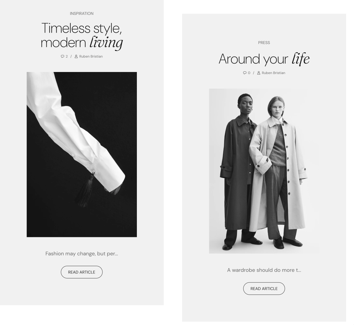
Where you can use it
- In article lists: the Blog posts section, the Blog grid (the blog page) and the Search results (the search page). You style one card, and it repeats for every article. The articles come from the section, so the card has no Article setting to fill in.
- For a single article: Custom grid section and Mega menu in the Header section. Select the article in Article.
The Card style settings set the card's alignment, spacing, padding, corners and color scheme.
Blocks you can add
An Article card accepts these article blocks, plus any theme block and app blocks:
- Article title: the article title, linked to the article.
- Article image: the featured image of the article, linked to the article. When the article has no image, the block shows nothing.
- Article excerpt: a short text from the article.
- Article meta: the publish date, the number of comments and the author.
- Article tags: the tags of the article, as plain text.
- Content group: groups article blocks in a row or column.
The Article title, Article meta and Article tags blocks are also used in the Article header of the article page, and the Article image block in the Article body. This page is the home of their settings.
Common use cases
- Blog grids: featured or recent articles in a structured grid.
- Content marketing: educational or inspirational content on product or collection pages.
- Related reading: relevant articles at the end of blog posts or on product pages.
- Homepage highlights: key stories, guides or announcements on the homepage.
Where does the Article excerpt come from?
It comes from the article's excerpt in Shopify admin → Content → Blog posts. When the article has no excerpt, Seventh uses the start of the article content. Number of words (default: 30) limits the length in both cases.
Why does the Article meta show 0 comments?
Show comments shows the comment count even when comments are turned off for the blog. Turn off Show comments in the Article meta block for blogs without comments. Blog comments are a Shopify feature: you turn them on or off per blog in Shopify admin, in the blog's settings.
All Article card settings
Every setting on this page, one list per section or block, with its type and default.
Accepts these blocks: Content group, Article title, Article excerpt, Article image, Article meta, Article tags, any theme block and app blocks.
Article (article picker): Selects the article the card shows. Not needed in the Blog posts section, the blog page and the search results, where the section sets the article of each card.
Article card: Card style
Where to find it: Custom grid → Article card → Card style
Text alignment (alignment, default: Left).
Inner blocks spacing (dropdown, default: Small). Options: XXSmall, XSmall, Small, Regular, Large, XLarge.
Padding (dropdown, default: Regular). Options: XSmall, Small, Regular, Large, XLarge, XXLarge. Shown only when Remove card background is off.
Add padding to media elements (checkbox, default: on): Adds the card padding around the Article image and other media blocks inside the card. It does not affect the card background media. Shown only when Remove card background is off.
Remove card background (checkbox, default: off): Removes the card background color and the padding around the card content.
Corner radius (dropdown, default: None): Sets the corner rounding of the card itself, not of the blocks inside it. Options: None, Slighty rounded, Rounded, Fully rounded. Shown only when Remove card background is off.
Color scheme (color scheme, default: Scheme 2).
Article card: Background
Where to find it: Custom grid → Article card → Background
Show media background (checkbox, default: off): Shows an image or video behind the card content. Shown only when Remove card background is off.
Background image (image). Shown only when Show media background is on and Remove card background is off.
Background video (video): Plays a muted, looping video behind the card content. When both are set, the video replaces the image. Shown only when Show media background is on and Remove card background is off.
Media overlay (dropdown, default: Color). Options: Color, Gradient. Shown only when Show media background is on and Remove card background is off.
Overlay color (color with transparency, default: rgba(0,0,0,0.1)). Shown only when Show media background is on and Remove card background is off and Media overlay is Color.
Overlay gradient (gradient, default: linear-gradient(0deg, rgba(0,0,0,0.5) 0%, rgba(0,0,0,0) 100%)). Shown only when Show media background is on and Remove card background is off and Media overlay is Gradient.
Where to find it: Blog posts → Default blog post → Article header → Article title. It is also available in: Article card, Content group.
Displays title from parent article.
Article title block: Typography
Where to find it: Blog posts → Default blog post → Article header → Article title → Typography
Font (dropdown, default: Headings). Options: Body, Headings, Accent.
Text size (dropdown, default: Heading 3). Options: Heading 1, Heading 2, Heading 3, Heading 4, Heading 5, Heading 6. Shown only when Font is not Body.
Text size (dropdown, default: Medium). Options: XXSmall, XSmall, Small, Medium, Large, XLarge, XXLarge. Shown only when Font is Body.
Line height (dropdown, default: Default). Options: Default, Smallest, Smaller, Larger, Largest.
Apply accent font to (dropdown, default: None): Sets which part of the title uses the accent font: the first word, the first letter or the last word. Options: None, First word, First letter, Last word. Shown only when Font is Headings.
Text weight (dropdown, default: Normal). Options: Normal, Bold.
Case (dropdown, default: Default). Options: Default, Uppercase.
Reduced text opacity (checkbox, default: off): Shows the text at 62 percent opacity (69 percent on dark color schemes), for secondary text such as captions or notes.
Custom text color (color, default: transparent): Sets a text color that replaces the color scheme text color. Leave it transparent to use the color scheme.
Article title block: SEO
Where to find it: Blog posts → Default blog post → Article header → Article title → SEO
HTML tag (dropdown, default: Heading 3): Sets the HTML heading level of the title for search engines. It does not change the size. Options: Heading 1, Heading 2, Heading 3, Heading 4, Paragraph.
Where to find it: Custom grid → Article card → Article excerpt. It is also available in: Content group.
Displays excerpt from parent article.
Number of words (slider 15 to 100, default: 30): Limits the excerpt to this number of words. The excerpt is the article's excerpt from Shopify admin, or the start of the article content when there is none.
Article excerpt block: Typography
Where to find it: Custom grid → Article card → Article excerpt → Typography
Text size (dropdown, default: Medium). Options: XXSmall, XSmall, Small, Medium, Large, XLarge, XXLarge.
Line height (dropdown, default: Default). Options: Default, Smallest, Smaller, Larger, Largest.
Text weight (dropdown, default: Normal). Options: Normal, Bold.
Case (dropdown, default: Default). Options: Default, Uppercase.
Reduced text opacity (checkbox, default: off): Shows the text at 62 percent opacity (69 percent on dark color schemes), for secondary text such as captions or notes.
Custom text color (color, default: transparent): Sets a text color that replaces the color scheme text color. Leave it transparent to use the color scheme.
Where to find it: Blog posts → Default blog post → Article body → Article image. It is also available in: Article card.
Displays image image from parent article.
Media aspect ratio (dropdown, default: Uncropped: Natural): Sets the shape of the image. Natural shows the image at its uploaded shape; the other ratios crop it. Options: Uncropped: Natural, Cropped: Short (4:3), Cropped: Square (1:1), Cropped: Tall (5:6), Cropped: Taller (2:3).
Media focal point (dropdown, default: Center): Sets which part of the image stays visible when the ratio crops it. Options: Top, Center, Bottom. Shown only when Media aspect ratio is not Uncropped: Natural.
Corner radius (dropdown, default: None): Sets the corner rounding of the image. Options: None, Slighty rounded, Rounded, Fully rounded.
Where to find it: Blog posts → Default blog post → Article header → Article meta. It is also available in: Article card, Content group.
Displays meta from parent article.
Show date (checkbox, default: on): Shows the publish date of the article.
Show comments (checkbox, default: on): Shows the number of comments, also when comments are turned off for the blog.
Show author (checkbox, default: on): Shows the author name of the article.
Article meta block: Typography
Where to find it: Blog posts → Default blog post → Article header → Article meta → Typography
Text size (dropdown, default: Medium). Options: XXSmall, XSmall, Small, Medium, Large, XLarge, XXLarge.
Line height (dropdown, default: Default). Options: Default, Smallest, Smaller, Larger, Largest.
Text weight (dropdown, default: Normal). Options: Normal, Bold.
Case (dropdown, default: Default). Options: Default, Uppercase.
Reduced text opacity (checkbox, default: off): Shows the text at 62 percent opacity (69 percent on dark color schemes), for secondary text such as captions or notes.
Custom text color (color, default: transparent): Sets a text color that replaces the color scheme text color. Leave it transparent to use the color scheme.
Where to find it: Blog posts → Default blog post → Article header → Article tags. It is also available in: Article card, Content group.
Displays tags from parent article.
Article tags block: Typography
Where to find it: Blog posts → Default blog post → Article header → Article tags → Typography
Text size (dropdown, default: Medium). Options: XXSmall, XSmall, Small, Medium, Large, XLarge, XXLarge.
Line height (dropdown, default: Default). Options: Default, Smallest, Smaller, Larger, Largest.
Text weight (dropdown, default: Normal). Options: Normal, Bold.
Case (dropdown, default: Default). Options: Default, Uppercase.
Reduced text opacity (checkbox, default: off): Shows the text at 62 percent opacity (69 percent on dark color schemes), for secondary text such as captions or notes.
Custom text color (color, default: transparent): Sets a text color that replaces the color scheme text color. Leave it transparent to use the color scheme.
Related pages
- Blog posts section: shows several articles with this card.
- Blog page: the blog template, which uses this card in its Blog grid.
- Article page: uses the Article title, meta, tags and image blocks.
- Search page: shows article results with this card.
- General section styling: the Section design and Cards arrangement settings of the parent section.