Blog page
The Blog page in Seventh lists the articles of one blog with a header, tag navigation and a grid of article cards.
Applies to: Seventh 4.0.0 and later. Added in: Seventh 1.0.0. Last checked: 2026-10-12 against Seventh 4.0.0.
The Blog page lists the articles of one blog as a grid of article cards. Shopify uses it for every blog of the store, for example /blogs/news.
Where to find it: in the theme editor, open the page selector at the top and choose Blogs → Default blog. The page has two sections: Blog header and Blog grid.
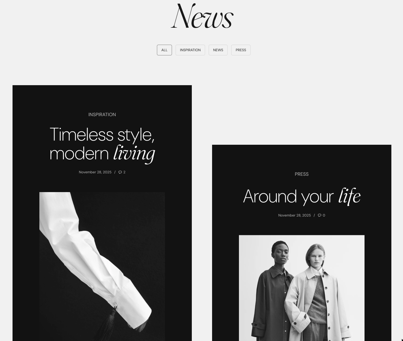
Blog header
The Blog header is the top area of the page.
- It starts with an Empty space block, the Page title block (the blog title, as an H1) and the Blog tags navigation block. The Page title block is described on Regular page.
- You can add a Content group, any theme block and app blocks.
- Set a background image or video in Blog header → Section design.
The Blog tags navigation block lets customers filter articles by tag:
- It shows an "All" link and one link per tag used in the blog.
- Selecting a tag opens the blog filtered to that tag (/blogs/news/tagged/tag-name).
- You add tags to each article in Shopify admin.
Tip: You can use the blog header section to add more information related to the blog or set background image for the entire header.
Blog grid
The Blog grid shows the articles of the blog, one Article card per article.
- In a new store each card shows the article tags, title, date and comment count, the image, the excerpt and a "Read article" button. The card and its blocks are described on Article card.
- Number of posts per page sets how many articles each page shows (6 by default). When the blog has more articles, the page shows pagination links.
Why are my blog posts not showing?
Because the articles are hidden or belong to another blog. Check these in order:
- The article is visible (published) in Shopify admin, and its publish date is not in the future.
- The article belongs to the blog you are looking at. Each blog has its own URL.
- A tag filter is active: the URL contains /tagged/. Select "All" in the Blog tags navigation.
Why do the article images have different heights?
Because the Article image block uses a different Media aspect ratio than your images, or Natural. Natural keeps each image at its own shape. Select a fixed ratio, for example Tall (5:6), in Blog grid → Article card → Article image, so every card crops to the same shape.
All Blog page settings
Every setting on this page, one list per section or block, with its type and default.
Accepts these blocks: Content group, Page title, Blog tags navigation, any theme block and app blocks.
Text alignment (alignment, default: Left).
Spacing (dropdown, default: Regular): Sets the space between the blocks of the Blog header. Options: Extra small, Small, Regular, Large, XLarge.
Text container width (dropdown, default: Large): Sets the width of the text area of the Blog header. Options: Small, Medium, Large.
Blog header section: Section design
Where to find it: Blogs → Default blog → Blog header → Section design
The Blog header section uses the standard Section design settings, listed in General section styling. Not available in this section: Extend section width to the edges of the screen.
Color scheme (color scheme, default: Scheme 1).
Top padding (dropdown, default: Default). Options: Default, None, Smaller, Larger, Largest.
Bottom padding (dropdown, default: Default). Options: Default, None, Smaller, Larger, Largest.
Show media background (checkbox, default: off): Shows a background image or video behind the section content.
Background image (image). Shown only when Show media background is on.
Background image (mobile) (image): Replaces the background image on screens narrower than 768 px. Shown only when Show media background is on and Background image is set.
Background video (video): Plays a muted, looping video behind the section content. When both a video and an image are set, the video is shown. Shown only when Show media background is on.
Media overlay (dropdown, default: Color): Sets the layer over the background media: a flat color or a gradient. Options: Color, Gradient. Shown only when Show media background is on.
Overlay color (color with transparency). Shown only when Show media background is on and Media overlay is Color.
Overlay gradient (gradient, default: linear-gradient(0deg, rgba(0,0,0,0.5) 0%, rgba(0,0,0,0) 100%)). Shown only when Show media background is on and Media overlay is Gradient.
Parallax effect (dropdown, default: Medium): Moves the background media at a different speed than the page while customers scroll. Subtle, Medium and Strong move it by up to 5, 10 and 20 percent. Options: None, Subtle, Medium, Strong. Shown only when Show media background is on.
Push content down (checkbox, default: off): Replaces Top padding with a larger top space, so more of the background media shows above the content. Shown only when Show media background is on.
Make section full height (checkbox, default: off): Makes the section at least as tall as the screen and centers the content vertically.
Where to find it: Blogs → Default blog → Blog header → Blog tags navigation.
Case (dropdown, default: Default): Sets the tag links to the default case or to uppercase. Options: Default, Uppercase.
Where to find it: Blogs → Default blog → Blog grid.
Number of posts per page (slider 4 to 12, default: 6): Sets how many articles each page of the blog shows. More articles go to the next pages.
Blog grid section: Layout
Where to find it: Blogs → Default blog → Blog grid → Layout
Cards size (dropdown, default: Medium): Layout is adjusted automatically for different screen sizes. Options: XSmall, Small, Medium, Large.
Cards size on mobile (dropdown, default: Small): On very small devices, cards will be resized to fit the screen. Options: Small, Large.
Cards alignment (dropdown, default: Top): If cards have different heights. Options: Top, Center, Bottom, Stretch.
Stretch alignment type (dropdown, default: Space between). Options: Top, Center, Bottom, Space between, Space around. Shown only when Cards alignment is Stretch.
Grid gap (dropdown, default: Default). Options: None, Default, XXSmall, XSmall, Small, Regular, Large, XLarge, XXLarge. Shown only when Scatter cards is off.
Blog grid section: Cards arrangement
Where to find it: Blogs → Default blog → Blog grid → Cards arrangement
The Blog grid section uses the standard Cards arrangement settings, listed in General section styling. Not available in this section: Randomize card sizes and Randomize card sizes on mobile devices.
Scatter cards (checkbox, default: off): Turns on the scattered (editorial) layout: each card moves up or down by a different amount, so the cards no longer sit in straight rows.
Scatter cards on mobile devices (checkbox, default: off): Keeps the scattered layout on mobile, with half the desktop offset. When off, cards line up in regular rows on mobile. Shown only when Scatter cards is on.
Horizontal spacing (dropdown, default: Medium): A larger value will make the cards smaller. Options: XSmall, Small, Medium, Large, XLarge. Shown only when Scatter cards is on.
Vertical scattering (dropdown, default: XSmall): Sets how far each scattered card moves up or down. Options: XSmall, Small, Medium, Large, XLarge. Shown only when Scatter cards is on.
Gap between rows (dropdown, default: XSmall): Sets the vertical space between rows of scattered cards. Options: XSmall, Small, Medium, Large, XLarge. Shown only when Scatter cards is on.
Blog grid section: Section design
Where to find it: Blogs → Default blog → Blog grid → Section design
The Blog grid section uses the standard Section design settings, listed in General section styling. In this section the group has only Color scheme, Top padding and Bottom padding.
Color scheme (color scheme, default: Scheme 1).
Top padding (dropdown, default: Default). Options: Default, None, Smaller, Larger, Largest.
Bottom padding (dropdown, default: Default). Options: Default, None, Smaller, Larger, Largest.
Related pages
- Article card: the card in the Blog grid and its article blocks.
- Article page: the page that opens when a customer selects an article.
- Blog posts section: shows articles on the home page or any other page.
- General section styling: the Section design and Cards arrangement settings.