Article page
The Article page in Seventh shows one blog post: the article header, the content, comments and links to recent articles.
Applies to: Seventh 4.0.0 and later. Added in: Seventh 1.0.0. Last checked: 2026-10-12 against Seventh 4.0.0.
The Article page shows one blog article with its content, media and details. Shopify uses it for every article of every blog.
Where to find it: in the theme editor, open the page selector at the top and choose Blog posts → Default blog post. The page has two sections: Article header and Article body.
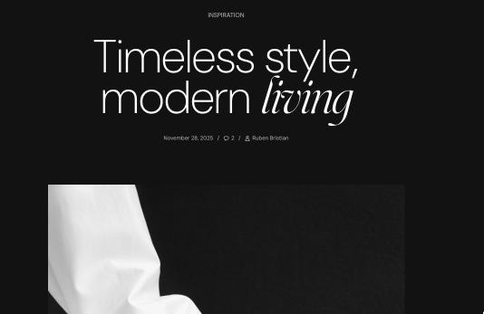
Article header
The Article header is the top of the article.
- It starts with the Article tags, Article title (as an H1) and Article meta (date, comment count, author) blocks.
- You can add a Content group, any theme block and app blocks.
- Show media background in Article header → Section design uses the article image as the header background. In a new store, Background image is connected to the article image.
The Article title, Article meta, Article tags and Article image blocks are documented on Article card, with their settings.
Article body
The Article body holds the article itself. It starts with the Article image, a Heading, the Article content, Article comments and Recent articles blocks. You can reorder or remove them, and add any theme block and app blocks.
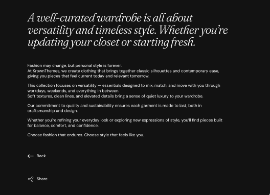
- Show link back to blog in the Article content block shows a link to the blog the article belongs to.
- Show sharing options (on by default) shows the social share links under the content.
- Headings typography changes only the headings that Seventh adds: the comments heading, the comment form title and the "Recent articles" heading. The headings inside your article text use the theme's heading styles from Typography theme settings.
Article comments
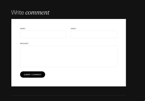
The Article comments block shows the comments and a comment form, when the blog allows comments.
Recent articles
The Recent articles block shows the previous and the next article of the same blog, as two article cards.
- To show other articles, select them in Previous post and Next post.
- On the first or last article of a blog, only one card shows.
Why are comments not showing on my articles?
Because comments are turned off for the blog. Shopify controls blog comments, not Seventh: you turn them on or off per blog in Shopify admin, in the blog's settings. When the blog moderates comments, a new comment shows only after you approve it in Shopify admin.
Can I show more related articles under the article?
Yes, with a Blog posts section. Seventh has no separate related-articles section: the Recent articles block shows two articles. Add a Blog posts section to the template to show more.
All Article page settings
Every setting on this page, one list per section or block, with its type and default.
Accepts these blocks: Content group, Article title, Article tags, Article meta, any theme block and app blocks.
Text alignment (alignment, default: Left).
Spacing (dropdown, default: Regular): Sets the space between the blocks of the Article header. Options: Extra small, Small, Regular, Large, XLarge.
Text container width (dropdown, default: Large): Sets the width of the text area of the Article header. Options: Small, Medium, Large.
Article header section: Section design
Where to find it: Blog posts → Default blog post → Article header → Section design
The Article header section uses the standard Section design settings, listed in General section styling. Not available in this section: Extend section width to the edges of the screen.
Color scheme (color scheme, default: Scheme 1).
Top padding (dropdown, default: Default). Options: Default, None, Smaller, Larger, Largest.
Bottom padding (dropdown, default: Default). Options: Default, None, Smaller, Larger, Largest.
Show media background (checkbox, default: off): Shows a background image or video behind the section content.
Background image (image). Shown only when Show media background is on.
Background image (mobile) (image): Replaces the background image on screens narrower than 768 px. Shown only when Show media background is on and Background image is set.
Background video (video): Plays a muted, looping video behind the section content. When both a video and an image are set, the video is shown. Shown only when Show media background is on.
Media overlay (dropdown, default: Color): Sets the layer over the background media: a flat color or a gradient. Options: Color, Gradient. Shown only when Show media background is on.
Overlay color (color with transparency). Shown only when Show media background is on and Media overlay is Color.
Overlay gradient (gradient, default: linear-gradient(0deg, rgba(0,0,0,0.5) 0%, rgba(0,0,0,0) 100%)). Shown only when Show media background is on and Media overlay is Gradient.
Parallax effect (dropdown, default: Medium): Moves the background media at a different speed than the page while customers scroll. Subtle, Medium and Strong move it by up to 5, 10 and 20 percent. Options: None, Subtle, Medium, Strong. Shown only when Show media background is on.
Push content down (checkbox, default: off): Replaces Top padding with a larger top space, so more of the background media shows above the content. Shown only when Show media background is on.
Make section full height (checkbox, default: off): Makes the section at least as tall as the screen and centers the content vertically.
Where to find it: Blog posts → Default blog post → Article body.
Accepts these blocks: Article image, Article content, Article comments, Recent articles, any theme block and app blocks.
Container width (dropdown, default: XSmall): Sets the width of the article column. Options: XSmall, Small, Large, Full width.
Container alignment (dropdown, default: Center): Sets the position of the article column on the page. Not available when Container width is Large. Options: Left, Center, Right. Shown only when Container width is not Full width.
Article body section: Headings typography
Where to find it: Blog posts → Default blog post → Article body → Headings typography
Font (dropdown, default: Headings). Options: Body, Headings, Accent.
Text size (dropdown, default: Heading 3). Options: Heading 1, Heading 2, Heading 3, Heading 4, Heading 5, Heading 6. Shown only when Font is not Body.
Text size (dropdown, default: Medium). Options: XXSmall, XSmall, Small, Medium, Large, XLarge, XXLarge. Shown only when Font is Body.
Line height (dropdown, default: Default). Options: Default, Smallest, Smaller, Larger, Largest.
Apply accent font to (dropdown, default: None). Options: None, First word, First letter, Last word. Shown only when Font is Headings.
Case (dropdown, default: Default). Options: Default, Uppercase.
HTML tags (dropdown, default: Heading 3): Sets the HTML heading level of the comments and Recent articles headings for search engines. It does not change the size. Options: Heading 1, Heading 2, Heading 3, Heading 4, Paragraph.
Article body section: Section design
Where to find it: Blog posts → Default blog post → Article body → Section design
The Article body section uses the standard Section design settings, listed in General section styling. In this section the group has only Color scheme, Top padding and Bottom padding.
Color scheme (color scheme, default: Scheme 1).
Top padding (dropdown, default: Default). Options: Default, None, Smaller, Larger, Largest.
Bottom padding (dropdown, default: Default). Options: Default, None, Smaller, Larger, Largest.
Where to find it: Blog posts → Default blog post → Article body → Article content.
Displays content from parent article.
Show link back to blog (checkbox, default: off): Shows a link back to the blog that the article belongs to.
Show sharing options (checkbox, default: on): Shows links to share the article on social networks.
Text alignment (alignment, default: Left).
Article content block: Typography
Where to find it: Blog posts → Default blog post → Article body → Article content → Typography
Text size (dropdown, default: Medium). Options: XXSmall, XSmall, Small, Medium, Large, XLarge.
Line height (dropdown, default: Default). Options: Default, Smallest, Smaller, Larger, Largest.
Case (dropdown, default: Default). Options: Default, Uppercase.
Where to find it: Blog posts → Default blog post → Article body → Article comments.
Displays content from parent article.
Comments per page (slider 1 to 10, default: 3): Sets how many comments show before the comment pagination. The block shows nothing when the blog does not allow comments.
Article comments block: Comment form color
Where to find it: Blog posts → Default blog post → Article body → Article comments → Comment form color
Color scheme (color scheme, default: Scheme 2): Sets the color scheme of the comment form.
Where to find it: Blog posts → Default blog post → Article body → Recent articles.
Previous post (article picker): Selects the article shown in the first card. Empty shows the previous article of the blog.
Next post (article picker): Selects the article shown in the second card. Empty shows the next article of the blog.
If not overwritten, the next and previous articles are displayed.
Recent articles block: Layout
Where to find it: Blog posts → Default blog post → Article body → Recent articles → Layout
Cards size on mobile (dropdown, default: Small): On very small devices, cards will be resized to fit the screen. Options: Small, Large.
Cards alignment (dropdown, default: Stretch): If cards have different heights. Options: Top, Center, Bottom, Stretch.
Related pages
- Article card: the article title, meta, tags and image blocks, and the cards in Recent articles.
- Blog page: the list of articles of a blog.
- General section styling: the Section design settings of the Article header.