Product page
The Product page in Seventh: gallery styles, layout, mobile media, sticky add to cart and the Product information blocks of the product template.
Applies to: Seventh 4.0.0 and later. Added in: Seventh 1.0.0. Last checked: 2026-10-12 against Seventh 4.0.0.
The Product page section shows one product with its media gallery and its details. It is the main section of the product template, and its Product information block holds the title, price, variant picker, buy buttons and the other product blocks.
Where to find it: in the theme editor, open the template picker and select Products → Default product, then select Product page.
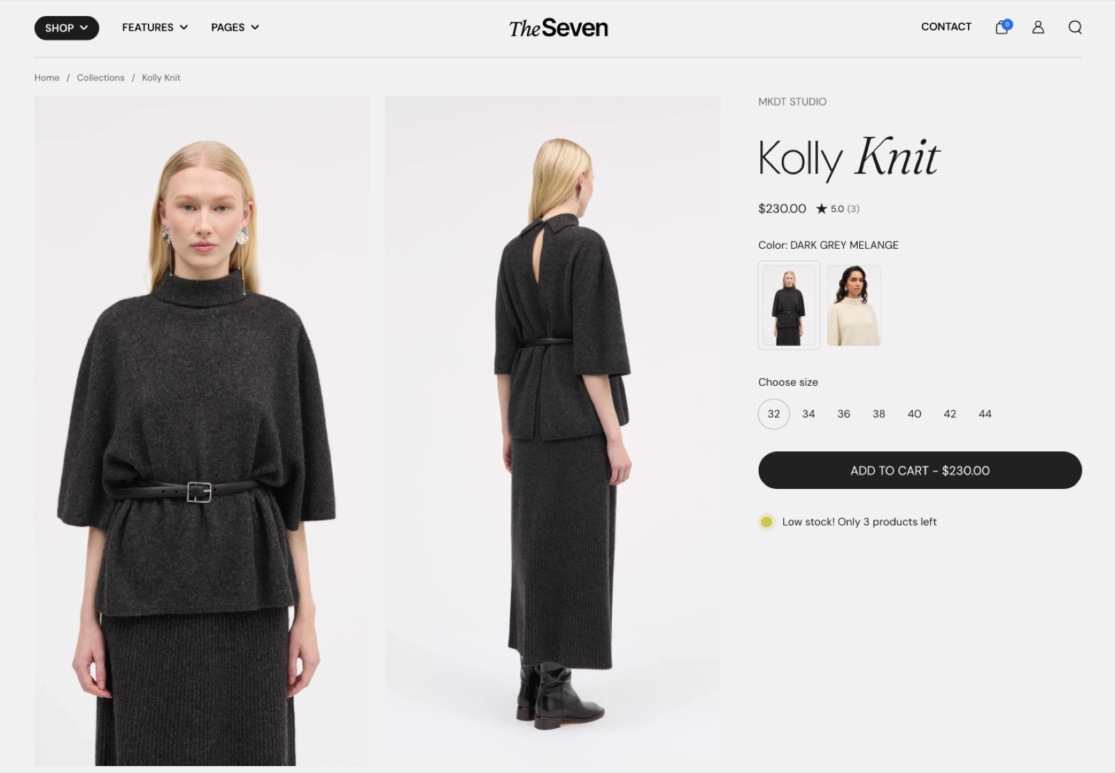
Product gallery
Product gallery style sets the whole layout of the product page. The other gallery settings change with it.
With Product gallery style set to Cover, the media fills the screen behind the header. The Product information block floats over it as a card. Cover suits stores with product photos shot in one consistent style.
- Media style sets how the media fills the screen:
- Fit keeps the whole image visible at screen height.
- Crop fills the screen and crops the image.
- Scroll crops the image and lets it scroll past the screen.
Use cases
Fit: Works very well with tall portrait images that have a similar background and style, because the customer might see more than one image at a time (on desktop).
Crop: Works well if you want a single image to fill in the entire viewport and it's not an issue if you'll get cropping. Works better with landscape images.
Scroll: The most immersive one, where the product image will fill not only the viewport, but expand beyond it.
- Media position (Fit only) shows one image at a time on the left, center or right, or all images inline in a row.
- Media focal point (Crop only) sets which part of the image stays visible, for example Top for photos of models.
- Parallax effect moves the media vertically while the customer scrolls.
Parallax requires extra cropping, so bigger parallax strength = more cropping to the images.
- The Product information card design settings of the Product information block (alignment, card background, corner radius, color scheme) set where the card sits over the media and how it looks.
- On mobile, the media sits behind the header as a slider. Turn on Switch to classic media style on mobile to show the slider below the header instead.
- Media aspect ratio, Media focal point and Fit media inside container set the mobile media shape.
Videos
- Enable video looping plays product videos in a loop.
- Enable video autoplay starts them on their own, without controls.
When videos are autoplaying, they will be muted and they will not pause when the customer interacts with the variants.
Filter media by variant
Turn on Filter media by variant to show only the media of the selected variant. For example, the page shows only the white photos when the customer selects White.
- The setting appears only when Select the first available variant by default is on.
- When the selected variant has no variant image, the product page shows all media.
Group the media in Shopify admin
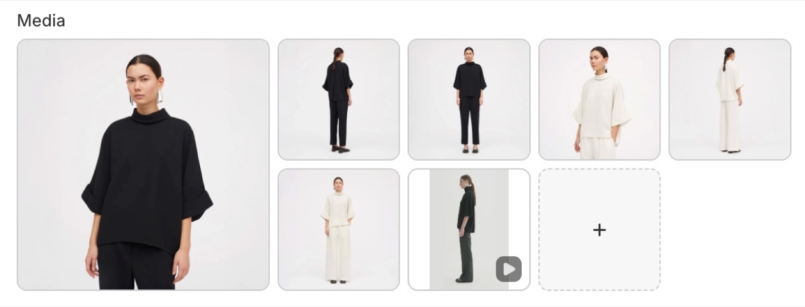
In Shopify admin → Products, order the product images so that all the images for the chosen variant are grouped together, for example 3 black, 3 white.
Assign the first image of each group
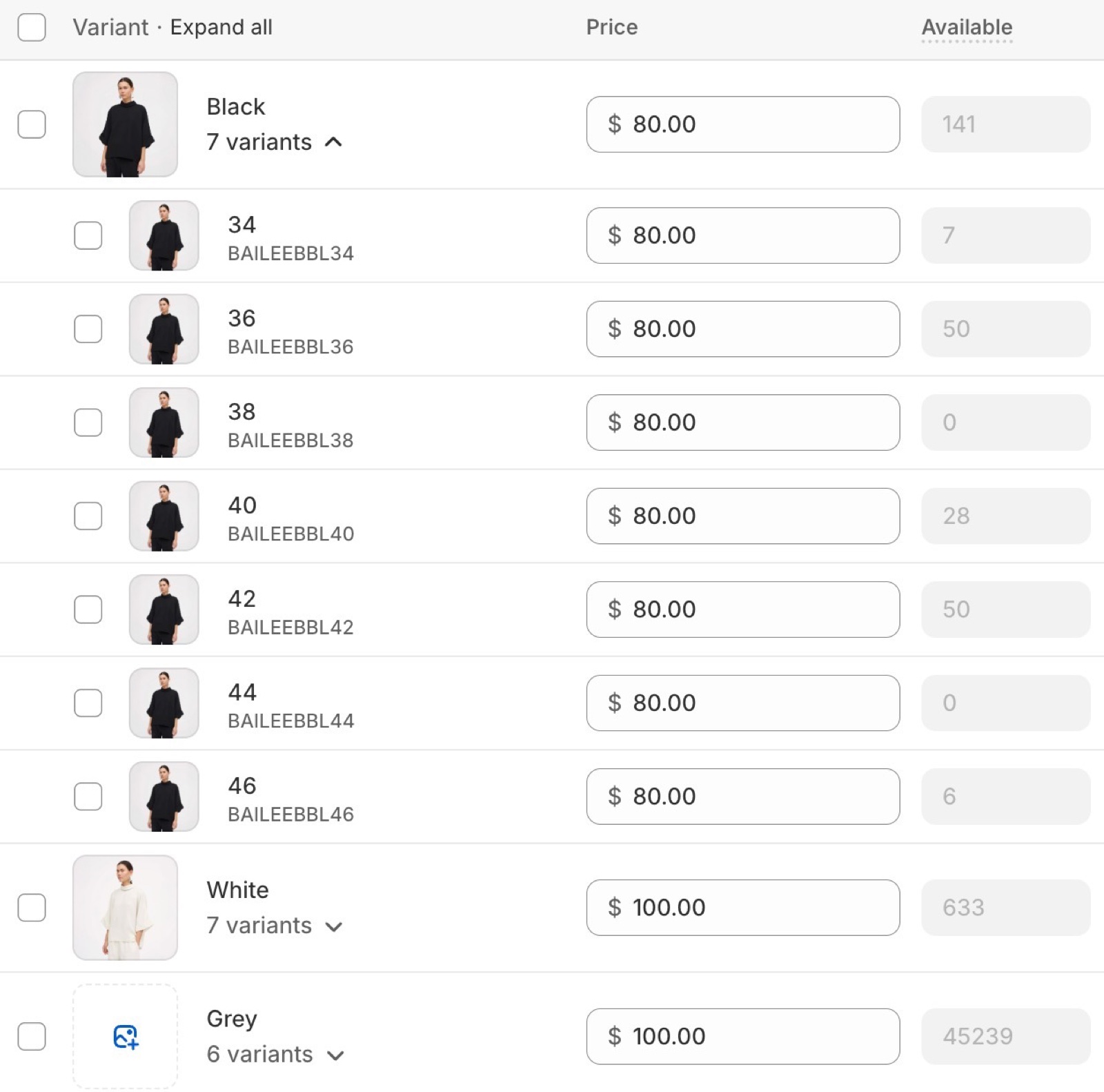
Assign the first image of each group to the proper color variant, for example the first black image to the Black variant and the first white image to the White variant. That image marks the start of the variant's group.
Turn on the setting
In the theme editor, check Filter media by variant in the Product page section, under Layout.
Note: Videos or 3d models will be displayed for all the variants.
Section design and functionality
- Color scheme, Top padding and Bottom padding are the standard section design settings.
- Select the first available variant by default selects the first available variant when the page opens. When it is off, customers must select a variant before they can buy.
If the Product gallery style is set to Cover, the section design settings apply only on mobile devices.
Sticky add to cart
Turn on Enable sticky add to cart to show a bar when the customer scrolls past the main buy buttons. The bar shows:
- the product image and title,
- the selected options, with a link to change them,
- an add to cart button.
Sold out products do not show the bar. With Select the first available variant by default turned off, the bar also has a button that scrolls back to the variant picker.
Product page blocks
Add the product blocks inside the Product information block. They are documented on these pages:
- Product title, vendor, price, rating, badges, SKU / barcode, tax info, description and share: see Product information blocks.
- Product variants, product siblings, buy buttons and custom property: see Product variants and buy buttons blocks.
- Inventory availability, pickup availability and back in stock alert: see Product availability blocks.
- Complementary products, coupon code, disclosures and variant metafield: see Complementary products, coupon code, disclosures and variant metafield blocks.
- Any theme block (for example Accordion, Text, Table or Popup button) and app blocks.
The Product recommendations section sits below the Product page section in the same template. See Product recommendations section.
Can I show a lifestyle image for every variant?
No, not while Filter media by variant is on. Images placed before the first variant group are hidden once a variant is selected. Put shared photos, for example a lifestyle photo, inside each variant's group instead. Adding #all to an image's alt text, as older Seventh articles describe, has no effect in Seventh 4.0.0.
Why does the product video not autoplay or loop?
Because Enable video autoplay and Enable video looping are off by default. Turn them on in Products → Default product → Product page → Video settings.
All Product page settings
Every setting on this page, one list per section or block, with its type and default.
Accepts these blocks: Product information.
Product page section: Layout
Where to find it: Products → Default product → Product page → Layout
Product gallery style (dropdown, default: Cover): Sets the product page layout. Cover shows the media full screen behind the header with the product information as a card over it. Classic shows the media and the product information side by side. Options: Cover, Classic.
Media style (dropdown, default: Fit). Options: Fit, Crop, Scroll. Shown only when Product gallery style is Cover.
Media fits the viewport height, adjusting its width to preserve the aspect ratio. Shown only when Product gallery style is Cover and Media style is Fit.
Media expands to fill the entire viewport. Parts of the image may be cropped. Shown only when Product gallery style is Cover and Media style is Crop.
Media is cropped and will scroll with the viewport. Shown only when Product gallery style is Cover and Media style is Scroll.
Media position (dropdown, default: Show one image at a time: Center): Sets how the Fit media is placed: one image at a time on the left, center or right, or all images inline in a row. Options: Show one image at a time: Left, Show one image at a time: Center, Show one image at a time: Right, Inline. Shown only when Product gallery style is Cover and Media style is Fit.
Duplicate the first image at the end of the gallery (checkbox, default: on): Repeats the first image at the end of the inline gallery. Shown only when Product gallery style is Cover and Media position is Inline and Media style is Fit.
Media focal point (dropdown, default: Top): Sets which part of the image stays visible when Crop cuts it, for example Top for photos of models. Options: Top, Center, Bottom. Shown only when Product gallery style is Cover and Media style is Crop.
Media layout (dropdown, default: Scroll: 1 column): Defaults to a 1 column slider on mobile devices. Options: Slider: 1 column, Scroll: 1 column, Scroll: 2 columns. Shown only when Product gallery style is Classic.
Desktop media width (dropdown, default: One half). Options: One half, Two thirds. Shown only when Product gallery style is Classic.
Enhance first image (checkbox, default: off): Shows the first image at full width above the two columns on desktop. Shown only when Product gallery style is Classic and Media layout is Scroll: 2 columns.
Media overlay (dropdown, default: Color). Options: Color, Gradient. Shown only when Product gallery style is Cover.
Overlay color (color with transparency, default: #00000008). Shown only when Product gallery style is Cover and Media overlay is Color.
Overlay gradient (gradient, default: linear-gradient(0deg, rgba(0,0,0,0.5) 0%, rgba(0,0,0,0) 100%)). Shown only when Product gallery style is Cover and Media overlay is Gradient.
Enable vertical scrolling (checkbox, default: off): Shows the media as a vertical scroll instead of a slider, on desktop only. Shown only when Product gallery style is Cover.
Show thumbnails (checkbox, default: off): Shows media thumbnails on desktop. Mobile uses the slider navigation instead. Shown only when Product gallery style is Cover.
Enable image zoom (checkbox, default: off). Shown only when Product gallery style is Classic.
Parallax effect (dropdown, default: Medium): Sets the vertical parallax movement of the media while scrolling. A stronger effect crops more of the image. Options: None, Subtle, Medium, Strong. Shown only when Product gallery style is Cover.
Filter media by variant (checkbox, default: off): Shows only the media of the selected variant. Order the media by variant in Shopify admin and assign the first image of each group as the variant image. Videos and 3D models show for every variant. Shown only when Select the first available variant by default is on.
Product page section: Mobile media style
Where to find it: Products → Default product → Product page → Mobile media style
Switch to classic media style on mobile (checkbox, default: off): Shows the mobile gallery as a slider below the header instead of behind it. Shown only when Product gallery style is Cover.
Media aspect ratio (dropdown, default: Square (1:1)): Sets the media shape. With the Cover gallery style it applies on mobile only; with Classic on all devices. Options: Standard (3:2), Short (4:3), Square (1:1), Tall (5:6), Taller (2:3), Ultra tall (1:2).
Media focal point (dropdown, default: Center). Options: Top, Center, Bottom. Shown only when Fit media inside container is off.
Fit media inside container (checkbox, default: off): Shows the whole image inside the aspect ratio instead of cropping it to fill.
Container background (color with transparency, default: transparent). Shown only when Fit media inside container is on.
Enable horizontal parallax in slider (checkbox, default: on): Adds a horizontal parallax movement between slides in the Classic slider. Shown only when Product gallery style is Classic.
Product page section: Mobile media style
Where to find it: Products → Default product → Product page → Mobile media style
Remove gallery padding on mobile (checkbox, default: off): Lets the Classic gallery reach the screen edges on mobile. Shown only when Product gallery style is Classic.
Product page section: Video settings
Where to find it: Products → Default product → Product page → Video settings
Enable video looping (checkbox, default: off).
Enable video autoplay (checkbox, default: off): The video will be muted and without controls.
Product page section: Section design
Where to find it: Products → Default product → Product page → Section design
The Product page section uses the standard Section design settings, listed in General section styling. In this section the group has only Color scheme, Top padding and Bottom padding.
Color scheme (color scheme, default: Scheme 2).
Top padding (dropdown, default: Default). Options: Default, None, Smaller, Larger, Largest.
Bottom padding (dropdown, default: Default). Options: Default, None, Smaller, Larger, Largest.
These settings differ from the standard ones or exist only here:
Color scheme (color scheme, default: Scheme 2).
Product page section: Functionality
Where to find it: Products → Default product → Product page → Functionality
Select the first available variant by default (checkbox, default: on): Selects the first available variant when the page opens. When off, customers must select a variant before they can buy, and the price shows "From" and the lowest price until then.
Product page section: Sticky add to cart
Where to find it: Products → Default product → Product page → Sticky add to cart
Enable sticky add to cart (checkbox, default: on): Shows a bar with the product, the selected options and an add to cart button when the customer scrolls past the main buy buttons. Not shown for sold out products.
Color scheme (color scheme, default: Scheme 1).
Where to find it: Products → Default product → Product page → Product information.
Accepts these blocks: Product title, Product description, Product price, Product vendor, Product rating, Product badges, Content group, Product variants, Product siblings, Buy buttons, Inventory availability, Pickup availability, Product SKU / barcode, Product tax info, Disclosures, Product share, Back in stock alert, Complementary products, Custom property, Variant metafield, Coupon code, any theme block and app blocks.
Text alignment (alignment, default: Left).
Inner blocks spacing (dropdown, default: Small). Options: XXSmall, XSmall, Small, Regular, Large, XLarge.
Padding (dropdown, default: Small). Options: XSmall, Small, Regular, Large. Shown only when Remove card background is off and the section's Product gallery style is Cover.
Product information block: Product information card design
Where to find it: Products → Default product → Product page → Product information → Product information card design
Horizontal alignment (dropdown, default: Right): Sets the side of the screen where the product information card sits over the Cover media, on desktop. Options: Left, Right. Shown only when the section's Product gallery style is Cover.
Vertical alignment (dropdown, default: Bottom): Sets the vertical position of the product information card over the Cover media, on desktop. Options: Top, Center, Bottom. Shown only when the section's Product gallery style is Cover.
Remove card background (checkbox, default: off): Removes the card background so the product information sits directly on the media. Shown only when the section's Product gallery style is Cover.
Corner radius (dropdown, default: None). Options: None, Slighty rounded, Rounded, Fully rounded. Shown only when the section's Product gallery style is Cover.
Color scheme (color scheme). Shown only when the section's Product gallery style is Cover.
Related pages
- Product information blocks: title, price, vendor, rating, badges and the other content blocks.
- Product variants and buy buttons blocks: variant picker, product siblings and buy buttons.
- Product recommendations section: related products below the product page.
- Color swatches & size options theme settings: store-wide swatch and product siblings style.
- Seventh video guides: a video walkthrough of product pages, galleries and siblings.
- Troubleshoot product and collection pages: answers to common product page problems.
Video
The Video section in Seventh is a Custom grid preset that shows one video in a card, from Shopify files or YouTube and Vimeo.
Product information blocks
The Product information blocks in Seventh: product title, vendor, price, rating, badges, SKU, tax info, description and share on the product page.