Complementary products, coupon code, disclosures and variant metafield blocks
The Complementary products, Coupon code, Disclosures and Variant metafield blocks add cross-sells, codes and details to the Seventh product page.
Applies to: Seventh 4.0.0 and later. Added in: Seventh 1.0.0. Last checked: 2026-10-12 against Seventh 4.0.0.
The Complementary products, Coupon code, Disclosures and Variant metafield blocks add cross-sell products, a copyable discount code, Shopify product disclosures and variant-specific details to the product page. They sit inside the Product information block of the Product page section.
Where to find it: Products → Default product → Product page → Product information, then select Add block.
Complementary products
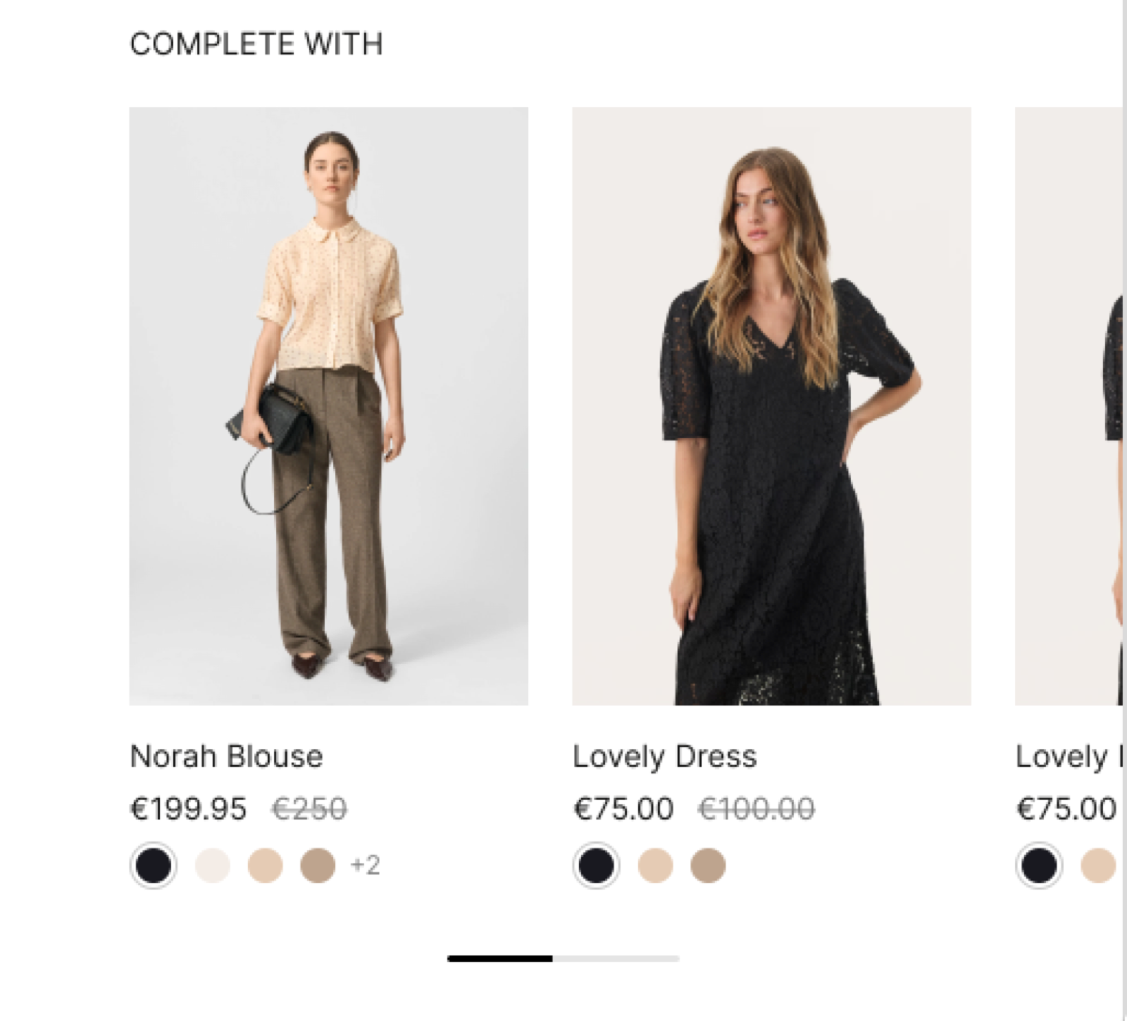
The Complementary products block shows products that go well with the product, as a slider when there is more than one.
- Complementary products are controlled by Shopify's Search & Discovery app, not by Seventh.
- The block shows only the products that you assign to each product in the app, up to Maximum number of products shown.
- Each product inside the block is a Product card. Select the Product card block inside Complementary products to change what it shows. See Product card.
To set them up:
- Install the Shopify Search & Discovery app.
- In the app, open Product recommendations, select the product and add its complementary products.
- Reload the product page.
Complementary products can be set up individually for each product, using the Shopify Search & Discovery app.
Coupon code
The Coupon code block shows a discount code in a box. Customers select the code to copy it to the clipboard. It was added in Seventh 3.0.0.
- Caption adds a short line under the code, for example "10% off your first order".
- Link label with Link adds a link, for example to the terms.
The Coupon code block does not create or apply the discount. Discounts are controlled by Shopify, not by Seventh. Create the discount with the same code in Shopify admin → Discounts, and make sure it is active. See Shopify Help Center: Discounts.
Disclosures
The Disclosures block shows Shopify's product disclosures, for example safety or regulatory information. Customers open them like an accordion. It was added in Seventh 3.0.0.
- Product disclosures are controlled by Shopify, not by Seventh.
- You add them to the product in Shopify admin, through the product's category metafield for disclosures.
- The block shows only the disclosures whose display settings include the product page.
See Shopify Help Center: Product disclosures.
Variant metafield
The Variant metafield block shows different details for each variant. It shows the value of one variant metafield for the selected variant, for example the material or the measurements of each size. It updates when the customer selects another variant. It was added in Seventh 2.0.0.
Create the variant metafield
Open Shopify admin → Settings → Metafields and metaobjects → Variants and select Add definition. Choose a type, for example single line text, and save.
Fill in each variant
Open each product in Shopify admin → Products, select a variant and enter its value in the new metafield.
Add the block
In the theme editor, open Products → Default product → Product page → Product information, select Add block and choose Variant metafield.
Enter the metafield key
Enter the metafield as namespace.key in Variant metafield key, for example custom.material. Add a Title to show a label before the value.
Variants without a value show nothing. For more about variant metafields, see Using variant metafields in product pages.
Why is the Complementary products block empty?
Because the product has no complementary products in Shopify. Add them to the product in the Search & Discovery app, as described above.
Why does the Disclosures block show nothing?
Because the product has no disclosures for the product page. Add them to the product in Shopify admin and check that their display settings include the product page.
All Complementary products, coupon code, disclosures and variant metafield blocks settings
Every setting on this page, one list per section or block, with its type and default.
Where to find it: Products → Default product → Product page → Product information → Complementary products.
To select complementary products, add the Search & Discovery app. Shopify Help Center.
Maximum number of products shown (slider 1 to 8, default: 3): Sets the maximum number of complementary products shown, from 1 to 8. The products come from the Shopify Search & Discovery app.
Heading (text field, default: "Pairs well with").
Complementary products block: Typography
Where to find it: Products → Default product → Product page → Product information → Complementary products → Typography
Text size (dropdown, default: Medium). Options: XXSmall, XSmall, Small, Medium, Large, XLarge.
Line height (dropdown, default: Small). Options: Default, Smallest, Smaller, Small, Larger, Largest.
Text weight (dropdown, default: Normal). Options: Normal, Bold.
Case (dropdown, default: Default). Options: Default, Uppercase.
Reduced text opacity (checkbox, default: off): Shows the text at 62 percent opacity (69 percent on dark color schemes), for secondary text such as captions or notes.
Custom text color (color, default: transparent).
Where to find it: Products → Default product → Product page → Product information → Coupon code.
Code (text field, default: "SAVE10"): Sets the discount code that customers copy. Create the same code in Shopify admin → Discounts; this block does not create the discount.
Caption (text field): Sets a short line of text under the code.
Link label (text field).
Link (link). Shown only when Link label is set.
Open link in a new window (checkbox, default: off). Shown only when Link label is set.
Coupon code block: Style
Where to find it: Products → Default product → Product page → Product information → Coupon code → Style
Text size (dropdown, default: Small). Options: XSmall, Small, Medium.
Corner radius (dropdown, default: Slighty rounded). Options: None, Slighty rounded, Rounded.
Color scheme (color scheme, default: Scheme 2).
Where to find it: Products → Default product → Product page → Product information → Disclosures. It is also available in: Featured product card, Content group.
Displays the disclosures attached to this product through Shopify's Product Disclosures. Shopify Help Center.
Product disclosures can be configured with metafields at product level.
Disclosures block: Typography
Where to find it: Products → Default product → Product page → Product information → Disclosures → Typography
Font (dropdown, default: Headings). Options: Body, Headings, Accent.
Text size (dropdown, default: Heading 3). Options: Heading 1, Heading 2, Heading 3, Heading 4, Heading 5, Heading 6. Shown only when Font is not Body.
Text size (dropdown, default: Medium). Options: XXSmall, XSmall, Small, Medium, Large, XLarge, XXLarge. Shown only when Font is Body.
Line height (dropdown, default: Default). Options: Default, Smallest, Smaller, Larger, Largest.
Apply accent font to (dropdown, default: None). Options: None, First word, First letter, Last word. Shown only when Font is Headings.
Text weight (dropdown, default: Normal). Options: Normal, Bold.
Case (dropdown, default: Default). Options: Default, Uppercase.
Reduced text opacity (checkbox, default: off): Shows the text at 62 percent opacity (69 percent on dark color schemes), for secondary text such as captions or notes.
Custom text color (color, default: transparent).
Disclosures block: Functionality
Where to find it: Products → Default product → Product page → Product information → Disclosures → Functionality
Opened by default (checkbox, default: off).
Disclosures block: Content typography
Where to find it: Products → Default product → Product page → Product information → Disclosures → Content typography
Text size (dropdown, default: XSmall). Options: XXSmall, XSmall, Small, Medium, Large, XLarge.
Line height (dropdown, default: Default). Options: Default, Smallest, Smaller, Larger, Largest.
Text weight (dropdown, default: Normal). Options: Normal, Bold.
Case (dropdown, default: Default). Options: Default, Uppercase.
Reduced text opacity (checkbox, default: off).
Where to find it: Products → Default product → Product page → Product information → Variant metafield. It is also available in: Featured product card.
Variant metafield key (text field): Sets the variant metafield to show, written as namespace.key, for example custom.material. The value updates when the customer selects another variant.
Title (text field): Sets a label shown before the metafield value. Shown only when Variant metafield key is set.
Variant metafield block: Typography
Where to find it: Products → Default product → Product page → Product information → Variant metafield → Typography
Text size (dropdown, default: Medium). Options: XXSmall, XSmall, Small, Medium, Large, XLarge.
Line height (dropdown, default: Small). Options: Default, Smallest, Smaller, Small, Larger, Largest.
Text weight (dropdown, default: Normal). Options: Normal, Bold.
Case (dropdown, default: Default). Options: Default, Uppercase.
Reduced text opacity (checkbox, default: off): Shows the text at 62 percent opacity (69 percent on dark color schemes), for secondary text such as captions or notes.
Custom text color (color, default: transparent).
Custom background color (color with transparency, default: transparent): Sets a background color behind the text.
Related pages
- Product page: the Product page section and the Product information block.
- Product information blocks: title, price, vendor and the other content blocks.
- Product recommendations section: related products below the product page, also from Shopify.
- Product card: the card used for each complementary product.
Product availability blocks
The Product availability blocks in Seventh: Inventory availability, Pickup availability and Back in stock alert on the product page.
Product recommendations
The Product recommendations section shows related products below the product page in Seventh. Shopify chooses the products.