Product recommendations section
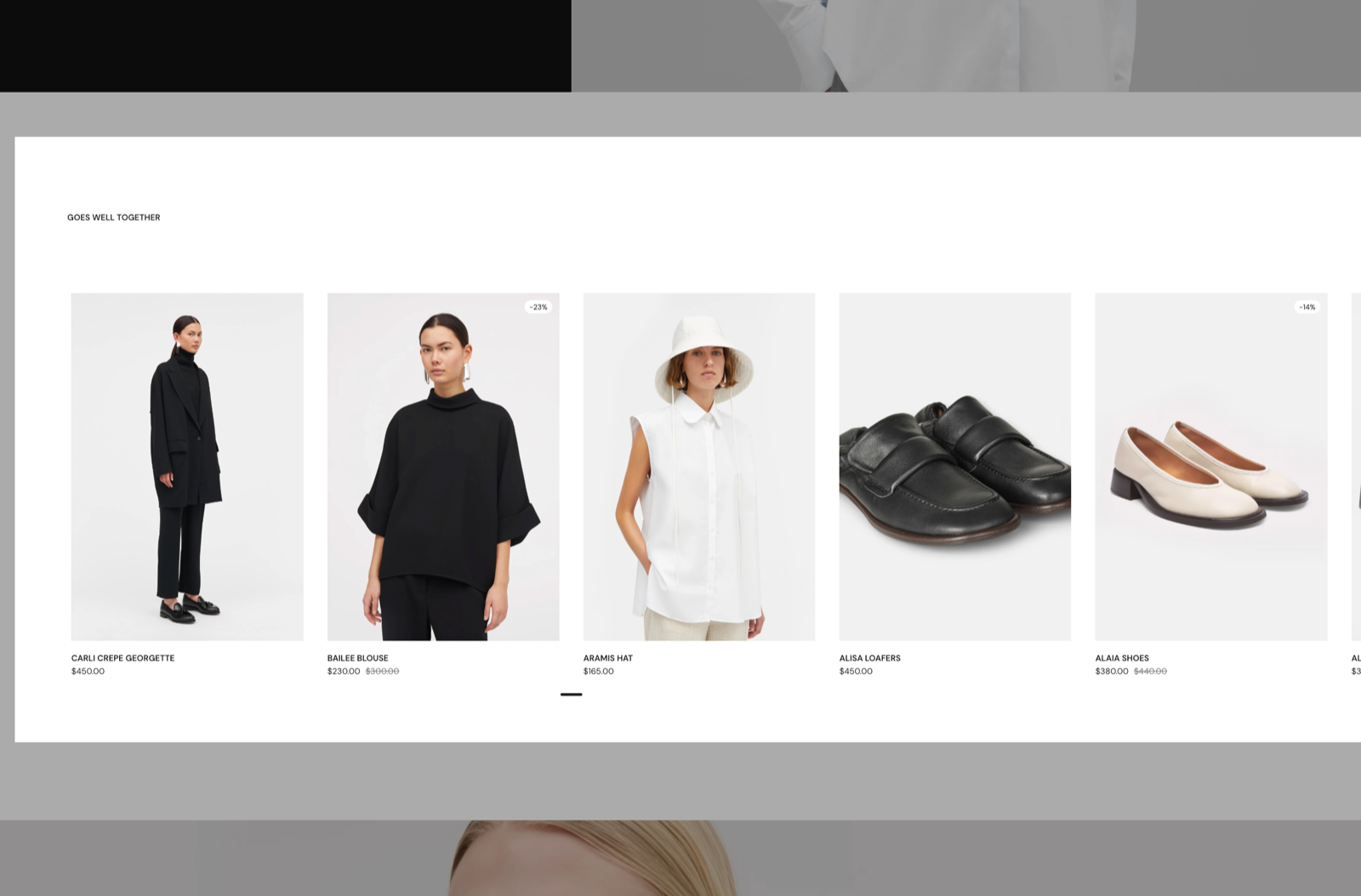
The Product recommendations section shows related products below the product page in Seventh. Shopify chooses the products.
Applies to: Seventh 4.0.0 and later. Added in: Seventh 1.0.0. Last checked: 2026-10-12 against Seventh 4.0.0.
The Product recommendations section shows products related to the product being viewed, for example under a "You may also like" heading. It sits below the Product page section in the product template.
Where to find it: in the theme editor, open the template picker and select Products → Default product, then select Product recommendations.
Which products show
Product recommendations are controlled by Shopify, not by Seventh.
- Shopify picks related products automatically from sales and product data.
- Seventh shows up to Maximum products to display of them.
- To choose the related products yourself, install Shopify's Search & Discovery app and set related products per product. See Product recommendations.
Note: Product recommendations are powered by Shopify's recommendation engine.
You can adjust recommendations by installing Shopify's Search & Discovery app.
Section header and product cards
- The section header holds a Heading block, for the title above the products. See General section styling.
- Position set to Left places the section header next to the products instead of above them.
- Stick to top keeps the header in view while the customer scrolls the products.
- One Product card is repeated for each recommended product. Select it to choose what each card shows. See Product card.
Why is the Product recommendations section not showing?
Because Shopify returned no recommendations for that product. The section hides itself when the list is empty. This happens on new stores and new products, before Shopify has enough data, and on stores with very few products. Add related products manually with the Search & Discovery app, or wait until Shopify generates recommendations.
Recommendations may not appear immediately if Shopify hasn't generated them yet for your store.
Can I limit recommendations to the same collection?
Not in the theme editor. Seventh does not support choosing recommendation rules, such as "same collection only". Use the Search & Discovery app for this, or use a Featured collection section with a fixed collection instead.
All Product recommendations settings
Every setting in this group, with its type and default.
Product recommendations are automatically curated by Shopify. To refine the list, add the Search & Discovery app. Shopify Help Center.
Maximum products to display (slider 1 to 12, default: 4): Sets the maximum number of recommended products, from 1 to 12. Shopify decides which products appear.
Product recommendations section: Layout
Where to find it: Products → Default product → Product recommendations → Layout
Layout (dropdown, default: Grid). Options: Slider, Grid.
Cards size (dropdown, default: Medium): Layout is adjusted automatically for different screen sizes. Options: XSmall, Small, Medium, Large, XLarge. Shown only when Position is Top.
Cards size (dropdown, default: Medium): Layout is adjusted automatically for different screen sizes. Options: Small, Medium, Large, XLarge. Shown only when Position is Left.
Cards size on mobile (dropdown, default: Small): On very small devices, cards will be resized to fit the screen. Options: Small, Large. Shown only when Cards size is not XLarge.
Cards alignment (dropdown, default: Top): If cards have different heights. Options: Top, Center, Bottom, Stretch.
Stretch alignment type (dropdown, default: Space between). Options: Top, Center, Bottom, Space between, Space around. Shown only when Cards alignment is Stretch.
Grid gap (dropdown, default: Default). Options: None, Default, XXSmall, XSmall, Small, Regular, Large, XLarge, XXLarge. Shown only when Scatter cards is off, or Layout is Slider.
Product recommendations section: Cards arrangement
Where to find it: Products → Default product → Product recommendations → Cards arrangement
The Product recommendations section uses the standard Cards arrangement settings, listed in General section styling.
Scatter cards (checkbox, default: off): Turns on the scattered (editorial) layout: each card moves up or down by a different amount, so the cards no longer sit in straight rows. Shown only when Layout is Grid.
Scatter cards on mobile devices (checkbox, default: off): Keeps the scattered layout on mobile, with half the desktop offset. When off, cards line up in regular rows on mobile. Shown only when Layout is Grid and Scatter cards is on.
Horizontal spacing (dropdown, default: Medium): A larger value will make the cards smaller. Options: XSmall, Small, Medium, Large, XLarge. Shown only when Scatter cards is on and Layout is not Slider.
Vertical scattering (dropdown, default: XSmall): Sets how far each scattered card moves up or down. Options: XSmall, Small, Medium, Large, XLarge. Shown only when Scatter cards is on and Layout is not Slider.
Gap between rows (dropdown, default: XSmall): Sets the vertical space between rows of scattered cards. Options: XSmall, Small, Medium, Large, XLarge. Shown only when Scatter cards is on and Layout is not Slider.
Randomize card sizes (checkbox, default: off). Shown only when Layout is Slider.
Randomize card sizes on mobile devices (checkbox, default: on). Shown only when Layout is Slider and Randomize card sizes is on.
Product recommendations section: Section header
Where to find it: Products → Default product → Product recommendations → Section header
Position (dropdown, default: Top): Sets where the section header sits: above the products (Top) or next to them (Left). Options: Top, Left.
Stick to top (checkbox, default: off): Keeps the section header in view while the customer scrolls past the products.
Product recommendations section: Section design
Where to find it: Products → Default product → Product recommendations → Section design
The Product recommendations section uses the standard Section design settings, listed in General section styling.
Color scheme (color scheme, default: Scheme 1).
Top padding (dropdown, default: Default). Options: Default, None, Smaller, Larger, Largest.
Bottom padding (dropdown, default: Default). Options: Default, None, Smaller, Larger, Largest.
Extend section width to the edges of the screen (checkbox, default: off). Shown only when Position is Top.
Show media background (checkbox, default: off): Shows a background image or video behind the section content.
Background image (image). Shown only when Show media background is on.
Background image (mobile) (image): Replaces the background image on screens narrower than 768 px. Shown only when Show media background is on and Background image is set.
Background video (video): Plays a muted, looping video behind the section content. When both a video and an image are set, the video is shown. Shown only when Show media background is on.
Media overlay (dropdown, default: Color): Sets the layer over the background media: a flat color or a gradient. Options: Color, Gradient. Shown only when Show media background is on.
Overlay color (color with transparency). Shown only when Show media background is on and Media overlay is Color.
Overlay gradient (gradient, default: linear-gradient(0deg, rgba(0,0,0,0.5) 0%, rgba(0,0,0,0) 100%)). Shown only when Show media background is on and Media overlay is Gradient.
Parallax effect (dropdown, default: Medium): Moves the background media at a different speed than the page while customers scroll. Subtle, Medium and Strong move it by up to 5, 10 and 20 percent. Options: None, Subtle, Medium, Strong. Shown only when Show media background is on.
Push content down (checkbox, default: off): Replaces Top padding with a larger top space, so more of the background media shows above the content. Shown only when Show media background is on.
Make section full height (checkbox, default: off): Makes the section at least as tall as the screen and centers the content vertically.
Related pages
- Product page: the main section of the product template.
- Complementary products, coupon code, disclosures and variant metafield blocks: complementary products inside the Product information block.
- Product card: the card used for each recommended product.
- General section styling: the Cards arrangement and Section design settings.
Complementary products, coupon code, disclosures and variant metafield blocks
The Complementary products, Coupon code, Disclosures and Variant metafield blocks add cross-sells, codes and details to the Seventh product page.
Collection page
The Collection page in Seventh: the Main header with the collection title and description, and the Collection grid of product cards.