Color swatches & size options theme settings
The Color swatches & size options theme settings control color swatches, product siblings and size options on product cards in Seventh.
Applies to: Seventh 4.0.0 and later. Added in: Seventh 1.0.0. Last checked: 2026-10-12 against Seventh 4.0.0.
The Color swatches & size options theme settings set how color swatches, product siblings and size options look in product cards and mini product blocks. The product page variant picker has its own swatch style settings.
Where to find it: Theme settings → Color swatches & size options
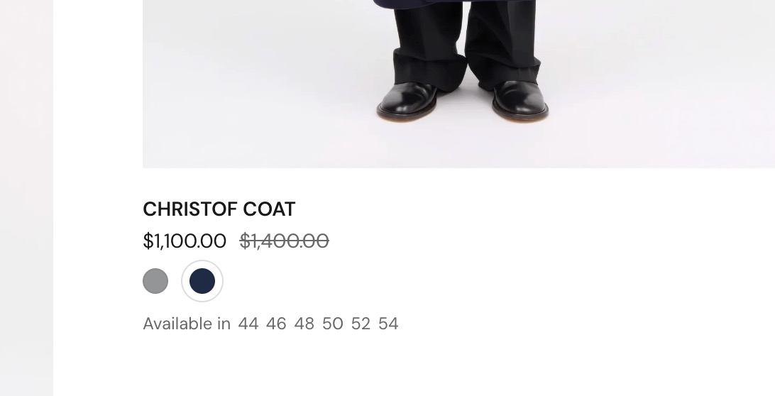
Show color swatches
Show color swatches turns color swatches on for the whole theme. The swatch colors come from Shopify's category metafields: each color value can have a color, a gradient, a pattern or an image that you set in Shopify admin. Shopify controls this data, not Seventh. See Shopify's guide to category metafields.
Disabling the color swatches here will disable them everywhere (both in the product cards and product pages).
These settings style the swatches but do not add them to product cards. Add the Color swatches & size or Product siblings block inside the product card.
Swatch style
The Swatches & product siblings settings shape both color swatches and product sibling swatches in product cards:
- Size sets the swatch size. The sizes differ by a few pixels, except the Thumbnail sizes, which show a large image preview.
- Corner roundness sets the swatch shape.
- Image aspect ratio sets the shape of Thumbnail swatches and of the image in hover tooltips.
- Focal point sets which part of the image stays visible when swatches show images instead of colors.
For example, if you have tall images featuring models but display swatches as little squares, you may want the head of the models always visible, case in which you can select the "top" focal point.
Color swatches in product cards
- Display mode sets what the swatches show: the swatch color from Shopify (Color swatch) or each variant's image (Variant image). A variant without an image shows an empty swatch.
- Show variant image on hover (Color swatch only) shows the variant image in a small tooltip on desktop.
Product siblings
Product siblings are separate products shown as swatches of one another, for example one product per color. Each sibling is its own product with its own page, and the swatches link between them. Shopify calls a similar feature combined listings.
Here you only choose how siblings look in product cards. Display mode offers:
- Product thumbnail: each sibling's featured image. Needs no extra setup.
- Custom color: a color from a metafield on each sibling.
- Custom swatch image: an image from a metafield on each sibling.
With a custom color or image, Show featured image on hover still shows the product image in a tooltip on desktop.
Setting up product siblings
Product siblings need a product list metafield in Shopify admin that lists the siblings of each product, and a Product siblings block in the product card or product page connected to it.
The process of setting up product siblings is a separate topic and is detailed here: Product variants and buy buttons blocks.
Setting up the custom color metafield
For Custom color or Custom swatch image, give each sibling product its color or image in a metafield:
- In Shopify admin → Settings → Metafields and metaobjects → Products, create a metafield of type Color (for Custom color) or File with images (for Custom swatch image).
- Copy its namespace and key, for example
custom.sibling_color, into Custom color / image metafield. - On each sibling product, fill the new metafield.
You can also use metaobjects for setting up custom colors in product siblings:
Create the metaobject definition
Create a metaobject definition that has at least a color field set up.
Add it as a product metafield
Add the color definition from the created metaobject as a product metafield.
Write the full reference
When writing the namespace, write the entire reference: the namespace.key of the metafield and the reference to the color value. For example, if your metaobject is named "color-product-sibling" and the color field is named "color", the complete metafield reference is "custom.color-product-sibling.value.color".
Tip: Using metaobjects is helpful if you want to add more fields to the metaobject, like the color's name for example, to be referenced later in the product page.
Size options
Size options list a product's sizes next to its swatches or siblings in a product card, for example "Available in S, M, L". Show size options turns them on.
- Seventh finds the size option by its name. An option counts as a size when its name, in lower case, is in Size option names.
- The list includes the word for "size" in several languages. If yours is missing, add it, separated by a comma.
- Size option label sets the text before the sizes.
Tip: This feature is intended for showing sizes in the clothing industry. But you can change its purpose by editing the option label and be able to show any product variants that you'd want here, not only sizes.
To show another option, add its name to Size option names and change Size option label to match, for example "Available in these materials".
Visible swatches or siblings sets how many swatches a card shows on mobile and on desktop before the rest turn into a "+" count.
Why don't swatches show in my product cards?
Usually the swatch block is missing from the card. Check three things:
- The product card contains the Color swatches & size or Product siblings block.
- Show color swatches is on.
- The product's color values have swatch data in Shopify admin (or, for siblings, the product list metafield is filled).
All Color swatches & size options settings
Every setting in this group, with its type and default.
Show color swatches (checkbox, default: on): Shows color swatches for products whose color option values have swatch data in Shopify (category metafields). Turning it off removes swatches everywhere, in product cards and on product pages.
This theme offers support for color swatches created with category metafields. Shopify Help Center.
Color swatches & size options theme settings: Swatches & product siblings
Where to find it: Theme settings → Color swatches & size options → Swatches & product siblings
Size (dropdown, default: Square: Regular): Sets the swatch size in product cards: Small 12 px, Regular 18 px, Large 24 px, XLarge 36 px, XXLarge 50 px. The Thumbnail sizes show image swatches as small thumbnails in the Image aspect ratio shape. Options: Square: Small, Square: Regular, Square: Large, Thumbnail: XLarge, Thumbnail: XXLarge.
Corner roundness (dropdown, default: Fully rounded): Sets the corner shape of swatches and product sibling swatches. Options: None, Slighty rounded, Rounded, Fully rounded.
Image aspect ratio (dropdown, default: Tall (5:6)): Sets the shape of swatch images with a Thumbnail size, and of the image shown in hover tooltips. Options: Square (1:1), Tall (5:6), Taller (2:3).
Focal point (dropdown, default: Center): Sets which part of the image stays visible when swatches show images instead of colors. Top keeps the upper part, for example the faces in model photos. Options: Top, Center, Bottom.
Color swatches & size options theme settings: Color swatches
Where to find it: Theme settings → Color swatches & size options → Color swatches
Display mode (dropdown, default: Color swatch): Sets what product card swatches show: the swatch color from Shopify (Color swatch) or the image of each variant (Variant image). Options: Color swatch, Variant image.
Show variant image on hover (checkbox, default: off): Shows the variant image in a small tooltip when the pointer is over a color swatch, on desktop. Variants without an image show no tooltip. Shown only when Display mode is Color swatch.
Color swatches & size options theme settings: Product siblings
Where to find it: Theme settings → Color swatches & size options → Product siblings
Display mode (dropdown, default: Product thumbnail): Sets what product sibling swatches show: each sibling's featured image (Product thumbnail), a color from a metafield (Custom color) or an image from a metafield (Custom swatch image). Options: Product thumbnail, Custom color, Custom swatch image.
Custom color / image metafield (text field): The metafield on each sibling product that holds its color or swatch image, written as namespace.key. For a color stored in a metaobject, write the four-part path namespace.key.value.field.
Show featured image on hover (checkbox, default: off): Shows the sibling's featured image in a small tooltip when the pointer is over a custom color or image swatch, on desktop. Shown only when Display mode is not Product thumbnail.
Hide when product has only one sibling (checkbox, default: on): Hides the product siblings swatches in product cards when the sibling list has one product or fewer.
Color swatches & size options theme settings: Size options
Where to find it: Theme settings → Color swatches & size options → Size options
Show size options (checkbox, default: on): Shows the size options of each product next to its swatches or siblings in product cards.
Size option names (text field, default: "size,format,größe,talla,taille,dimension,mărime,dimensione,tamanho,寸法"): The product option names that count as sizes, in lower case and separated by commas. Seventh shows the values of the first matching option; sold out sizes appear dimmed. Shown only when Show size options is on.
Size option label (text field, default: "Available in"): Sets the text shown before the size options. Shown only when Show size options is on.
Color swatches & size options theme settings: Visible swatches or siblings
Where to find it: Theme settings → Color swatches & size options → Visible swatches or siblings
On mobile (slider 1 to 8, default: 3): Sets how many swatches or siblings a product card shows on mobile before the rest are replaced by "+" and the number of hidden swatches.
On desktop (slider 1 to 12, default: 4): Sets how many swatches or siblings a product card shows on desktop before the rest are replaced by "+" and the number of hidden swatches.
Related pages
- Product card: the Color swatches & size and Product siblings blocks in product cards.
- Product variants and buy buttons blocks: the variant picker and Product siblings block on the product page.
- Mini product block theme settings: swatches in the search drawer and cart recommendations.
- Product card theme settings: the rest of the product card design.
Product badges theme settings
The Product badges theme settings set where Seventh shows sale, sold out and custom badges on product cards, and their colors.
Cart theme settings
The Cart theme settings choose the cart type and set up the free shipping bar, gift wrapping, cart notes, terms checkbox and discount text in Seventh.