Content group block
The Content group block in Seventh groups other blocks in a row or column, with its own spacing and alignment, inside cards and headers.
Applies to: Seventh 4.0.0 and later. Added in: Seventh 1.0.0. Last checked: 2026-10-12 against Seventh 4.0.0.
The Content group block holds other blocks and lines them up in a row or a column, with its own gap and alignment. Use it to put a heading and a button side by side, or to keep a set of blocks together inside a card.
Where to find it: select Add block inside a card, section header, slide or column in the theme editor, then choose Content group.
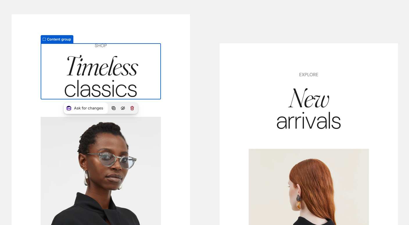
Content group versions
At its core, a Content group is a flex box container. Seventh has five versions of the Content group. They have the same settings and differ only in the blocks you can put inside them:
- Content group in cards, section headers, slides, columns, modals and page headers: Heading, Text, Caption, Button, Icon, Star rating, Divider, Empty space, Custom HTML / Liquid, app blocks and other Content groups.
- Content group in the product page Product information and the Featured product card: the same blocks plus the product blocks (title, price, vendor, rating, variants, siblings, badges, SKU, tax info and disclosures).
- Content group in the Product card: the same blocks plus the compact product blocks (title, price, vendor, rating, Color swatches & size, siblings, badges, SKU and tax info).
- Content group in the Collection card: the same blocks plus Collection title, Collection count and Collection description.
- Content group in the Article card: the same blocks plus Article title, Article excerpt, Article meta and Article tags.
Placing two blocks side by side
Add the Content group
Select Add block inside the card and choose Content group. Set Direction to Horizontal.
Add the blocks inside it
Select Add block inside the Content group and add the two blocks, for example a Heading and a Button.
Align them
Set Horizontal alignment to Space between to push the blocks to the two ends, and Vertical alignment to Center.
With Wrap content on (the default), a block moves to the next line when the row has no room. Turn it off to keep all blocks on one line.
A horizontal Content group ignores the Text alignment of the card around it. Set its position with its own Horizontal alignment.
Common use cases
- Aligning text and buttons.
- Building compact card layouts.
Tips for success
- Use groups to keep the spacing consistent.
- Keep groups small and focused.
All Content group settings
Every setting on this page, one list per section or block, with its type and default.
Where to find it: Blog posts → Default blog post → Article header → Content group. It is also available in: Blog header, Main header, Search header, Flex card, Card, Column, Content group, Age verification, Exit intent popup, Modal card, Newsletter card, Promo card, Rich text card, Scrolling card, Section header, Slide.
Accepts these blocks: Content group, Button, Icon, Empty space, Divider, Caption, Star rating, Text, Heading, app blocks and Custom HTML / Liquid.
Direction (dropdown, default: Horizontal): Sets the direction of the blocks inside the group: Horizontal places them in a row, Vertical in a column. Options: Horizontal, Vertical.
Vertical alignment (dropdown, default: Center): Sets how blocks of different heights line up in a horizontal group. Options: Top, Center, Bottom. Shown only when Direction is Horizontal.
Horizontal alignment (dropdown, default: Left): Sets the position of the blocks in a horizontal group. Space between pushes them to the two ends. The group ignores the alignment of the card around it. Options: Left, Center, Right, Space between, Space around. Shown only when Direction is Horizontal.
Gap (dropdown, default: Regular): Sets the space between the blocks inside the group. Options: XXSmall, XSmall, Small, Regular, Large, XLarge.
Wrap content (checkbox, default: on): Moves blocks to the next line when the row has no room. Turn it off to keep all blocks on one line. Shown only when Direction is Horizontal.
Where to find it: Products → Default product → Product page → Product information → Content group. It is also available in: Featured product card, Content group.
Accepts these blocks: Product title, Product price, Product vendor, Product rating, Product variants, Product siblings, Product badges, Product SKU / barcode, Product tax info, Disclosures, Content group, Button, Icon, Empty space, Divider, Caption, Star rating, Text, Heading, app blocks and Custom HTML / Liquid.
Direction (dropdown, default: Horizontal): Sets the direction of the blocks inside the group: Horizontal places them in a row, Vertical in a column. Options: Horizontal, Vertical.
Vertical alignment (dropdown, default: Center): Sets how blocks of different heights line up in a horizontal group. Options: Top, Center, Bottom. Shown only when Direction is Horizontal.
Horizontal alignment (dropdown, default: Left): Sets the position of the blocks in a horizontal group. Space between pushes them to the two ends. The group ignores the alignment of the card around it. Options: Left, Center, Right, Space between, Space around. Shown only when Direction is Horizontal.
Gap (dropdown, default: Regular): Sets the space between the blocks inside the group. Options: XXSmall, XSmall, Small, Regular, Large, XLarge.
Wrap content (checkbox, default: on): Moves blocks to the next line when the row has no room. Turn it off to keep all blocks on one line. Shown only when Direction is Horizontal.
Where to find it: Custom grid → Product card → Content group. It is also available in: Content group.
Accepts these blocks: Product title, Product price, Product vendor, Product rating, Color swatches & size, Product siblings, Product badges, Product SKU / barcode, Product tax info, Content group, Button, Icon, Empty space, Divider, Caption, Star rating, Text, Heading, app blocks and Custom HTML / Liquid.
Direction (dropdown, default: Horizontal): Sets the direction of the blocks inside the group: Horizontal places them in a row, Vertical in a column. Options: Horizontal, Vertical.
Vertical alignment (dropdown, default: Center): Sets how blocks of different heights line up in a horizontal group. Options: Top, Center, Bottom. Shown only when Direction is Horizontal.
Horizontal alignment (dropdown, default: Left): Sets the position of the blocks in a horizontal group. Space between pushes them to the two ends. The group ignores the alignment of the card around it. Options: Left, Center, Right, Space between, Space around. Shown only when Direction is Horizontal.
Gap (dropdown, default: Regular): Sets the space between the blocks inside the group. Options: XXSmall, XSmall, Small, Regular, Large, XLarge.
Wrap content (checkbox, default: on): Moves blocks to the next line when the row has no room. Turn it off to keep all blocks on one line. Shown only when Direction is Horizontal.
Where to find it: Custom grid → Collection card → Content group. It is also available in: Content group.
Accepts these blocks: Collection title, Collection count, Collection description, Content group, Button, Icon, Empty space, Divider, Caption, Star rating, Text, Heading, app blocks and Custom HTML / Liquid.
Direction (dropdown, default: Horizontal): Sets the direction of the blocks inside the group: Horizontal places them in a row, Vertical in a column. Options: Horizontal, Vertical.
Vertical alignment (dropdown, default: Center): Sets how blocks of different heights line up in a horizontal group. Options: Top, Center, Bottom. Shown only when Direction is Horizontal.
Horizontal alignment (dropdown, default: Left): Sets the position of the blocks in a horizontal group. Space between pushes them to the two ends. The group ignores the alignment of the card around it. Options: Left, Center, Right, Space between, Space around. Shown only when Direction is Horizontal.
Gap (dropdown, default: Regular): Sets the space between the blocks inside the group. Options: XXSmall, XSmall, Small, Regular, Large, XLarge.
Wrap content (checkbox, default: on): Moves blocks to the next line when the row has no room. Turn it off to keep all blocks on one line. Shown only when Direction is Horizontal.
Where to find it: Custom grid → Article card → Content group. It is also available in: Content group.
Accepts these blocks: Article title, Article excerpt, Article meta, Article tags, Content group, Button, Icon, Empty space, Divider, Caption, Star rating, Text, Heading, app blocks and Custom HTML / Liquid.
Direction (dropdown, default: Horizontal): Sets the direction of the blocks inside the group: Horizontal places them in a row, Vertical in a column. Options: Horizontal, Vertical.
Vertical alignment (dropdown, default: Center): Sets how blocks of different heights line up in a horizontal group. Options: Top, Center, Bottom. Shown only when Direction is Horizontal.
Horizontal alignment (dropdown, default: Left): Sets the position of the blocks in a horizontal group. Space between pushes them to the two ends. The group ignores the alignment of the card around it. Options: Left, Center, Right, Space between, Space around. Shown only when Direction is Horizontal.
Gap (dropdown, default: Regular): Sets the space between the blocks inside the group. Options: XXSmall, XSmall, Small, Regular, Large, XLarge.
Wrap content (checkbox, default: on): Moves blocks to the next line when the row has no room. Turn it off to keep all blocks on one line. Shown only when Direction is Horizontal.
Related pages
- Blank card: the Card block, which accepts Content groups.
- Product card: the card that uses the product card Content group.
- Collection card: the card that uses the collection Content group.
- Article card: the card that uses the article Content group.
- Product information blocks: the product blocks you can group on the product page.