Caption block
The Caption block in Seventh adds a short line of small text, with an optional icon, above or below headings and other blocks.
Applies to: Seventh 4.0.0 and later. Added in: Seventh 1.0.0. Last checked: 2026-10-12 against Seventh 4.0.0.
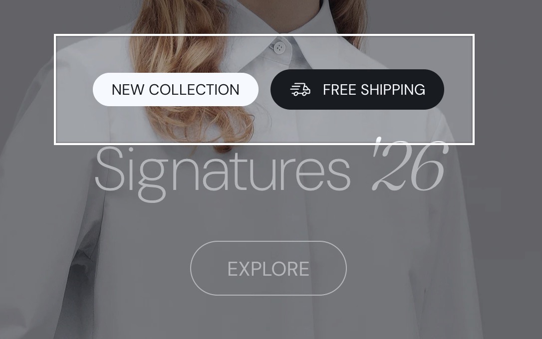
The Caption block shows one short line of small text, for example a label above a heading or a note under an image. It has an optional icon and an optional colored "pill" background.
Where to find it: select Add block inside a section or card in the theme editor, then choose Caption.
Common use cases
- Section labels, above a heading.
- Image or card subtitles.
Tips for success
- Keep the wording short.
- Keep the contrast subtle but readable.
- Too large? Lower Text size or Text weight. Blends into the background? Change the color.
Captions are most effective when paired with a clear heading.
When should I use a Caption instead of a Text block?
Use a Caption for a single short line: a label such as "New collection", a price note or a badge-like tag. Content is a one-line field that supports bold, italic and links, but no paragraphs. For longer text with paragraphs and lists, use the Text block.
How do I show the caption as a pill?
Set Custom background color to any color that is not transparent. The caption then sits in a rounded pill of that color, with padding based on the Text size. Set Custom text color too, so the text stays readable on the pill. Leave both transparent to use the color scheme.
Can the Caption show product data?
Yes. Connect Content to a product field or metafield as a dynamic source. Turn on Hide block if dynamic content is not present to hide the caption when the field is empty and no icon is set.
All Caption settings
Every setting in this group, with its type and default.
Content (formatted text, default: "Caption label"): Sets the caption text, on one line. Supports bold, italic and links.
Caption block: Typography
Where to find it: Caption → Typography
Text size (dropdown, default: XSmall). Options: XXSmall, XSmall, Small, Medium, Large.
Case (dropdown, default: Default). Options: Default, Uppercase.
Text weight (dropdown, default: Normal). Options: Normal, Bold.
Reduced text opacity (checkbox, default: off): Shows the text at 62 percent opacity (69 percent on dark color schemes), for secondary text such as captions or notes.
Custom text color (color, default: transparent): Sets a text color that replaces the color scheme text color. Leave it transparent to use the color scheme.
Custom background color (color with transparency, default: transparent): Wraps the caption in a rounded pill of this color. Leave it transparent for no background.
Caption block: Icon
Where to find it: Caption → Icon
Select an icon (dropdown): Shows an icon from the theme icon set before the text. Options: None, Business: Earth globe, Business: Flag, Business: Helpline, Business: Like hand, Business: Map marker, Business: Security shield, Business: Star, Commerce: Appointment, Commerce: Archive box, Commerce: Box, Commerce: Checkout cart, Commerce: Currency, Commerce: Delivery, Commerce: Delivery time, Commerce: Giftbox, Commerce: Label, Commerce: Open 24 hours, Commerce: Open box, Commerce: Paper bag, Commerce: Shipping truck, Commerce: Store, Commerce: Time, Commerce: Time limit, Commerce: Wallet.
Custom icon (image): Shows your own image before the text, in place of the selected icon. Use a 72 x 72 px transparent PNG.
Caption block: Dynamic content
Where to find it: Caption → Dynamic content
Hide block if dynamic content is not present (checkbox, default: off): Hides the caption when its Content is empty and no icon is set, for example when Content is connected to an empty metafield.
Related pages
- Text block: longer text with paragraphs.
- Heading block: the title that a caption usually sits above.
- Icon block: an icon on its own, without text.