Attribute meter block
The Attribute meter block in Seventh shows a product attribute, like fit or intensity, as a scale filled from a product metafield.
Applies to: Seventh 4.0.0 and later. Added in: Seventh 1.0.0. Last checked: 2026-10-12 against Seventh 4.0.0.
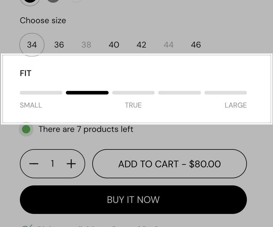
The Attribute meter block shows a bar of segments with one active segment, to rate a product attribute such as fit, warmth or intensity. Optional labels under the bar name the two ends and the middle of the scale.
Where to find it: select Add block inside a section or card in the theme editor, then choose Attribute meter. On the product page, add it inside Product information.
Building a scale
- Set Heading to the attribute, for example "Fit".
- Set Segments to the length of the scale and Active segment to the value.
- Type Start label, Middle label and End label, for example "Runs small", "True to size" and "Runs large". They sit under the first, the middle and the last segment.
To show a progress bar instead of separate segments, turn on Fill segments up to active segment and Remove space between segments.
Showing a different value for each product
Store the value in a product metafield and type its reference in Active segment metafield.
Create the metafield
Open Shopify admin → Settings → Metafields and metaobjects → Products and add a definition of type "Integer", for example custom.fit_value.
Fill in the values
On each product, enter a whole number between 1 and the number of Segments.
Enter the reference
In the theme editor, select the Attribute meter block on the product page and type custom.fit_value in Active segment metafield.
Tip: Make sure that the dynamic value isn't higher than the total number of segments.
Products with an empty metafield show the Active segment value. The metafield is read from the product of the product page, so this works only on the product page. In the Product comparison section, use the comparison table's own Attribute meter, described on Product comparison section.
Common use cases
- Material or quality indicators.
- Feature strength or level.
- Size fit, from true to size to loose fit.
Tips for success
- Use the same scale across meters.
- Limit the meters to a few key attributes.
- If a label wraps onto two lines, shorten it.
Why does the Attribute meter show no active segment?
Because the value is higher than Segments. A metafield value of 8 on a 5-segment meter has no segment to highlight. Keep every value between 1 and the number of segments.
All Attribute meter settings
Every setting in this group, with its type and default.
Heading (text field): Sets the text above the meter, for example the attribute name.
Attribute meter block: Content
Where to find it: Attribute meter → Content
Segments (slider 1 to 10, default: 9): Sets the number of segments in the bar.
Active segment (slider 1 to 10, default: 6): Sets which segment is active. Used when Active segment metafield is empty or has no value for the product.
Dynamic segments label.
Active segment metafield (text field): Takes a product metafield reference as namespace.key, for example custom.active_segment_value. The metafield value sets the active segment. Works on the product page only.
Active segment color (color, default: #000000): Sets the color of the active segment. The other segments use the text color at reduced opacity.
Fill segments up to active segment (checkbox, default: off): Highlights every segment up to the active one, not only the active one.
Remove space between segments (checkbox, default: off): Joins the segments into one continuous bar.
Segments height (slider 3 to 10, default: 6): Sets the height of the bar, from 3 to 10 px.
Show active segments value (checkbox, default: off): Shows the active value and the total, for example 6/9.
Start label (text field): Sets the label under the first segment.
Middle label (text field): Sets the label under the middle of the bar.
End label (text field): Sets the label under the last segment.
Attribute meter block: Typography
Where to find it: Attribute meter → Typography
Text size (dropdown, default: Medium). Options: XXSmall, XSmall, Small, Medium, Large, XLarge.
Text weight (dropdown, default: Bold). Options: Normal, Bold.
Case (dropdown, default: Default). Options: Default, Uppercase.
Reduced text opacity (checkbox, default: off): Shows the text at 62 percent opacity (69 percent on dark color schemes), for secondary text such as captions or notes.
Related pages
- Product page: the Product information area where the meter is most often used.
- Product comparison section: the comparison table version of the Attribute meter.