Accordion block
The Accordion block in Seventh shows a heading that opens to reveal text or other blocks, for FAQs and product details.
Applies to: Seventh 4.0.0 and later. Added in: Seventh 1.0.0. Last checked: 2026-10-12 against Seventh 4.0.0.
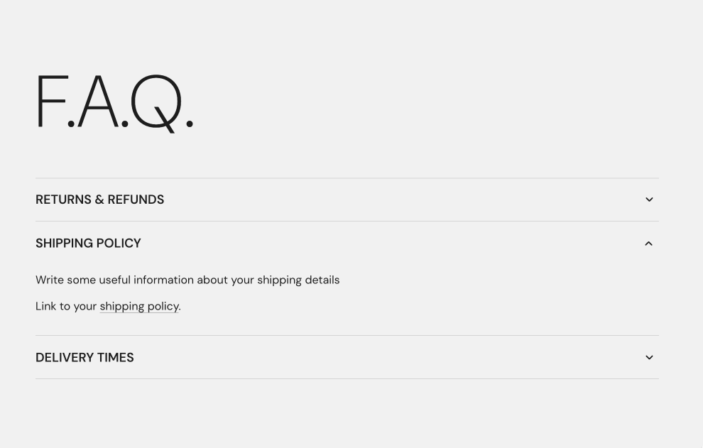
The Accordion block shows a title that customers select to open or close a panel of content below it. Use it for questions and answers, product details or size information.
Where to find it: select Add block inside a section or card in the theme editor, then choose Accordion.
Adding content to the panel
The panel is made of blocks. A new Accordion contains one Text block.
- Type the heading in the Accordion's Title.
- To add more content, select the Accordion, then Add block inside it. Any theme block works (for example Text, Image, Button or Table), and so do app blocks.
- Each Accordion opens and closes on its own. For a list of questions, add one Accordion per question.
The FAQ section is a Multicolumn preset that builds this list for you.
Common use cases
- FAQ items.
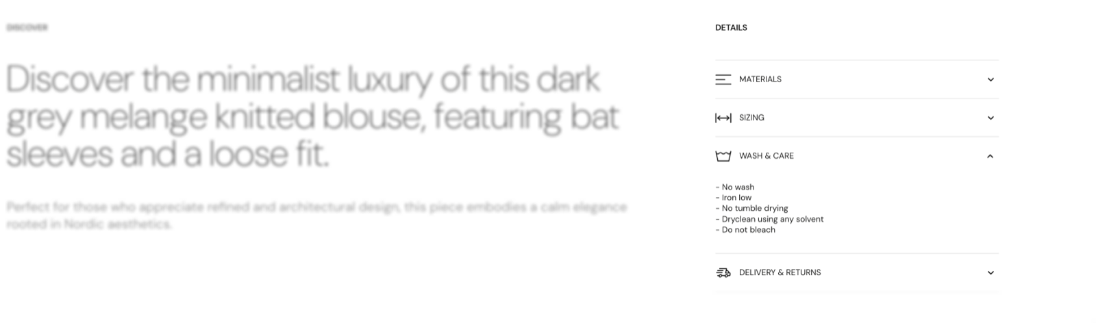
- Product details or sizing information.
Tips for success
- Keep titles short, so they are easy to scan.
- Group related accordions together.
Tip: Accordions work best when each item contains a single topic.
Can an Accordion show product information?
Yes. On the product page, connect the Text block inside the Accordion to a product field or a metafield, for example the product description. Turn on Hide block if dynamic content is not present to hide the whole Accordion on products where that field is empty.
How do I add an icon to the Accordion title?
Pick one in Select an icon, or upload your own image in Custom icon (72 x 72 px transparent PNG). The icon shows before the title, and a custom image replaces the selected icon.
All Accordion settings
Every setting in this group, with its type and default.
Accepts these blocks: any theme block and app blocks.
Title (text field, default: "Accordion title"): Sets the text that customers select to open the panel.
Accordion block: Typography
Where to find it: Accordion → Typography
Font (dropdown, default: Headings). Options: Body, Headings, Accent.
Text size (dropdown, default: Heading 3). Options: Heading 1, Heading 2, Heading 3, Heading 4, Heading 5, Heading 6. Shown only when Font is not Body.
Text size (dropdown, default: Medium). Options: XXSmall, XSmall, Small, Medium, Large, XLarge, XXLarge. Shown only when Font is Body.
Line height (dropdown, default: Default). Options: Default, Smallest, Smaller, Larger, Largest.
Apply accent font to (dropdown, default: None): Sets which part of the title uses the accent font: the first word, the first letter or the last word. Options: None, First word, First letter, Last word. Shown only when Font is Headings.
Text weight (dropdown, default: Normal). Options: Normal, Bold.
Case (dropdown, default: Default). Options: Default, Uppercase.
Reduced text opacity (checkbox, default: off): Shows the text at 62 percent opacity (69 percent on dark color schemes), for secondary text such as captions or notes.
Custom text color (color, default: transparent): Sets a title color that replaces the color scheme text color. Leave it transparent to use the color scheme.
Accordion block: Icon
Where to find it: Accordion → Icon
Select an icon (dropdown): Shows an icon from the theme icon set before the title. Options: None, Business: Earth globe, Business: Flag, Business: Helpline, Business: Like hand, Business: Map marker, Business: Security shield, Business: Star, Commerce: Appointment, Commerce: Archive box, Commerce: Box, Commerce: Checkout cart, Commerce: Currency, Commerce: Delivery, Commerce: Delivery time, Commerce: Giftbox, Commerce: Label, Commerce: Open 24 hours, Commerce: Open box, Commerce: Paper bag, Commerce: Shipping truck, Commerce: Store, Commerce: Time, Commerce: Time limit, Commerce: Wallet.
Custom icon (image): Shows your own image before the title, in place of the selected icon. Use a 72 x 72 px transparent PNG.
Accordion block: Functionality
Where to find it: Accordion → Functionality
Opened by default (checkbox, default: off): Shows the panel open when the page loads.
Accordion block: Dynamic content
Where to find it: Accordion → Dynamic content
Hide block if dynamic content is not present (checkbox, default: off): Hides the whole Accordion when the blocks inside it have no content, for example a Text block connected to an empty metafield.
Related pages
- FAQ section: a Multicolumn preset built from Accordion blocks.
- Text block: the default content of an Accordion.
- Product page: uses Accordions for product details.