Contact form block
The Contact form block in Seventh adds a form with name, email, custom fields, checkboxes, dropdowns and a submit button.
Applies to: Seventh 4.0.0 and later. Added in: Seventh 1.0.0. Last checked: 2026-10-12 against Seventh 4.0.0.
The Contact form block adds a form that customers fill in to send you a message. Use it on contact pages and in support sections. You build the form from field blocks: Name & email, Field, Dropdown, Checkbox and Submit.
Where to find it: select Add block inside a section or card in the theme editor, then choose Contact form. The Contact form section and the contact page template already contain one.
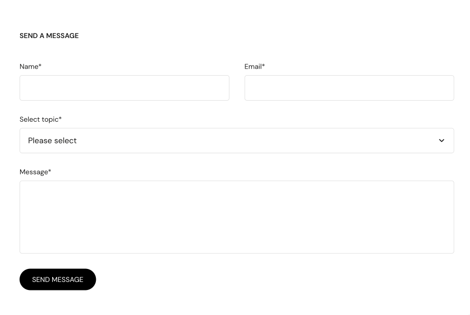
Contact form blocks
A new Contact form starts with these blocks, in this order:
- Name & email: the name and email fields, both required. For a signed-in customer they are filled in already. This block has no settings.
- Field: a multi-line "Message" field, required.
- Dropdown: "Select topic" with three options, optional.
- Checkbox: "I agree to the terms and conditions", optional.
- Submit: the "Send message" button.
You can reorder, remove and add Field, Dropdown and Checkbox blocks. Keep one Name & email block and one Submit block in every form.
Where the messages go
Note: Messages are sent to the store’s configured contact email.
- Shopify sends the messages, not Seventh.
- Change the address in Shopify admin → Settings → Notifications → Sender email.
- The message lists every field by its Label.
Why do two of my form fields arrive as one?
Because the fields have the same Label. Seventh names each field after its label, so two fields called "Phone" overwrite each other. Give every Field, Dropdown and Checkbox block a unique label.
Why are my placeholders not showing?
Because Show placeholders is off in the Contact form block. Placeholders of Field blocks show only when Show placeholders is on.
Why are contact form messages not arriving?
Because of the store email setup, not the theme. Check these in order:
- The sender email in Shopify admin is correct and verified.
- The messages are not in your spam folder.
- The form shows a success message after you send a test. If it shows an error, a required field was empty.
All Contact form settings
Every setting on this page, one list per section or block, with its type and default.
Accepts these blocks: Text, Name & email, Field, Checkbox, Dropdown and Submit.
Show placeholders (checkbox, default: off): Shows placeholder text inside the fields, and uses the Placeholder setting of Field blocks.
Contact form block: Typography
Where to find it: Contact form → Typography
Labels size (dropdown, default: Small): Sets the text size of all field labels in the form. Options: Small, Medium.
Labels case (dropdown, default: Default): Sets all field labels to the default case or to uppercase. Options: Default, Uppercase.
Where to find it: Custom HTML / Liquid → Contact form → Name & email.
The Name & email block has no settings of its own in Seventh 4.0.0.
Where to find it: Custom HTML / Liquid → Contact form → Field.
Label (text field, default: "Message"): Sets the field name shown to customers and in the message you receive. Give every field a unique label, or fields with the same label overwrite each other.
Placeholder (text field): Sets the hint text inside the field. Shown only when Show placeholders is on in the Contact form block.
Type (dropdown, default: Single line): Sets the field size. Single line suits a phone number or an order number; Multi line suits a message. Options: Single line, Multi line.
Required (checkbox): Stops the form from sending while this field is empty.
Where to find it: Custom HTML / Liquid → Contact form → Checkbox.
Label (text field, default: "I agree to the terms and conditions"): Sets the text next to the checkbox. Give every field a unique label, or fields with the same label overwrite each other.
Required (checkbox): Stops the form from sending until the checkbox is ticked.
Where to find it: Custom HTML / Liquid → Contact form → Dropdown.
Label (text field, default: "Choose an option"): Sets the dropdown name shown to customers and in the message you receive. Give every field a unique label.
Options (text field, default: "Option 1, Option 2, Option 3"): Sets the choices of the dropdown, separated by commas.
Required (checkbox): Stops the form from sending until a choice is selected.
Where to find it: Custom HTML / Liquid → Contact form → Submit.
Label (text field, default: "Send message"): Sets the text on the submit button.
Submit block: Button style
Where to find it: Custom HTML / Liquid → Contact form → Submit → Button style
Style (dropdown, default: Solid). Options: Outline, Solid.
Size (dropdown, default: Small). Options: XSmall, Small, Medium, Large, XLarge.
Fit container (checkbox, default: off): Makes the button take the full width of the form.
Use custom colors (checkbox, default: off): Uses the Primary and Secondary colors below instead of the button colors of the color scheme.
Primary (color, default: #000000): Sets the background of a Solid button, or the border and label of an Outline button. Shown only when Use custom colors is on.
Secondary (color, default: #ffffff): Sets the label color of a Solid button. Shown only when Use custom colors is on.
Submit block: Icon
Where to find it: Custom HTML / Liquid → Contact form → Submit → Icon
Select an icon (dropdown): To see all icons, visit the Krown icon library. Options: None, Business: Earth globe, Business: Flag, Business: Helpline, Business: Like hand, Business: Map marker, Business: Security shield, Business: Star, Commerce: Appointment, Commerce: Archive box, Commerce: Box, Commerce: Checkout cart, Commerce: Currency, Commerce: Delivery, Commerce: Delivery time, Commerce: Giftbox, Commerce: Label, Commerce: Open 24 hours, Commerce: Open box, Commerce: Paper bag, Commerce: Shipping truck, Commerce: Store, Commerce: Time, Commerce: Time limit, Commerce: Wallet.
Custom icon (image): Shows your own image as the button icon, in place of the selected icon. Use a 72 x 72 px transparent PNG.
Related pages
- Contact form section: a section with a Contact form ready to use.
- Button block: the same style settings as the Submit block.
- Buttons & forms theme settings: the style of all form fields.