Product content blocks
The product content blocks of Local add text, collapsible tabs, images, buttons, popups, text banners, custom code, dividers and space to the product page.
Applies to: Local 4.2.1 and later. Added in: Local 1.0.0. Last checked: 2026-10-13 against Local 4.2.1.
The product content blocks add your own content next to the product: notes, tabs, images, buttons, popups, banners, custom code and spacing. Their content is the same for every product on the template, unless you connect a setting to a metafield.
Where to find it: in the theme editor, open Products → Default product, select Product page, then Add block.
The same blocks exist in the Featured product section and the Quick view popup.
Text
The Text block adds a short rich text paragraph.
- Text size sets Small, Regular or Large text.
- Text color sets its color (grey by default).
- Text transform (uppercase) writes the text in capital letters.
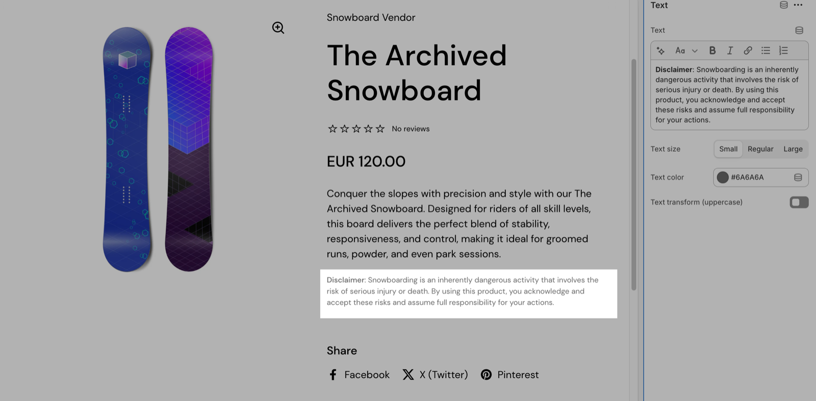
Use the Text block for short notices next to the buy buttons, such as a disclaimer, a delivery note or a policy line. For longer content, use a Collapsible tab.
Collapsible tab
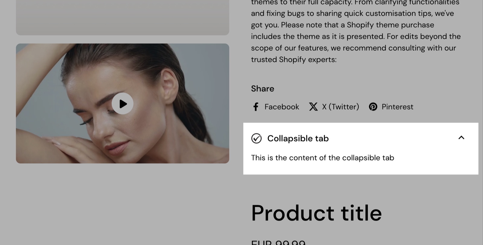
The Collapsible tab block shows content in a tab that customers open and close, for care instructions, ingredients, shipping details or an FAQ.
- Title is the tab's label (default "Collapsible tab"). Subtitle, Tooltip text and Icon are optional.
- Tab content is the text of the tab.
- Tab content from page adds the content of one of your Shopify pages.
- Tab image adds an image.
- Collapsible is on by default. Turn it off to show the content always open, as a box with a heading.
- Layout, Custom text color, Custom background color and Darken the header set the look.
The tab shows all three contents together, in this order: the Tab content, the page content, then the image. The page does not replace the text.
Showing a collapsible tab only when the product has content
To give each product its own tab content, connect the tab to a product metafield and hide the tab on products where the metafield is empty.
Create the metafield
In Shopify admin, open Settings → Metafields and metaobjects → Products and select Add definition. Name it, for example "Care instructions", and choose the type Rich text.
Fill it on your products
Open each product that needs the tab and write the content in the new metafield, under Metafields at the bottom of the product page. Leave it empty on the others.
Add the Collapsible tab block
In the theme editor, open Products → Default product → Product page, select Add block and choose Collapsible tab. Type the tab's Title, for example "Care instructions".
Connect Tab content to the metafield
Select the Connect dynamic source icon next to Tab content and choose the metafield. Clear Tab content from page and Tab image, or connect them to metafields too.
Hide the tab when it is empty
Under Dynamic content, turn on Hide block if dynamic content is not present, then select Save. Products with an empty metafield now show no tab.
Hide block if dynamic content is not present hides the tab only when Tab content, Tab content from page and Tab image are all empty. A typed text or a picked page keeps the tab visible on every product.
Image
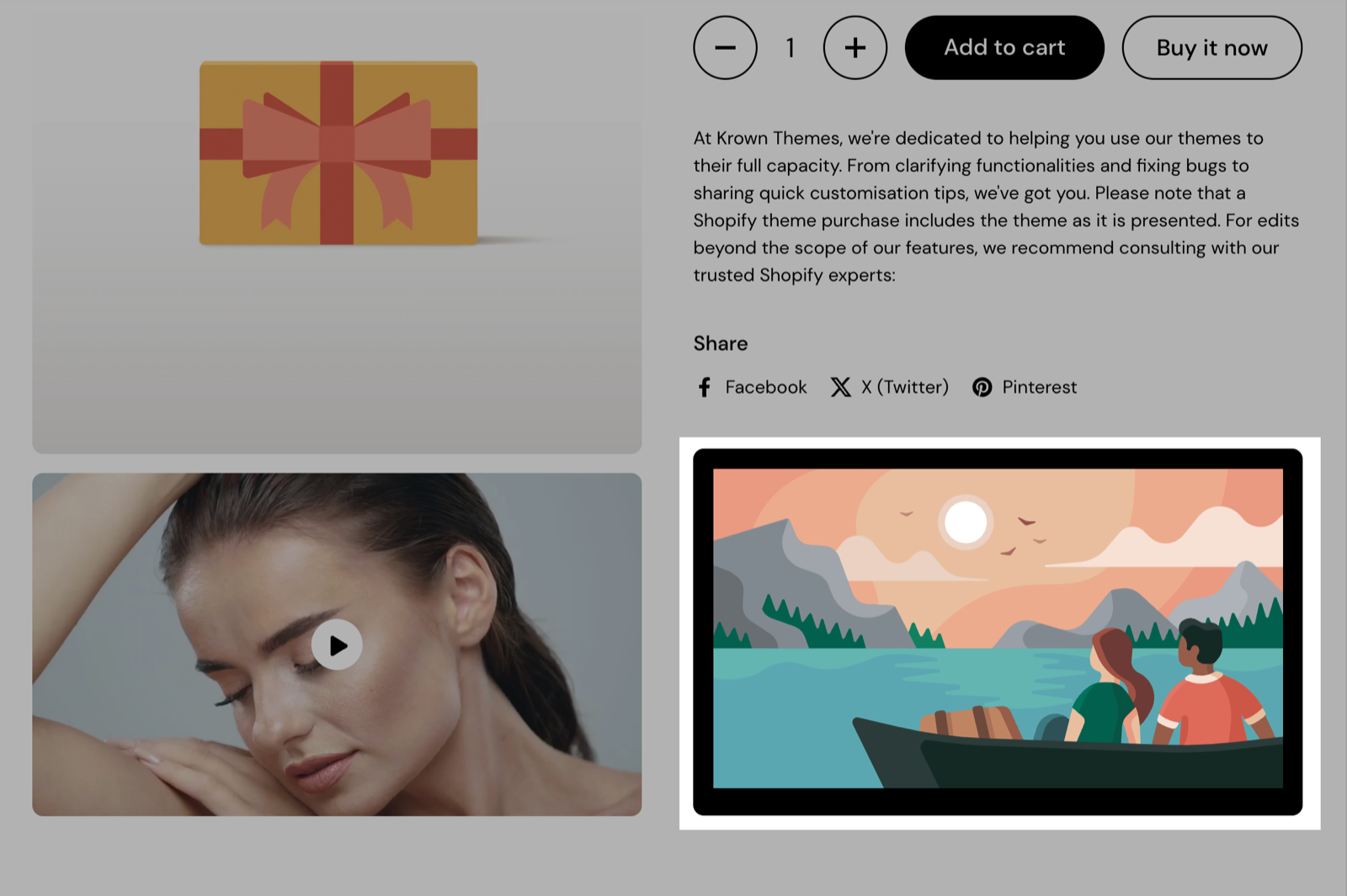
The Image block adds an image next to the product, for example a size chart or a certificate.
- Image is the image on desktop. Mobile image (optional) replaces it on mobile.
- Border radius rounds the image corners, 0 to 30 px.
- Link makes the image clickable. Open link in a new window opens it in a new tab.
- The Block Heading and Block Style settings add a heading above the image and can make it collapsible.
Without an image, the block shows a placeholder illustration.
Button
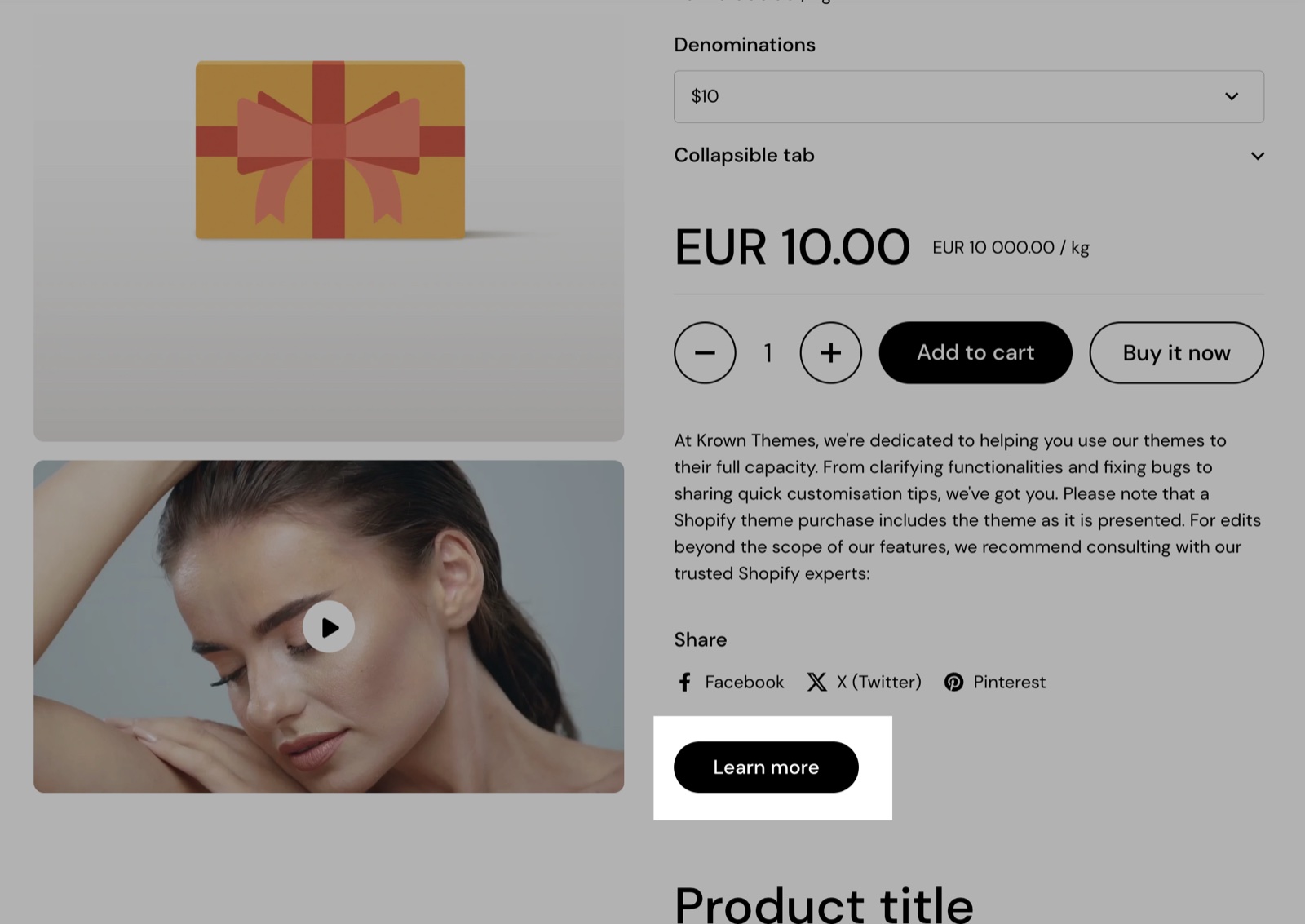
The Button block adds a button that links to any page.
- Button label is the text (default "Learn more"). The button is hidden when the label is empty.
- Button style sets Solid or Outline.
- Button link and Open link in a new window set where it goes.
Popup
The Popup block adds a button that opens a popup over the product page, for a size guide, a delivery note or terms.
- Button label (default "Open popup") and Button style set the button.
- Heading is the popup's title.
- Text is the popup content. Select a Page to show that page's content instead: the page replaces the text.
- Hide block if dynamic content is not present hides the button when both Text and Page are empty, useful when they are connected to metafields.
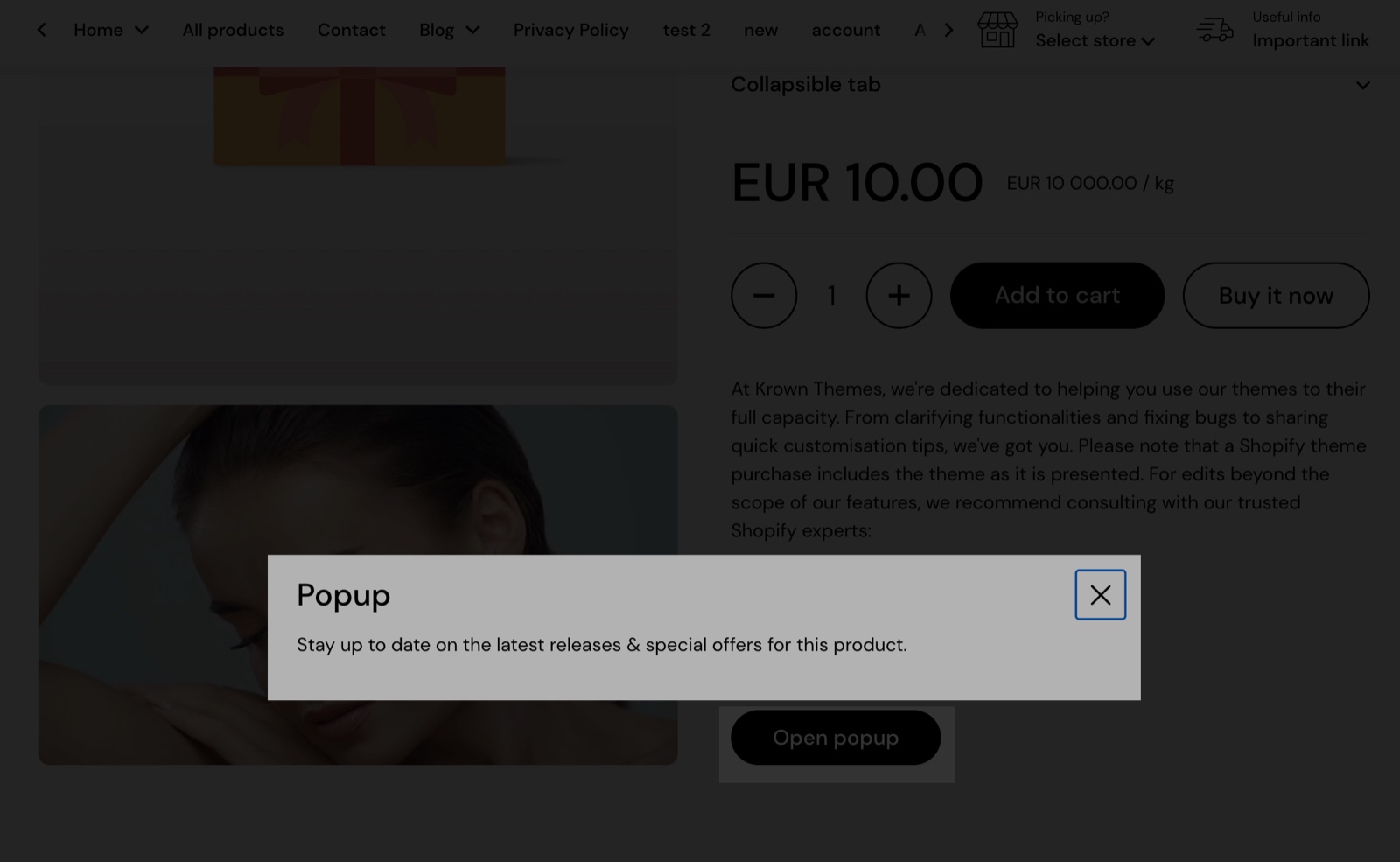
Setting up a size guide popup
Write the size guide as a page
In Shopify admin, open Online Store → Pages and select Add page. Add the size table or text and save the page.
Add the Popup block
In the theme editor, open Products → Default product → Product page, select Add block and choose Popup. Set Button label to "Size guide" and Heading to the popup title.
Pick the page
Select the page under Page, then select Save. The button now opens the page's content in a popup.
To show the button only on some products, create a separate product template for them; see Product page.
Text banner
The Text banner block shows a highlighted box with a title and a short text, for delivery times, a promotion or an important product note.
- Title, Tooltip text and Icon set the heading.
- Text content is the message.
- Banner link makes the whole banner clickable. Open link in a new window opens it in a new tab.
- Custom text color and Custom background color set its colors.
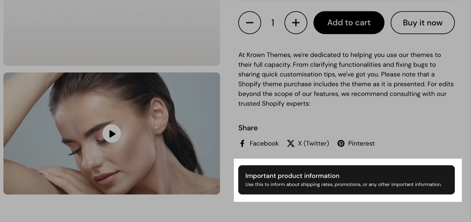
Custom HTML / Liquid
The Custom HTML / Liquid block runs your own HTML, CSS, JavaScript or Liquid code on the product page. Liquid can read the product, for example {{ product.title }} or {{ product.price | money }}.
- Custom Liquid holds the code.
- The Block Heading and Block Style settings add a heading and can make it collapsible.
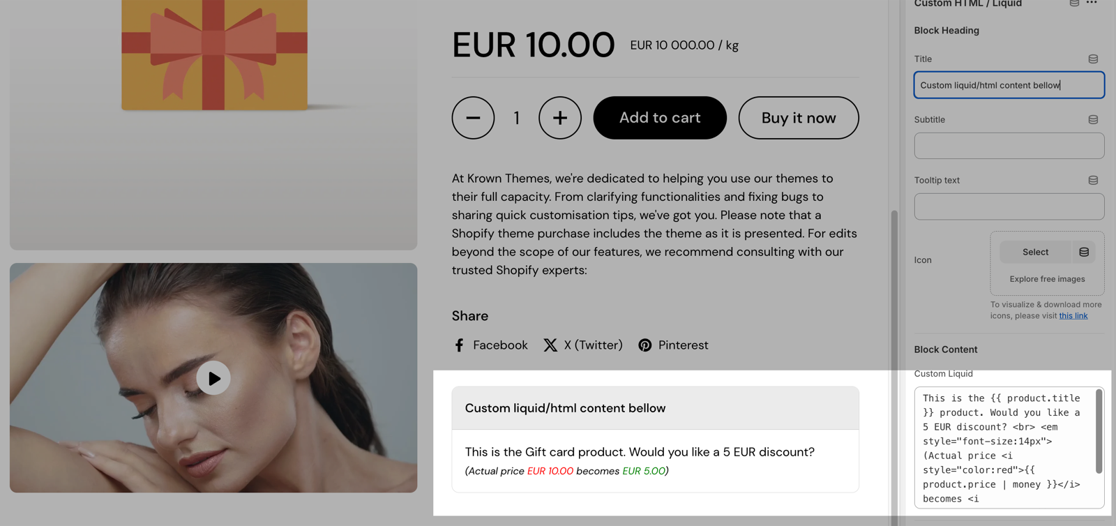
Krown support does not write or fix custom code. See Custom work and code changes.
Divider
The Divider block draws a horizontal line between blocks.
- Height sets the line thickness, 1 to 10 px.
- Color and Style (Solid, Dotted, Dashed or Double) set its look.
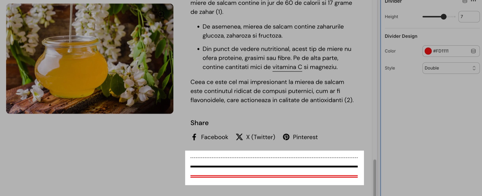
Setting the color to match the page color results in empty space with a variable height.
Empty space
The Empty space block adds a small fixed gap between two blocks. It has no settings. The default product template uses it between the price, the buy buttons and the description; add several in a row for a bigger gap, or use a Divider with the page color for a gap of your own height.
Can a collapsible tab show a page?
Yes. Select a page under Tab content from page and the tab shows that page's content. Anything typed in Tab content still shows above it, so clear that field if you want only the page. One page can feed the same tab on many products, and you update it in one place.
Why does my collapsible tab not open and close?
Because the tab has no Title or Subtitle, or Collapsible is off. The heading is what customers click, so a block without a heading always shows its content. Type a Title under Block Heading and turn on Collapsible under Block Style.
All Product content blocks settings
These blocks are part of the Product page section. Every setting of every block, with its type and default, is listed in All Product page settings.
Related pages
- Product page: the gallery, the shared Block Heading and Block Style settings, and the full list of block settings.
- Product information blocks: title, price, description and the other product facts.
- Product attribute blocks: nutrition tables, meters and icon lists.
- Use dynamic sources for unique product pages: connect block settings to metafields.
Product information blocks
The product information blocks of Local show the title, vendor, price, tax notice, SKU, badges, description, rating and share buttons on the product page.
Product variant and buy blocks
The variant and buy blocks of Local: the variant picker, product siblings, buy buttons with pre-order and gift card options, and custom properties.