Product comparison page
The Product comparison page of Local builds a comparison table from up to four products a customer selects in the collection grid.
Applies to: Local 4.2.1 and later. Added in: Local 4.1.0. Last checked: 2026-10-13 against Local 4.2.1.
The Product comparison page lets customers build their own comparison. While browsing a collection, they select up to 4 products and open a page that shows them side by side, one column per product and one row per block. For a fixed table with products you pick yourself, use the Product comparison section.
Where to find it: Online Store → Themes → Customize → Collections → Default collection → Product grid → Filtering and sorting → Enable comparing (the switch), and Products → compare → Product comparison (the page)
Local 4.2.1 does not include the compare product template in its theme files, and the theme editor cannot create it: its section cannot be added with Add section. Without it, the Compare button opens the first selected product's normal page. If the template picker has no Products → compare template, contact Krown support.
How customers compare products
With Enable comparing on, the collection page gets a comparison mode:
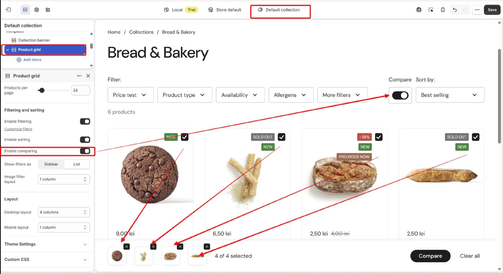
- A Compare switch sits next to the filters. When a customer turns it on, every product card gets a compare checkbox.
- A compare bar appears at the bottom of the screen with the selected products, "X of 4 selected", a Compare button and Clear all.
- After 4 products, the other checkboxes are disabled and the bar says "You can compare up to 4 products".
- Compare works from 2 products. It opens the comparison page with the selected products.
The selection is saved in the customer's browser, so it stays while they move between collection pages. The address of the comparison page lists the selected products, so it can be shared.
On the comparison page:
- Each column has a close (×) button that removes that product.
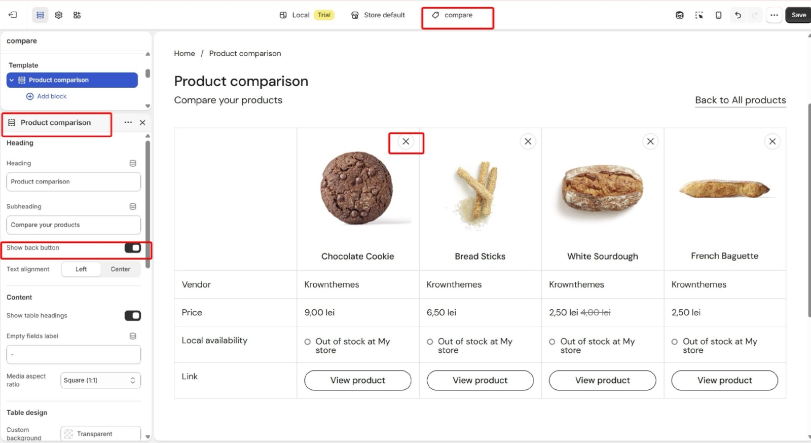
- With one product left, the second column says "Select another item to compare".
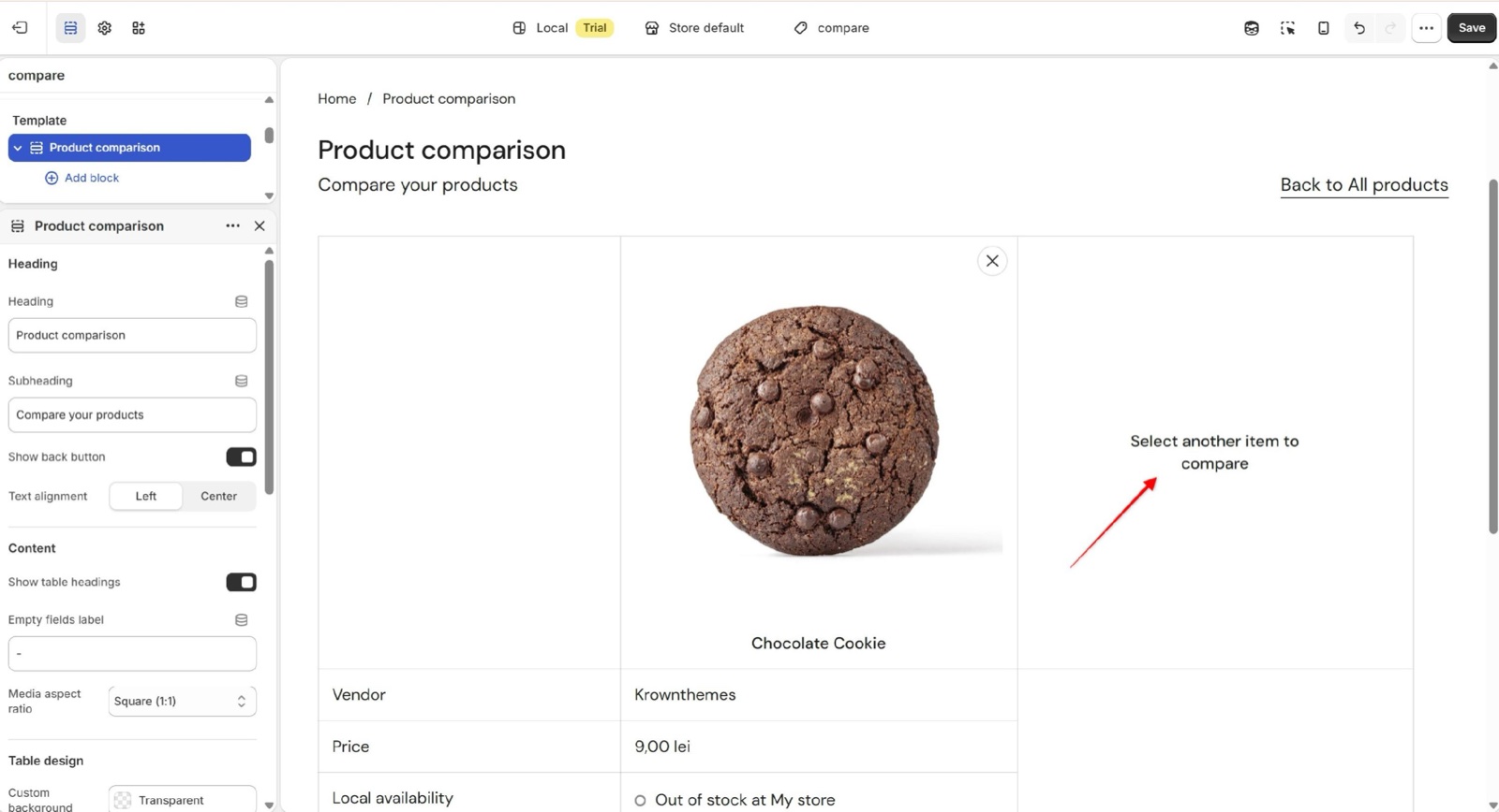
- With no products left, the page shows "No products selected" and a link back to the catalog.
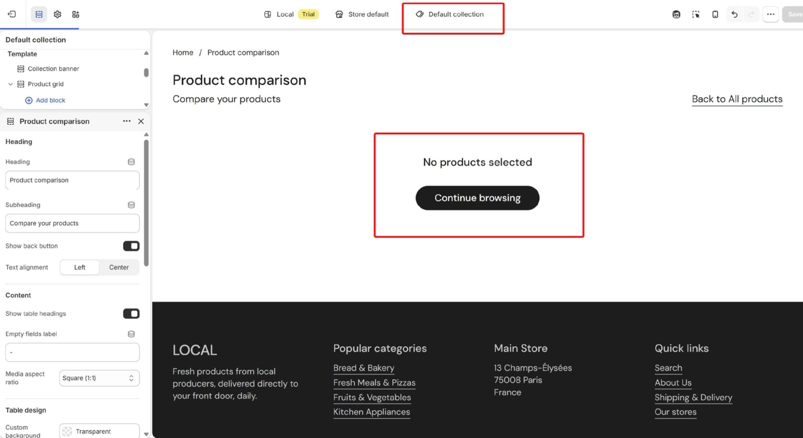
Heading
- Heading and Subheading introduce the page (defaults "Product comparison" and "Compare your products").
- Show back button (on by default) adds a "Back to All products" link. It returns to the page the customer came from in your store, or to the all products collection when they arrived from elsewhere.
Content
- Show table headings (on by default) shows the left column with the row labels.
- Empty fields label is the text of an empty cell (default "-").
- Media aspect ratio sets the shape of the product images: Natural or cropped to Short (4:3), Square (1:1, default), Tall (5:6) or Taller (2:3).
Table design
Custom background color, Custom text color and Accent (the hover color of buttons and links) color the table. The section background, margins, SEO and visibility are the standard settings, see General section styling.
Table rows
The rows are the same 12 blocks as in the Product comparison section: Description, Price, Quick buy, Vendor, Rating, Local availability, Icons list, Dynamic text, Product link, Nutriscore, Attribute meter and Variants. Each has a Heading for its row label. They are explained in Product comparison section.
Turning on product comparison
Check that the compare template exists
In the theme editor, open the template menu at the top and select Products. Look for a template named compare. If it is not there, see the warning at the top of this page before you continue.
Turn on comparing in the collection grid
Open Collections → Default collection, select the Product grid section and turn on Enable comparing under Filtering and sorting. Save.
Repeat for your other collection templates
If you use more collection templates, open each one and turn on Enable comparing there too. Only the collection page's Product grid has this switch; search results and other product grids do not.
Set up the comparison table
Open Products → compare and pick any product to preview the page. Select the Product comparison section and add the row blocks you want (for example Vendor, Price, Local availability and Product link). Drag them into order and set each Heading.
Test it on the storefront
Open a collection page, turn on the Compare switch, select two or more products and select Compare in the bar at the bottom.
Why is there no compare option on my collection page?
Because Enable comparing is off in that collection template's Product grid. It is off by default and set per template, so a collection that uses another template needs it turned on there too. The switch also stays hidden on a collection with no products.
Why is the Products → compare template missing?
Because the Local 4.2.1 release does not ship it, and the theme editor cannot create it: a template made with Create template copies the default product page, and the comparison section cannot be added to it. Contact Krown support for the template. Until it is in your theme, the Compare button opens the first selected product's normal page.
Does the comparison keep the products when the customer leaves the page?
Yes. The selected products and the state of the Compare switch are saved in the customer's browser, so they are still there on other collection pages and on a later visit with the same browser. Clear all in the compare bar empties the selection.
All Product comparison page settings
Every setting, with its type and default.
Accepts these blocks: Description, Price, Quick buy, Vendor, Rating, Local availability, Icons list, Dynamic text, Product link, Nutriscore, Attribute meter and Variants.
Product comparison section: Heading
Where to find it: Product comparison → Heading
The Product comparison section uses the standard Heading settings, listed in General section styling. Not available in this section: Show section link, Link text, Link and Open link in a new window.
Heading (text field, default: "Product comparison").
Subheading (text field, default: "Compare your products").
Show back button (checkbox, default: on): Adds a Back to All products link. It returns to the previous page of your store, or to the all products collection.
Text alignment (dropdown, default: Left). Options: Left, Center.
These settings differ from the standard ones or exist only here:
Heading (text field, default: "Product comparison").
Subheading (text field, default: "Compare your products").
Show back button (checkbox, default: on): Adds a Back to All products link. It returns to the previous page of your store, or to the all products collection.
Product comparison section: Content
Where to find it: Product comparison → Content
Show table headings (checkbox, default: on): Shows the left column with the row labels (each block's Heading).
Empty fields label (text field, default: "-"): Sets the text of a cell that has no value for that product.
Media aspect ratio (dropdown, default: Cropped: Square (1:1)). Options: Uncropped: Natural, Cropped: Short (4:3), Cropped: Square (1:1), Cropped: Tall (5:6), Cropped: Taller (2:3).
Product comparison section: Table design
Where to find it: Product comparison → Table design
Custom background color (color, default: transparent).
Custom text color (color, default: transparent).
Accent (color, default: transparent): Sets the hover color of the buttons and links in the table.
Product comparison section: Section design
Where to find it: Product comparison → Section design
The Product comparison section uses the standard Section design settings, listed in General section styling.
Background color (color, default: transparent).
Background gradient (gradient).
Heading text color (color, default: transparent): Sets the color of the text outside the cards, mostly the section heading.
Descrease top margin (checkbox, default: off): Sets the space above the section to the grid gap of Theme settings → Layout → Horizontal space, instead of the full space between sections. Shown only when Remove top margin is off.
Remove top margin (checkbox, default: off): Removes the space above the section, so it touches the section before it. Shown only when Descrease top margin is off.
Product comparison section: SEO
Where to find it: Product comparison → SEO
The Product comparison section uses the standard SEO settings, listed in General section styling.
Heading tag (dropdown, default: H2): Sets the HTML tag of the heading for search engines. It does not change how the heading looks. Options: H1, H2, H3, H4, span.
Product comparison section: Visibility
Where to find it: Product comparison → Visibility
The Product comparison section uses the standard Visibility settings, listed in General section styling.
Section visibility (dropdown, default: Show always): Shows the section on every screen, only below 768 px (mobile) or only from 768 px (desktop, tablets included). A hidden section is still in the page. Options: Show always, Show only on mobile, Show only on desktop.
Description block
Where to find it: Product comparison → Add block → Description
One Description block per section.
Heading (text field, default: "Description").
Truncate description (dropdown, default: Truncate: Show a small excerpt): Cuts the description to about 10, 30 or 40 words, or shows it in full. Options: Don't truncate, Truncate: Show a small excerpt, Truncate: Show a medium excerpt, Truncate: Show a large excerpt.
Price block
Where to find it: Product comparison → Add block → Price
One Price block per section.
Heading (text field, default: "Price").
Quick buy block
Where to find it: Product comparison → Add block → Quick buy
One Quick buy block per section.
Heading (text field, default: "Quick buy").
Vendor block
Where to find it: Product comparison → Add block → Vendor
One Vendor block per section.
Heading (text field, default: "Vendor").
Rating block
Where to find it: Product comparison → Add block → Rating
One Rating block per section.
Heading (text field, default: "Rating").
Local availability block
Where to find it: Product comparison → Add block → Local availability
One Local availability block per section.
Heading (text field, default: "Local availability").
This theme shows local availability for products. See Collection page.
Icons list block
Where to find it: Product comparison → Add block → Icons list
One Icons list block per section.
Heading (text field, default: "Icons list").
This theme allows you to add custom product icons through dynamic content. See Dynamic icons list theme settings.
Dynamic text block
Where to find it: Product comparison → Add block → Dynamic text
Heading (text field, default: "Text").
Label metafield (text field): Type the product metafield to show, as namespace.key.
Product link block
Where to find it: Product comparison → Add block → Product link
One Product link block per section.
Heading (text field, default: "Link").
Button label (text field, default: "View product"): Sets the text of the button that opens the product page.
Nutriscore block
Where to find it: Product comparison → Add block → Nutriscore
One Nutriscore block per section.
Heading (text field, default: "Nutriscore").
Nutriscore block: Block Content
Where to find it: Product comparison → Add block → Nutriscore → Block Content
Active item (slider 1 to 5, default: 3).
Use dynamic sources to set the active item or segment with product metafields. See Product attribute blocks.
Active item metafield (text field): Type a number metafield (1 to 5) as namespace.key to set the active letter per product. Products without a value use Active item.
Nutriscore block: Item 1
Where to find it: Product comparison → Add block → Nutriscore → Item 1
Label (text field, default: "A").
Color (color, default: #007517).
Nutriscore block: Item 2
Where to find it: Product comparison → Add block → Nutriscore → Item 2
Label (text field, default: "B").
Color (color, default: #94C11E).
Nutriscore block: Item 3
Where to find it: Product comparison → Add block → Nutriscore → Item 3
Label (text field, default: "C").
Color (color, default: #FFDE00).
Nutriscore block: Item 4
Where to find it: Product comparison → Add block → Nutriscore → Item 4
Label (text field, default: "D").
Color (color, default: #F29200).
Nutriscore block: Item 5
Where to find it: Product comparison → Add block → Nutriscore → Item 5
Label (text field, default: "E").
Color (color, default: #DD1E01).
Attribute meter block
Where to find it: Product comparison → Add block → Attribute meter
One Attribute meter block per section.
Heading (text field, default: "Attributes").
Attribute meter block: Block Content
Where to find it: Product comparison → Add block → Attribute meter → Block Content
Segments (slider 1 to 10, default: 9).
Active segments (slider 1 to 10, default: 6).
Use dynamic sources to set the active item or segment with product metafields. See Product attribute blocks.
Active segment metafield (text field): Type a number metafield as namespace.key to set the active segment per product. Products without a value use Active segments.
Active segment color (color, default: #000000).
Fill segments up to active segment (checkbox, default: off).
Remove space between segments (checkbox, default: off).
Segments height (slider 3 to 10, default: 6).
Show active segments value (checkbox, default: off).
Start label (text field).
Middle label (text field).
End label (text field).
Variants block
Where to find it: Product comparison → Add block → Variants
One Variants block per section.
Heading (text field, default: "Variants").