General section styling
The settings most Borders sections share: section heading, section footer, Section design, Inner content design and SEO heading tags.
Applies to: Borders 3.1.0 and later. Added in: Borders 1.0.0. Last checked: 2026-10-13 against Borders 3.1.0.
Most Borders sections share the same groups of settings: a section heading at the start, and a section footer, Section design, Inner content design and SEO heading tags at the end. This page explains them once; each section page lists only what is special about it.
Where to find it: select any section in the theme editor; these settings are at the start and the end of its list.
Section heading
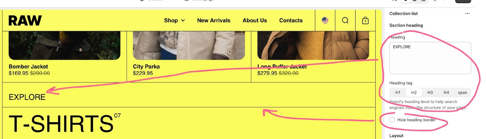
- Heading adds an optional title above the section content. Leave it empty for no heading.
- Heading tag sets the HTML tag of the heading (H1, H2, H3, H4 or span; usually H2). It changes only how search engines read the page structure, not the look.
- Hide heading border removes the line between the heading and the content.
- The heading style (font, size, padding, slider arrows) is the same in every section: set it in Section headings and footers theme settings.
Section footer
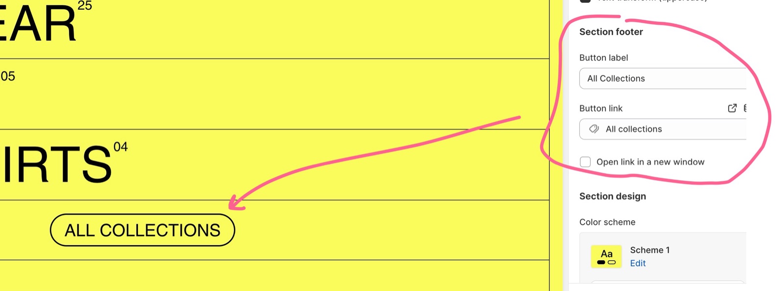
- Button label and Button link add a call to action button below the section, for example "All collections". Without a label there is no button.
- Open link in a new window opens the button link in a new browser tab (in the sections that have it).
- In slider sections, the footer also holds the previous and next arrows when they are not in the heading row.
- The button style and hover are set in Section headings and footers theme settings.
Section design
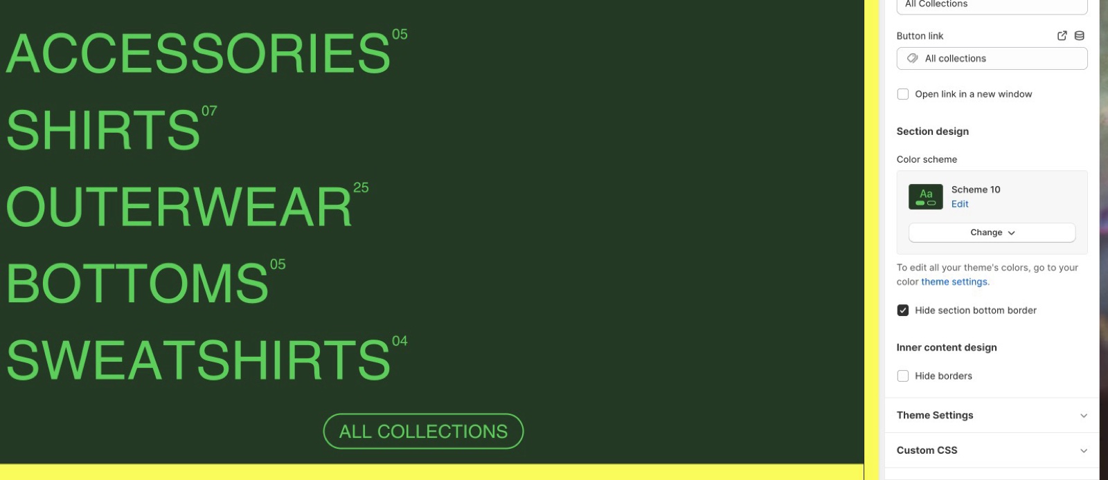
- Color scheme sets the colors of the whole section. See Colors theme settings.
- Hide section bottom border removes the line under the section. Use it when the section has a contrasting background, so the color change already separates it from the next section.
- Remove inner padding (Apps, Custom HTML / Liquid, Scrolling text) lets the content touch the section edges.
Inner content design
Inner content design styles the cards, blocks or media inside the section. The options depend on the section:
- Hide borders removes the lines between the section's grid items (primary borders).
- Remove border radius gives the inner cards or media square corners.
- Remove inner padding & border radius removes both the grid padding and the rounding, so a boxed section becomes full width.
- Color scheme (inner): Rich text has one color scheme for its whole content card; Rich blocks, Vertical slider and other sections with blocks have a Color scheme per block instead.
- Hide section if dynamic content is not present (Image, Rich text, Rich blocks) hides the section, or the empty blocks, when the content connected to a dynamic source is empty on that page. Use it on product or collection templates with metafields: products without the metafield then show nothing instead of an empty box.
SEO
Heading tag settings appear in many places: on the section heading, on block titles (for example slide or block titles) and on Text blocks. Some sections have several, one per text element. They let you build a clean structure of headings from H1 to H4. Use them in order, and use H1 only once per page.
Planning heading tags for a page
This is an example structure, not SEO advice. For Shopify's own SEO tools, see SEO.
Use one H1 on the home page
On the home page, set the first slide title of the first section to H1, for example with Title heading tag in the Vertical slider. It works as the introduction of the page.
Use H2 for section headings
Set Heading tag of every section heading to H2.
Use H3 for titles inside sections
Set block titles, slide titles after the first one and card titles to H3.
Keep H4 for minor content
Use H4 for small headings, for example in the footer. Use span for text that should look like a heading but is not one.
Start other pages at H2
On every other page, the page title is already the H1. Use only H2 to H4 in the sections you add there.
Which sections have a heading or footer?
A section heading exists in: Apps, Blog posts, Buttons, Cart recommendations, Collection description, Collection list, Collection navigation, Content toggles, Custom HTML / Liquid, Featured collection, Featured product, Flex columns, Flex grid, Image, Image comparison, Image with hotspots, Product recommendations, Recently viewed products, Rich blocks, Rich text, Rotating images, Scrolling images, Shop the look, Shoppable videos, Table, Testimonials, Text columns with icons, Text columns with images and Video.
A section footer with a button exists in: Blog posts, Collection list, Collection navigation, Content toggles, Image with hotspots, Rich blocks, Shop the look and Testimonials.
Why is there a line between my sections?
That is the secondary border, drawn under every section. Turn on Hide section bottom border in the section's Section design, or set the secondary Border width to 0 in Borders theme settings to remove the lines under all sections.
Related pages
- Section headings and footers theme settings: the shared style.
- Borders theme settings: border styles.
- Colors theme settings: the color schemes.
- Borders sections: every section you can add.