Vertical slider section
The Vertical slider section of Borders stacks full-height slides that zoom and move as customers scroll, with media, title and button.
Applies to: Borders 3.1.0 and later. Added in: Borders 1.0.0. Last checked: 2026-10-13 against Borders 3.1.0.
The Vertical slider section stacks full-width slides on top of each other. As the customer scrolls, each slide stays in place while the next one slides up over it, with a zoom and parallax effect on the media. Each slide has an image or video, a title, a subtitle and a button. The Borders home page starts with one.
Where to find it: select Add section in the theme editor, then choose Vertical slider.
Layout
- Desktop aspect ratio sets the slide shape on screens 768 px and wider: Ultra-Wide (21:9), Wide (2:1), Landscape (16:9), Standard (3:2) or Square (1:1).
- Mobile aspect ratio sets the slide shape below 768 px: Landscape (16:9), Standard (3:2), Square (1:1), Tall (5:6) or Taller (2:3).
- The slides are never taller than the screen. With a sticky header, they are also shortened by the header height, so the whole slide stays visible.
- Images are cropped to the aspect ratio. There is no single recommended size: upload images with a ratio close or equal to the one you set. See Recommended image sizes.
- Media shape rounds the slides with a shape: Top, Right, Bottom or Left rounded, or Fully rounded.
- Add borders to media draws a primary border around each slide. It works only when Media shape is None.
Because mobile layouts tends to be different than desktops, it is very useful to upload separate images for mobile devices, with a different aspect ratio. This will help in improving your store's performance, if you make sure that you don't add images that are too large for small contexts.
Typography
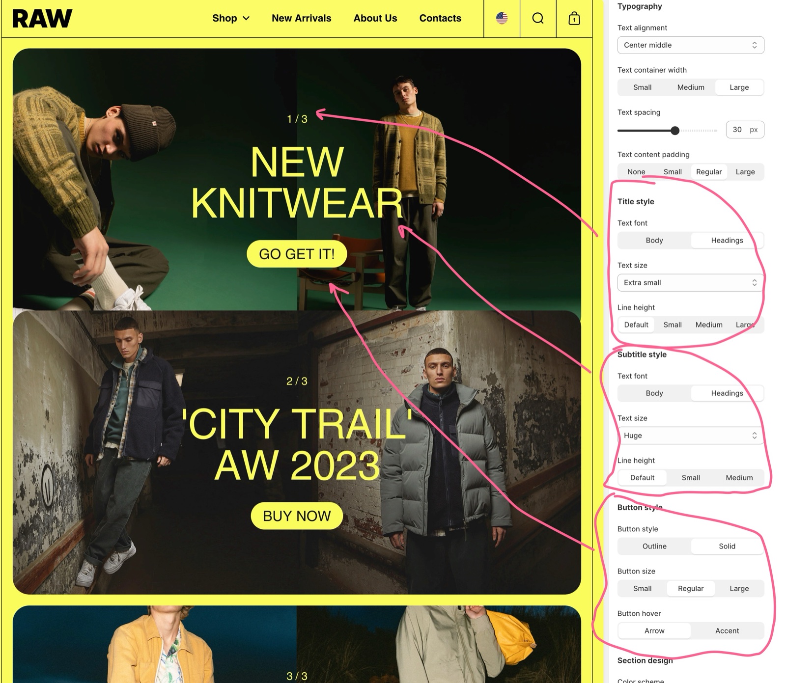
The typography settings apply to every slide:
- Text alignment places the text in one of nine positions over the slide, from Left top to Right bottom.
- Text container width limits the text to Small (50 percent), Medium (70 percent) or Large (the full width) of the slide.
- Text spacing sets the space between title, subtitle and button, -12 to 60 px.
- Text content padding sets the space between the text and the slide edges. On phones the padding is always 20 px.
- Title style and Subtitle style each set Text font, Text size, Mobile text size and Line height.
- Button style sets Button style (Outline or Solid), Button size and Button hover: Arrow fills the button with the accent color and shows an arrow on hover, Accent slides the accent color in behind the label.
Animations
- Disable zoom effect keeps the parallax movement but stops the zoom of the media and of the slide underneath.
- Disable all effects turns off both: the slides still stack as the customer scrolls, without movement inside them.
- The scrolling effects also follow the global switches in Animations theme settings.
Slides
Each Slide block is one slide. The section holds up to 12 slides.
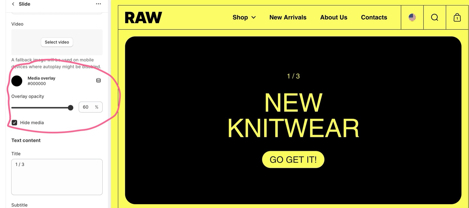
- Image is the slide image. Mobile image (optional) replaces it below 768 px, for example with a portrait crop for phones. Smaller mobile images also load faster.
- Video plays a Shopify-hosted video instead of the image, muted and in a loop. The Image is then the poster and the fallback on mobile devices where autoplay is off.
- Media overlay and Overlay opacity (0 to 60 percent) darken or tint the media so the text stays readable.
- Hide media turns the slide into a text-only slide. The Media overlay color then fills the slide at full strength, so set the overlay color you want as background.
- Title and Subtitle are the slide texts.
- Color scheme sets the colors of the text and button in the slide only, not the background.
- Text blending mode blends the text with the media behind it: Color dodge, Difference, Exclusion, Normal or Plus lighter. Difference, for example, makes the text change color over light and dark parts of the image.
- Button label and Link add a button. With a Link but no Button label, the title itself becomes the link.
- Open link in a new window opens the link in a new tab.
- Title heading tag and Subtitle heading tag set the SEO tags. On the home page, set the first slide's title to H1. See General section styling.
Setting up the vertical slider
Add the section
In the theme editor, select Add section and choose Vertical slider.
Choose the aspect ratios
Set Desktop aspect ratio and Mobile aspect ratio.
Prepare the images
Crop your images to those ratios. Make a separate portrait image for phones if the mobile ratio differs from the desktop one.
Add the slides
Select Add block → Slide for each slide. Set Image, Mobile image (optional) or Video.
Write the texts
Fill in Title, Subtitle, Button label and Link.
Set the slide colors
Choose the slide's Color scheme for the text, and a Media overlay if the text needs contrast. Try Text blending mode for creative effects.
Make text-only slides (optional)
Turn on Hide media on a slide and set Media overlay to the background color you want.
Tune the motion
If the movement is too strong, turn on Disable zoom effect or Disable all effects under Animations.
Why are my slide images cropped?
The slides always have the aspect ratio set in the section, so images with another shape are cropped around their focal point (the center, unless you set one in Shopify). Upload images in the same ratio as Desktop aspect ratio, and a Mobile image (optional) in the Mobile aspect ratio. Slides are also capped at the screen height, which can crop wide ratios on short screens.
Does the vertical slider change slides by itself?
No. The slides move only when the customer scrolls: each new slide slides over the previous one. There is no autoplay or timer, and no arrows.
Why does my video show an image on my phone?
Some phones turn off video autoplay, for example in low power mode. Borders then shows the slide's Image instead. Always set an Image on video slides.
All Vertical slider settings
Every setting on this page, with its type and default.
Accepts these blocks: Slide (up to 12 blocks in the section).
Desktop aspect ratio (dropdown, default: Landscape (16:9)): Sets the shape of every slide on screens 768 px and wider. Slides are never taller than the screen. Options: Ultra-Wide (21:9), Wide (2:1), Landscape (16:9), Standard (3:2), Square (1:1).
Mobile aspect ratio (dropdown, default: Square (1:1)): Sets the shape of every slide on screens narrower than 768 px. Options: Landscape (16:9), Standard (3:2), Square (1:1), Tall (5:6), Taller (2:3).
The slides' maximum height is constrained to the screen's height.
Media shape (dropdown, default: None): Gives the slides a rounded shape on one side or all sides. Options: None, Top rounded, Right rounded, Bottom rounded, Left rounded, Fully rounded.
Add borders to media (checkbox, default: off): Borders will be added only when media shapes are not used.
Vertical slider section: Typography
Where to find it: Vertical slider → Typography
Text alignment (dropdown, default: Left top): Places the slide text in one of nine positions over the media. Options: Left top, Center top, Right top, Left middle, Center middle, Right middle, Left bottom, Center bottom, Right bottom.
Text container width (dropdown, default: Large): Limits the text block to 50 percent (Small), 70 percent (Medium) or the full width (Large) of the slide. Options: Small, Medium, Large.
Text spacing (slider -12 to 60 px, default: 12 px): Sets the space between the title, subtitle and button.
Text content padding (dropdown, default: Small): Sets the space between the slide text and the slide edges. On phones it is always 20 px. Options: None, Small, Regular, Large.
Vertical slider section: Title style
Where to find it: Vertical slider → Title style
Text font (dropdown, default: Headings). Options: Body, Headings.
Text size (dropdown, default: Large). Options: Extra small, Small, Regular, Large, Extra large, Huge.
Mobile text size (dropdown, default: Default): Scales the slide titles on screens narrower than 768 px: Small 75 percent, Medium 90 percent, Large 120 percent. Options: Default, Small, Medium, Large.
Line height (dropdown, default: Default). Options: Default, Small, Medium, Large.
Vertical slider section: Subtitle style
Where to find it: Vertical slider → Subtitle style
Text font (dropdown, default: Body). Options: Body, Headings.
Text size (dropdown, default: Extra small). Options: Extra small, Small, Regular, Large, Extra large, Huge.
Mobile text size (dropdown, default: Default): Scales the slide subtitles on screens narrower than 768 px: Small 75 percent, Medium 90 percent, Large 120 percent. Options: Default, Small, Medium, Large.
Line height (dropdown, default: Default). Options: Default, Small, Medium, Large.
Vertical slider section: Button style
Where to find it: Vertical slider → Button style
Button style (dropdown, default: Outline). Options: Outline, Solid.
Button size (dropdown, default: Regular). Options: Small, Regular, Large.
Button hover (dropdown, default: Arrow): Sets the hover effect of slide buttons: Arrow fills the button with the accent color and shows an arrow, Accent slides the accent color in behind the label. Options: Arrow, Accent.
Vertical slider section: Section design
Where to find it: Vertical slider → Section design
Color scheme (color scheme, default: scheme_1).
Hide section bottom border (checkbox, default: off).
Vertical slider section: Inner content design
Where to find it: Vertical slider → Inner content design
Remove border radius (checkbox, default: off).
Remove inner padding & border radius (checkbox, default: off): Removes the padding around the slides and their corner radius, so slides fill the full width and height. Ignored when a media shape is used.
Vertical slider section: Animations
Where to find it: Vertical slider → Animations
Disable zoom effect (checkbox, default: off): Stops the zoom of the media and of the slide underneath while scrolling; the parallax movement stays.
Disable all effects (checkbox, default: off): Turns off the zoom and parallax movement. The slides still stack as the customer scrolls.
Slide block
Where to find it: Vertical slider → Add block → Slide
Image (image).
Mobile image (optional) (image): Replaces the slide image on screens narrower than 768 px.
Video (video): Plays a Shopify-hosted video instead of the image, muted and in a loop. The slide Image is the poster and the fallback where autoplay is off.
Media overlay (color, default: transparent): Lays a color over the slide media. With Hide media on, this color fills the slide as its background.
Overlay opacity (slider 0 to 60 %, default: 30 %).
Hide media (checkbox, default: off): Hides the image and video, so the slide shows only text on the Media overlay color.
Slide block: Text content
Where to find it: Vertical slider → Add block → Slide → Text content
Title (text box, default: "Write your best promotion yet").
Subtitle (text box, default: "Introducing").
Color scheme (color scheme, default: scheme_1): Sets the colors of the slide's text and button; the background comes from the media or the overlay.
Text blending mode (dropdown, default: Normal): Blends the slide text with the media behind it, using a CSS blend mode. Options: Color dodge, Difference, Exclusion, Normal, Plus lighter.
Button label (text field).
Link (link): The slide link. Without a Button label, the title becomes the link.
Open link in a new window (checkbox, default: off).
Slide block: SEO
Where to find it: Vertical slider → Add block → Slide → SEO
Specify heading level to help search engines index the structure of your page.
Title heading tag (dropdown, default: H2): Sets the HTML tag of the slide title for search engines. Use H1 on the first slide of the home page. Options: H1, H2, H3, H4, span.
Subtitle heading tag (dropdown, default: span). Options: H1, H2, H3, H4, span.
Related pages
- Recommended image sizes: image sizes per aspect ratio.
- Animations theme settings: the store-wide scrolling effects.
- General section styling: Section design, Inner content design and heading tags.
- Rich blocks section: promotion blocks in a grid or slider.