Animations theme settings
The Animations theme settings of Borders set image loading visuals, image and text link hover effects, card hover and the scrolling effects.
Applies to: Borders 3.1.0 and later. Added in: Borders 1.0.0. Last checked: 2026-10-13 against Borders 3.1.0.
The Animations theme settings set the motion of the whole store: how images appear while they load, what linked images, text links and cards do on hover, and the effects while the customer scrolls.
Where to find it: Theme settings → Animations
Image animations
- Image loading visuals sets what customers see while an image loads: Pixelate (a tiny pixelated preview of the image), Solid color (a plain block) or None.
- Image mouse over animations sets the hover effect of linked images that are not product cards: None, Zoom in, Zoom out, or one of two Repetition styles. Product cards have their own Mouse over animation in Product card theme settings.
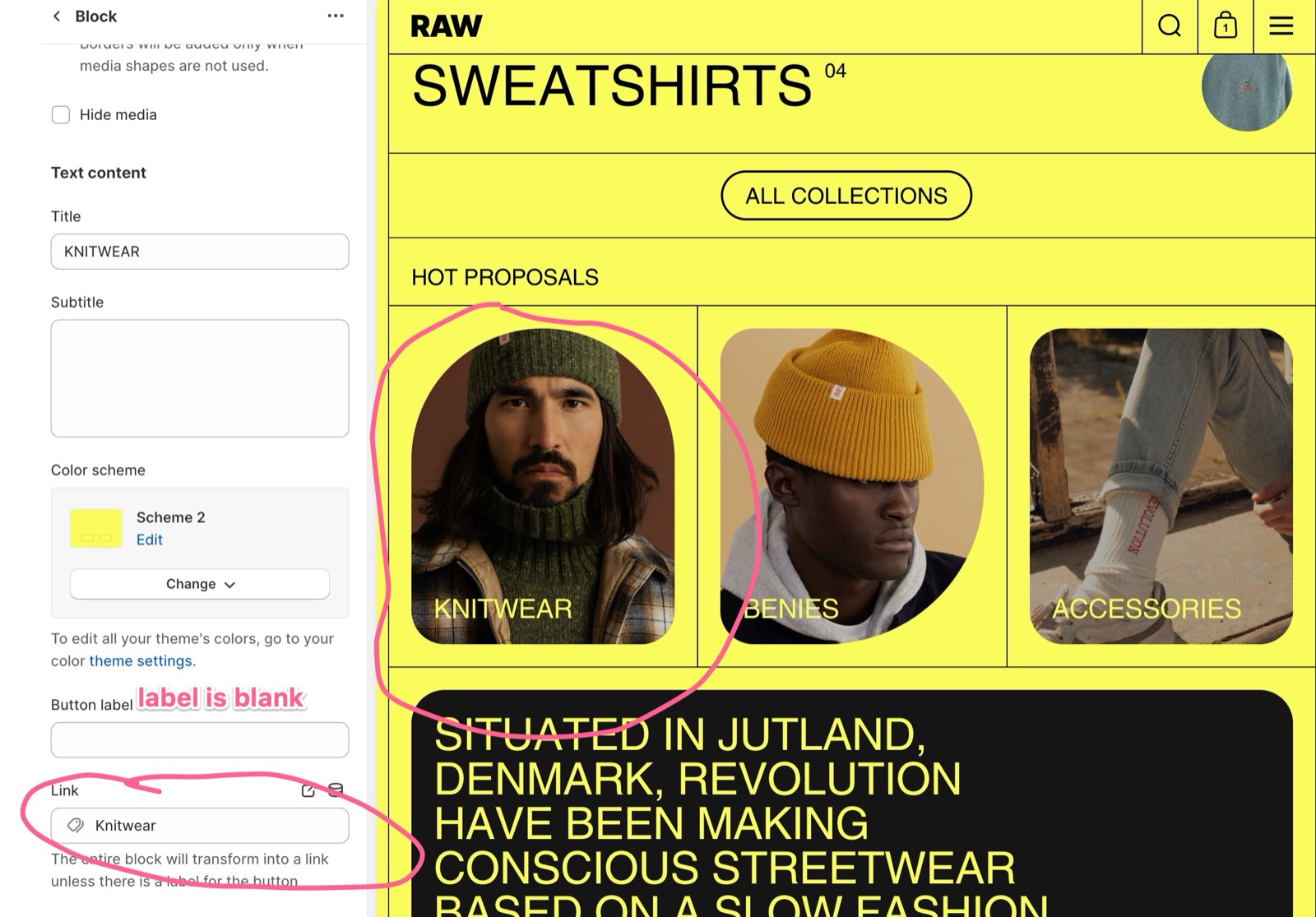
You see the image hover effect, for example, in a Rich blocks block that has a Link but no Button label: the whole block becomes a link and its image animates on hover.
Text links
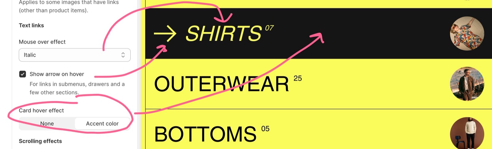
- Mouse over effect sets what text links do on hover: Highlight (accent color) draws an accent-colored highlight, Underline (text color) draws an underline (default), Italic switches the text to italic.
- Show arrow on hover adds a small arrow next to links in submenus, drawers and a few other sections.
- Card hover effect set to Accent color turns most cards to the accent colors on hover: the background becomes the scheme's Accent and the text its Accent foreground (Colors theme settings). None keeps the cards unchanged.
Hover effects do not run on touch screens.
Scrolling effects
- Animate specific sections into view moves some sections and grid items into place as the customer scrolls: they start slightly zoomed out and lower, then settle when they reach the screen.
- Add subtle zoom to images starts images slightly zoomed in and slowly brings them to 100 percent as they come into view.
- You can use both at the same time. Check how they feel on the devices your customers use: on older devices, or for an audience that does not like movement on screen, turn them off.
Turn off the animations
Simplify image loading
Open Theme settings → Animations and set Image loading visuals to Solid color or None.
Turn off image hover
Set Image mouse over animations to None. In Theme settings → Product card, set Mouse over animation to None too.
Turn off the scrolling effects
Turn off Animate specific sections into view and Add subtle zoom to images.
Calm the Vertical slider
If you use a Vertical slider section, turn on Disable all effects in its Animations settings. See Vertical slider section.
Why does the card hover effect not change my cards?
Card hover effect works on the cards that support it, not on every grid item, and only with a mouse. Check that the scheme's Accent and Accent foreground differ from its Background and Text, or the change is not visible.
All Animations settings
Every setting on this page, with its type and default.
Image loading visuals (dropdown, default: Pixelate): Sets the placeholder shown while images load: a tiny pixelated preview of the image, a solid block of color, or nothing. Options: Pixelate, Solid color, None.
Image mouse over animations (dropdown, default: Zoom out): Sets the hover effect of linked images other than product cards, for example a Rich blocks block with a link and no button label. Not on touch screens. Options: None, Zoom in, Zoom out, Repetition (style 1), Repetition (style 2).
Animations theme settings: Text links
Where to find it: Theme settings → Animations → Text links
Mouse over effect (dropdown, default: Underline (text color)): Sets the hover effect of text links: an accent-colored highlight, an underline in the text color, or italic text. Options: Highlight (accent color), Underline (text color), Italic.
Show arrow on hover (checkbox, default: on): For links in submenus, drawers and a few other sections.
Card hover effect (dropdown, default: None): With Accent color, cards that support it switch to the color scheme's Accent background and Accent foreground text on hover. Not on touch screens. Options: None, Accent color.
Animations theme settings: Scrolling effects
Where to find it: Theme settings → Animations → Scrolling effects
Animate specific sections into view (checkbox, default: on): Moves some sections and grid items into place as they scroll into view: they start slightly zoomed out and lower.
Add subtle zoom to images (checkbox, default: on): Starts images slightly zoomed in and brings them to 100 percent as they scroll into view.
Related pages
- Vertical slider section: its own zoom and parallax switches.
- Product card theme settings: the product card hover animation.
- Colors theme settings: the accent colors used by the hover effects.
- Rich blocks section: linked blocks that use the image hover.