Typography theme settings
The Typography theme settings of Borders set the heading and body fonts, base sizes, line heights and letter spacing used across the store.
Applies to: Borders 3.1.0 and later. Added in: Borders 1.0.0. Last checked: 2026-10-13 against Borders 3.1.0.
Borders uses two fonts: one for headings and one for body text. The Typography theme settings choose them and set the base size, line height and letter spacing that every text size in the store is calculated from.
Where to find it: Theme settings → Typography
Heading font
- Font family picks the heading font from Shopify's font library.
- Base size sets the reference size of heading text, 24 to 120 px (default 80 px). At 80, an Extra large heading is 80 px on wide screens. All heading-font sizes in sections (Small to Extra huge) scale from it.
- Line height sets the space between heading lines, 0.8 to 2.
- Letter spacing sets the space between letters, from -10 to 20 (hundredths of the font size: 10 adds 0.1 em).
Body font
- Font family picks the font for paragraphs, buttons, menus and forms.
- Base size sets the reference size of body text, 12 to 26 px (default 18 px): regular paragraphs are this size on wide screens. Body-font sizes in sections scale from it.
- Line height sets the space between text lines, 1 to 2.
- Letter spacing works like the heading setting.
Borders uses responsive sizes. You set a base size, and the theme reduces the text on smaller screens. With the default base size of 80, a heading-font Extra large title is:
- 80 px on wide screens.
- 60 px between 1024 and 1280 px.
- 40 px on tablets.
- 35 px on phones.
Typography inside sections
Most sections and blocks have their own typography settings: Text font (Body or Headings), Text size, sometimes Mobile text size and Line height. You mix the two fonts and their sizes per section, while the fonts themselves stay the ones set here.
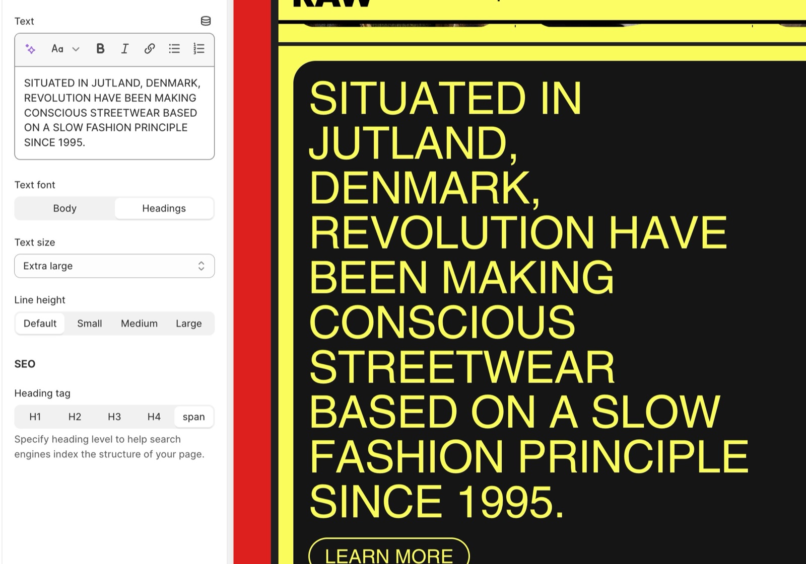
The text style of section headings, page titles and buttons has its own theme settings:
- Section headings and footers theme settings
- Page titles theme settings
- Buttons and forms theme settings
Can I use my own font?
Not with theme settings. Font family offers only the fonts in Shopify's font library. A font of your own, or a Google font, needs a code change in the theme files; the recipe is on Custom CSS and code. Krown support does not provide help with custom code.
Why are my headings smaller on mobile?
Because Borders sizes text responsively. Headings shrink in steps below 1281, 1024 and 768 px wide, so long words fit on small screens. To change only the mobile size of section headings or page titles, use Mobile text size in Section headings and footers theme settings or Page titles theme settings.
Why does my font look bold or italic in some places?
Some text styles ask for the bold or italic version of the font, for example Text weight (bold) on section headings. Borders loads the bold version of each font and, when section headings use italic, the italic version of the heading font. Fonts without those versions are shown with the closest style the browser can make.
All Typography settings
Every setting on this page, with its type and default.
Typography theme settings: Headings
Where to find it: Theme settings → Typography → Headings
Font family (font, default: sans-serif): Sets the font of headings and of every text whose Text font is Headings. Borders also loads its bold version (+200 weight, or 700).
Base size (slider 24 to 120 px, step 2, default: 80 px): Sets the reference size of heading-font text: at 80, an Extra large heading is 80 px on wide screens. Every heading-font text size scales from it and shrinks on smaller screens.
Line height (slider 0.8 to 2, step 0.1, default: 1): Sets the line height of heading-font text, as a multiple of the font size.
Letter spacing (slider -10 to 20, default: 0): Sets the letter spacing of heading-font text in hundredths of the font size (10 = 0.1 em).
Typography theme settings: Body
Where to find it: Theme settings → Typography → Body
Font family (font, default: sans-serif): Sets the font of paragraphs, menus, buttons, forms and every text whose Text font is Body. Borders also loads its bold version.
Base size (slider 12 to 26 px, default: 18 px): Sets the reference size of body-font text: regular paragraphs are this size on wide screens. Every body-font text size scales from it.
Line height (slider 1 to 2, step 0.1, default: 1.4): Sets the line height of body-font text, as a multiple of the font size.
Letter spacing (slider -10 to 20, default: 0): Sets the letter spacing of body-font text in hundredths of the font size (10 = 0.1 em).
Related pages
- Section headings and footers theme settings: the style of section headings.
- Page titles theme settings: the titles of inner pages.
- Custom CSS and code: adding a custom font with code.
Colors theme settings
The Colors theme settings of Borders define the color schemes, the default color scheme for pages without one, the body background and drawer colors.
Section headings and footers theme settings
The Section headings & footers theme settings of Borders style every section heading, its padding and slider arrows, and the section footer button.