Layout theme settings
The Layout theme settings of Borders set the margins of the main container, the fixed width layout and the padding and radius of grid items.
Applies to: Borders 3.1.0 and later. Added in: Borders 1.0.0. Last checked: 2026-10-13 against Borders 3.1.0.
The Layout theme settings set the space around your store and inside every grid item. Borders is built on a strict grid: these settings change the whole store at once.
Where to find it: Theme settings → Layout
Main container
The main container holds the header, every section and the footer. Its margins create a "boxed" look, with the Body background color (Theme settings → Colors) showing around it.
- Horizontal margin sets the space on the left and right of the store, 0 to 50 px.
- Vertical margin sets the space above and below the store, 0 to 50 px.
- The margins are responsive. Below 1024 px wide they shrink to half their value, at most 20 px (15 px below 768 px, 10 px below 475 px).
- Remove margins on mobile removes the margins and the main container border on phones (screens narrower than 475 px), so content uses the full width.
- Centered fixed width layout limits the store to 1360 px wide and centers it on larger screens. The body background fills the rest of the screen.
Grid items
Every grid item (a product card, a block, a column) has the same inner padding and corner radius.
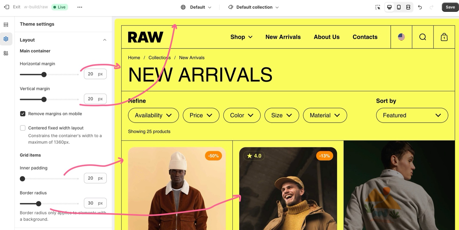
- Inner padding sets the space inside every grid item, 20 to 50 px. It shrinks on smaller screens and is 15 px on phones.
- The same value is the padding of the borders when you turn on Add padding to horizontal borders or Add padding to vertical borders in Borders theme settings.
- Border radius rounds the corners of grid items, 0 to 100 px. Only elements with a background, such as media and cards with their own color scheme, show the rounding.
Even if these are general settings that affect your entire store, you can still change the grid design for most of your sections, individually, having almost complete freedom on your layout.
Setting up a boxed layout
A boxed layout shows the store as a framed box over a background color.
Set the margins
Open Theme settings → Layout → Main container. Set Horizontal margin and Vertical margin, for example 30 px each.
Choose the mobile behaviour
Turn on Remove margins on mobile to use the full screen width on phones. Leave it off to keep a small frame there too.
Cap the width on large screens (optional)
Turn on Centered fixed width layout to keep the store at 1360 px wide on large monitors.
Set the grid padding and radius
Open Grid items and set Inner padding and Border radius. A radius of 0 gives square corners.
Color the frame
Open Theme settings → Colors and set Body background: it fills the margins around the store.
Style the border around the store
Open Theme settings → Borders → Main container and set Border style and Border width. A width of 0 removes the border.
Why can't I see the border around my store on mobile?
Remove margins on mobile is on. On screens narrower than 475 px, it removes both the margins and the main container border. Turn it off to keep the border on phones; the margins then shrink to at most 10 px there.
Can I change the grid padding for one section only?
Not to a different value, but you can remove it. Most sections have Remove inner padding & border radius, Remove border radius or Hide borders in their design settings. See General section styling.
All Layout settings
Every setting on this page, with its type and default.
Layout theme settings: Main container
Where to find it: Theme settings → Layout → Main container
Horizontal margin (slider 0 to 50 px, default: 0 px): Sets the space on the left and right of the main container, where the body background shows. Below 1024 px wide it is halved and capped at 20 px (15 px below 768 px, 10 px below 475 px).
Vertical margin (slider 0 to 50 px, default: 0 px): Sets the space above and below the main container, where the body background shows. It shrinks on smaller screens like the horizontal margin.
Remove margins on mobile (checkbox, default: off): Removes the margins and the main container border on screens narrower than 475 px.
Centered fixed width layout (checkbox, default: off): Limits the main container to 1360 px wide and centers it; the body background fills the rest of wider screens.
Layout theme settings: Grid items
Where to find it: Theme settings → Layout → Grid items
Inner padding (slider 20 to 50 px, default: 20 px): Sets the padding inside every grid item, and the inset of padded borders. It shrinks on smaller screens and is 15 px below 768 px.
Border radius (slider 0 to 100 px, default: 20 px): Rounds the corners of grid items. Only elements with a background, such as media and cards with a color scheme, show the rounding.
Related pages
- Borders theme settings: the border styles and widths.
- Colors theme settings: the body background behind the margins.
- General section styling: remove the padding, radius or borders of one section.
- Recommended image sizes: how the grid crops your images.
Recreate the Borders demo stores
Video guides that rebuild the Borders demo stores (Raw, Objekts, Black): why Shopify cannot copy demo content, and what each video covers.
Borders theme settings
The Borders theme settings set the style, width and padding of the container, primary and secondary borders, and the borders in drawers.