Colors theme settings
The Colors theme settings of Borders define the color schemes, the default color scheme for pages without one, the body background and drawer colors.
Applies to: Borders 3.1.0 and later. Added in: Borders 1.0.0. Last checked: 2026-10-13 against Borders 3.1.0.
Borders sets colors with color schemes: named sets of colors that you apply to whole sections. Change a scheme once and every section that uses it follows.
Where to find it: Theme settings → Colors
Color schemes
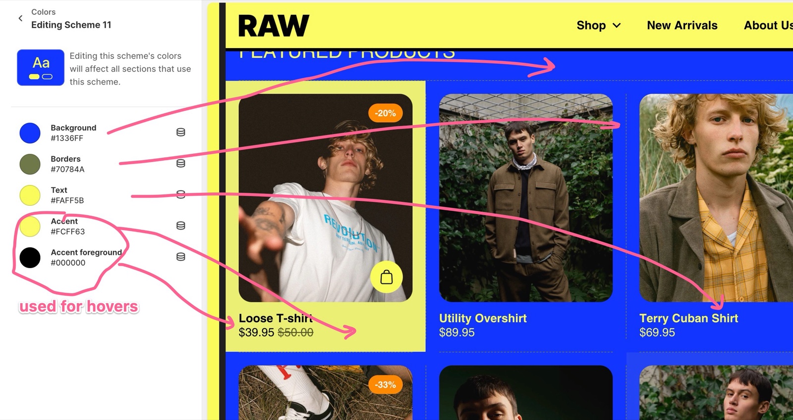
Each color scheme has five colors:
- Background: the section background.
- Borders: the grid and section lines drawn in that section (see Borders theme settings).
- Text: text and icons. Form field borders and light backgrounds (for example placeholders) are made from the text color at low opacity.
- Accent: the hover color of buttons and text links, and of cards when Theme settings → Animations → Card hover effect is Accent color.
- Accent foreground: the text on top of the accent color.
You can add as many schemes as you need, for contrasting sections, cards or slides.
All sections start out with the first color scheme, so if you want to change how all sections look at once, just edit the colors within Scheme 1 and all sections will follow.
Choose a color scheme for a section
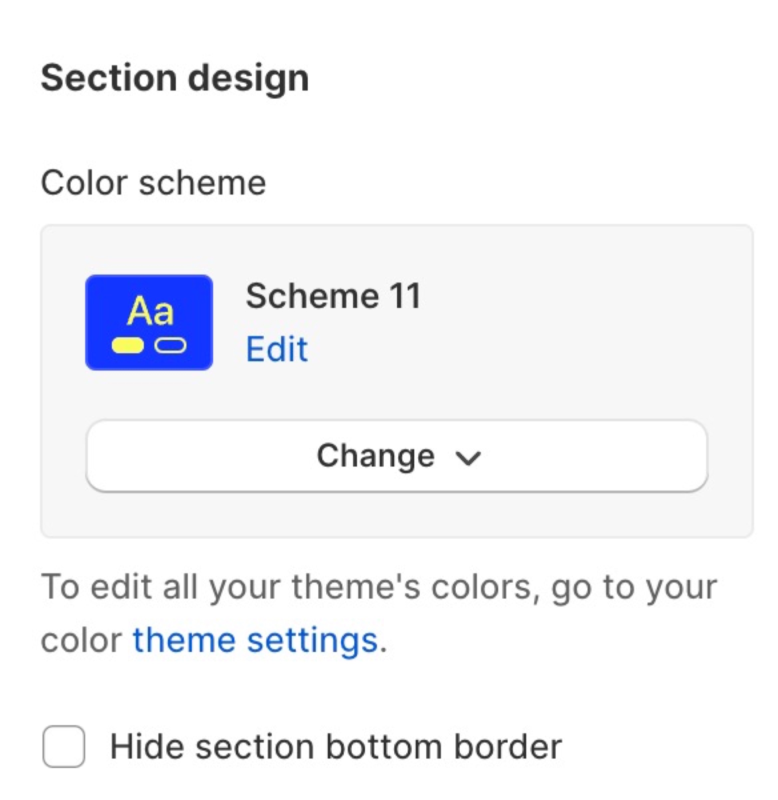
- Most sections have a Section design group at the end of their settings, with Color scheme.
- Many sections also have an inner color scheme for their cards, blocks or slides (Inner content design, or Color scheme on a block).
- Once you choose another scheme for a section, edits to the first scheme no longer change it.
Default color scheme
Some pages and sections have no color scheme setting: customer account pages, the 404 page, the gift card page and most page template sections such as articles.
- Default color scheme sets the colors of those pages and sections, and the base colors of the store.
- Each preset sets its own default scheme (Scheme 1 in the Borders, Folio and Mosaic presets, Scheme 5 in Readers).
- If you restyle the store through the first scheme, check that Default color scheme points to the same scheme.
Body background and drawers
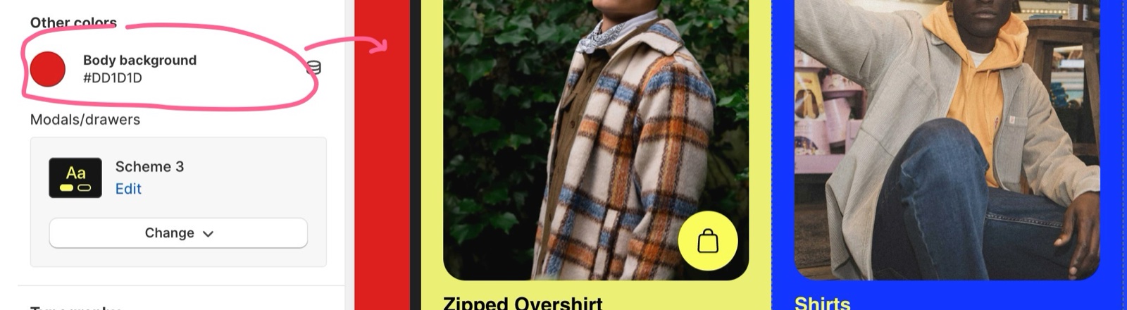
- Body background is the color behind the store. It is visible only when the store has margins (Theme settings → Layout → Horizontal margin or Vertical margin) or uses Centered fixed width layout.
- Modals/drawers sets the color scheme of every drawer: the navigation, cart and search drawers, the filters drawer on collection and search pages, the pickup availability drawer and the account panel opened from the header.
Restyling the whole store
Edit the first scheme
Open Theme settings → Colors → Color schemes and edit Scheme 1: Background, Borders, Text, Accent and Accent foreground. Every section still on Scheme 1 changes.
Add schemes for contrast
Select Add scheme and create the extra schemes you need, for example a dark scheme for one highlight section.
Apply them to sections
Select a section, open its Section design group and choose the scheme in Color scheme.
Set the default color scheme
Under Default color scheme, choose the scheme for account pages, the 404 page and other pages without a scheme setting.
Set the body background
If your store has margins or a fixed width, set Body background under Other colors.
Set the drawer colors
Choose the scheme for the drawers in Modals/drawers.
Why does my background color not show?
Body background shows only around the store. Without margins or the fixed width layout, the sections cover the whole screen and you see their scheme's Background instead. Set Horizontal margin or Vertical margin in Layout theme settings, or edit the section's color scheme.
Why do my account pages have different colors from my sections?
They use Default color scheme, not the first scheme. Set Default color scheme to the scheme your sections use.
All Colors settings
Every setting on this page, with its type and default.
Color schemes (color schemes): The color schemes sections, cards and blocks choose from. Each has Background, Borders (the grid and section lines), Text, Accent (hover color of buttons, links and cards) and Accent foreground (text on the accent color). Each color scheme has these colors:
- Background (color, default:
#F2F1EA) - Borders (color, default:
#000000) - Text (color, default:
#000000) - Accent (color, default:
#FFEF5F) - Accent foreground (color, default:
#000000)
Default color scheme (color scheme, default: Scheme 2): Sets the base colors of the store and of pages and sections without a color scheme setting, such as account pages, the 404 page and the gift card page. Each preset sets its own value.
Colors theme settings: Other colors
Where to find it: Theme settings → Colors → Other colors
Body background (color, default: #F2F1EA): Sets the color behind the store, visible only in the Layout margins or around the centered fixed width layout.
Modals/drawers (color scheme, default: Scheme 1): Sets the color scheme of the navigation, cart, search, filters and pickup availability drawers and of the header account panel.
Related pages
- General section styling: the Section design color scheme of each section.
- Layout theme settings: margins that reveal the body background.
- Borders theme settings: the lines drawn in each scheme's Borders color.
- Animations theme settings: the hover effects that use the accent color.
Borders theme settings
The Borders theme settings set the style, width and padding of the container, primary and secondary borders, and the borders in drawers.
Typography theme settings
The Typography theme settings of Borders set the heading and body fonts, base sizes, line heights and letter spacing used across the store.