Product card theme settings
The Product card theme settings of Borders control product media, captions, the dynamic caption, quick buy, ratings and the product badges in grids.
Applies to: Borders 3.1.0 and later. Added in: Borders 1.0.0. Last checked: 2026-10-13 against Borders 3.1.0.
Product cards are the product thumbnails in every grid of the store: collection pages, Featured collection, search results, recommendations and recently viewed products. The Product card theme settings style all of them at once: media, caption, quick buy, ratings and badges.
Where to find it: Theme settings → Product card
Media thumbnail
- Media aspect ratio crops every product image to one shape, from Landscape (16:9) to Taller (2:3). Pick the ratio closest to your product photos to reduce cropping. See Recommended image sizes.
- Fit media inside container shows the whole image inside the shape instead of cropping it. Container inner spacing (0 to 15 percent) adds space around it and Container background fills the empty area. This also turns off the parallax effect on product cards.
- Mouse over animation sets what the image does on hover: None, Zoom in, Zoom out, or one of two Repetition styles (the image repeats in layers).
- Show second product media on mouse over swaps to the product's second image on hover, when it has one.
- Media overlay and Overlay opacity lay a color over every product image, for example to calm down bright photos.
- Show product video plays the first video uploaded to the product (not YouTube or Vimeo) instead of the featured image, muted and in a loop.
The mouse over animation and the second image do not work on touch screens.
Product caption
The caption is the text under the image: title and price.
- The first setting in this group sets the text alignment, Left or Center. Its label does not show correctly in the editor in Borders 3.1.0 (it shows an untranslated key or nothing).
- Title size sets Small or Large titles.
- Text weight (bold) and Text transform (uppercase) style the title.
Dynamic caption
Every product card can show one extra line of text above or below the title, for example a subtitle, a key feature or a temporary offer. The text comes from a product metafield, so each product shows its own.
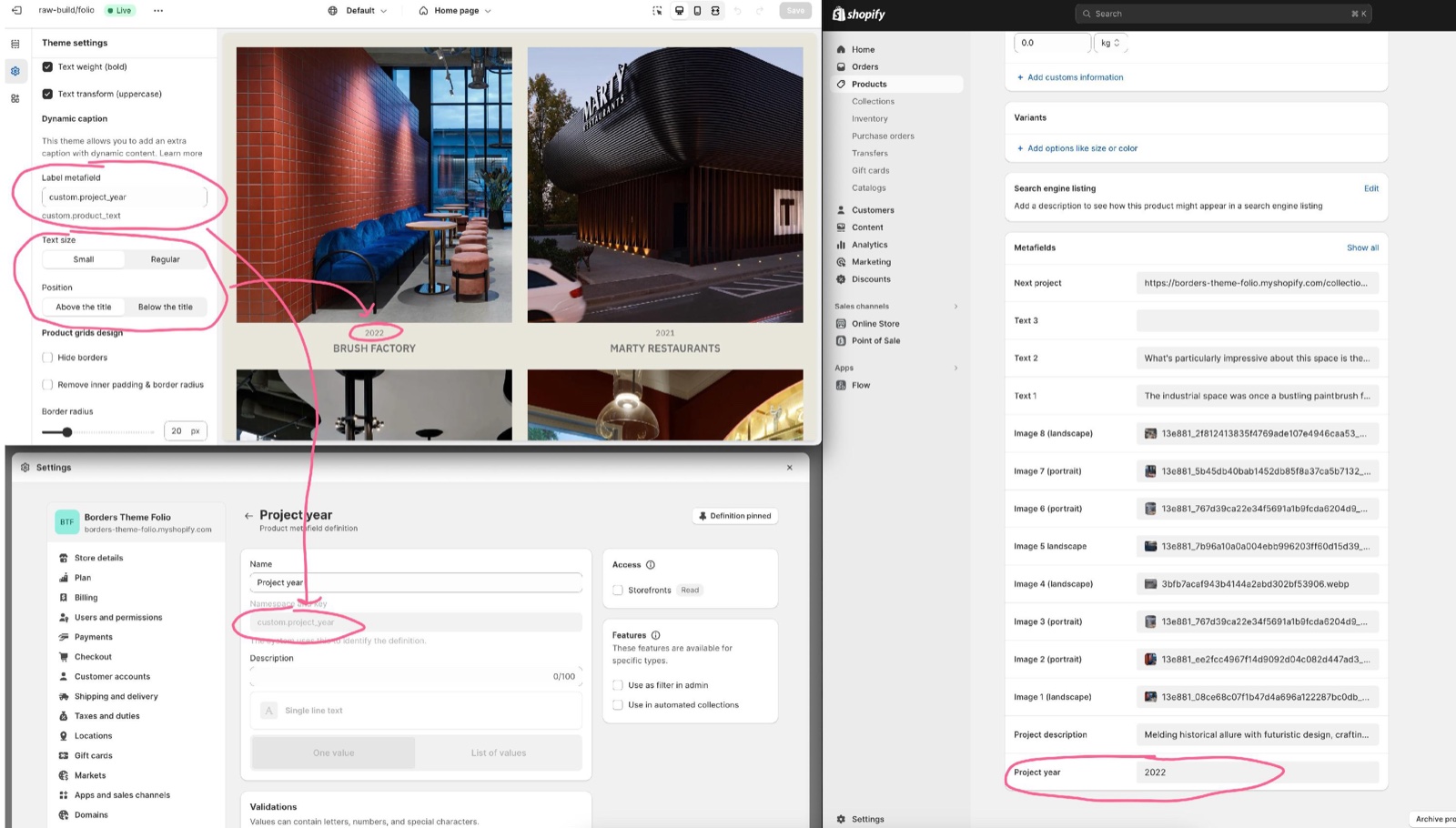
- Label metafield is the metafield reference, written as
namespace.key(for examplecustom.product_text). - Text size sets Small or Regular.
- Position puts the line Above the title or Below the title.
- Products with an empty metafield show no extra line.
Setting up the dynamic caption
Create the metafield
In Shopify admin → Settings → Custom data → Products, select Add definition. Name it, for example "Product text", and choose the type Single line text.
Copy the namespace and key
Copy the definition's namespace and key in the form namespace.key, for example custom.product_text.
Fill it on your products
Open each product in Shopify admin and type the caption in the new metafield, at the bottom of the product page.
Paste the reference in the theme
In the theme editor, open Theme settings → Product card → Dynamic caption and paste the reference into Label metafield.
Choose the size and position
Set Text size and Position, then check a collection page in the preview.
Make sure that you only write the namespace and key, not the entire metafield in the Label metafield option setting.
Product grids design
Product grids can have their own design, different from the main grid in Layout theme settings:
- Hide borders removes the lines between product cards.
- Remove inner padding & border radius removes the padding and rounding of product cards, so images touch each other.
- Border radius rounds the product cards, 0 to 100 px, instead of the global grid radius.
Quick buy
Quick buy adds a buy button over the product image: on hover on desktop, always visible on mobile.
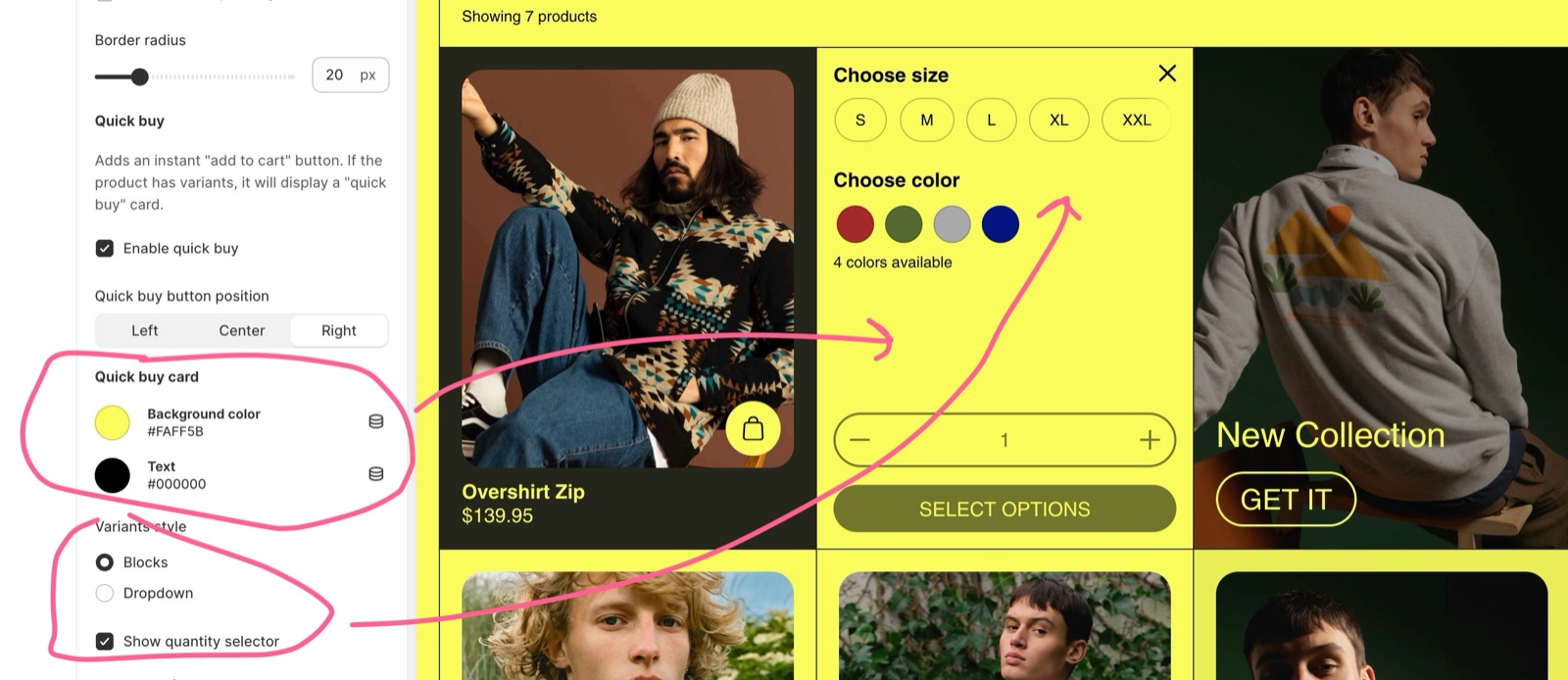
- Enable quick buy turns the button on (default: on). It shows only on products that are in stock.
- Products without variants go straight to the cart. Products with variants open the quick buy card, where the customer picks a variant first.
- Quick buy button position places the button on the Left, Center or Right of the image.
- With Theme settings → Cart → Cart type set to Drawer, the cart drawer opens after adding. With Page, the customer goes to the cart page.
The Quick buy card group styles that card:
- Background color and Text set its colors.
- Variants style shows the options as Blocks (buttons) or a Dropdown. Color options show as swatches when color swatches are on.
- Handle unavailable variants hides sold-out variants (Hide) or shows them but blocks their selection (Disable).
- Show quantity selector adds a quantity field next to the buy button.
Setting up quick buy
Turn on quick buy
Open Theme settings → Product card → Quick buy and turn on Enable quick buy.
Place the button
Choose Quick buy button position.
Style the quick buy card
Under Quick buy card, set Background color and Text.
Choose how variants show
Choose Variants style, Handle unavailable variants and Show quantity selector. Then hover over a product with variants in the preview and select the buy button to check the card.
Product rating
A rating badge (a star and the average, for example 4.5) shows over the product image when you use a supported review app.
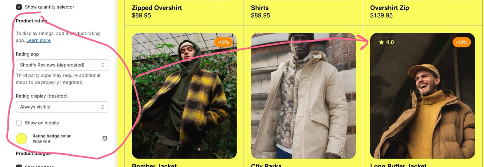
- Rating app chooses the app: Okendo, Loox, Judge.me, Stamped, Klaviyo, Yotpo, Ali Reviews, Rapid Reviews or Air Reviews (default: Judge.me).
- Judge.me, Loox, Rapid Reviews, Air Reviews and Okendo are read from the ratings the app saves on each product. Stamped, Klaviyo, Yotpo and Ali Reviews show the app's own star widget, which needs the app's script on the store.
- Rating display (desktop) sets Don't show, Show on hover or Always visible.
- Show on mobile shows the badge on phones too.
- Rating badge color sets the badge color.
- Products without reviews show no badge. The Product rating block on the product page uses the same app.
Setting up product ratings
Install a supported review app
Install one of the apps listed in Rating app and follow its setup.
Select the app in the theme
Open Theme settings → Product card → Product rating and choose your app in Rating app.
Choose where the badge shows
Set Rating display (desktop), Show on mobile and Rating badge color.
Collect the first reviews
The badge shows once a product has reviews. Caching can delay it after a new review is written.
Check out Recommended rating apps for our honest opinion on rating apps.
Product badges
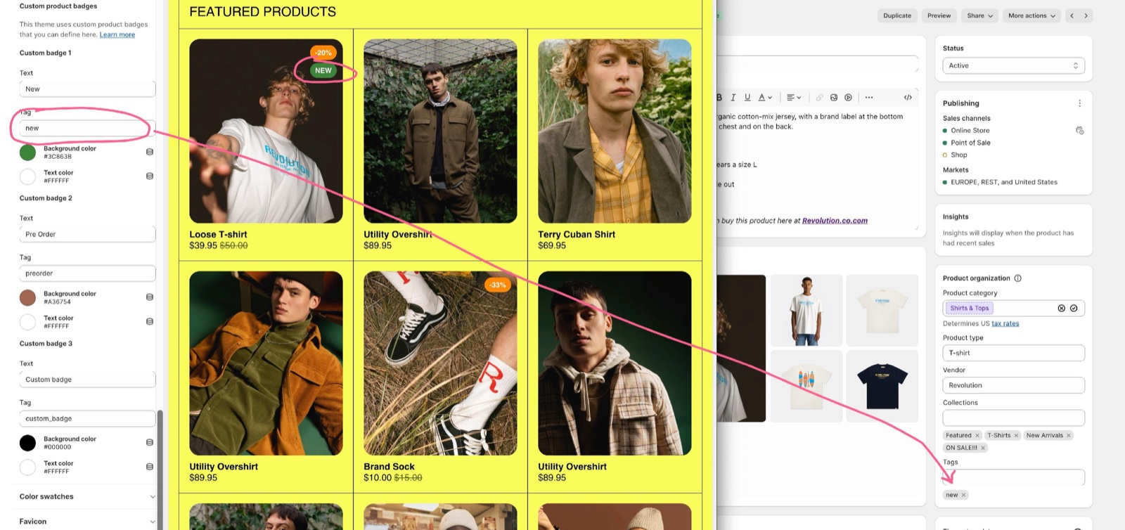
Badges are small labels over the product image. Borders shows two automatically and up to three of your own, set with product tags.
- Show badges turns all badges on product cards on or off.
- Badges position puts them on the Left or Right of the image.
- The Sold out badge shows when all variants of a product are out of stock.
- The Discount badge shows when the product's compare-at price is higher than its price. Show discount as... sets its text: Text ("On Sale"), Percentage (for example "-20%") or Amount saved ("Save" and the amount).
- Each badge has its own background and text color.
- Compare-at prices are set on the product in Shopify. See Shopify's Sales guide.
The three custom badges (Custom badge 1, 2 and 3) each have a Text, a Tag, a Background color and a Text color. A product with that exact tag shows the badge after the automatic ones. By default they are "New" (tag new), "Pre Order" (tag preorder) and "Custom badge" (tag custom_badge).
Setting up custom badges
Set the badge text and tag
Open Theme settings → Product card → Custom badge 1. Type the label in Text, for example "New", and the product tag that triggers it in Tag, for example new.
Choose the colors
Set Background color and Text color.
Tag your products
In Shopify admin → Products, open each product and add the same tag, for example new. Save.
Check a collection page
Open a collection with a tagged product in the preview. Repeat with Custom badge 2 and 3 for other labels.
Why does my discount badge say "On Sale" instead of a percentage?
The product's variants have different prices or compare-at prices. Product cards then show "On Sale" instead of one saving for all variants. Give all variants the same price and compare-at price to show the percentage or amount.
Why does my custom badge not show?
The tag does not match exactly. Borders compares the Tag with the product's tags letter by letter, including upper and lower case: New and new are different tags. Also check that Show badges is on.
Why does my rating badge not show?
Check these in order: the right app is selected in Rating app, the product has at least one review, and Rating display (desktop) is not Don't show (on phones, Show on mobile must be on). Stamped, Klaviyo, Yotpo and Ali Reviews also need the app's script on the store. New reviews can take a while to appear because of caching.
All Product card settings
Every setting on this page, with its type and default.
Product card theme settings: Media thumbnail
Where to find it: Theme settings → Product card → Media thumbnail
Media aspect ratio (dropdown, default: Square (1:1)): Crops the media of every product card to this shape. Options: Landscape (16:9), Standard (3:2), Short (4:3), Square (1:1), Tall (5:6), Taller (2:3).
Fit media inside container (checkbox, default: off): Shows the whole product image inside the aspect ratio instead of cropping it, and turns off the parallax effect on product cards.
When enabled, this will disable the parallax effect for product cards. Shown only when Fit media inside container is on.
Container inner spacing (slider 0 to 15 %, default: 5 %): Sets the space around the fitted image, as a percentage of the card. Shown only when Fit media inside container is on.
Container background (color with transparency, default: transparent): Fills the empty area around the fitted image. Shown only when Fit media inside container is on.
Mouse over animation (dropdown, default: Zoom out): Sets the hover effect of the product image. Repetition styles repeat the image in layers. Hover effects do not run on touch screens. Options: None, Zoom in, Zoom out, Repetition (style 1), Repetition (style 2).
Show second product media on mouse over (checkbox): Shows the product's second media on hover, when it has one. Not on touch screens.
Media overlay (color, default: transparent): Lays this color over every product card image; shown only when Overlay opacity is above 0.
Overlay opacity (slider 0 to 100 %, default: 0 %).
Show product video (checkbox, default: off): Displays the first self hosted video from the product gallery, instead of the featured image.
Product card theme settings: Product caption
Where to find it: Theme settings → Product card → Product caption
[unresolved sections.rich-text.settings.text_alignment.label.] (dropdown, default: Left): Aligns the product card caption (title and price) to the left or the center. The label of this setting does not resolve in the Borders 3.1.0 editor. Options: Left, Center.
Title size (dropdown, default: Small). Options: Small, Large.
Text weight (bold) (checkbox, default: on).
Text transform (uppercase) (checkbox, default: off).
Product card theme settings: Dynamic caption
Where to find it: Theme settings → Product card → Dynamic caption
This theme allows you to add an extra caption with dynamic content.
Label metafield (text field): The product metafield shown as an extra line on product cards, written as namespace.key (for example custom.product_text). Products with an empty metafield show nothing.
Text size (dropdown, default: Small). Options: Small, Regular.
Position (dropdown, default: Above the title): Puts the dynamic caption above or below the product title. Options: Above the title, Below the title.
Product card theme settings: Product grids design
Where to find it: Theme settings → Product card → Product grids design
Hide borders (checkbox, default: off): Removes the lines between product cards in every product grid.
Remove inner padding & border radius (checkbox, default: off): Removes the padding and corner radius of product cards in every product grid.
Border radius (slider 0 to 100 px, default: 20 px): Rounds product cards with this radius instead of the global grid radius. Ignored when Remove inner padding & border radius is on.
Product card theme settings: Quick buy
Where to find it: Theme settings → Product card → Quick buy
Adds an instant "add to cart" button. If the product has variants, it will display a "quick buy" card.
Enable quick buy (checkbox, default: on): Adds a buy button over the image of in-stock products: on hover on desktop, always on mobile. Products without variants are added to the cart directly; products with variants open the quick buy card.
Quick buy button position (dropdown, default: Right). Options: Left, Center, Right. Shown only when Enable quick buy is on.
Product card theme settings: Quick buy card
Where to find it: Theme settings → Product card → Quick buy card
Background color (color, default: #000000). Shown only when Enable quick buy is on.
Text (color, default: #ffffff). Shown only when Enable quick buy is on.
Variants style (radio buttons, default: Blocks): Shows the options in the quick buy card as buttons (Blocks) or dropdowns. Color options show as swatches when color swatches are on. Options: Blocks, Dropdown. Shown only when Enable quick buy is on.
Handle unavailable variants (dropdown, default: Disable): Hides sold-out variants in the quick buy card, or shows them but blocks their selection. Options: Hide, Disable. Shown only when Enable quick buy is on.
Show quantity selector (checkbox, default: on). Shown only when Enable quick buy is on.
Product card theme settings: Product rating
Where to find it: Theme settings → Product card → Product rating
To display ratings, add a product rating app. Learn more.
Rating app (dropdown, default: Judge.me): Sets the review app whose ratings show on product cards and in the product page Product rating block. Stamped, Klaviyo, Yotpo and Ali Reviews show the app's own widget, which needs the app's script. Options: Okendo, Loox, Judge.me, Stamped, Klaviyo, Yotpo, Ali Reviews, Rapid Reviews, Air Reviews.
Rating display (desktop) (dropdown, default: Show on hover): Sets when the rating badge shows on product cards on desktop. Options: Don't show, Show on hover, Always visible.
Show on mobile (checkbox, default: off): Shows the rating badge on product cards on mobile.
Rating badge color (color, default: #000000).
Product card theme settings: Product badges
Where to find it: Theme settings → Product card → Product badges
Show badges (checkbox, default: on): Shows the sold out, discount and custom badges over product card images.
Badges position (dropdown, default: Right). Options: Left, Right.
Product card theme settings: Sold out badge
Where to find it: Theme settings → Product card → Sold out badge
'Sold out' background color (color, default: #757575).
'Sold out' text color (color, default: #ffffff).
Product card theme settings: Discount badge
Where to find it: Theme settings → Product card → Discount badge
Show discount as... (dropdown, default: Percentage): Sets the discount badge text: Text shows "On Sale", Percentage the saving in percent, Amount saved "Save" and the amount. Products whose variants have different prices always show "On Sale" on product cards. Options: Text, Percentage, Amount saved.
Products with varying prices across variants will show a generic 'Sale' badge. Shown only when Show discount as... is not Text.
'Discount' background color (color, default: #D14545).
'Discount' text color (color, default: #ffffff).
Product card theme settings: Custom product badges
Where to find it: Theme settings → Product card → Custom product badges
This theme uses custom product badges that you can define here.
Product card theme settings: Custom badge 1
Where to find it: Theme settings → Product card → Custom badge 1
Text (text field, default: "New").
Tag (text field, default: "new"): The product tag that shows this badge. It must match the tag exactly, including upper and lower case.
Background color (color, default: #3C863B).
Text color (color, default: #ffffff).
Product card theme settings: Custom badge 2
Where to find it: Theme settings → Product card → Custom badge 2
Text (text field, default: "Pre Order").
Tag (text field, default: "preorder"): The product tag that shows this badge. It must match the tag exactly, including upper and lower case.
Background color (color, default: #A36754).
Text color (color, default: #ffffff).
Product card theme settings: Custom badge 3
Where to find it: Theme settings → Product card → Custom badge 3
Text (text field, default: "Custom badge").
Tag (text field, default: "custom_badge"): The product tag that shows this badge. It must match the tag exactly, including upper and lower case.
Background color (color, default: #000000).
Text color (color, default: #ffffff).
Related pages
- Color swatches theme settings: swatches in the quick buy card.
- Product page: the Product badges and Product rating blocks.
- Cart theme settings: Cart type, used by quick buy.
- Recommended rating apps: which review app to choose.
Buttons and forms theme settings
The Buttons & forms theme settings of Borders set the corner roundness of buttons and fields, the button border size and uppercase labels.
Color swatches theme settings
The Color swatches theme settings of Borders turn color options into swatches on product pages, in quick buy and in filters, from names, files or metafields.