Product page
The Product page section of Borders sets the gallery, sticky add to cart and the product blocks: price, variant picker, size guide, buy buttons and more.
Applies to: Borders 3.1.0 and later. Added in: Borders 1.0.0. Last checked: 2026-10-13 against Borders 3.1.0.
The Product page section is the main part of every product page. The media gallery sits on one side. The product information sits on the other, built from blocks such as the title, price, variant picker and buy buttons. It has the most options of any Borders section.
Where to find it: Online Store → Themes → Customize → Products → Default product → Product page
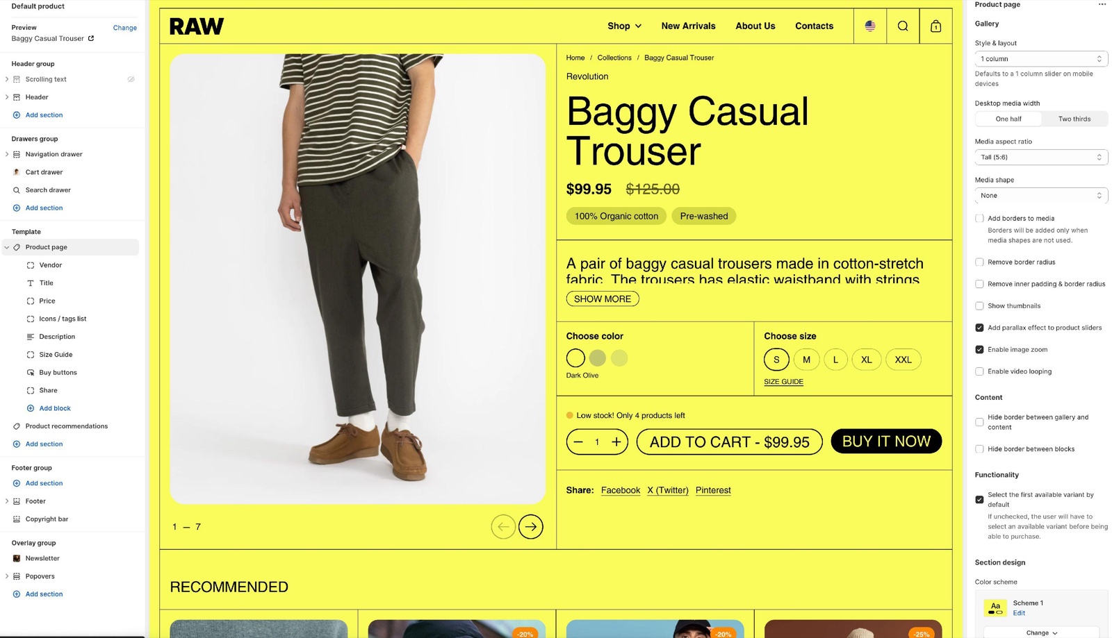
Gallery
- Style & layout sets the desktop gallery: Slider, 1 column (customers swipe through the media), or Scroll, 1 column or 2 columns (the media are stacked and scroll with the page). On mobile the gallery is always a 1 column slider.
- Desktop media width gives the gallery one half or two thirds of the page width, so you can put more weight on the pictures or on the text.
- Media aspect ratio sets one shape for all media, from Standard (3:2) to Taller (2:3). Media are cropped to it.
- Fit media inside container shows the whole image without cropping, inside a frame with Container inner spacing and Container background. Media shape is not available then.
- Media shape rounds one side or all corners. Add borders to media works only without a media shape. Remove border radius and Remove inner padding & border radius change the frame of the gallery.
- Show thumbnails adds small images of all media. Add parallax effect to product sliders adds a light movement while scrolling. Enable image zoom lets customers open the images larger.
- Videos: Enable video looping, Enable video autoplay (muted and without controls) and Fill videos to match the aspect ratio of the images.
Because the aspect ratio of the gallery is fixed, make sure that you choose the setting which is the closest to your product images, in order to reduce the level of cropping you'll get.
Content and functionality
- Hide border between gallery and content and Hide border between blocks remove the lines of the product page grid.
- Select the first available variant by default (on by default) opens the page with a variant already chosen. Turn it off to make customers choose every option before they can add the product to the cart.
- Color scheme and Hide section bottom border set the section design.
Sticky add to cart
- Enable sticky add to cart shows a bar with the product title, the price and a button at the bottom of the screen when customers scroll past the buy buttons. It shows only for products that are available.
- For a product without variants, the button adds it to the cart. For a product with variants, the button reads "Choose options" and takes the customer back to the variant picker.
- Color scheme (under Sticky add to cart) sets the bar's colors.
Product blocks
The product information is built from blocks. Select Add block in the Product page section to add one, and drag the blocks to reorder them. Most blocks can be added once; Text, Collapsible tab, Tabs, Icons / tags list, Image, Product siblings, Coupon code, Variant metafield, Disclosures and Custom HTML / Liquid can be added several times. App blocks from your installed apps can be added too.
Combined with several product templates, metafields and dynamic sources, the blocks let each product show its own content.
Vendor
Shows the product's vendor, linked to a page with all products of that vendor (Shopify creates it automatically). No settings.
Title
The product title, as the page's H1. Text font, Text size (Regular to Huge) and Mobile text size.
Price
The price of the selected variant, with the compare-at price when it is on sale, and Shopify's installment message when Shop Pay Installments is on. No settings.
Tax information
Shows "Tax included." when your prices include tax, and a link to the shipping policy when you have one (Shopify admin → Settings → Policies). Open links in opens the policy in a Popup, in the Same window or in a New window.
SKU / BARCODE
Shows the SKU and the barcode of the selected variant, when they are filled in. No settings.
Description
The product description. Text font, Text size, Line height, and Truncate description: Don't truncate, or a small, medium or large excerpt (3, 7 or 12 lines) with a Show more button. Use an excerpt for long descriptions.
Icons / tags list
Up to six labels with icons, shown as pills, for example "Vegan" or "Free shipping". See Setting up an icons list with metafields.
- Each Icon (128 x 128 px) and Label is optional. An icon with neither an image nor a label is hidden.
- Without an icon image, Borders looks for a file named after the label in Shopify admin → Content → Files: "Free shipping" uses
free-shipping.png. - Background color, Text color and Style (Columns or Rows) set the look.
Variant picker
The options of the product, such as color and size.
- Variants style: Blocks shows each value as a button; Dropdown shows a list. Options set up as color swatches always show as swatches.
- Handle unavailable variants: Hide removes sold-out combinations, Disable shows them crossed out, Show lists them like the other values; the buy button then reads "Sold out".
- Metaobject swatch metafields adds small images or colors to the values of the Blocks style. See Setting up metaobject swatches.
- Size guide: Size guide option names, Size guide label, Size guide page and Open options add a size guide link next to the size option. See Setting up a size guide.
The size guide option isn't limited to size guides only, you can use it for absolutely anything you want, even offering information about variants.
Product siblings
Shows other products as small images, for example the same model in other colors, each linking to its own product page. See Setting up product siblings.
- Heading sits above the images. Products is the list. Media aspect ratio sets the image shape.
- Reduce opacity for unavailable products fades sold-out siblings.
- The current product is highlighted when it is in the list.
Buy buttons
The quantity selector and the add to cart button.
- Show quantity selector. Show price adds the price to the button; Update price based on quantity multiplies it by the quantity.
- Show "pre-order" button label writes "Pre-Order" on the button instead of "Add to cart", for every available variant.
- Show inventory notifications shows low stock and out of stock messages. Variants need inventory tracking in Shopify admin.
- Show dynamic checkout buttons adds buttons such as Shop Pay, PayPal or Apple Pay, from your payment settings.
- Show recipient information form for gift card products lets customers send a gift card to someone else, with a message.
- Buttons color scheme gives the buttons their own colors, for example a contrasting call to action.
Back in stock alert
A form shown only when the selected variant is sold out. The customer enters an email address; you receive an email with the product, the variant and that address. See Setting up a back in stock alert.
- Text, Button label and Success message are what the customer sees. Email message is the line in the email you receive.
Coupon code
Shows a discount code with a copy button, for example SAVE10.
- Code is the code shown. Caption adds a line under it. Link label and Link add a link, for example to the terms of the offer.
- The block does not create or apply the discount. Create the code in Shopify admin → Discounts with exactly the same name. Customers enter it at checkout, or in the cart when Theme settings → Cart → Enable cart discounts is on.
Collapsible tab
A heading that opens on click to show content, for example care instructions.
- Heading, Tab content, Tab content from page (a Shopify page shown inside the tab, after the text) and Tab image.
- Hide block if dynamic content is not present hides the tab when the text, the page and the image are all empty. Use it when the content comes from a metafield.
Tabs
Up to three tabs side by side, each with a Title and Content. A tab without a title is not shown. Hide block if dynamic content is not present hides tabs whose content comes from an empty metafield.
Text
A short text. Text size, Text color, Text transform (uppercase) and Hide borders (the lines around the block).
Share
Links to share the product on Facebook, X (Twitter) and Pinterest. No settings.
Product badges
Shows the same badges as product cards (Sold out, discount and custom badges), for the selected variant. Set them in Product card theme settings. No settings.
Product rating
Shows the product rating from the review app chosen in Theme settings → Product card → Rating app. No settings.
Pickup availability
Shows whether the selected variant can be picked up in store, with a link to the pickup locations. It needs local pickup set up in Shopify admin → Settings → Shipping and delivery. No settings.
Image
An image inside the product information, for example a size chart or a trust badge. Image, Mobile image (optional), Remove border radius, and Link with Open link in a new window.
Complementary products
Products that go well with this one, as small cards with a Buy now or View product button. Title sits above them. The products come from the Shopify Search & Discovery app; the block stays empty until you set complementary products there.
Variant metafield
Shows a variant metafield of the selected variant and updates when the customer picks another variant. See Setting up a variant metafield.
- Variant metafield key is the metafield as
namespace.key, for examplecustom.material. Title is shown above the value. - The block stays empty for variants without a value.
Disclosures
Shows the product disclosures you set in Shopify for that product, for example legal or safety information, under a Title. The block shows only when the product has disclosures for the product page. See Shopify's Product disclosures.
Custom HTML / Liquid
Runs your own HTML or Liquid code in the product information. Custom Liquid holds the code. Krown support does not provide help with custom code.
Setting up a size guide
Create the size guide page
In Shopify admin → Online Store → Pages, create a page with your size chart.
Check the option name
In the theme editor, select the Variant picker block. Check that the name of your size option, in lowercase, is in Size guide option names (for example size). Add it, separated by a comma, if it is not.
Connect the page
Type the Size guide label and choose the page in Size guide page.
Choose how it opens
Set Open options: Popup shows the page content over the product page; Same window and New window open the page itself.
Check a product
Open a product that has the size option. The link shows next to that option.
Use metafields or page templates in order to set up unique size guides for different products on your store.
Setting up metaobject swatches
Metaobject swatches add a small image or color to option values that are not colors, for example wood types or fabrics. They work with the Blocks variant style. Color options use the Color swatches theme settings instead.
Create the metaobject definition
In Shopify admin → Settings → Custom data → Metaobjects, add a definition, for example "Material", with a field label (single line text) and a field image (file) or color (color).
Add the entries
Add one entry per value. Its label must be exactly the option value, for example "Oak" or "Walnut", with the same capitals and spaces.
Create the product metafield
In Settings → Custom data → Products, add a metafield definition of type list of metaobject references to "Material", for example custom.materials.
Fill it on the products
On each product, choose the entries it uses in the new metafield.
Connect it in the theme
Select the Variant picker block, keep Variants style on Blocks, and type custom.materials in Metaobject swatch metafields. Separate several metafields with commas.
The metaobject fields must be called label, and image or color. With other field names, or a label that differs from the option value, the value shows without a swatch.
Setting up product siblings
Create the metafield
In Shopify admin → Settings → Custom data → Products, add a metafield definition of type Product, with List of products selected, for example custom.siblings.
Fill it on each product
On each product, choose its siblings in the metafield. Include the product itself, so it shows as the current one.
Add the Product siblings block
In the theme editor, select Add block → Product siblings in the Product page section.
Connect the metafield
Next to Products, select the dynamic source button and choose the custom.siblings metafield. Each product now shows its own list.
Style it
Set the Heading and the Media aspect ratio.
Setting up an icons list with metafields
Prepare the icons
Make square icons of 128 x 128 px. Free icons are at resources.krownthemes.com/icons.
Add the Icons / tags list block
Select Add block → Icons / tags list and upload an Icon and a Label for each feature.
Connect labels to metafields
For features that differ per product, select the dynamic source button next to a Label and choose a product metafield. Products without a value for that metafield do not show that label.
Choose the style
Set Style, Background color and Text color.
Setting up a back in stock alert
Add the Back in stock alert block
Select Add block → Back in stock alert, and place it under the Buy buttons.
Write the texts
Change the Text, Button label, Success message and Email message if needed.
Check your store email
The requests arrive at your store's contact email, as set in Shopify admin → Settings → General. Check that someone reads it.
Notify customers by hand
When the product is back in stock, email the customers who asked. Borders does not send these emails automatically.
Setting up a coupon code
Create the discount
In Shopify admin → Discounts, create a discount code, for example SAVE10.
Add the Coupon code block
In the theme editor, select Add block → Coupon code in the Product page section.
Type the same code
Type the code in Code, exactly as in Shopify admin. Add a Caption, for example "10% off your first order".
Link the terms
Optionally add a Link label and Link to a page with the terms of the offer.
To let customers enter the code in the cart, turn on Theme settings → Cart → Enable cart discounts.
Setting up a variant metafield
Create the variant metafield
In Shopify admin → Settings → Custom data → Variants, add a definition, for example custom.material (single line text). Variant metafields are under Variants, not Products.
Fill it per variant
Open each product, select a variant and fill the metafield.
Add the Variant metafield block
In the theme editor, select Add block → Variant metafield, type custom.material in Variant metafield key and write a Title.
See also Show variant metafields on the product page.
Why can customers not buy without choosing a variant?
Select the first available variant by default is off. The page then opens with no variant chosen, and the buy button stays disabled until the customer picks every option. Turn it on to start with the first available variant.
Why does my size guide button not show?
The size guide link shows only when the product has an option whose name is in Size guide option names and a Size guide page is chosen. Check that the option name, in lowercase, is in the list, for example size for an option called "Size". Products without that option do not show the link.
Why does the Back in stock alert not show?
The form shows only when the selected variant is sold out. If the product is set to continue selling when out of stock, Shopify treats it as available and the form stays hidden. In the theme editor the form always shows, so you can style it.
All Product page settings
Every setting on this page, with its type and default.
Accepts these blocks: Coupon code, Collapsible tab, Tabs, Text, Vendor, Title, Price, Tax information, SKU / BARCODE, Variant picker, Back in stock alert, Product siblings, Buy buttons, Description, Product rating, Share, Pickup availability, Product badges, Icons / tags list, Image, Complementary products, Custom HTML / Liquid, Variant metafield, Disclosures and app blocks.
Product page section: Gallery
Where to find it: Products → Default product → Product page → Gallery
Style & layout (dropdown, default: Scroll: 1 column): Sets the desktop gallery: a 1 column slider, or media stacked in 1 or 2 columns that scroll with the page. Mobile always uses a 1 column slider. Options: Slider: 1 column, Scroll: 1 column, Scroll: 2 columns.
Desktop media width (dropdown, default: One half): Sets how much of the desktop page width the gallery takes: one half or two thirds. Options: One half, Two thirds.
Media aspect ratio (dropdown, default: Square (1:1)): Sets one shape for all gallery media. Media are cropped to it unless Fit media inside container is on. Options: Standard (3:2), Short (4:3), Square (1:1), Tall (5:6), Taller (2:3).
Fit media inside container (checkbox, default: off): Shows each image whole, without cropping, inside a frame of the chosen aspect ratio.
Container inner spacing (slider 0 to 15 %, default: 5 %): Sets the space between the image and the frame, 0 to 15 percent. Shown only when Fit media inside container is on.
Container background (color with transparency, default: transparent): Sets the color of the frame around fitted images. Shown only when Fit media inside container is on.
Media shape (dropdown, default: None): Rounds one side or all corners of the gallery media. Options: None, Top rounded, Right rounded, Bottom rounded, Left rounded, Fully rounded. Shown only when Fit media inside container is off.
Add borders to media (checkbox, default: off): Borders will be added only when media shapes are not used.
Remove border radius (checkbox, default: off).
Remove inner padding & border radius (checkbox, default: off).
Show thumbnails (checkbox, default: off): Adds small images of all media to the gallery.
Add parallax effect to product sliders (checkbox, default: on): Adds a light movement to the media while the page scrolls.
Enable image zoom (checkbox, default: on): Lets customers open the images larger.
Enable video looping (checkbox, default: off).
Enable video autoplay (checkbox, default: off): The video will be muted and without controls.
Fill videos to match the aspect ratio of the images (checkbox, default: off): Crops videos to the gallery aspect ratio, like the images.
Product page section: Content
Where to find it: Products → Default product → Product page → Content
Hide border between gallery and content (checkbox, default: off): Removes the line between the gallery and the product information.
Hide border between blocks (checkbox, default: off): Removes the lines between the product blocks.
Product page section: Functionality
Where to find it: Products → Default product → Product page → Functionality
Select the first available variant by default (checkbox, default: on): Opens the page with the first available variant chosen. When off, customers must choose every option before the buy button works.
Product page section: Section design
Where to find it: Products → Default product → Product page → Section design
Color scheme (color scheme, default: scheme_1).
Hide section bottom border (checkbox, default: off).
Product page section: Sticky add to cart
Where to find it: Products → Default product → Product page → Sticky add to cart
Enable sticky add to cart (checkbox, default: off): Shows a bar with title, price and button at the bottom of the screen after customers scroll past the buy buttons. Only for available products; products with variants get a Choose options button.
Color scheme (color scheme, default: scheme_1): Sets the colors of the sticky add to cart bar.
Coupon code block
Where to find it: Products → Default product → Product page → Add block → Coupon code
Code (text field, default: "SAVE10"): Sets the code shown with a copy button. Create the same code in Shopify admin → Discounts; the block does not apply it.
Caption (text field): Adds a line of text under the code.
Link label (text field).
Link (link). Shown only when Link label is set.
Open link in a new window (checkbox, default: off). Shown only when Link label is set.
Collapsible tab block
Where to find it: Products → Default product → Product page → Add block → Collapsible tab
Heading (text field, default: "Collapsible tab"): Include a heading that explains the content.
Tab content (rich text, default: "Write relevant information about your products here.").
Tab content from page (page picker): Shows the content of a Shopify page inside the tab, after the text.
Tab image (image).
Collapsible tab block: Dynamic content
Where to find it: Products → Default product → Product page → Add block → Collapsible tab → Dynamic content
Hide block if dynamic content is not present (checkbox, default: off): Hides the tab when its text, page and image are all empty.
Tabs block
Where to find it: Products → Default product → Product page → Add block → Tabs
Tabs block: Tab 1
Where to find it: Products → Default product → Product page → Add block → Tabs → Tab 1
Title (text field, default: "Tab 1").
Content (rich text, default: "Tab content here.").
Tabs block: Tab 2
Where to find it: Products → Default product → Product page → Add block → Tabs → Tab 2
Title (text field, default: "Tab 2").
Content (rich text, default: "Tab content here.").
Tabs block: Tab 3
Where to find it: Products → Default product → Product page → Add block → Tabs → Tab 3
Title (text field, default: "Tab 3").
Content (rich text, default: "Tab content here.").
Tabs block: Dynamic content
Where to find it: Products → Default product → Product page → Add block → Tabs → Dynamic content
Hide block if dynamic content is not present (checkbox, default: off): Hides tabs whose content is empty, for content from metafields.
Text block
Where to find it: Products → Default product → Product page → Add block → Text
Text (rich text, default: "Text block").
Text size (dropdown, default: Small). Options: Small, Regular, Large.
Text color (color, default: transparent): Sets the text color. Leave it transparent to use the color scheme.
Text transform (uppercase) (checkbox, default: off).
Hide borders (checkbox, default: off): Removes the lines around the block.
Vendor block
Where to find it: Products → Default product → Product page → Add block → Vendor
One Vendor block per section.
The Vendor block has no settings in Borders 3.1.0.
Title block
Where to find it: Products → Default product → Product page → Add block → Title
One Title block per section.
Text font (dropdown, default: Headings). Options: Body, Headings.
Text size (dropdown, default: Extra large). Options: Regular, Large, Extra large, Huge.
Mobile text size (dropdown, default: Default): Changes the title size on screens narrower than 768 px. Options: Default, Small, Medium, Large.
Price block
Where to find it: Products → Default product → Product page → Add block → Price
One Price block per section.
The Price block has no settings in Borders 3.1.0.
Tax information block
Where to find it: Products → Default product → Product page → Add block → Tax information
One Tax information block per section.
Open links in (dropdown, default: Popup): Sets how the shipping policy link opens: in a popup, in the same window or in a new window. Options: Popup, Same window, New window.
SKU / BARCODE block
Where to find it: Products → Default product → Product page → Add block → SKU / BARCODE
One SKU / BARCODE block per section.
The SKU / BARCODE block has no settings in Borders 3.1.0.
Variant picker block
Where to find it: Products → Default product → Product page → Add block → Variant picker
One Variant picker block per section.
Variants style (radio buttons, default: Blocks): Shows option values as buttons (Blocks) or as a list (Dropdown). Color swatch options always show as swatches. Options: Blocks, Dropdown.
Handle unavailable variants (dropdown, default: Disable): Sets what happens to sold-out combinations: hidden, shown crossed out and not selectable (Disable), or listed like the others (Show). Options: Hide, Disable, Show.
Metaobject swatch metafields (text field): Sets product metafields (namespace.key, comma separated) with lists of metaobject entries. An entry whose label equals an option value adds its image or color to that value. Blocks style only.
Variant picker block: Size guide
Where to find it: Products → Default product → Product page → Add block → Variant picker → Size guide
Size guide option names (text field, default: "size,format,größe,talla,taille,dimension,mărime,dimensione,tamanho,寸法"): Sets the option names, in lowercase and comma separated, next to which the size guide link shows.
Size guide label (text field, default: "SIZE GUIDE").
Size guide page (page picker): Sets the Shopify page with the size guide. The link shows only when this is set.
Open options (dropdown, default: Popup): Opens the size guide page content in a popup, in the same window or in a new window. Options: Popup, Same window, New window.
Back in stock alert block
Where to find it: Products → Default product → Product page → Add block → Back in stock alert
One Back in stock alert block per section.
This back in stock alert form will show up when the product is out of stock.
Store owner will receive an email when a customer fills in this form. Store owner must manually notify the customer once the product is back in stock.
Text (formatted text, default: "Enter your email address below to be notified when this product is back in stock."): Sets the text above the form. The form shows only when the selected variant is sold out.
Button label (text field, default: "Notify me").
Success message (text field, default: "Thanks! We will notify you when this product becomes available!").
Email message (text field, default: "I would like to be notified when this product is back in stock."): Sets the message line of the email you receive, together with the product, variant and customer email.
Product siblings block
Where to find it: Products → Default product → Product page → Add block → Product siblings
To assign a different list to each product, use a product reference list metafield as a dynamic source.
Heading (text field, default: "Sibling products").
Products (products picker): Sets the sibling products. Connect it to a product list metafield to give each product its own list.
Media aspect ratio (dropdown, default: Square (1:1)). Options: Standard (3:2), Short (4:3), Square (1:1), Tall (5:6), Taller (2:3).
Reduce opacity for unavailable products (checkbox, default: off): Fades sibling products that are sold out.
Buy buttons block
Where to find it: Products → Default product → Product page → Add block → Buy buttons
One Buy buttons block per section.
Show quantity selector (checkbox, default: on).
Show "pre-order" button label (checkbox, default: off): Writes Pre-Order on the button instead of Add to cart, for every available variant.
Show inventory notifications (checkbox, default: on): Shows low stock and sold out messages for variants with inventory tracking.
Show dynamic checkout buttons (checkbox, default: on): Using the payment methods available on your store, customers see their preferred option, like PayPal or Apple Pay. Shopify Help Center.
Show recipient information form for gift card products (checkbox, default: off): Gift card products can optionally be sent direct to a recipient along with a personal message.
Show price (checkbox, default: on): Adds the price to the add to cart button.
Update price based on quantity (checkbox, default: off): Multiplies the price on the button by the chosen quantity. Shown only when Show price is on and Show quantity selector is on.
Buttons color scheme (color scheme, default: scheme_1): Sets the colors of the buy buttons.
Description block
Where to find it: Products → Default product → Product page → Add block → Description
One Description block per section.
Text font (dropdown, default: Body). Options: Body, Headings.
Text size (dropdown, default: Regular). Options: Small, Regular, Large, Extra large.
Line height (dropdown, default: Default). Options: Default, Small, Medium, Large.
Truncate description (dropdown, default: Don't truncate): Shows the whole description, or an excerpt of 3, 7 or 12 lines with a Show more button. Options: Don't truncate, Truncate: Show a small excerpt, Truncate: Show a medium excerpt, Truncate: Show a large excerpt.
Product rating block
Where to find it: Products → Default product → Product page → Add block → Product rating
One Product rating block per section.
To display ratings, add a product rating app. Learn more.
Share block
Where to find it: Products → Default product → Product page → Add block → Share
One Share block per section.
If you include a link in social media posts, the page's featured image will be shown as the preview image. Shopify Help Center.
A store title and description are included with the preview image. Shopify Help Center.
Pickup availability block
Where to find it: Products → Default product → Product page → Add block → Pickup availability
One Pickup availability block per section.
The Pickup availability block has no settings in Borders 3.1.0.
Product badges block
Where to find it: Products → Default product → Product page → Add block → Product badges
One Product badges block per section.
The Product badges block has no settings in Borders 3.1.0.
Icons / tags list block
Where to find it: Products → Default product → Product page → Add block → Icons / tags list
To see all icons, visit the Krown icon library.
Icons / tags list block: Icon 1
Where to find it: Products → Default product → Product page → Add block → Icons / tags list → Icon 1
Icon (image): Sets the icon of the first pill, 128 x 128 px. Without an image, a file named after the label (label-handle.png) in Content → Files is used.
Label (text field, default: "Key features"): Sets the text of the first pill. An icon with neither image nor label is hidden.
Icons / tags list block: Icon 2
Where to find it: Products → Default product → Product page → Add block → Icons / tags list → Icon 2
Icon (image): 128 x 128px.
Label (text field, default: "Main benefits").
Icons / tags list block: Icon 3
Where to find it: Products → Default product → Product page → Add block → Icons / tags list → Icon 3
Icon (image): 128 x 128px.
Label (text field).
Icons / tags list block: Icon 4
Where to find it: Products → Default product → Product page → Add block → Icons / tags list → Icon 4
Icon (image): 128 x 128px.
Label (text field).
Icons / tags list block: Icon 5
Where to find it: Products → Default product → Product page → Add block → Icons / tags list → Icon 5
Icon (image): 128 x 128px.
Label (text field).
Icons / tags list block: Icon 6
Where to find it: Products → Default product → Product page → Add block → Icons / tags list → Icon 6
Icon (image): 128 x 128px.
Label (text field).
Icons / tags list block: Design
Where to find it: Products → Default product → Product page → Add block → Icons / tags list → Design
Background color (color, default: #000000).
Text color (color, default: #ffffff).
Style (dropdown, default: Columns): Sets how the pills are arranged. Options: Columns, Rows.
Image block
Where to find it: Products → Default product → Product page → Add block → Image
Image (image).
Mobile image (optional) (image).
Remove border radius (checkbox, default: off).
Link (link).
Open link in a new window (checkbox, default: off). Shown only when Link is set.
Complementary products block
Where to find it: Products → Default product → Product page → Add block → Complementary products
One Complementary products block per section.
To select complementary products, add the Search & Discovery app. Shopify Help Center.
Title (text field, default: "Complementary products"): Sets the title above the complementary products from the Search & Discovery app.
Custom HTML / Liquid block
Where to find it: Products → Default product → Product page → Add block → Custom HTML / Liquid
Custom Liquid (Liquid).
Variant metafield block
Where to find it: Products → Default product → Product page → Add block → Variant metafield
This theme can show a variant metafield on the product page.
Variant metafield key (text field): Sets the variant metafield to show, as namespace.key. It updates when the customer picks another variant.
Title (text field): Sets the bold title above the value.
Disclosures block
Where to find it: Products → Default product → Product page → Add block → Disclosures
Displays the disclosures attached to this product through Shopify's Product Disclosures. Shopify Help Center.
Title (text field, default: "Disclosures"): Sets the title above the product disclosures. The block shows only when the product has disclosures.
Product disclosures can be configured with metafields at product level.
Related pages
- Product card theme settings: badges, ratings and quick buy.
- Color swatches theme settings: color swatches in the variant picker.
- Product recommendations section: related products under the product page.
- Troubleshoot product and collection pages: common problems.
- Use dynamic sources for unique product pages: metafields in blocks.