Collection navigation section
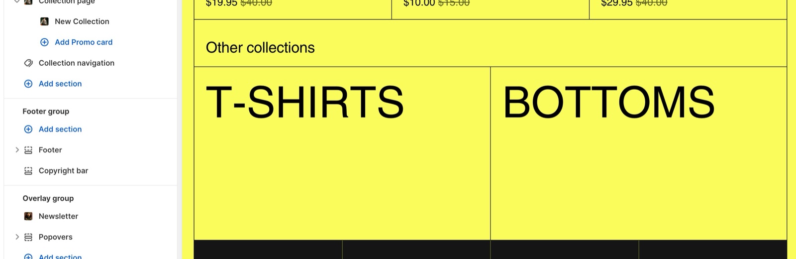
The Collection navigation section of Borders shows links to other collections under a collection, with optional images.
Applies to: Borders 3.1.0 and later. Added in: Borders 1.0.0. Last checked: 2026-10-13 against Borders 3.1.0.
The Collection navigation section shows links to two other collections, the previous one and the next one, at the bottom of a collection page. Customers can move through your collections without going back to the menu.
Where to find it: Online Store → Themes → Customize → Collections → Default collection → Add section → Collection navigation. It can only be added to collection templates.
Content
- The section picks the collections by itself: the one before and the one after the current collection in your store's list of collections. After the last collection it starts again from the first. The home page collection is skipped.
- The collections show as large text links.
- Show collection image adds each collection's image. A collection without an image uses the featured image of its first product. Media shape sets the shape of the images (fully rounded by default).
- Heading (default "Other collections"), Heading tag and Hide heading border set the section heading.
- The section footer adds an optional button with Button label and Button link, for example to a page with all collections.
Add the collection navigation
Open a collection template
In the theme editor, open the page picker and choose Collections → Default collection, or another collection template.
Add the section
Select Add section → Collection navigation and drag it below the Collection page section.
Choose the look
Turn on Show collection image for images, choose a Media shape, and write the Heading.
Can I choose which collections the navigation shows?
No. Borders always shows the previous and the next collection. To show collections of your choice, use the Collection list section instead.
All Collection navigation settings
Every setting on this page, with its type and default.
Collection navigation section: Section heading
Where to find it: Collection navigation → Section heading
Heading (text box, default: "Other collections").
Heading tag (dropdown, default: H2): Specify heading level to help search engines index the structure of your page. Options: H1, H2, H3, H4, span.
Hide heading border (checkbox, default: off).
Show collection image (checkbox, default: off): Shows the image of the previous and next collections. A collection without an image uses the image of its first product.
Media shape (dropdown, default: Fully rounded): Sets the shape of the collection images. Options: None, Top rounded, Right rounded, Bottom rounded, Left rounded, Fully rounded.
Collection navigation section: Section footer
Where to find it: Collection navigation → Section footer
Button label (text field).
Button link (link).
Open link in a new window (checkbox, default: off).
Collection navigation section: Section design
Where to find it: Collection navigation → Section design
Color scheme (color scheme, default: scheme_1).
Hide section bottom border (checkbox, default: off).
Related pages
- Collection page: the main section of the collection template.
- Collection description section: the other section for collection templates.
- Collection list section: collections you choose yourself.
Collection page
The Collection page section of Borders sets the collection banner, the product grid, filters and sorting, and promo cards inside the grid.
Collection description
The Collection description section of Borders shows the collection description as its own section, for long texts below the grid.