Collection page
The Collection page section of Borders sets the collection banner, the product grid, filters and sorting, and promo cards inside the grid.
Applies to: Borders 3.1.0 and later. Added in: Borders 1.0.0. Last checked: 2026-10-13 against Borders 3.1.0.
The Collection page section shows a collection: its title, an optional banner with the collection image and description, the product grid, the filters and sorting, and promo cards placed between the products. The look of each product card is set in Product card theme settings.
Where to find it: Online Store → Themes → Customize → Collections → Default collection → Collection page
Collection banner
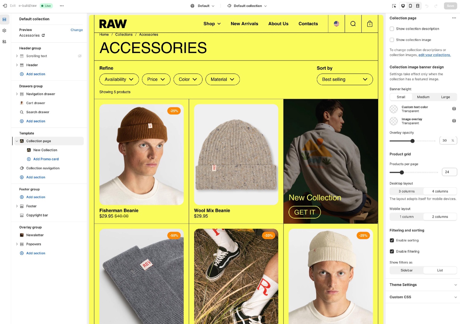
- Show collection description shows the description under the title. Show collection image turns the collection image into a banner behind the title. Both come from Shopify admin → Products → Collections.
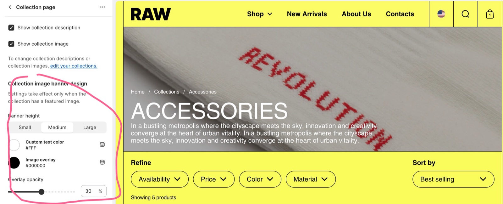
- Once Show collection image is on, the Collection image banner design settings appear: Banner height (Small, Medium, Large), Custom text color, Image overlay and Overlay opacity.
- Hide on mobile devices removes the banner on phones. Image position on mobile devices shows the image as the background (the default), or above or below the description on mobile. The custom colors apply only to the background position.
The collection needs a featured image in order to show the banner.
For a long description, show it below the products with the Collection description section instead.
Product grid
- Products per page sets how many products show before the pagination, 12 to 248.
- Desktop layout sets 3, 4 or 5 columns. Smaller screens show fewer.
- Mobile layout sets 1 or 2 columns on phones.
Filtering and sorting
- Enable sorting adds the sort menu (best selling, price, date and so on).
- Enable filtering adds the filters. Show filters as: Sidebar shows them in a column beside the products on desktop, which takes one of the Desktop layout columns; List shows them in a row above the products.
- Image filter layout shows filters with images, such as Shopify's visual swatch filters, in 1 or 2 columns.
- Which filters exist is decided in the Shopify Search & Discovery app, not in Borders.
To configure the filters on your store you will need to install Shopify Search & Discovery app.
Setting up filters
Install Search & Discovery
Install the Shopify Search & Discovery app from the Shopify App Store.
Add the filters
In the app, open Filters → Add filter and add the filters you need, for example availability, price, size or color.
Turn on filtering and sorting
In the theme editor, select the Collection page section and turn on Enable filtering and Enable sorting.
Choose the layout
Set Show filters as to Sidebar or List, and Image filter layout for filters with images.
Promo cards
A Promo card block adds a card between the products, to write about the collection or to promote a product, a sale or another collection.
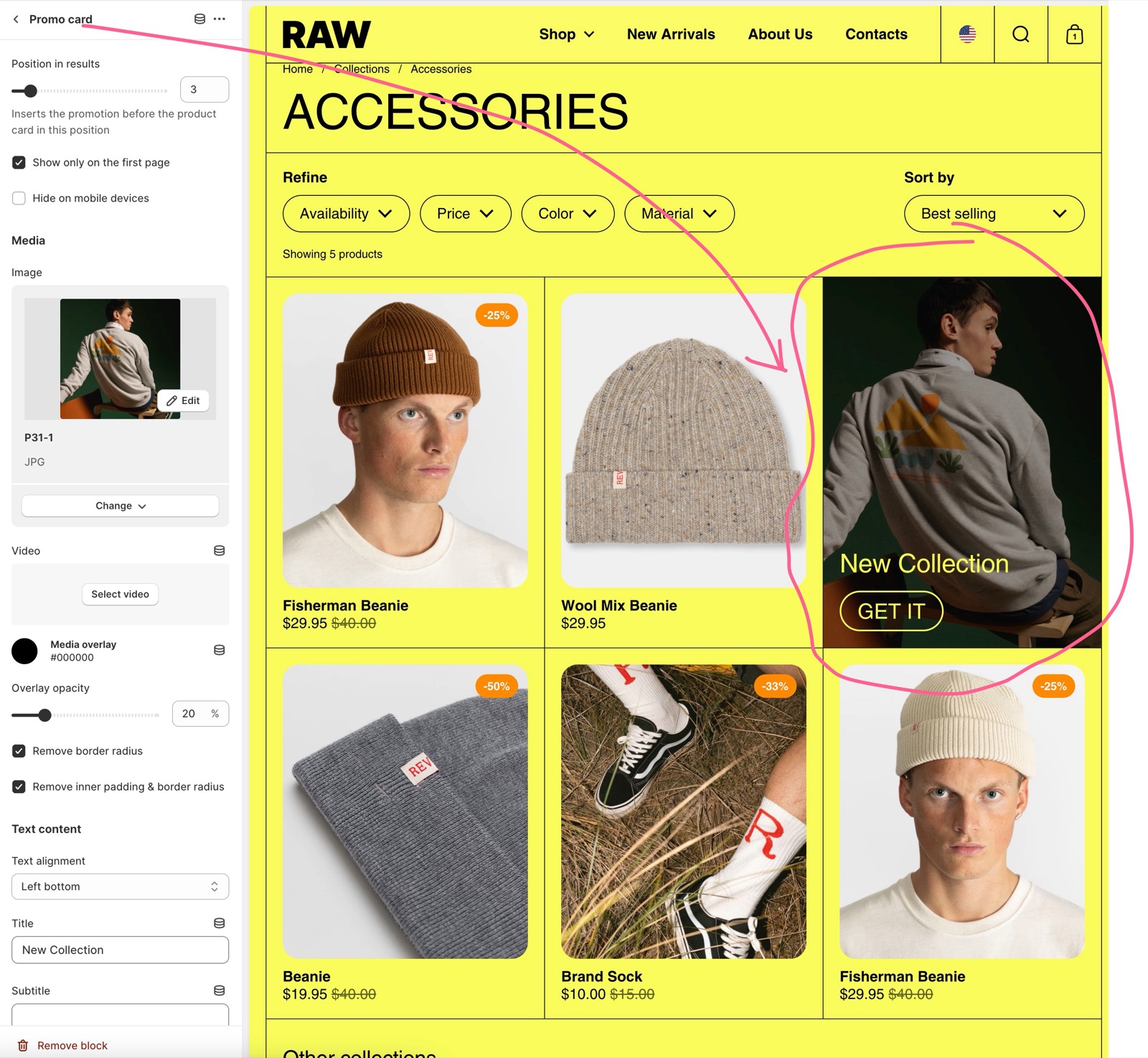
- Position in results (1 to 24) puts the card before the product at that position. On a page with fewer products, the card goes to the end.
- The card shows on every page of the collection. Show only on the first page limits it to page 1. Hide on mobile devices removes it on phones.
- Media: Image or Video, Media overlay and Overlay opacity, Remove border radius and Remove inner padding & border radius.
- Text content: Text alignment, Title, Subtitle, Text color, Button label and Link. Without a button label, the whole card is a link.
Setting up promo cards in the grid
Add the block
Select Collection page, then Add block → Promo card.
Place it
Set Position in results, for example 3 to show it as the third card. Turn on Show only on the first page if it should not repeat on the next pages.
Add the media
Choose an Image or a Video, and a Media overlay if the text needs more contrast.
Write the text
Write the Title and Subtitle, and set Text alignment and Text color.
Add the link
Set the Link. Add a Button label for a button, or leave it empty to make the whole card a link.
Promo cards show in every collection that uses this template.
Can I show a promo card in one collection only?
Yes, with a collection template of its own.
Create a collection template
In the theme editor, open the page picker, choose Collections and create a new template, for example "sale".
Add the promo card
In the new template, add the Promo card block to the Collection page section and set it up.
Assign the template
In Shopify admin → Products → Collections, open the collection and choose the new template under Theme template.
Why does my collection banner not show?
Show collection image is off, or the collection has no image. Turn on Show collection image in the Collection page section, and add an image to the collection in Shopify admin → Products → Collections. If Hide on mobile devices is on, the banner is also hidden on phones.
How do I add filters?
With the Shopify Search & Discovery app; Borders only shows them. Follow Setting up filters. Filters for availability, price, product type, vendor, tags, options and metafields are possible. See Shopify's Search & Discovery filters.
All Collection page settings
Every setting on this page, with its type and default.
Accepts these blocks: Promo card.
Show collection description (checkbox, default: on): Shows the collection description under the title.
Show collection image (checkbox, default: off): Shows the collection image as a banner behind the title. The collection needs an image in Shopify admin.
To change collection descriptions or collection images, edit your collections in Shopify admin.
Collection page section: Collection image banner design
Where to find it: Collections → Default collection → Collection page → Collection image banner design
Banner height (dropdown, default: Small): Sets the height of the collection banner. Options: Small, Medium, Large. Shown only when Show collection image is on.
Custom text color (color, default: transparent): Sets the color of the title and description over the banner. Leave it transparent to use the color scheme. Shown only when Show collection image is on.
Image overlay (color, default: transparent): Tints the banner image so the text stays readable. Shown only when Show collection image is on.
Overlay opacity (slider 0 to 60 %, default: 30 %). Shown only when: “Show collection image” and “Image overlay” != 'rgba(0,0,0,0)'.
Hide on mobile devices (checkbox, default: off): Hides the banner image on phones. Shown only when Show collection image is on.
Image position on mobile devices (dropdown, default: Background): Shows the banner image as the background, or above or below the description on mobile. Only Background uses the custom colors. Options: Background, Above description, Below description. Shown only when Show collection image is on and Hide on mobile devices is off.
Collection page section: Product grid
Where to find it: Collections → Default collection → Collection page → Product grid
Products per page (slider 12 to 248, step 4, default: 24): Sets how many products show per page before the pagination.
Desktop layout (dropdown, default: 4 columns): Sets the columns of the product grid on desktop. With the filters as a sidebar, the sidebar takes one of them. Options: 3 columns, 4 columns, 5 columns.
Mobile layout (dropdown, default: 2 columns). Options: 1 column, 2 columns.
Collection page section: Filtering and sorting
Where to find it: Collections → Default collection → Collection page → Filtering and sorting
Enable sorting (checkbox, default: on).
Enable filtering (checkbox, default: on).
Show filters as (dropdown, default: Sidebar): Shows the filters in a sticky column beside the products on desktop (Sidebar) or in a row above them (List). Options: Sidebar, List.
Image filter layout (dropdown, default: 1 column): Shows filters with images, such as visual swatch filters, in 1 or 2 columns. Options: 1 column, 2 columns.
Collection page section: Section design
Where to find it: Collections → Default collection → Collection page → Section design
Color scheme (color scheme, default: scheme_1).
Hide section bottom border (checkbox, default: off).
Promo card block
Where to find it: Collections → Default collection → Collection page → Add block → Promo card
Up to 6 Promo card blocks per section.
Position in results (slider 1 to 24, default: 1): Inserts the card before the product at this position on each page. With fewer products on the page, the card goes to the end.
Show only on the first page (checkbox, default: off): Shows the card only on the first page of the collection.
Hide on mobile devices (checkbox, default: off): Hides the card on phones.
Promo card block: Media
Where to find it: Collections → Default collection → Collection page → Add block → Promo card → Media
Image (image).
Video (video): Plays a muted, looping video instead of the image.
Media overlay (color, default: transparent): Tints the media so the text stays readable.
Overlay opacity (slider 0 to 100 %, default: 30 %).
Remove border radius (checkbox, default: on).
Remove inner padding & border radius (checkbox, default: on).
Promo card block: Text content
Where to find it: Collections → Default collection → Collection page → Add block → Promo card → Text content
Text alignment (dropdown, default: Left bottom). Options: Left top, Center top, Right top, Left middle, Center middle, Right middle, Left bottom, Center bottom, Right bottom.
Title (text field, default: "Write your best promotion yet").
Subtitle (text field).
Text color (color, default: #000).
Button label (text field).
Link (link): Sets the link. Without a Button label, the whole card is the link.
Open link in a new window (checkbox, default: off).
Related pages
- Product card theme settings: the look of the products in the grid.
- Collection navigation section: links to the previous and next collection.
- Collection description section: the description below the grid.
- Color swatches theme settings: swatches in the filters.
- Troubleshoot product and collection pages: common problems.
Product recommendations
The Product recommendations section of Borders shows related products under the product page, chosen by Shopify or the Search & Discovery app.
Collection navigation
The Collection navigation section of Borders shows links to other collections under a collection, with optional images.