Borders theme settings
The Borders theme settings set the style, width and padding of the container, primary and secondary borders, and the borders in drawers.
Applies to: Borders 3.1.0 and later. Added in: Borders 1.0.0. Last checked: 2026-10-13 against Borders 3.1.0.
The Borders theme settings draw the lines of the Borders grid: around the store, between grid items and between sections. They set the style, width and padding of each kind of line. The line color comes from the Borders color of each section's color scheme (Colors theme settings).
Where to find it: Theme settings → Borders
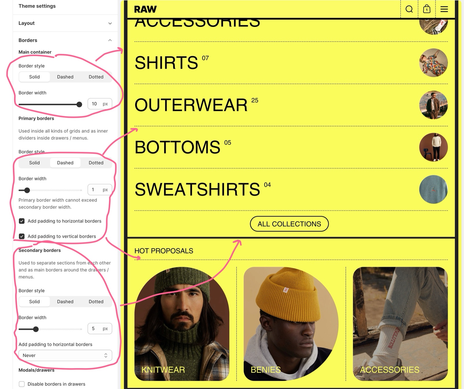
Main container
The main container border is the line around your entire store.
- Border style sets Solid, Dashed or Dotted.
- Border width sets the thickness, 0 to 20 px. 0 removes the line.
- The border sits inside the margins set in Layout theme settings.
If you check the "Remove margins on mobile" option in the Layout settings, the border you set here will not be visible on mobile devices.
Primary borders
Primary borders are the lines you see most: between all inner grid items (product cards, blocks, columns), and as inner dividers inside drawers and menus.
- Border style sets Solid, Dashed or Dotted (default: Dotted).
- Border width sets the thickness, 0 to 20 px.
- Add padding to horizontal borders shortens the horizontal lines so they stop at the grid item's inner padding instead of touching the edges.
- Add padding to vertical borders does the same for the vertical lines.
- The padding takes its value from Inner padding in Theme settings → Layout.
- You can hide these lines in one section with Hide borders in that section's design settings.
The width of this border is maxed out at the secondary borders width. For example, if your primary borders have 10px width but your secondary borders have 5px width, your primary border will only display a 5px width.
Secondary borders
Secondary borders separate sections from each other: you see them at the bottom of each section. They are also the outer borders of drawers and menus.
- Border style sets Solid, Dashed or Dotted.
- Border width sets the thickness, 0 to 20 px. 0 removes the line under every section.
- Add padding to horizontal borders insets the lines under sections by the grid Inner padding:
- Never: the lines run the full width.
- Main content area: the lines are inset in the page sections and the footer; the header area keeps full-width lines.
- Everywhere: the lines are inset everywhere, including the Header, Announcement bar and header Scrolling text sections.
- You can hide the line under one section with Hide section bottom border in that section's design settings.
Modals/drawers
Drawers and modals use the border styles set above, always at 1 px wide.
- Disable borders in drawers removes the lines inside drawers and modals completely.
Setting up the border style of your store
Style the border around the store
Open Theme settings → Borders → Main container. Choose Border style and set Border width, or set the width to 0 for no frame.
Set the secondary borders first
Under Secondary borders, choose Border style and Border width.
Set the primary borders
Under Primary borders, choose Border style and a Border width equal to or below the secondary width.
Add padding to the lines (optional)
Turn on Add padding to horizontal borders and Add padding to vertical borders for primary borders, and choose Main content area or Everywhere for secondary borders. The padding is the grid Inner padding from Theme settings → Layout.
Decide on drawer borders
Under Modals/drawers, turn on Disable borders in drawers for drawers and modals without lines.
Set the line color
Open Theme settings → Colors and edit the Borders color of each color scheme. Sections that use that scheme draw their lines in that color.
Why is my primary border thinner than I set it?
Borders limits the primary border width to the secondary border width. A 10 px primary border with a 5 px secondary border shows at 5 px. Raise the secondary Border width to make primary borders thicker.
How do I hide the borders of one section?
Use the section's own design settings. Hide section bottom border removes the line under the section, Hide borders removes the lines between its grid items, and Hide heading border removes the line under its heading. See General section styling.
Can I change the color of the borders?
Yes, per color scheme. Each scheme in Theme settings → Colors has a Borders color, used by every section with that scheme. To have lines of a different color in one section, give that section a different color scheme.
All Borders settings
Every setting on this page, with its type and default.
Borders theme settings: Main container
Where to find it: Theme settings → Borders → Main container
Border style (dropdown, default: Solid): Sets the line style of the border around the whole store. Options: Solid, Dashed, Dotted.
Border width (slider 0 to 20 px, default: 1 px): Sets the thickness of the border around the whole store; 0 removes it. The border is hidden below 475 px when Remove margins on mobile is on (Theme settings → Layout).
Borders theme settings: Primary borders
Where to find it: Theme settings → Borders → Primary borders
Used inside all kinds of grids and as inner dividers inside drawers / menus.
Border style (dropdown, default: Dotted): Sets the line style between grid items (product cards, blocks, columns) and of the inner dividers in drawers and menus. Options: Solid, Dashed, Dotted.
Border width (slider 0 to 20 px, default: 1 px): Primary border width cannot exceed secondary border width.
Add padding to horizontal borders (checkbox, default: off): Shortens the horizontal lines between grid items by the grid Inner padding (Theme settings → Layout), so they do not touch the item edges.
Add padding to vertical borders (checkbox, default: off): Shortens the vertical lines between grid items by the grid Inner padding (Theme settings → Layout), so they do not touch the item edges.
Borders theme settings: Secondary borders
Where to find it: Theme settings → Borders → Secondary borders
Used to separate sections from each other and as main borders around the drawers / menus.
Border style (dropdown, default: Solid): Sets the line style under each section and of the outer borders of drawers and menus. Options: Solid, Dashed, Dotted.
Border width (slider 0 to 20 px, default: 1 px): Sets the thickness of the line under each section; 0 removes the lines under all sections. It is also the maximum width of primary borders.
Add padding to horizontal borders (dropdown, default: Never): Insets the lines under sections by the grid Inner padding: Never keeps them full width, Main content area insets them in page sections and the footer, Everywhere also in the Header group sections. Options: Never, Main content area, Everywhere.
Borders theme settings: Modals/drawers
Where to find it: Theme settings → Borders → Modals/drawers
Disable borders in drawers (checkbox, default: off): Removes the lines inside drawers and modals. When off, they use the border styles above at 1 px.
Related pages
- Layout theme settings: margins and grid padding.
- General section styling: Hide section bottom border and Hide borders.
Layout theme settings
The Layout theme settings of Borders set the margins of the main container, the fixed width layout and the padding and radius of grid items.
Colors theme settings
The Colors theme settings of Borders define the color schemes, the default color scheme for pages without one, the body background and drawer colors.