Rich blocks section
The Rich blocks section of Borders builds grids or sliders of blocks with media, title, subtitle and button, for promotions, galleries and links.
Applies to: Borders 3.1.0 and later. Added in: Borders 1.0.0. Last checked: 2026-10-13 against Borders 3.1.0.
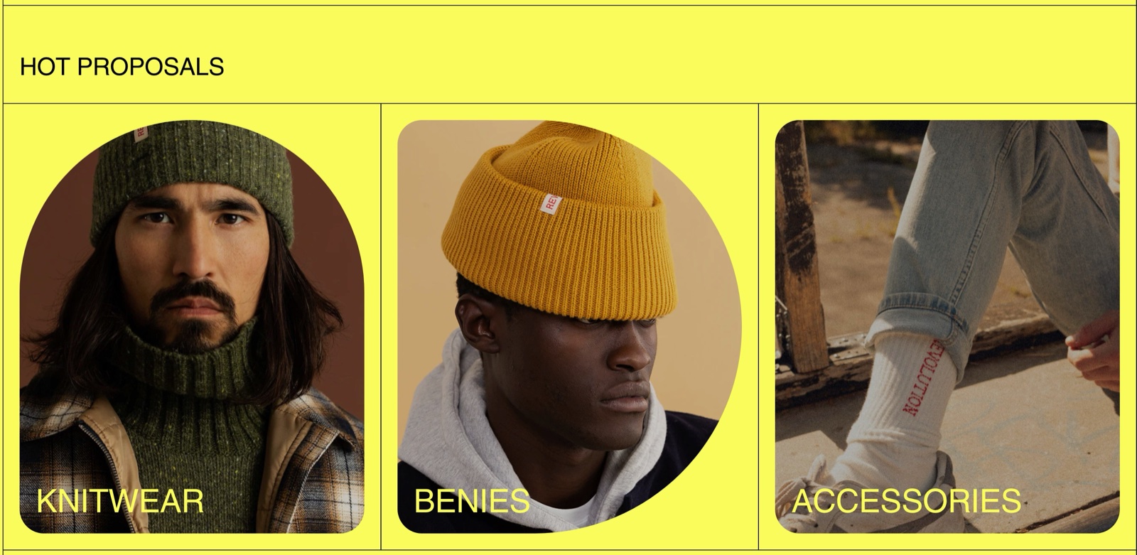
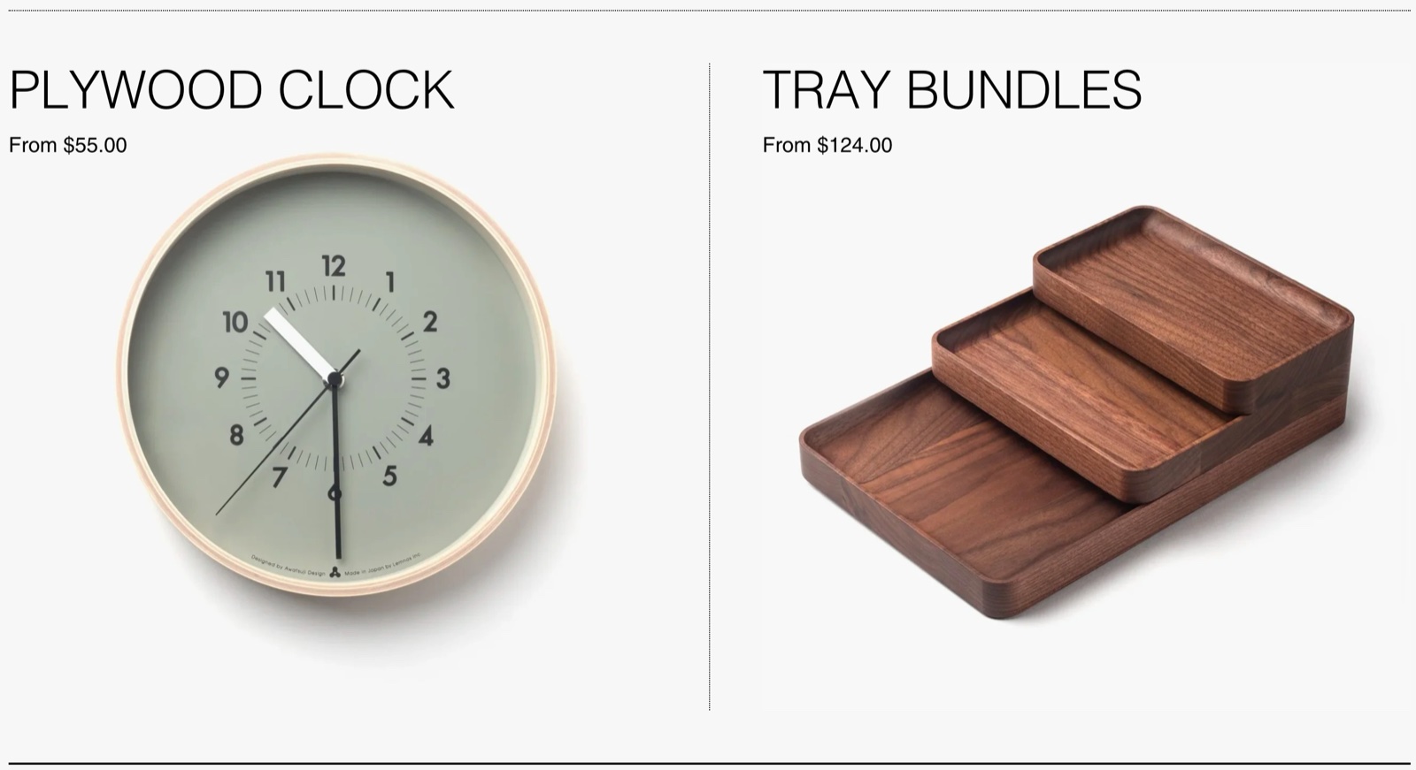
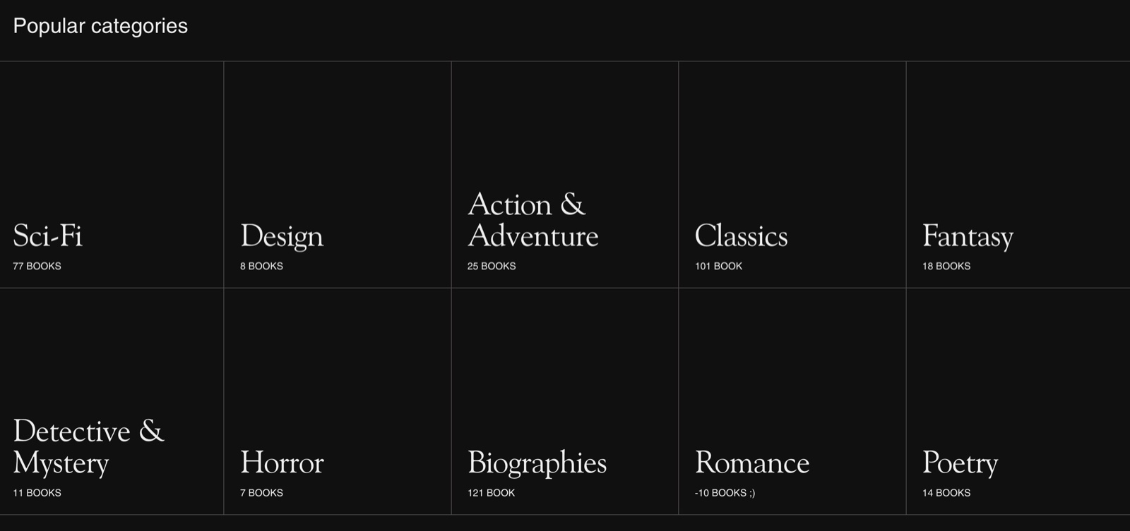
The Rich blocks section lays out blocks in a grid or a slider. Each block has an image or video as background, a title, a subtitle and an optional button. Use it for promotion tiles, category links, galleries, lookbooks or text-only cards. Older Borders docs call it "Promotion blocks".
Where to find it: select Add section in the theme editor, then choose Rich blocks.
Layout
- Desktop layout sets 1 to 6 columns on desktop. With 4 to 6 columns, smaller screens show fewer (3 or 4).
- Mobile layout sets 1 or 2 columns on phones.
- Style shows the blocks as a Grid, or as a Slider that customers swipe or move with arrows.
- Minimum aspect ratio gives every block the same minimum height, from Wide (2:1) to Taller (2:3). The media fills the block. When a block's text needs more room, the block grows, and every block in that row grows with it.
- Upload images and videos close to the ratio you choose, so little is cropped. See Recommended image sizes.
Typography
The typography settings apply to every block:
- Text alignment places the text in one of nine positions inside the block.
- Text container width limits the text to Small (50 percent), Medium (70 percent) or Large (the full width) of the block.
- Title font, Title size and Mobile text size style the block titles. Subtitle size sets the subtitles.
- Text spacing sets the space between title, subtitle and button, -12 to 60 px.
- Text content padding sets the space between the text and the block edges.
Button style
- Button style sets Outline or Solid.
- Button size sets Small, Regular or Large.
- Button hover: Arrow fills the button with the accent color and shows an arrow on hover, Accent slides the accent color in behind the label.
The section footer (Button label, Button link) adds one button below the whole section; in Slider style it also holds the arrows on mobile. See General section styling for the section heading, footer and design settings.
Blocks
Each Block is one tile. The section holds up to 12 blocks.
- Image or Video is the block background. A video plays muted and in a loop; the Image is its fallback on mobile devices where autoplay is off.
- Media overlay and Overlay opacity (0 to 60 percent) tint the media so the text stays readable.
- Media shape rounds the media on one side or all sides.
- Add borders to media draws a border around the media. It works only when Media shape is None.
- Hide media removes the image and video: the block shows only its text, on the Media overlay color at full strength.
- Title and Subtitle are the block texts. Color scheme sets their colors and the button colors.
- Button label and Link add a button. With a Link but no Button label, the entire block becomes a link, and its image uses the hover effect from Theme settings → Animations → Image mouse over animations.
- Open link in a new window opens the link in a new tab.
- Heading tag sets the SEO tag of the title (default H3).
- Hide section if dynamic content is not present (section setting) hides blocks that have no image, video, title or subtitle, and the whole section when every block is empty. Use it when the block content comes from metafields.
Setting up a promotion grid
Add the section
In the theme editor, select Add section and choose Rich blocks.
Choose the layout
Set Desktop layout, Mobile layout and Style (Grid or Slider).
Set the block shape
Choose Minimum aspect ratio and prepare your images at that ratio.
Add a block per promotion
Select Add block → Block. Set Image or Video, Title and Subtitle.
Link the block
Either set only a Link, to make the whole block clickable, or add a Button label too, to show a button.
Style the text and buttons
Set Text alignment, Text container width, the title and subtitle sizes, Text spacing and Text content padding, then the button style.
Make text-only blocks (optional)
For a category grid without images, turn on Hide media on each block and set Media overlay to the background color.
Why are my blocks different heights?
They are the same minimum height, but a block grows when its text needs more room than Minimum aspect ratio gives it, and the other blocks in that row grow with it. Shorten the text, lower Title size, or choose a taller Minimum aspect ratio.
Why doesn't my linked block show a hover effect?
The block has a Button label, or the image hover is off. Only a block with a Link and no Button label becomes one big link with the image hover. The effect itself is set in Animations theme settings and does not run on touch screens.
All Rich blocks settings
Every setting on this page, with its type and default.
Accepts these blocks: Block (up to 12 blocks in the section).
Rich blocks section: Section heading
Where to find it: Rich blocks → Section heading
Heading (text box, default: "Rich blocks").
Heading tag (dropdown, default: H2): Specify heading level to help search engines index the structure of your page. Options: H1, H2, H3, H4, span.
Hide heading border (checkbox, default: off).
Rich blocks section: Layout
Where to find it: Rich blocks → Layout
Desktop layout (dropdown, default: 3 columns): Sets the number of block columns on desktop. With 4 to 6 columns, smaller desktop and tablet screens show 3 or 4. Options: 1 column, 2 columns, 3 columns, 4 columns, 5 columns, 6 columns.
Mobile layout (dropdown, default: 1 column). Options: 1 column, 2 columns.
Style (dropdown, default: Grid): Shows the blocks as a grid, or as a slider customers swipe or move with arrows. Options: Slider, Grid.
Minimum aspect ratio (dropdown, default: Square (1:1)): Sets the minimum height of every block as an aspect ratio; the media fills the block. A block with more text grows, and its row grows with it. Options: Wide (2:1), Landscape (16:9), Short (4:3), Square (1:1), Tall (5:6), Taller (2:3).
Rich blocks section: Typography
Where to find it: Rich blocks → Typography
Text alignment (dropdown, default: Left bottom): Places the block text in one of nine positions inside the block. Options: Left top, Center top, Right top, Left middle, Center middle, Right middle, Left bottom, Center bottom, Right bottom.
Text container width (dropdown, default: Large): Limits the text to 50 percent (Small), 70 percent (Medium) or the full width (Large) of the block. Options: Small, Medium, Large.
Title font (dropdown, default: Headings). Options: Body, Headings.
Title size (dropdown, default: Regular). Options: Extra small, Small, Regular, Large, Extra large, Huge.
Mobile text size (dropdown, default: Default): Scales the block titles on screens narrower than 768 px: Small 75 percent, Medium 90 percent, Large 120 percent. Options: Default, Small, Medium, Large.
Subtitle size (dropdown, default: Regular). Options: Extra small, Small, Regular, Large.
Text spacing (slider -12 to 60 px, default: 12 px): Sets the space between the title, subtitle and button of each block.
Text content padding (dropdown, default: Regular): Sets the space between the block text and the block edges. Options: None, Small, Regular, Large.
Rich blocks section: Button style
Where to find it: Rich blocks → Button style
Button style (dropdown, default: Outline). Options: Outline, Solid.
Button size (dropdown, default: Regular). Options: Small, Regular, Large.
Button hover (dropdown, default: Arrow): Sets the hover effect of block buttons: Arrow fills the button with the accent color and shows an arrow, Accent slides the accent color in behind the label. Options: Arrow, Accent.
Rich blocks section: Section footer
Where to find it: Rich blocks → Section footer
Button label (text field).
Button link (link).
Rich blocks section: Section design
Where to find it: Rich blocks → Section design
Color scheme (color scheme, default: scheme_1).
Hide section bottom border (checkbox, default: off).
Rich blocks section: Inner content design
Where to find it: Rich blocks → Inner content design
Hide borders (checkbox, default: off).
Remove border radius (checkbox, default: off).
Remove inner padding & border radius (checkbox, default: off).
Rich blocks section: Dynamic content
Where to find it: Rich blocks → Dynamic content
Hide section if dynamic content is not present (checkbox, default: off): Hides blocks with no image, video, title or subtitle (for example empty dynamic sources), and the whole section when every block is empty.
Block block
Where to find it: Rich blocks → Add block → Block
Image (image).
Video (video): Plays a Shopify-hosted video as the block background, muted and in a loop. The Image is the fallback where autoplay is off.
Media overlay (color, default: transparent): Lays a color over the block media. With Hide media on, this color fills the block as its background.
Overlay opacity (slider 0 to 60 %, default: 30 %).
Media shape (dropdown, default: None): Gives the block media a rounded shape on one side or all sides. Options: None, Top rounded, Right rounded, Bottom rounded, Left rounded, Fully rounded.
Add borders to media (checkbox, default: off): Borders will be added only when media shapes are not used.
Hide media (checkbox, default: off): Hides the image and video, so the block shows only its text on the Media overlay color.
Block block: Text content
Where to find it: Rich blocks → Add block → Block → Text content
Title (text field, default: "Promotion").
Subtitle (text box, default: "Write about it").
Color scheme (color scheme, default: scheme_1): Sets the colors of the block's title, subtitle and button.
Button label (text field).
Link (link): The block link. Without a Button label, the whole block becomes the link and its image uses the Image mouse over animation from Theme settings → Animations.
Open link in a new window (checkbox, default: off).
Block block: SEO
Where to find it: Rich blocks → Add block → Block → SEO
Heading tag (dropdown, default: H3): Specify heading level to help search engines index the structure of your page. Options: H1, H2, H3, H4, span.
Related pages
- Recommended image sizes: match the Minimum aspect ratio.
- Animations theme settings: the hover effect of linked blocks.
- General section styling: section heading, footer and design settings.
- Vertical slider section: full-height slides with the same kind of blocks.