Product card theme settings
The Product card theme settings style Highlight's product cards: media ratio, hover effect, color swatches, sale price color, ratings and quick buy.
Applies to: Highlight 4.1.0 and later. Added in: Highlight 1.0.0. Last checked: 2026-10-13 against Highlight 4.1.0.
The product card is the product image with its title and price in collection pages, search results, the Featured collection, Products slider and Product recommendations sections. Its settings apply to every product card in the store. Highlight has no product card block; everything is set here.
Where to find it: Theme settings → Product card
Media and hover effect
- Media aspect ratio sets the shape of product images. Uncropped: Natural keeps each image's own shape; the cropped options resize every image to the same shape. Natural works well in the Asymmetrical layout, where images of different shapes sit side by side. In a regular grid, a cropped ratio gives a cleaner layout.
- Desktop animation style sets how the image reacts when the mouse is over the card: Subtle zoom enlarges the image a little, Slight movement lifts it up.
- Show second product media on hover shows the product's second image when the mouse is over the card. It needs at least two product images.
Both hover effects work only on desktop, where there is a mouse. On phones and tablets the first tap opens the product page.
Color swatches
- Show color swatches shows the color values of each product as small circles under the price.
- Color swatches labels lists the option names that become swatches, separated by commas, for example
color,colour. Options whose values have Shopify swatches become swatches too. - Selecting a swatch on a card shows that variant's image on the card, and the card then links to that variant.
Where the swatch colors and images come from, and how to set them up, is in Color swatches.
Sale price color
- Sale price color sets the color of the current price of products on sale in product cards. The compare-at price next to it stays in a lighter text color.
- When the setting is empty, the price uses the text color.
Product rating
- Show rating shows the product's average rating under the price, for example "4.5 / 5" with a star.
- Rating app tells Highlight which review app holds your ratings. Highlight reads the rating from the app's product metafields (Shopify Reviews, Judge.me, Loox, Rapid Reviews, Air Reviews) or shows the app's own star widget (Stamped, Yotpo, Ali Reviews).
- The same Rating app is used by Show product rating in the Product header block of the Product page.
Showing ratings from a review app
Install a review app
Install one of the apps in the Rating app list from the Shopify App Store and collect a few reviews. See Recommended rating apps.
Turn on the app's storefront part
Follow the app's own setup. Stamped, Yotpo and Ali Reviews need their app embed turned on in the theme editor (the App embeds icon in the sidebar), because their stars are drawn by the app's script. The other apps store the rating in product metafields.
Choose the app in Highlight
Open Theme settings → Product card → Product rating, select your app in Rating app and turn on Show rating.
Check a collection page
Open a collection with a reviewed product. The rating shows under the price; products without reviews show nothing.
Third party apps may require additional steps to be properly integrated. If no stars show, check with the app's support that it writes its ratings to product metafields or loads its widget on collection pages.
Quick buy
Enable quick buy adds a button to the product image of available products:
- A product without variants gets an "Add to cart" button that adds it to the cart straight away and opens the cart drawer, or the cart page when Cart type is Page.
- A product with variants gets a "Choose options" button that opens the product in a popup, where the customer picks the variant.
- On desktop the button slides in when the mouse is over the image. On screens narrower than 1024 px it is a small cart icon that is always visible.
- Sold-out products get no button.
What the popup shows is set in the Quick view template.
Setting up unique product badges (icons)
A unique product badge is a small icon and a very short text above the product image in the product grid, for example "Breathable fabric" or "Gift packaging". It comes from two product metafields, so each product can have its own. Highlight has had it since 2.0.0.
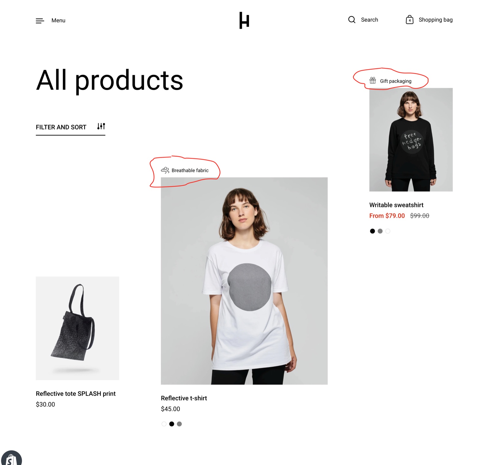
Create the icon metafield
In Shopify admin, open Settings → Metafields and metaobjects → Products and select Add definition. Enter unique_feature.icon as the namespace and key, and choose the type File (images).
Create the title metafield
Add a second definition with the namespace and key unique_feature.title and the type Single line text.
Fill the metafields on your products
Open a product and scroll to its metafields. Upload a square PNG icon (48 x 48 px looks sharp) to the icon field and write a very short text in the title field. Either one alone also works.
Check a collection page
Open a collection page or a Featured collection section that contains the product. The badge sits above the product image.
The namespace and key must be exactly unique_feature.icon and unique_feature.title. Highlight ignores metafields with another namespace, such as custom.icon, and an icon written as a URL in a text field.
The badges show in the Collection page, the Featured collection section and search results. Highlight does not show them in the Products slider, Product recommendations or Popups sections, or on sold-out products, which show the Sold out badge instead. The icon is shown at 24 x 24 px and cropped to a square.
This video shows the setup from 0:30. It was recorded on Highlight 2.0 with the Shopify admin of 2021, so some labels differ.
Why does the hover effect not work on phones?
Because phones and tablets have no mouse. Desktop animation style and Show second product media on hover react to the mouse pointer only, so on touch screens the first tap opens the product page instead. This is how Highlight is designed, not a setting.
Why does my unique product badge not show?
Check these in order:
- The metafields are product metafields named exactly
unique_feature.icon(File) andunique_feature.title(Single line text). - The product has a value in at least one of them.
- You are looking at a Collection page, a Featured collection section or search results, not a Products slider or Product recommendations.
- The product is not sold out. Sold-out products show the Sold out badge instead.
More answers are in Troubleshoot product and collection pages.
All Product card settings
Every setting, with its type and default.
Media aspect ratio (dropdown, default: Uncropped: Natural): Sets the shape of product images in product cards. Natural keeps each image's own shape and suits the Asymmetrical layout; the cropped options resize every image to the same shape. Options: Uncropped: Natural, Cropped: Short (4:3), Cropped: Square (1:1), Cropped: Tall (5:6), Cropped: Taller (2:3).
Desktop animation style (dropdown, default: Subtle zoom): Sets how the image reacts when the mouse is over a product card: Subtle zoom enlarges it a little, Slight movement lifts it up. Desktop only. Options: Subtle zoom, Slight movement.
Show second product media on hover (checkbox): Shows the product's second image when the mouse is over the card. Desktop only; the product needs at least two images.
Show color swatches (checkbox, default: off): Shows the values of color options as swatches under the price; selecting a swatch shows that variant's image and links the card to the variant. Swatches come from Shopify swatches, image files in Content → Files or color names (see Color swatches).
Color swatches labels (text field, default: "color,colour,couleur,cor,colore,culoare,farbe,색,色,カラー,färg,farve,szín,barva"): Lists the option names, separated by commas, that become swatches. Write them in lower case, without spaces after the commas. Options whose values have Shopify swatches become swatches anyway.
This theme also offers support for color swatches created with category metafields. Shopify Help Center.
Product card theme settings: Product caption
Where to find it: Theme settings → Product card → Product caption
Sale price color (color): Sets the color of the current price of products on sale in product cards. When empty, the price uses the text color.
Product card theme settings: Product rating
Where to find it: Theme settings → Product card → Product rating
To display ratings, add a product rating app. Learn more.
Show rating (checkbox, default: off): Shows the product's average rating under the price, for example 4.5 / 5, from the app chosen in Rating app.
Rating app (dropdown, default: Shopify Reviews (deprecated)): Sets which review app the ratings come from, in product cards and in the Product header block of the product page. Shopify Reviews, Judge.me, Loox, Rapid Reviews and Air Reviews are read from product metafields; Stamped, Yotpo and Ali Reviews show the app's own widget, which needs the app's script. Options: Shopify Reviews (deprecated), Loox, Judge.me, Stamped, Yotpo, Ali Reviews, Rapid Reviews, Air Reviews.
Product card theme settings: Quick buy
Where to find it: Theme settings → Product card → Quick buy
Adds an instant "add to cart" button. If the product has variants, it will display a "quick buy" popup.
Enable quick buy (checkbox, default: on): Adds a button to the image of available products: Add to cart for products without variants, Choose options for products with variants, which opens the Quick view popup.
Related pages
- Color swatches: the three ways to make swatches.
- Quick view: the popup that Quick buy opens.
- Cart theme settings: the thumbnail aspect ratio in the cart and search.
- Collection page: the Asymmetrical layout and the promotional block.