Caption block
The Caption block of Combine adds a short line of small text, or a badge when it has a background color, inside flex sections.
Applies to: Combine 4.2.0 and later. Added in: Combine 3.1.0. Last checked: 2026-10-13 against Combine 4.2.0.
The Caption block adds a short line of small text, such as a tagline above a heading or a note under a button. Give it a background color and it turns into a badge.
Where to find it: in a Flex slideshow, Flex grid, Flex cards or Flex columns section, select Add block inside a slide, card or column, then choose Caption. You can also add it inside a Content group block.
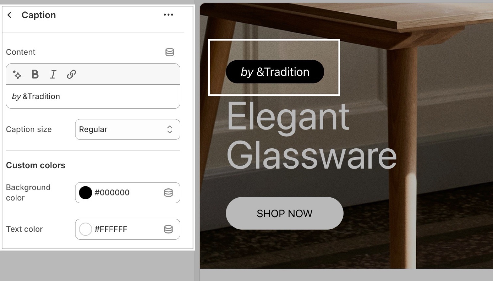
Content and size
- Content is the caption text. It takes bold, italic and links. An empty caption shows nothing.
- Caption size sets the text size against the body text size of Typography theme settings. The options are Small, Medium (the default, the body text size), Regular (a little larger) and Large. On a desktop with the default body size they are about 15, 16, 18 and 26 px.
Turn a caption into a badge
- Background color under Custom colors puts the caption in a pill shape with that color behind it. The corners follow the button corner radius of Forms and buttons theme settings.
- Text color sets the caption color. Leave it transparent to use the text color of the card or slide.
- Put several badge captions in a Content group to show them in one row, for example "New", "Vegan" and "Handmade".
Why is the Regular caption size bigger than Medium?
Because the options are named in that order in the editor. Medium is the body text size and Regular is one step larger. Use Small for fine print and Large for a short statement line.
Why does my caption badge have no background?
Because Background color is transparent, which is its default. The badge shape appears only when the color is not transparent. Pick a color and raise its opacity above 0.
All Caption settings
Every setting of this block, with its type and default.
Content (formatted text, default: "Caption"): Sets the caption text. Supports bold, italic and links.
Caption size (dropdown, default: Medium): Sets the size against the body text size: Small is smaller, Medium is the body size, Regular is one step larger and Large is the largest. Options: Small, Medium, Regular, Large.
Caption block: Custom colors
Where to find it: Caption → Custom colors
Background color (color, default: transparent): Turns the caption into a badge with this color behind it, with the corner radius of the buttons. Leave it transparent for plain text.
Text color (color, default: transparent): Sets the caption color. Leave it transparent to use the text color of the card or slide.
Related pages
- Flex sections: the sections that accept theme blocks.
- Content group block: several captions or buttons in one row.
- Heading block: the title a caption usually sits above.
- Text block: longer paragraphs.