Content group block
The Content group block of Combine puts other blocks side by side in a row, such as two buttons or a list of logos.
Applies to: Combine 4.2.0 and later. Added in: Combine 3.1.0. Last checked: 2026-10-13 against Combine 4.2.0.
The Content group block puts other blocks side by side in one row: two buttons, a heading and a button, a row of logos or a group of badges. Without it, blocks in a flex section stack one under the other.
Where to find it: in a Flex slideshow, Flex grid, Flex cards or Flex columns section, select Add block inside a slide, card or column, then choose Content group. A new Content group holds two Button blocks.
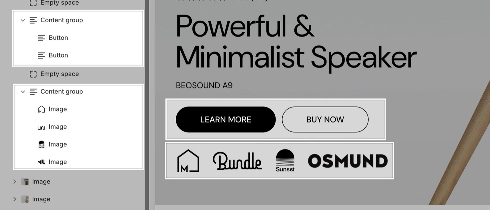
Blocks you can put in a content group
A content group holds these four theme blocks, in any number and order:
- Button block
- Image block, for logos and icons
- Caption block, for badges
- Quick buy button block
Select Add block inside the content group to add one, and drag the blocks to reorder them.
Spacing and alignment
- Horizontal spacing between blocks sets the gap between the blocks: Small (the default) or Medium. The gap is the theme's grid spacing, so it follows Layout theme settings.
- The row follows the text alignment of the section or card: left, center or right.
- When the blocks do not fit on one line, they wrap to the next line.
- On screens narrower than 475 px, the blocks stretch to share the full width of each line, so two buttons become two equal halves.
Can I put a heading or text inside a content group?
No. A content group accepts only Button, Image, Caption and Quick buy button blocks. To put a heading next to a button, place the Heading block above the content group, or use a Flex grid with two Text cards side by side.
How do I make a logo list?
Add a content group and put one Image block per logo inside it. Set the same Height on every Image block, for example 60 px, so the logos line up. Link each image to the brand's collection with its Link setting.
All Content group settings
Every setting of this block, with its type and default.
Accepts these blocks: Button, Image, Caption and Quick buy button.
Horizontal spacing between blocks (dropdown, default: Small): Sets the gap between the blocks in the row, from the theme's grid spacing. Options: Small, Medium.
Related pages
- Flex sections: the sections that accept theme blocks.
- Button block: the buttons a content group usually holds.
- Image block: logos and icons in a row.
- Caption block: badges in a row.