Button block
The Button block of Combine adds a solid or outline button with a link inside flex sections, cards and content groups.
Applies to: Combine 4.2.0 and later. Added in: Combine 3.1.0. Last checked: 2026-10-13 against Combine 4.2.0.
The Button block adds a call-to-action button with a label and a link. You add it inside the flex sections: in a slide, a card, a column, a text card or a content group.
Where to find it: in a Flex slideshow, Flex grid, Flex cards or Flex columns section, select Add block inside a slide, card or column, then choose Button.
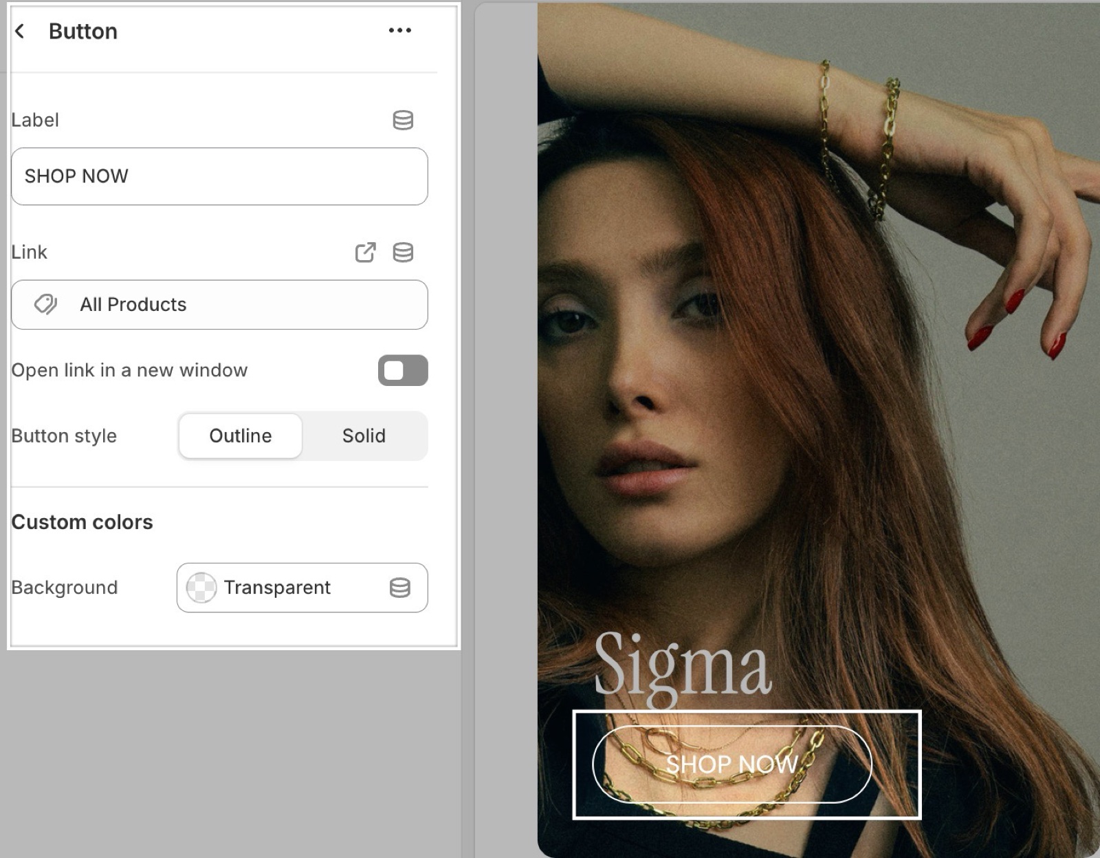
Label and link
- Label is the text on the button. A Button block with an empty Label shows nothing.
- Link is where the button goes: a product, a collection, a page or any web address.
- Open link in a new window appears once a link is set. It opens the link in a new browser tab.
- If the slide or card that holds the button has its own Link, the whole card is clickable and the button's own link does not work. Leave the card link empty when the card has buttons.
Button style and color
- Button style sets the look: Outline (a border with a transparent fill, the default) or Solid (a filled button).
- Background under Custom colors sets the button color. On an Outline button it colors the border; on a Solid button it fills the button. Combine picks a black or white label automatically, whichever reads better on that color.
- Leave Background transparent to use the text color of the card or slide around the button.
How do I put two buttons side by side?
Add a Content group block and put two Button blocks inside it. A new Content group already holds two buttons. Blocks outside a content group always sit one under the other.
Why does my button not open its link?
Because the card or slide around it has its own link. When Link is set on the Image slide, Video slide, Card or Text card, the whole card becomes one link and the links inside it stop working. Remove the card link, or remove the button and let the card link do the job.
Can I change the color of every button in the store?
Not from this block. Background changes only this button. Store-wide, buttons follow Theme settings → Colors → Body → Text; see How do I change the button colors?.
All Button settings
Every setting of this block, with its type and default.
Label (text field, default: "Button label"): Sets the button text. The block shows nothing while it is empty.
Link (link): Sets where the button goes. It does not work when the slide or card around the button has its own Link.
Open link in a new window (checkbox, default: off). Shown only when Link is set.
Button style (dropdown, default: Outline): Sets an outline button with a transparent fill, or a filled button. Options: Outline, Solid.
Button block: Custom colors
Where to find it: Button → Custom colors
Background (color, default: transparent): Sets the button color: the border of an Outline button, the fill of a Solid one. The label turns black or white for contrast. Leave it transparent to use the text color of the card or slide.
Related pages
- Flex sections: the sections that accept theme blocks and how to build a layout.
- Content group block: buttons, images and captions side by side.
- Quick buy button block: an add to cart button for one product.
- How do I change the button colors?: button colors across the store.