Rotating badges section
The Rotating badges section of Borders floats round, spinning text badges with an icon over the page, each with its own position and visibility.
Applies to: Borders 3.1.0 and later. Added in: Borders 1.0.0. Last checked: 2026-10-13 against Borders 3.1.0.
The Rotating badges section floats round badges over your pages. Each badge is a ring of text that turns around an icon. Use them as decoration, or for information about your products, store or policies, such as free shipping.
Where to find it: Online Store → Themes → Customize → Overlay group → Rotating badges
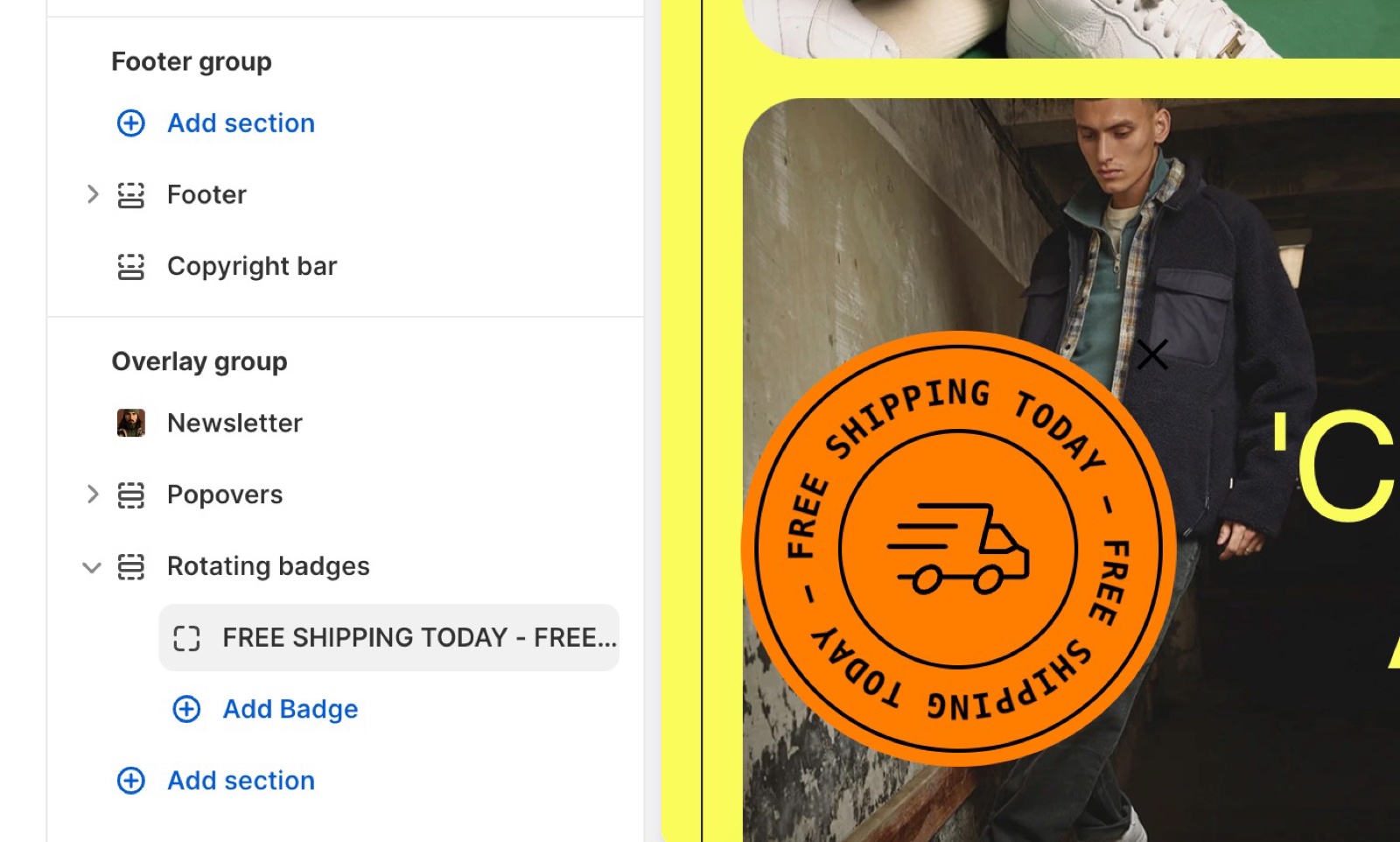
The section has no settings of its own. Each Badge block is one badge, with its own text, design and pages. Customers can close a badge with its close button; it stays hidden until they close the browser tab.
Badge content
- Text is the text of the ring. Put separators between the words, for example
FREE · SHIPPING · TODAY ·. - Maximum characters (30 to 60) sets how many characters fit in the ring, and so the size of the badge. Text longer than this is cut off.
- Select an icon puts a theme icon in the middle; choose No icon for none. Custom icon uses your own image instead, 256 x 256 px.
- Link makes the badge a link, with Open link in a new window.
Design
- Characters spacing (1 to 2) sets the space between the letters.
- Text scale (1 to 1.5) and Badge scale (0.5 to 1) make the text or the whole badge bigger or smaller.
- Rotation speed sets the seconds for one full turn, 0 to 30 (default 9). A lower number turns faster; 0 stops the rotation.
- Position places the badge on the screen: left, center or right, at the top, middle or bottom.
- Color scheme sets the colors. Border draws no line, a single line or a double line around the badge.
Visibility
- Visibility: All pages, Homepage only, Product pages only, or All pages except the homepage.
- Hide on mobile devices hides the badge on screens narrower than 475 px, where it could cover content.
Setting up a rotating badge
Add a badge
Open Overlay group → Rotating badges → Add block → Badge.
Write the text
Type the Text with separators, for example FREE · SHIPPING · , and set Maximum characters so the whole text fits.
Choose the icon
Pick an icon in Select an icon, or upload a Custom icon.
Place and animate it
Set Position, Badge scale and Rotation speed.
Choose the pages
Set Visibility, and turn on Hide on mobile devices if the badge covers content on phones.
Why is my badge text cut off?
The text has more characters than Maximum characters. Raise Maximum characters (up to 60), which also makes the badge larger, or shorten the text. Spaces and separators count as characters.
Can I show two badges at once?
Yes. Add a second Badge block and give it a different Position. Two badges with the same position sit on top of each other.
All Rotating badges settings
Every setting on this page, with its type and default.
Accepts these blocks: Badge (up to 12 blocks in the section).
The Rotating badges section has no settings of its own in Borders 3.1.0; its blocks have theirs.
Badge block
Where to find it: Overlay group → Rotating badges → Add block → Badge
Text (text field, default: "YOUR · TEXT · HERE · YOUR · TEXT · HERE ·"): Sets the text of the ring. Text longer than Maximum characters is cut off.
Maximum characters (slider 30 to 60, default: 42): Sets how many characters fit in the ring, 30 to 60, and so the size of the badge.
Select an icon (dropdown, default: Business: Star): Sets the theme icon in the middle of the badge. Options: No icon, Business: Earth globe, Business: Flag, Business: Helpline, Business: Like hand, Business: Map marker, Business: Security shield, Business: Star, Commerce: Appointment, Commerce: Archive box, Commerce: Box, Commerce: Checkout cart, Commerce: Currency, Commerce: Delivery, Commerce: Delivery time, Commerce: Giftbox, Commerce: Label, Commerce: Open 24 hours, Commerce: Open box, Commerce: Paper bag, Commerce: Shipping truck, Commerce: Store, Commerce: Time, Commerce: Time limit, Commerce: Wallet.
Custom icon (image): Sets your own icon in the middle of the badge instead of the theme icon.
Link (link): Makes the badge a link.
Open link in a new window (checkbox, default: off).
Badge block: Design
Where to find it: Overlay group → Rotating badges → Add block → Badge → Design
Characters spacing (slider 1 to 2, step 0.1, default: 1): Sets the space between the letters.
Text scale (slider 1 to 1.5, step 0.1, default: 1): Makes the text larger, up to 1.5 times.
Badge scale (slider 0.5 to 1, step 0.1, default: 1): Makes the whole badge smaller, down to half its size.
Rotation speed (slider 0 to 30 s, default: 9 s): Sets the seconds for one full turn. 0 stops the rotation.
Position (dropdown, default: Left bottom): Sets where on the screen the badge floats. Options: Left top, Center top, Right top, Left middle, Center middle, Right middle, Left bottom, Center bottom, Right bottom.
Color scheme (color scheme, default: scheme_1).
Border (dropdown, default: Single): Draws no line, a single line or a double line around the badge. Options: None, Single, Double.
Badge block: Visibility
Where to find it: Overlay group → Rotating badges → Add block → Badge → Visibility
Visibility (dropdown, default: All pages): Sets the pages that show this badge. Options: All pages, Homepage only, Product pages only, All pages except the homepage.
Hide on mobile devices (checkbox, default: off): Hides the badge on screens narrower than 475 px.
Related pages
- Overlay group: the other floating elements.
- Colors theme settings: the color schemes of the badges.
- Header group: announcement bars with the same page visibility options.