Navigation drawer section
The Navigation drawer section is the Seventh mobile and side menu. This page lists its settings, its Menu blocks and the promotion cards it can show.
Applies to: Seventh 4.0.0 and later. Added in: Seventh 1.0.0. Last checked: 2026-10-12 against Seventh 4.0.0.
The Navigation drawer section is the menu panel that slides in from the side when a customer taps the menu icon in the header. It is the menu on mobile, and on desktop too when the header's Menu Style is Drawer or Both.
Where to find it: in the theme editor sidebar, open the Drawers group and select Navigation drawer.
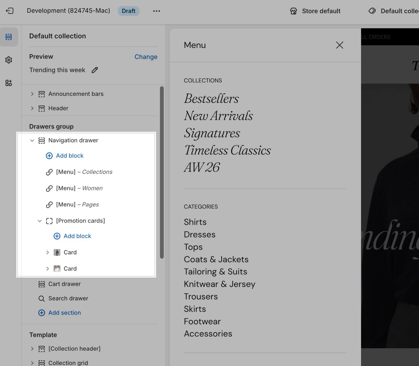
Drawer content
- The drawer holds Menu blocks, a Promotions cards block and a footer with social links and selectors.
- It has its own menus. It does not copy the menus or mega menus of the Header section, so set up the drawer menus separately.
- Its colors come from Theme settings → Colors → Modals/drawers.
- The selectors show only when the store has more than one language, or more than one country or region, in Shopify admin → Settings → Languages and Shopify admin → Settings → Markets.
- The social icons come from Social theme settings.
Menus
- Each Menu block shows a Shopify menu, with an optional Heading.
- Links with child links show an arrow. A tap slides the drawer to that link's child links instead of opening the link's own page.
- Add several Menu blocks to group the drawer, for example a main menu and a smaller help menu with a different Text size.
Note: Links that have submenus will make the url inaccessible. Clicking on those will open the submenu, instead of following the link.
If that page must be reachable, add it again as the first child link in Shopify admin → Content → Menus, for example "All dresses" under "Dresses".
Promotions cards
The Promotions cards block shows the cards you add inside it: Card, Product card or Collection card. With more than one card, the cards show in a horizontal slider.
Note: Promo blocks do not appear in submenus. They are only shown in the initial state of the navigation drawer.
Can I show the account link in the navigation drawer?
No. Since Seventh 1.1.0, the account link is no longer in the navigation drawer. Customers sign in from the account icon in the header, which opens Shopify's sign-in panel. Turn on Show account in Header → Main row → Icons.
Why do the promotion card images look blurred in the theme editor?
The theme editor loads a smaller preview image. Save, then check the drawer on the live storefront or in the theme preview outside the editor.
All Navigation drawer settings
Every setting on this page, one list per section or block, with its type and default.
Accepts these blocks: Menu.
Configure the contents of the menu that appears on mobile devices or when set up accordingly.
Inner blocks spacing (dropdown, default: XSmall): Sets the vertical space between the blocks in the drawer (menus and promotion cards). Options: XXSmall, XSmall, Small, Regular, Large, XLarge.
Navigation drawer section: Content
Where to find it: Drawers group → Navigation drawer → Content
Show country/region selector (checkbox, default: on): Shows the country/region and currency selector at the bottom of the drawer. It appears only when the store sells in more than one country or region (Shopify admin → Settings → Markets).
Show language selector (checkbox, default: on): Shows the language selector at the bottom of the drawer. It appears only when the store has more than one published language (Shopify admin → Settings → Languages).
Show social links (checkbox, default: on): Shows the social icons from Theme settings → Social at the bottom of the drawer.
Where to find it: Drawers group → Navigation drawer → Menu.
Heading (text field): Sets an optional heading above this menu in the drawer.
Menu (menu picker, default: the main-menu menu): Sets the Shopify menu shown in the drawer, with its child links as submenus that slide in.
Menu block: Heading typography
Where to find it: Drawers group → Navigation drawer → Menu → Heading typography
Font (dropdown, default: Body). Options: Body, Headings, Accent. Shown only when Heading is set.
Text size (dropdown, default: Heading 6). Options: Heading 1, Heading 2, Heading 3, Heading 4, Heading 5, Heading 6. Shown only when Heading is set and either Font is Headings or Accent.
Text size (dropdown, default: Medium). Options: XXSmall, XSmall, Small, Medium, Large, XLarge, XXLarge. Shown only when Heading is set and Font is Body.
Text weight (dropdown, default: Normal). Options: Normal, Bold. Shown only when Heading is set.
Case (dropdown, default: Default). Options: Default, Uppercase. Shown only when Heading is set.
Reduced text opacity (checkbox, default: off).
Menu block: Menu typography
Where to find it: Drawers group → Navigation drawer → Menu → Menu typography
Font (dropdown, default: Body). Options: Body, Headings, Accent. Shown only when Menu is set.
Text size (dropdown, default: Heading 6). Options: Heading 1, Heading 2, Heading 3, Heading 4, Heading 5, Heading 6. Shown only when Menu is set and either Font is Headings or Accent.
Text size (dropdown, default: Medium). Options: XXSmall, XSmall, Small, Medium, Large, XLarge, XXLarge. Shown only when Menu is set and Font is Body.
Text weight (dropdown, default: Normal). Options: Normal, Bold. Shown only when Menu is set.
Case (dropdown, default: Default). Options: Default, Uppercase. Shown only when Menu is set.
Where to find it: Drawers group → Navigation drawer → Promotions cards.
Accepts these blocks: Card, Product card and Collection card.
Heading (text field): Sets an optional heading above the promotion cards.
Promotions cards block: Heading typography
Where to find it: Drawers group → Navigation drawer → Promotions cards → Heading typography
Font (dropdown, default: Body). Options: Body, Headings, Accent. Shown only when Heading is set.
Text size (dropdown, default: Heading 6). Options: Heading 1, Heading 2, Heading 3, Heading 4, Heading 5, Heading 6. Shown only when Heading is set and either Font is Headings or Accent.
Text size (dropdown, default: Medium). Options: XXSmall, XSmall, Small, Medium, Large, XLarge, XXLarge. Shown only when Heading is set and Font is Body.
Text weight (dropdown, default: Normal). Options: Normal, Bold. Shown only when Heading is set.
Case (dropdown, default: Default). Options: Default, Uppercase. Shown only when Heading is set.
Reduced text opacity (checkbox, default: off).
Promotions cards block: Layout
Where to find it: Drawers group → Navigation drawer → Promotions cards → Layout
Cards alignment (dropdown, default: Top): Sets how cards of different heights line up in the slider. Stretch makes every card as tall as the tallest one. Options: Top, Center, Bottom, Stretch.
Related pages
- Drawers group: the three drawers and what they share.
- Header section: Menu Style and Drawer menu position, which decide when the drawer opens.
- Header menus and mega menus: the desktop menus.
- Blank card: the Card block the Promotions cards block can hold.
- Product card: the Product card the Promotions cards block can hold.
- Collection card: the Collection card the Promotions cards block can hold.
Drawers group
The Drawers group in Seventh holds the navigation drawer, the search drawer and the cart drawer, the panels that slide in from the side of the screen.
Search drawer
The Search drawer section shows predictive search results, featured links and a product list when a customer opens search in Seventh.