Header section
The Header section sets the Seventh store header: logo, style (standard, transparent, translucent), sticky behavior, icons, account and the top row.
Applies to: Seventh 4.0.0 and later. Added in: Seventh 1.0.0. Last checked: 2026-10-12 against Seventh 4.0.0.
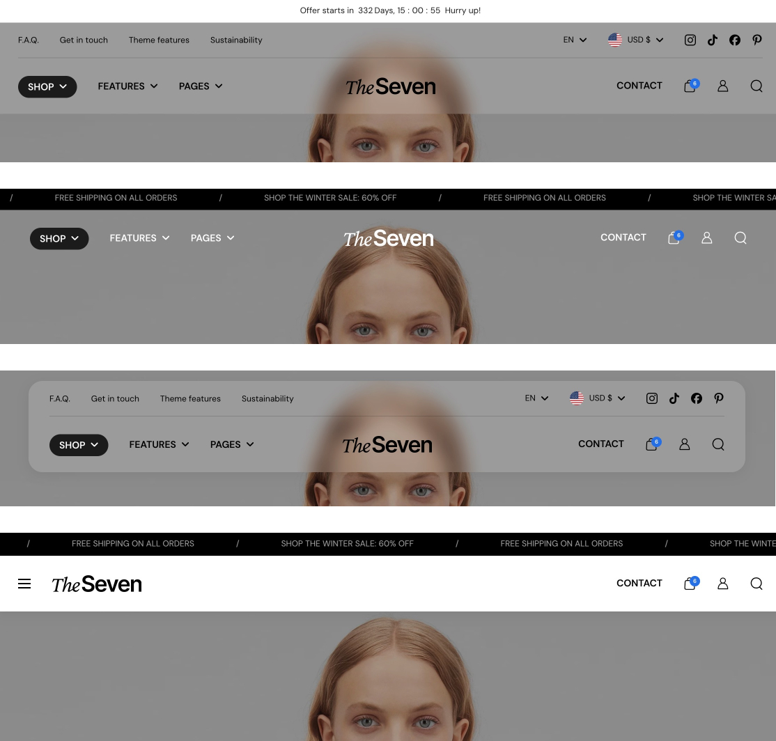
The Header section is the store header at the top of every page: logo, main menu, icons, an optional top row and the breadcrumbs. It has four styles (Standard, Transparent, Boxed, Translucent) and three sticky behaviours.
Where to find it: select Header at the top of the theme editor sidebar. The Header section is the same on every page, so you can open it from any template.
The header blocks
- The Header section always contains three blocks: Top row, Main row and Breadcrumbs.
- These blocks cannot be reordered or deleted.
- To hide the Top row or the Breadcrumbs, point to the block in the theme editor sidebar and select the eye icon next to its name. The block keeps its settings; select the eye icon again to show it.
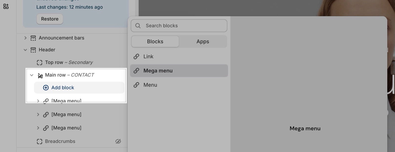
- The menus, mega menus and custom links of the main navigation are blocks inside the Main row. See Header menus and mega menus.
Header style and colors
Style has one standard option and three options in the Floating group:
- Standard: the header sits above the page content with a solid background.
- Transparent: the header sits over the first section and has no background until the customer scrolls (when the header is sticky) or moves the mouse over it. Use it over a full-width image or video at the top of the page.
- Boxed: the header is a rounded box that floats over the first section, with its own Background opacity, Corner radius and optional Blur background.
- Translucent: a full-width header over the first section with a see-through background set by Background opacity.
The Transparent, Boxed and Translucent styles all overlap the first section of the page, so that section needs enough top space or a media background.
Transparent and alternate colors are intended for use over hero images or strong backgrounds; set text colors for contrast.
A sticky Translucent header keeps its Background opacity while the page scrolls, because Make header fully opaque only on hover is on by default. It then turns fully opaque only when the mouse is over it. Turn the checkbox off to make the header fully opaque as soon as the customer scrolls. The checkbox shows only when Style is Translucent, Background opacity is below 100 and Sticky header type is not None.
The header has its own Text color and Background color; it does not use a color scheme from Theme settings → Colors. The dropdown panels opened from the header, such as the account panel, use Theme settings → Colors → Modals/drawers.
Standard header on some pages
With Style set to Transparent, you can show the standard header on the page types that have no hero. For example, to keep the transparent header on the home page only:
Select the Transparent style
In the theme editor, select Header and set Style to Transparent.
Turn on the standard header replacement
Under Standard header, turn on Replace the transparent header with the standard one in specific pages.
Select every other page type
Turn on Replace in regular pages, Replace in collection pages, Replace in product pages and Replace in article pages. "Regular pages" covers every page that is not the home page, a collection, a product or an article, for example pages, the cart, search and blogs.
Save and check
Select Save. Open a product page in the preview: the header has its background color. The home page keeps the transparent header.
The home page cannot be replaced, so it always keeps the transparent header. To keep the transparent header on one more page, leave its page type off and list only the handles you want replaced in Replace in specific pages instead. The list accepts the handles of products, collections, pages, articles and blogs, separated by commas.
Tip: Use this to display a standard header in pages where you don't have a hero section with media backgrounds as the first one in your page.
Light logo and text over a dark hero
The alternate color scheme changes the text color and the logo only while the header is transparent. When the customer scrolls or hovers, the header returns to Text color and the main logo.
- In Header → Alternate color scheme, turn on Enable an alternate color scheme for the transparent header and set Alternate text color.
- In Header → Main row → Alternate logo for the transparent header, upload Alternate logo and, if you use one, Alternate mobile logo.
To use the alternate colors on some pages only, turn on Restrict the alternate color scheme to specific pages. Then select the page types or enter handles in Restrict to specific pages.
Tip: Use this when you have pages that have different backgrounds than your defaults, and you want to choose different colors for the header in these.
Sticky header
Sticky header type sets what the header does when the page scrolls: it scrolls away (None), stays at the top (Always sticky, the default) or comes back when the customer scrolls up.
Main row
The Main row is the main strip of the header: logo, navigation and icons.
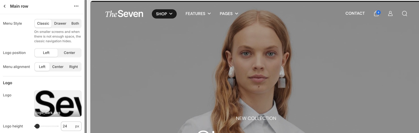
Menu and logo
- Menu Style: Classic shows the links in the main row, Drawer shows a menu icon that opens the Navigation drawer section on every screen, Both combines them.
- Logo position puts the logo on the left or in the center.
- Menu alignment places the classic menu when the logo is on the left.
- Drawer menu position sets the side of the menu icon.
- Logo and Mobile logo set the logo images, each with its own height. Without a logo, the store name shows as text.
- Main menu level typography styles only the top-level links of the classic menu, not dropdowns or mega menus.
Note: When your "classic" menus are too large to fit the viewport, they will be replaced with the mobile navigation. This could happen especially in the Shopify Editor, since it gives you a smaller version of your store.
Icons and selectors
- Show search, Show cart and Show account turn the header icons on or off.
- Show account needs customer accounts turned on in Shopify admin → Settings → Customer accounts. Since Seventh 1.1.0, the account icon opens Shopify's sign-in panel with the menu set in Customer account menu.
- Show currency selector and Show language selector add the selectors next to the icons. Seventh hides them on screens narrower than 768 px.
- Custom link adds a link or an icon next to the icons, with its own label, icon and colors.
A note on currency & language selectors
Currency & language are dependent on your Shopify's store settings. These are not controlled by the theme, but rather part of setting up your store in a specific way.
Read more on Shopify's documentation:
Menus and mega menus
The main navigation is built with Menu, Mega menu and Link blocks inside the Main row. See Header menus and mega menus.
Top row
The Top row is an optional strip above the main row.
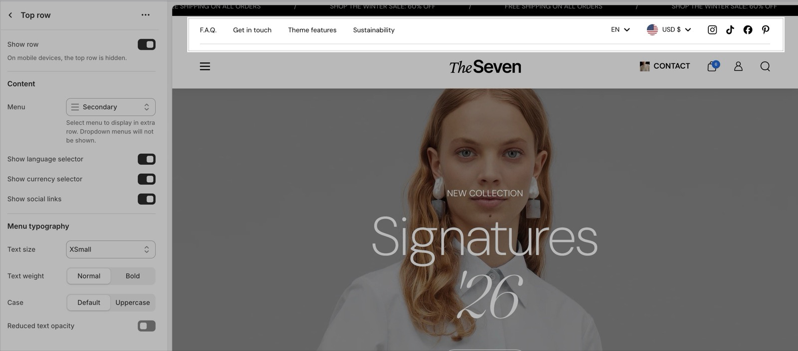
- Seventh hides the top row on screens narrower than 768 px. Put links that customers need on mobile into the main menu or the Navigation drawer section.
- Menu shows only the top-level links of its menu; dropdowns are not shown.
- Show language selector, Show currency selector and Show social links add them to the row. The social profiles come from Social theme settings.
- Menu typography styles all the links in the row.
Breadcrumbs
- The Breadcrumbs block shows the trail from the home page to the current page, below the header.
- Breadcrumbs never show on the home page.
- To show the collection name in product breadcrumbs, turn on Theme settings → SEO & Other settings → Improve product breadcrumb navigation (see SEO and other theme settings).
- Typography styles the trail, including a Custom text color.
Why is my header not transparent?
A setting replaces it on the page you are viewing. Check these in order:
- Style is Transparent. Boxed and Translucent have their own background opacity and are never fully transparent.
- Replace the transparent header with the standard one in specific pages is off, or the page type you are on is not selected under it.
- The page handle is not listed in Replace in specific pages.
- The customer has not scrolled or moved the mouse over the header. A transparent header gets its background when it becomes sticky or is hovered.
Pages that are not built from a theme template, for example pages served by some apps, always show the standard header.
Why did my menu turn into a drawer icon?
The classic menu does not fit. Seventh hides the classic menu on screens narrower than 1024 px, and also when the menu links need more space than the main row has. The menu icon then opens the navigation drawer. The theme editor preview is narrower than a full browser window, so this happens there more often. Shorten the menu labels, lower the Text size of the main menu level, or set Menu Style to Drawer to use the drawer on every screen size.
Why don't the language or currency selectors appear?
Shopify decides which languages and currencies exist. A selector appears only when the store has more than one published language, or more than one country or region in its markets. Languages are managed in Shopify admin → Settings → Languages, countries and regions in Shopify admin → Settings → Markets. See Shopify's Markets and Languages.
All Header settings
Every setting on this page, one list per section or block, with its type and default.
Text color (color, default: #000000).
Background color (color, default: #f1edea).
Style (dropdown, default: Standard): Sets how the header sits on the page. Standard sits above the content. Transparent, Boxed and Translucent (the Floating group) sit over the first section of the page. Options: Standard, Floating: Transparent, Floating: Boxed, Floating: Translucent.
Show border bottom (checkbox, default: on). Shown only when Style is not Floating: Boxed.
Width (dropdown, default: Fit): Sets whether the header spans the whole browser window (Full width) or stops at Theme settings → Layout → Maximum page width (Fit). Has an effect only when the browser is wider than that maximum width. Options: Full width, Fit.
Corner radius (dropdown, default: Rounded). Options: None, Slighty rounded, Rounded. Shown only when Style is Floating: Boxed.
Background opacity (slider 5 to 100 %, default: 50 %): Sets how see-through the Boxed or Translucent header background is, from 5 to 100 percent. Shown only when Style is Floating: Boxed or Floating: Translucent.
Make header fully opaque only on hover (checkbox, default: on): Keeps a sticky Translucent header at its Background opacity while the page scrolls and makes it fully opaque only on mouse over. Turn it off to make the header fully opaque as soon as the page scrolls. Shown only when Style is Floating: Translucent and Background opacity is less than 100 and Sticky header type is not None.
Blur background (checkbox, default: off): Blurs the page content behind the Boxed or Translucent header. Only visible when Background opacity is below 100 percent. Shown only when Style is Floating: Boxed or Floating: Translucent.
Add a subtle shadow effect (checkbox, default: off): Adds a light shadow under the header.
Header section: Transparent header
Where to find it: Header → Transparent header
By default, the header's background color is removed until sticky or mouse over the header. Shown only when Style is Floating: Transparent.
This functionality affects all pages, unless configured otherwise. Shown only when Style is Floating: Transparent.
Header section: Standard header
Where to find it: Header → Standard header
Replace the transparent header with the standard one in specific pages (checkbox, default: off): Shows the standard header instead of the transparent one on the page types and handles selected below. The home page always keeps the transparent header. Shown only when Style is Floating: Transparent.
Replace in regular pages (checkbox, default: off): Shows the standard header on every page that is not the home page, a collection, a product or an article, for example pages, the cart, search and blogs. Shown only when Replace the transparent header with the standard one in specific pages is on and Style is Floating: Transparent.
Replace in collection pages (checkbox, default: off). Shown only when Replace the transparent header with the standard one in specific pages is on and Style is Floating: Transparent.
Replace in product pages (checkbox, default: off). Shown only when Replace the transparent header with the standard one in specific pages is on and Style is Floating: Transparent.
Replace in article pages (checkbox, default: off). Shown only when Replace the transparent header with the standard one in specific pages is on and Style is Floating: Transparent.
Replace in specific pages (text field): Shows the standard header on the products, collections, pages, articles or blogs whose handles you enter, separated by commas. Example: all,new,best-sellers. Shown only when Replace the transparent header with the standard one in specific pages is on and Style is Floating: Transparent.
Header section: Alternate color scheme
Where to find it: Header → Alternate color scheme
Enable an alternate color scheme for the transparent header (checkbox, default: off): Turns on a second text color, and optionally a second logo, that the header uses only while it is transparent. Shown only when Style is Floating: Transparent.
Alternate text color (color, default: #000000): Sets the header text color while the header is transparent. When the header is hovered or sticky, it uses Text color again. Shown only when Enable an alternate color scheme for the transparent header is on and Style is Floating: Transparent.
You can also choose a different logo for the alternate color scheme, in the main row block. Shown only when Enable an alternate color scheme for the transparent header is on and Style is Floating: Transparent.
This functionality affects all pages, unless configured otherwise. Shown only when Enable an alternate color scheme for the transparent header is on and Style is Floating: Transparent.
Restrict the alternate color scheme to specific pages (checkbox, default: off): Limits the alternate color scheme to the page types and handles selected below. When off, the alternate colors apply on every page with a transparent header. Shown only when Enable an alternate color scheme for the transparent header is on and Style is Floating: Transparent.
Restrict to the home page (checkbox, default: off). Shown only when Enable an alternate color scheme for the transparent header is on and Restrict the alternate color scheme to specific pages is on and Style is Floating: Transparent.
Restrict to regular pages (checkbox, default: off): Uses the alternate colors on every page that is not a collection, a product or an article. This includes the home page. Shown only when Enable an alternate color scheme for the transparent header is on and Restrict the alternate color scheme to specific pages is on and Style is Floating: Transparent.
Restrict to collection pages (checkbox, default: off). Shown only when Enable an alternate color scheme for the transparent header is on and Restrict the alternate color scheme to specific pages is on and Style is Floating: Transparent.
Restrict to product pages (checkbox, default: off). Shown only when Enable an alternate color scheme for the transparent header is on and Restrict the alternate color scheme to specific pages is on and Style is Floating: Transparent.
Restrict to article pages (checkbox, default: off). Shown only when Enable an alternate color scheme for the transparent header is on and Restrict the alternate color scheme to specific pages is on and Style is Floating: Transparent.
Restrict to specific pages (text field): Uses the alternate colors on the products, collections, pages, articles or blogs whose handles you enter, separated by commas. Example: all,new,best-sellers. Shown only when Enable an alternate color scheme for the transparent header is on and Restrict the alternate color scheme to specific pages is on and Style is Floating: Transparent.
Header section: Functionality
Where to find it: Header → Functionality
Sticky header type (dropdown, default: Always sticky): Sets what the header does when the page scrolls. None: the header scrolls away. Always sticky: the header stays at the top. Sticky on scroll up: the header hides while scrolling down and comes back when scrolling up. Options: None, Always sticky, Sticky on scroll up.
Where to find it: Header → Top row.
On mobile devices, the top row is hidden.
Top row block: Content
Where to find it: Header → Top row → Content
Menu (menu picker): Sets the menu shown in the top row, above the main row. Only the top-level links show; dropdown menus are not shown.
Show language selector (checkbox, default: on): Shows the language selector in the top row. It appears only when the store has more than one published language (Shopify admin → Settings → Languages).
Show currency selector (checkbox, default: on): Shows the country/region and currency selector in the top row. It appears only when the store sells in more than one country or region (Shopify admin → Settings → Markets).
Show social links (checkbox, default: on): Shows the social icons from Theme settings → Social in the top row.
Top row block: Menu typography
Where to find it: Header → Top row → Menu typography
Text size (dropdown, default: Medium). Options: XXSmall, XSmall, Small, Medium, Large, XLarge, XXLarge.
Text weight (dropdown, default: Normal). Options: Normal, Bold.
Case (dropdown, default: Default). Options: Default, Uppercase.
Reduced text opacity (checkbox, default: off): Shows the top row links and social icons at reduced opacity.
Where to find it: Header → Main row.
Accepts these blocks: Mega menu, Menu and Link.
Menu Style (dropdown, default: Classic): Sets how the main menu shows. Classic: links in the main row, with the drawer menu on screens below 1024 px or when the links do not fit. Drawer: a menu icon that opens the navigation drawer on every screen size. Both: the classic links and the menu icon together. Options: Classic, Drawer, Both.
Logo position (dropdown, default: Left). Options: Left, Center.
Menu alignment (dropdown, default: Left): Sets where the classic menu sits in the main row when the logo is on the left. Options: Left, Center, Right. Shown only when Logo position is Left and either Menu Style is Classic or Both.
Drawer menu position (dropdown, default: Left): Sets on which side of the main row the menu icon for the navigation drawer appears. Options: Left, Right. Shown only when Menu Style is Drawer or Both.
Main row block: Logo
Where to find it: Header → Main row → Logo
Logo (image): Sets the logo image. Without a logo, the store name shows as text.
Logo height (slider 20 to 120 px, default: 30 px).
Mobile logo (image): Sets a different logo for mobile. Leave empty to use Logo on every screen size.
Mobile logo height (slider 10 to 100 px, default: 30 px).
Main row block: Alternate logo for the transparent header
Where to find it: Header → Main row → Alternate logo for the transparent header
Alternate logo (image): Sets the logo shown while the transparent header uses its alternate color scheme. Shown only when the section's Enable an alternate color scheme for the transparent header is on and the section's Style is Floating: Transparent.
Alternate mobile logo (image): Sets the mobile logo shown while the transparent header uses its alternate color scheme. Shown only when the section's Enable an alternate color scheme for the transparent header is on and the section's Style is Floating: Transparent.
Main row block: Main menu level typography
Where to find it: Header → Main row → Main menu level typography
Text size (dropdown, default: Medium): Sets the text size of the top-level links of the classic menu. Submenus and mega menus are not affected. Options: XXSmall, XSmall, Small, Medium, Large, XLarge, XXLarge.
Text weight (dropdown, default: Normal). Options: Normal, Bold.
Case (dropdown, default: Default). Options: Default, Uppercase.
Main row block: Icons
Where to find it: Header → Main row → Icons
Show search (checkbox, default: on).
Show cart (checkbox, default: on).
Cart count background color (color, default: #000000): Sets the background color of the item count bubble on the cart icon. Shown only when Show cart is on.
Show account (checkbox, default: on): Shows the account icon, which opens Shopify's sign-in panel. Customer accounts must be turned on in Shopify admin → Settings → Customer accounts.
Customer account menu (menu picker, default: the customer-account-main-menu menu): Sets the menu shown in the account panel for signed-in customers. Shown only when Show account is on.
Show currency selector (checkbox, default: off): Shows the country/region and currency selector next to the icons. It appears only when the store sells in more than one country or region, and is hidden on screens below 768 px.
Show language selector (checkbox, default: off): Shows the language selector next to the icons. It appears only when the store has more than one published language, and is hidden on screens below 768 px.
Main row block: Custom link
Where to find it: Header → Main row → Custom link
Label (text field): Sets the label of the custom link shown next to the header icons.
Link (link): Sets where the custom link next to the header icons goes.
Open link in a new window (checkbox, default: off). Shown only when Link is set.
Select an icon (dropdown): To see all icons, visit the Krown icon library. Options: None, Business: Earth globe, Business: Flag, Business: Helpline, Business: Like hand, Business: Map marker, Business: Security shield, Business: Star, Commerce: Appointment, Commerce: Archive box, Commerce: Box, Commerce: Checkout cart, Commerce: Currency, Commerce: Delivery, Commerce: Delivery time, Commerce: Giftbox, Commerce: Label, Commerce: Open 24 hours, Commerce: Open box, Commerce: Paper bag, Commerce: Shipping truck, Commerce: Store, Commerce: Time, Commerce: Time limit, Commerce: Wallet.
Custom icon (image): Sets your own icon for the custom link. Use a transparent PNG of 72 x 72 px.
Background color (color, default: transparent): Sets a background color that highlights the custom link. Transparent means no highlight.
Text color (color, default: transparent): Sets the text color of the custom link. Transparent uses the header text color.
Where to find it: Header → Breadcrumbs.
Breadcrumbs navigation doesn't appear on the home page.
Breadcrumbs block: Typography
Where to find it: Header → Breadcrumbs → Typography
Text size (dropdown, default: Medium). Options: XXSmall, XSmall, Small, Medium, Large, XLarge, XXLarge.
Line height (dropdown, default: Default). Options: Default, Smallest, Smaller, Larger, Largest.
Text weight (dropdown, default: Normal). Options: Normal, Bold.
Case (dropdown, default: Default). Options: Default, Uppercase.
Reduced text opacity (checkbox, default: off): Shows the text at 62 percent opacity (69 percent on dark color schemes), for secondary text such as captions or notes.
Custom text color (color, default: transparent).
Related pages
- Header area: how the Announcement bars and Header sections sit together.
- Header menus and mega menus: the Menu, Mega menu and Link blocks of the main row.
- Navigation drawer section: the mobile and drawer menu.
- Search drawer section: what opens from the search icon.
- Social theme settings: the profiles shown by Show social links.
- Troubleshoot the header, menus and drawers: more answers about the header.
Announcement bars
The Announcement bars section shows scrolling text, a text slider, a countdown or custom code above the Seventh header. This page lists every block setting.
Header menus and mega menus
Header menus and mega menus in Seventh: add a menu, a mega menu with cards, or a custom link to the main row of the Header section.