Announcement bars section
The Announcement bars section shows scrolling text, a text slider, a countdown or custom code above the Seventh header. This page lists every block setting.
Applies to: Seventh 4.0.0 and later. Added in: Seventh 1.0.0. Last checked: 2026-10-12 against Seventh 4.0.0.
The Announcement bars section shows one or more message bars at the very top of every page, above the Header section. Each bar is a block: scrolling text, a text slider, a countdown, custom HTML / Liquid or an app.
Where to find it: select Announcement bars at the top of the theme editor sidebar, then select Add block.
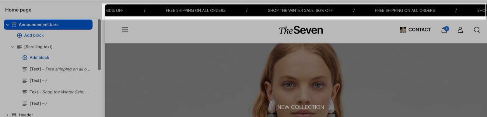
How the bars stack
- Each block is one bar. Several blocks stack in the order of the sidebar.
- When the section has no visible blocks, Seventh shows no announcement bar at all. To hide the bar, remove or hide its blocks.
- Each Scrolling text, Text slider and Countdown bar has its own Text color and Background color. Left transparent, they use Theme settings → Colors → Default color scheme.
Which pages show a bar
The Scrolling text, Text slider and Countdown blocks share three visibility settings:
- Visibility sets the page types: All pages, Homepage only, All product pages, All collection pages, Cart page only or All pages except the homepage.
- Show on selected collections shows the bar only on the collections you pick.
- Show on selected products shows the bar only on the products you pick.
As soon as you pick a product or a collection, Seventh ignores Visibility and the theme editor hides it. The bar then shows only on the selected products and collections. To go back to page types, remove every selected product and collection.
Scrolling text
The Scrolling text bar moves its content across the screen without stopping.
- Its content is made of Text blocks and Countdown blocks. The inner Countdown block is the same one the Scrolling text section uses; its settings are listed in Scrolling text section.
- Scroll direction, Scroll speed, Pause on mouseover and Horizontal space set the movement.
Text slider
The Text slider shows one message at a time and rotates through them.
Add the Text slider
Select Add block in Announcement bars and choose Text slider.
Add one Text block per message
Inside the Text slider, add a Text block for each message and enter Content and an optional Link.
Set the timing
With Autoplay on, the messages change every Autoplay interval seconds (2 to 30, default: 6).
Countdown
The Countdown bar shows a timer, with optional Text before countdown and Text after countdown.
The countdown counts to End year, End month, End day and End hour in the Timezone chosen in the block, not in the customer's or the store's timezone. For a sale that ends at midnight in New York in winter, select GMT -5:00.
Custom HTML / Liquid and apps
- The Custom HTML / Liquid block shows your own code as a bar. Krown support does not help with custom code.
- The Apps block holds app blocks. Only apps that offer an app block for themes appear in the list. The app controls the content and its settings; Seventh only provides the space in the bar.
Why is my announcement bar not showing?
The bar's visibility excludes the page you are viewing. Check these in order:
- The Announcement bars section has at least one block, and the block is not hidden in the theme editor.
- Show on selected collections and Show on selected products are empty, or the page you are on is one of them.
- Visibility includes the page type you are on. Homepage only does not show on other pages, and All pages except the homepage does not show on the home page.
- For a Countdown block, the end date has not passed while Hide block if countdown is over is on.
What happens when the countdown is over?
The countdown stops at zero. With Hide block if countdown is over turned on, the whole bar disappears the next time the page loads. Customers who keep the page open still see the zeros until they reload.
Can I show a different announcement bar per market or language?
Not per market: Seventh does not support a separate announcement bar per market. Translate the text with Shopify's Translate & Adapt app so each language gets its own wording. See Translate your store into multiple languages.
All Announcement bars settings
Every setting on this page, one list per section or block, with its type and default.
Accepts these blocks: Scrolling text, Text slider, Countdown, Custom HTML / Liquid and Apps.
The Announcement bars section has no settings of its own in Seventh 4.0.0.
Where to find it: Announcement bars → Scrolling text.
Accepts these blocks: Text and Countdown.
Visibility (dropdown, default: All pages): Sets the page types that show this bar. Ignored, and hidden in the editor, as soon as products or collections are selected below. Options: All pages, Homepage only, All product pages, All collection pages, Cart page only, All pages except the homepage. Shown only when Show on selected products is empty and Show on selected collections is empty.
Show on selected collections (collections picker): Shows this bar only on the selected collection pages. When set, Visibility is ignored.
Show on selected products (products picker): Shows this bar only on the selected product pages. When set, Visibility is ignored.
Scrolling text block: Functionality
Where to find it: Announcement bars → Scrolling text → Functionality
Scroll direction (dropdown, default: Left): Sets which way the text moves across the bar. Options: Right, Left.
Scroll speed (slider 20 to 300, step 10, default: 100): Sets how fast the text scrolls, from 20 to 300. Higher is faster. On screens narrower than 768 px the text moves at two thirds of this speed.
Pause on mouseover (checkbox, default: on): Stops the scrolling while the mouse is over the bar.
Horizontal space (dropdown, default: Medium): Sets the space between the repeated messages. Options: Small, Medium, Large, XLarge.
Scrolling text block: Typography
Where to find it: Announcement bars → Scrolling text → Typography
Text size (dropdown, default: XSmall). Options: XSmall, Small, Medium.
Text weight (dropdown, default: Normal). Options: Normal, Bold.
Case (dropdown, default: Default). Options: Default, Uppercase.
Scrolling text block: Colors
Where to find it: Announcement bars → Scrolling text → Colors
Text color (color, default: transparent): Sets the text color of this bar. Transparent uses the text color of Theme settings → Colors → Default color scheme.
Background color (color, default: transparent): Sets the background color of this bar. Transparent uses the background of Theme settings → Colors → Default color scheme.
Where to find it: Announcement bars → Scrolling text → Text. It is also available in: Text slider.
Content (text field, default: "Describe a product, share announcements or welcome customers to your store."): Sets the message of this text item.
Link (link): Makes the message a link.
Open link in a new window (checkbox, default: off). Shown only when Link is set.
Where to find it: Announcement bars → Text slider.
Accepts these blocks: Text.
Visibility (dropdown, default: All pages): Sets the page types that show this bar. Ignored, and hidden in the editor, as soon as products or collections are selected below. Options: All pages, Homepage only, All product pages, All collection pages, Cart page only, All pages except the homepage. Shown only when Show on selected products is empty and Show on selected collections is empty.
Show on selected collections (collections picker): Shows this bar only on the selected collection pages. When set, Visibility is ignored.
Show on selected products (products picker): Shows this bar only on the selected product pages. When set, Visibility is ignored.
Text slider block: Functionality
Where to find it: Announcement bars → Text slider → Functionality
Autoplay (checkbox, default: on): Moves to the next message automatically.
Autoplay interval (slider 2 to 30, default: 6): Sets the seconds each message shows before the next one, from 2 to 30. Shown only when Autoplay is on.
Text slider block: Typography
Where to find it: Announcement bars → Text slider → Typography
Text size (dropdown, default: XSmall). Options: XSmall, Small, Medium.
Text weight (dropdown, default: Normal). Options: Normal, Bold.
Case (dropdown, default: Default). Options: Default, Uppercase.
Text slider block: Colors
Where to find it: Announcement bars → Text slider → Colors
Text color (color, default: transparent): Sets the text color of this bar. Transparent uses the text color of Theme settings → Colors → Default color scheme.
Background color (color, default: transparent): Sets the background color of this bar. Transparent uses the background of Theme settings → Colors → Default color scheme.
Where to find it: Announcement bars → Countdown.
Visibility (dropdown, default: All pages): Sets the page types that show this bar. Ignored, and hidden in the editor, as soon as products or collections are selected below. Options: All pages, Homepage only, All product pages, All collection pages, Cart page only, All pages except the homepage. Shown only when Show on selected products is empty and Show on selected collections is empty.
Show on selected collections (collections picker): Shows this bar only on the selected collection pages. When set, Visibility is ignored.
Show on selected products (products picker): Shows this bar only on the selected product pages. When set, Visibility is ignored.
Countdown block: Content
Where to find it: Announcement bars → Countdown → Content
End year (slider 2026 to 2036, default: 2027).
End month (slider 1 to 12, default: 1).
End day (slider 1 to 31, default: 1).
End hour (slider 0 to 24, default: 0): Sets the hour the countdown ends, from 0 to 24, in the selected Timezone.
Timezone (dropdown, default: GMT): Sets the timezone of the end date and hour. The countdown ends at the same moment for every customer, whatever their own timezone. Options: GMT -12:00, GMT -11:00, GMT -10:00, GMT -9:00, GMT -8:00, GMT -7:00, GMT -6:00, GMT -5:00, GMT -4:00, GMT -3:00, GMT -2:00, GMT -1:00, GMT, GMT +1:00, GMT +2:00, GMT +3:00, GMT +4:00, GMT +5:00, GMT +6:00, GMT +7:00, GMT +8:00, GMT +9:00, GMT +10:00, GMT +11:00, GMT +12:00.
Hide block if countdown is over (checkbox, default: off): Hides the whole bar once the end date has passed. The bar disappears the next time the page loads.
Text before countdown (formatted text): Sets the text shown before the timer, for example "Sale ends in".
Text after countdown (formatted text): Sets the text shown after the timer.
Countdown block: Typography
Where to find it: Announcement bars → Countdown → Typography
Text size (dropdown, default: XSmall). Options: XSmall, Small, Medium.
Text weight (dropdown, default: Normal). Options: Normal, Bold.
Case (dropdown, default: Default). Options: Default, Uppercase.
Countdown block: Colors
Where to find it: Announcement bars → Countdown → Colors
Text color (color, default: transparent): Sets the text color of this bar. Transparent uses the text color of Theme settings → Colors → Default color scheme.
Background color (color, default: transparent): Sets the background color of this bar. Transparent uses the background of Theme settings → Colors → Default color scheme.
Where to find it: Announcement bars → Custom HTML / Liquid.
Custom Liquid (Liquid): Adds your own HTML or Liquid code as a bar. Krown support does not help with custom code.
Where to find it: Announcement bars → Apps.
Accepts these blocks: app blocks.
The Apps block has no settings of its own in Seventh 4.0.0.
Related pages
- Header area: how the Announcement bars and Header sections sit together.
- Header section: the store header below the announcement bars.
- Scrolling text section: the same scrolling effect as a full section on any page.
- Countdown block: a countdown inside sections and cards.
- Custom HTML / Liquid section: what custom code can and cannot do in Seventh.
Header area
The header area of Seventh holds the Announcement bars section and the Header section, which appear at the top of every page of your store.
Header
The Header section sets the Seventh store header: logo, style (standard, transparent, translucent), sticky behavior, icons, account and the top row.