Footer group
The Footer group in Seventh holds the footer sections and the Copyright bar, with payment icons, country and language selectors and custom icons.
Applies to: Seventh 4.0.0 and later. Added in: Seventh 1.0.0. Last checked: 2026-10-12 against Seventh 4.0.0.
The Footer group is the area at the bottom of every page in Seventh. It is built from ordinary sections, such as Custom grid and Multicolumn, plus the Copyright bar: the bottom strip with the copyright notice, payment icons and selectors.
Where to find it: in the theme editor sidebar, scroll to the Footer group below the page sections. Select a section to edit it, or select Add section inside the group.
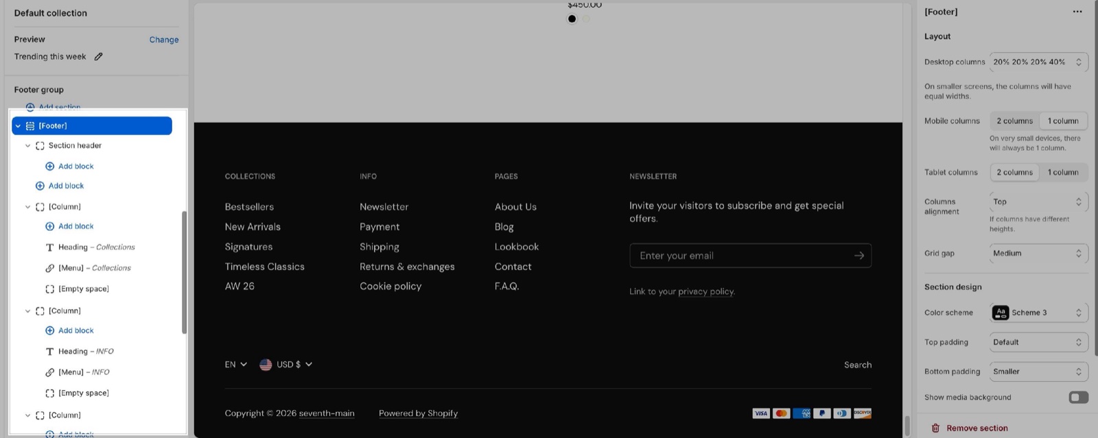
Footer group
A new Seventh store has four sections in the Footer group, from top to bottom:
- A Custom grid section with a card holding a heading, a newsletter form and text.
- A Multicolumn section with icons, headings and text.
- A Multicolumn section with columns of headings, menus, text and a newsletter form.
- The Copyright bar section.
Only the Copyright bar is made for the footer. The other sections have the same settings as on any page: see Custom grid section and Multicolumn section.
You can add any sections in the footer group; these will be sections that appear in your entire store.
Footer links
The footer links come from Shopify menus. Edit the menus in Shopify admin → Content → Menus. Then select the menu in the Menu block of a footer column, or in Menu of the Copyright bar. See Menu block.
Copyright bar
The Copyright bar has no blocks; all its options are section settings.
- Show language selector and Show country/region selector add the selectors. They appear only when the store has more than one language, or more than one country or region.
- Menu shows a row of links, for example policy links.
- Show copyright text shows "© year store name". Show Shopify notice shows the "Powered by Shopify" link: turn it off to remove it.
- Enable Follow on Shop shows Shopify's Follow on Shop button.
- Show payment icons shows an icon for each payment method turned on in Shopify.
- Icon 1 to Icon 6 add your own payment or trust icons. Only show the custom icons hides the Shopify icons.
Custom icons are cropped to the 90 x 57 px shape of a payment card and shown small, next to the Shopify payment icons. Upload PNG images with that shape, or the edges are cut off.
Why are the payment icons not showing?
Shopify decides which payment icons exist. Check these in order:
- Show payment icons is on and Only show the custom icons is off.
- The store has payment methods turned on in Shopify admin → Settings → Payments. Seventh shows one icon per payment method that Shopify reports as enabled.
- To show an icon that Shopify does not provide, upload it in Icon 1 to Icon 6. Custom icons show whether or not Show payment icons is on.
Why is the Follow on Shop button missing?
Shop Pay is off or the Shop channel is not installed. Shopify shows the Follow on Shop button only when the store has the Shop channel installed and Shop Pay turned on. See Shopify's help page Add Shop sign-in buttons to your store.
All Copyright bar settings
Every setting in this group, with its type and default.
Where to find it: Footer group → Copyright bar.
Copyright bar section: Language selector
Where to find it: Footer group → Copyright bar → Language selector
Show language selector (checkbox, default: on): Shows the language selector in the copyright bar. It appears only when the store has more than one published language (Shopify admin → Settings → Languages).
Copyright bar section: Country/region selector
Where to find it: Footer group → Copyright bar → Country/region selector
Show country/region selector (checkbox, default: on): Shows the country/region and currency selector in the copyright bar. It appears only when the store sells in more than one country or region (Shopify admin → Settings → Markets).
Copyright bar section: Content
Where to find it: Footer group → Copyright bar → Content
Menu (menu picker, default: the footer menu): Sets the menu shown as a row of links in the copyright bar, for example policy links.
Show copyright text (checkbox, default: on): Shows the copyright notice with the current year and the store name.
Show Shopify notice (checkbox, default: on): Shows the "Powered by Shopify" link.
Copyright bar section: Follow on Shop
Where to find it: Footer group → Copyright bar → Follow on Shop
To allow customers to follow your store on the Shop app from your storefront, Shop Pay must be enabled. Shopify Help Center.
Enable Follow on Shop (checkbox, default: on): Shows Shopify's Follow on Shop button, which lets customers follow the store in the Shop app. Needs Shop Pay turned on.
Copyright bar section: Payment icons
Where to find it: Footer group → Copyright bar → Payment icons
Show payment icons (checkbox, default: on): Shows an icon for each payment method turned on in Shopify admin → Settings → Payments.
The icons that show are determined by your store's payment settings. Shown only when Show payment icons is on.
Copyright bar section: Custom icons
Where to find it: Footer group → Copyright bar → Custom icons
Upload 90 x 57px.png images.
Only show the custom icons (checkbox, default: off): Hides the Shopify payment icons and shows only the images in Icon 1 to Icon 6.
Icon 1 (image): Adds your own payment or trust icon. Use a 90 x 57 px PNG; the image is cropped to that shape.
Icon 2 (image): Adds your own payment or trust icon. Use a 90 x 57 px PNG; the image is cropped to that shape.
Icon 3 (image): Adds your own payment or trust icon. Use a 90 x 57 px PNG; the image is cropped to that shape.
Icon 4 (image): Adds your own payment or trust icon. Use a 90 x 57 px PNG; the image is cropped to that shape.
Icon 5 (image): Adds your own payment or trust icon. Use a 90 x 57 px PNG; the image is cropped to that shape.
Icon 6 (image): Adds your own payment or trust icon. Use a 90 x 57 px PNG; the image is cropped to that shape.
Copyright bar section: Section design
Where to find it: Footer group → Copyright bar → Section design
The Copyright bar section uses the standard Section design settings, listed in General section styling. In this section the group has only Color scheme.
Color scheme (color scheme, default: Scheme 2).
Related pages
- Custom grid section: the newsletter area of the default footer.
- Multicolumn section: the link and info columns of the default footer.
- Menu block: the menus inside footer columns.
- Newsletter form block: the sign-up form in the footer.
- General section styling: the Color scheme setting of the Copyright bar.
- Social theme settings: the social profiles used across the store.
Cart drawer
The Cart drawer section sets the buttons, product recommendations and upsells inside the Seventh cart drawer. It applies when the cart type is Drawer.
Overlay group
The Overlay group in Seventh holds the Popovers and Modals sections: popups for newsletters, promotions, cookie consent, age verification and exit intent.