Header section
The Header section of Borders sets the logos, desktop layout, menu and submenu design, sticky behaviour, header icons and mega menu promotions.
Applies to: Borders 3.1.0 and later. Added in: Borders 1.0.0. Last checked: 2026-10-13 against Borders 3.1.0.
The Header section is the bar at the top of every page: your logo, the main menu, the header buttons (search, account, cart, selectors) and the promotions inside the dropdown menus. It sits in the Header group and cannot be removed.
Where to find it: Online Store → Themes → Customize → Header group → Header



Logo
Borders has two logos, one for desktop and one for mobile (screens narrower than 1024 px). Use the mobile logo when a large logo needs a simpler version on small screens.
- Desktop logo image and Mobile logo image set the two files. Without a mobile logo, the desktop logo is used on mobile too. Without any logo, the store name shows as text.
- Destkop logo image maximum height (shown with this spelling in the editor) sets the desktop height, 20 to 100 px. Mobile logo image maximum height sets the mobile height, 15 to 50 px.
- Center logo image on mobile centers the logo exactly in the middle of the mobile header. It shows only when Alignment is Center. When the two sides have a different number of buttons, the header can look uneven; turn it off to align the logo inside its own area instead.
Make sure that you upload a logo that is triple the size of the maximum height that you set. For example, if you want the logo to display at 80px in height, your uploaded file should be 240px.
Layout
- Desktop layout: One row puts the logo, the menu and the buttons on one line. Use it with the minimal menu or a short menu. Two rows puts the menu on its own row under the logo, for large menus.
- Desktop menu style shows only with One row. Classic (text) shows the menu links in the header. Minimal (drawer) shows a menu button that opens the Navigation drawer section.
- Alignment places the logo on the left or in the center. With Two rows, Center also centers the menu.
- Buttons in header display as shows the search, menu and cart buttons as icons or as text labels. Labels help customers who do not know the icons. On mobile the buttons are always icons.
- Buttons layout: Regular gives each button a larger box separated by borders. Compact removes the borders and puts the buttons closer together.
- Keep header padding static (don't follow inner padding value) (on by default) keeps the left and right padding of the header at about 20 px. Turn it off to use Theme settings → Layout → Inner padding, which can be up to 50 px.
Please note that whenever the classic (text) menu will not fit in its container (either if it's laid out in one or two rows), it will switch to the minimal (drawer) design.
Menu and submenu design
- Menu (under Content) is the Shopify menu of the classic desktop menu. The navigation drawer has its own menus, set in the Navigation drawer section.
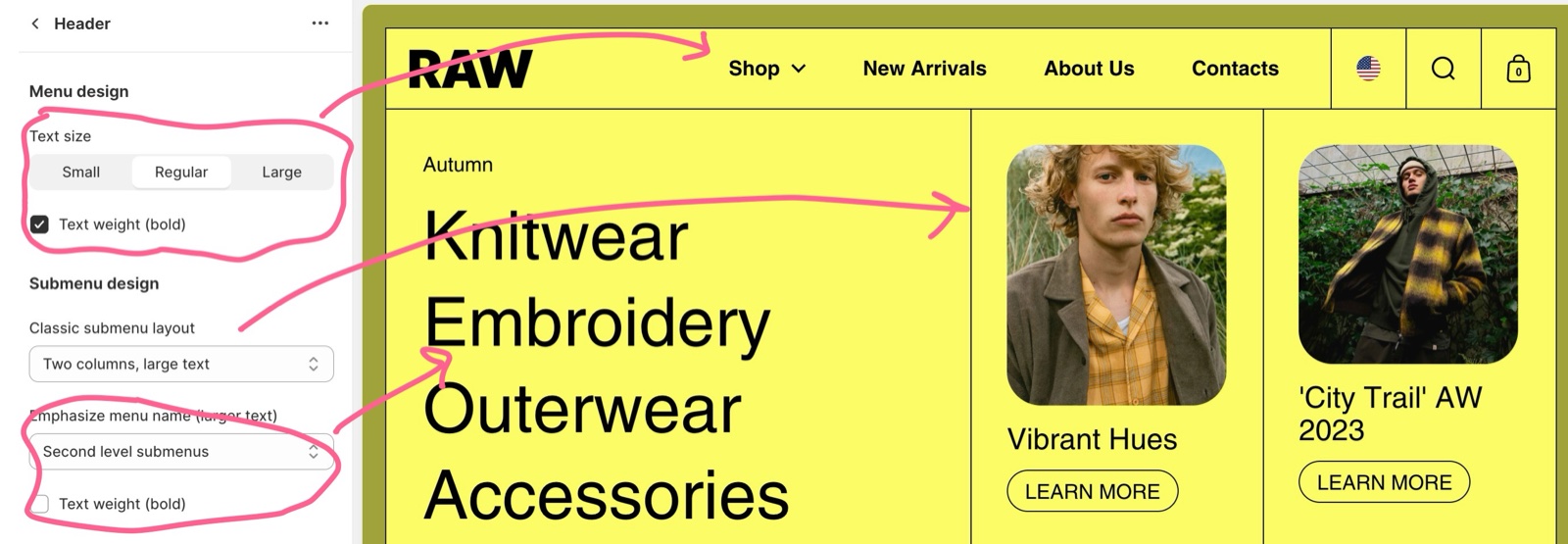
- Menu design: Text size (Small, Regular, Large) and Text weight (bold) style the top-level links.
- Classic submenu layout sets the dropdown: Two columns, large text suits small menus; Four columns, small text suits large menus with many submenus.
- Emphasize menu name (larger text): First level submenus shows the submenu titles in large text, a classic look. Second level submenus shows the links under them in large text instead, a more creative look.
- The submenu Text weight (bold) makes the large links bold.
Behaviour and content
- Sticky header: Disabled lets the header scroll away with the page. Always keeps it at the top of the screen.
- Show search adds the search button, which opens the Search drawer section.
- Show cart adds the cart button. It opens the cart drawer or goes to the cart page, as set in Theme settings → Cart → Cart type.
- Show account adds Shopify's account button, which opens Shopify's sign-in panel. It needs customer accounts turned on in Shopify admin → Settings → Customer accounts. Customer account menu sets the links in that panel.
- Show country/region selector and Show language selector add the selectors to the desktop header. They need more than one country in Shopify admin → Settings → Markets, or more than one published language in Settings → Languages.
Please note that the country & language selectors will disappear from the main menu on mobile devices. So you have to make sure that you show these (if needed) when setting up the drawer as well.
Section design
- Color scheme sets the header colors. The account panel uses Theme settings → Colors → Modals/drawers.
- Hide section bottom border removes the line under the header.
- Limit inner border width to 1px (on by default) keeps the lines between the header buttons at 1 px, even when Theme settings → Borders sets thicker lines.
Set up a two-row header with selectors
Upload the logos
Select Header and upload Desktop logo image and Mobile logo image. Set both maximum heights.
Choose the layout
Set Desktop layout to Two rows and Alignment to Center or Left.
Choose the menu
Under Content, choose the Menu for the desktop menu row.
Style the buttons
Choose Buttons in header display as (Icons or Labels) and Buttons layout (Compact or Regular).
Turn on the buttons you need
Turn on Show search, Show cart, Show account, Show country/region selector and Show language selector. With Show account on, choose the Customer account menu.
Set the sticky header
Set Sticky header to Always to keep the header on screen while customers scroll.
Add the selectors to the mobile menu
Open Drawers group → Navigation drawer and turn on Show country/region selector and Show language selector there too. The header hides them on mobile.
Promotion blocks
A Promotion block adds one or two promotions inside the dropdown of one top-level menu item: an image, a line of text and a button. Each promotion is optional, and the dropdown makes room for it: the menu links use fewer columns.
- Menu handle connects the block to a top-level menu item. A handle is the item's name in lowercase, with hyphens instead of spaces: "Our Promotions" becomes
our-promotions. - Promotion 1 and Promotion 2 each have Show promotion (off by default: the promotion stays hidden until you turn it on), Image, Promotion image link, Text, Button label, Button link and Open link in a new window.
- Promotion image link makes the image a link. Text shows in large type under the image. Button label and Button link add an outline button under the text.
- Write plain text in Text: the header shows it without bold or italic formatting.
- Promotions show only in the classic desktop menu. They do not show in the navigation drawer or on mobile.
Please note that promotion blocks only work inside navigation items that have subitems.
Setting up promotion blocks in submenus
Check the menu item
In Shopify admin → Content → Menus, open the menu of the header and find the top-level item that gets the promotion.
Work out the item's handle
Write the item's name in lowercase and replace spaces with hyphens. "Arabic books" becomes arabic-books.
Add the block
In the theme editor, select Header, then Add block → Promotion block.
Type the handle
Type the handle in Menu handle.
Fill the first promotion
Under Promotion 1, turn on Show promotion. Add an Image, a Promotion image link, the Text, a Button label and a Button link, as needed.
Add a second promotion
To show two promotions, turn on Show promotion under Promotion 2 and fill it the same way.
Save and check on desktop
Select Save. Open the dropdown of that menu item in a desktop browser window: the promotions show next to the links.
The menu handle is case sensitive - please insert lowercase text in the mega menu theme editor settings. In case you have a 2 words menu item, these need to be joined by "-", for example "arabic-books".
Why does my menu show as a drawer on desktop?
The classic menu does not fit in the header. Borders then shows the menu button and opens the navigation drawer instead, in one row and in two rows. The theme editor preview is narrower than a full browser window, so this happens there more often. Shorten the menu labels, lower the menu Text size, or use Desktop layout Two rows. Check also that Desktop menu style is not Minimal (drawer).
Why are the country and language selectors missing on mobile?
Borders hides them in the header on screens narrower than 1024 px. On mobile, the selectors live in the navigation drawer. Turn on Show country/region selector and Show language selector in Drawers group → Navigation drawer. The account button stays in the header on mobile.
Why does my promotion block not show?
Check these in order:
- Show promotion is on under Promotion 1 or Promotion 2.
- Menu handle is the exact handle of a top-level item, in lowercase, with hyphens.
- That item has sub-items in Shopify admin → Content → Menus.
- You are looking at the classic desktop menu. Promotions do not show in the drawer menu or on mobile.
All Header settings
Every setting on this page, with its type and default.
Accepts these blocks: Promotion block.
Header section: Logo
Where to find it: Header group → Header → Logo
Desktop logo image (image): Sets the logo on screens 1024 px and wider. Without a logo, the store name shows as text.
Destkop logo image maximum height (slider 20 to 100 px, default: 25 px): Sets the maximum height of the desktop logo, 20 to 100 px. Upload a file three times this height for sharp display.
Mobile logo image (image): If you don't upload a mobile logo, the desktop logo will be used instead.
Mobile logo image maximum height (slider 15 to 50 px, default: 20 px): Sets the maximum height of the logo on screens narrower than 1024 px, 15 to 50 px.
Center logo image on mobile (checkbox, default: on): Centers the logo exactly in the middle of the mobile header. When the two sides have a different number of buttons, the header can look uneven. Shown only when Alignment is Center.
Header section: Content
Where to find it: Header group → Header → Content
Menu (menu picker, default: the main-menu menu): Sets the Shopify menu of the classic desktop menu. The navigation drawer uses its own Menu blocks.
Header section: Layout
Where to find it: Header group → Header → Layout
Desktop layout (dropdown, default: Two rows): Sets the desktop header: One row puts logo, menu and buttons on one line; Two rows puts the menu on its own row under the logo. Two rows always uses the classic menu, which falls back to the drawer when it does not fit. Options: One row, Two rows.
Desktop menu style (dropdown, default: Classic (text)): Sets the desktop menu with One row: Classic (text) shows the links in the header; Minimal (drawer) shows a menu button that opens the navigation drawer. Options: Classic (text), Minimal (drawer). Shown only when Desktop layout is One row.
Alignment (dropdown, default: Center): Sets the logo position, on the left or in the center. With Two rows, Center also centers the menu. Options: Left, Center.
Buttons in header display as (dropdown, default: Icons): Shows the search, menu and cart buttons as icons or as text labels on desktop. Options: Icons, Labels.
Buttons layout (dropdown, default: Regular): Sets the header buttons: Regular gives each button a larger box separated by borders; Compact removes the borders and puts the buttons closer together. Options: Compact, Regular.
Keep header padding static (don't follow inner padding value) (checkbox, default: on): Keeps the left and right padding of the header items at about 20 px (15 px on smaller screens), instead of following Theme settings → Layout → Inner padding.
Header section: Menu design
Where to find it: Header group → Header → Menu design
Text size (dropdown, default: Regular): Sets the text size of the top-level menu links and of the button labels. Options: Small, Regular, Large.
Text weight (bold) (checkbox, default: on): Makes the top-level menu links bold.
Header section: Submenu design
Where to find it: Header group → Header → Submenu design
Classic submenu layout (dropdown, default: Four columns, small text): Sets the dropdown of the classic menu: two columns of large links, or four columns of small links. Promotion blocks take some of the columns. Options: Two columns, large text, Four columns, small text.
Emphasize menu name (larger text) (dropdown, default: First level submenus): Sets which level of the dropdown shows in large text: the submenu titles (First level submenus) or the links under them (Second level submenus). Options: First level submenus, Second level submenus.
Text weight (bold) (checkbox, default: on): Makes the large dropdown links bold.
Header section: Behaviour
Where to find it: Header group → Header → Behaviour
Sticky header (dropdown, default: Disabled): Sets whether the header scrolls away with the page (Disabled) or stays at the top of the screen (Always). Options: Disabled, Always.
Header section: Content
Where to find it: Header group → Header → Content
Show search (checkbox, default: on): Shows the search button, which opens the search drawer.
Show cart (checkbox, default: on): Shows the cart button with the item count. It opens the cart drawer or the cart page, as set in Theme settings → Cart → Cart type.
Show account (checkbox, default: off): Shows Shopify's account button, which opens the sign-in panel. Shown only when customer accounts are turned on in Shopify admin; it stays in the header on mobile.
Customer account menu (menu picker, default: the customer-account-main-menu menu): Sets the links in the account panel that opens from the account button. Shown only when Show account is on.
Show country/region selector (checkbox, default: off): Shows the country/region selector in the desktop header. Hidden on screens narrower than 1024 px: turn it on in the navigation drawer too.
Show language selector (checkbox, default: off): Shows the language selector in the desktop header. Hidden on screens narrower than 1024 px: turn it on in the navigation drawer too.
Header section: Section design
Where to find it: Header group → Header → Section design
Color scheme (color scheme, default: scheme_1).
Hide section bottom border (checkbox, default: off).
Limit inner border width to 1px (checkbox, default: on): Keeps the lines between the header items at 1 px. When off, they follow the primary border width of Theme settings → Borders, up to the secondary border width.
Promotion block block
Where to find it: Header group → Header → Add block → Promotion block
Menu handle (text field): Sets the top-level menu item whose dropdown shows the promotions: its handle, in lowercase with hyphens ("Our Promotions" is our-promotions). The item needs sub-items.
Promotion block block: Promotion 1
Where to find it: Header group → Header → Add block → Promotion block → Promotion 1
Show promotion (checkbox, default: off): Shows the first promotion. Off by default: the promotion stays hidden until this is on.
Image (image): Sets the image of the first promotion, shown at its own aspect ratio.
Promotion image link (link): Makes the image of the first promotion a link.
Text (text field, default: "Lead customers to your best offers"): Sets the large text under the image. Plain text only.
Button label (text field): Sets the label of an outline button under the text. Without a label, no button shows.
Button link (link).
Open link in a new window (checkbox, default: off).
Promotion block block: Promotion 2
Where to find it: Header group → Header → Add block → Promotion block → Promotion 2
Show promotion (checkbox, default: off): Shows the second promotion. Off by default.
Image (image).
Promotion image link (link): Makes the image of the second promotion a link.
Text (formatted text, default: "Link great product stories"): Sets the large text under the image. Bold and italic formatting are not applied.
Button label (text field): Sets the label of an outline button under the text. Without a label, no button shows.
Button link (link).
Open link in a new window (checkbox, default: off).
Related pages
- Navigation drawer section: the mobile menu and the minimal desktop menu.
- Header group: the sections above and below the header.
- Borders theme settings: the line styles and widths the header uses.
- Troubleshoot the header, menus and drawers: common problems.