Product card theme settings
The Product card theme settings set how Split shows products in grids: media ratio, caption, color swatches, ratings, quick buy and badges.
Applies to: Split 5.1.0 and later. Added in: Split 1.0.0. Last checked: 2026-10-13 against Split 5.1.0.
Product cards are the product tiles in collection pages, search results and sections such as Featured collection and Collection slider. These settings apply to every product card in the store: the image shape, the caption, color swatches, ratings, the quick buy button and the badges.
Where to find it: Theme settings → Product card
Product thumbnail
- Media aspect ratio sets the shape of every product image: Square (1:1), Tall (5:6, the default) or Taller (2:3). Images are cropped to fill that shape.
- Fit media inside container shrinks each image to fit inside the shape instead of cropping it. Use it when your product photos have different proportions, or for very tall images.
- Container inner spacing and Container background (shown with Fit media inside container) add space around the fitted image and color the empty area.
- Show second product media on hover swaps to the product's second image when the customer points at the card. It works on desktop only and on products with at least two images.
Product caption
- Caption display (desktop) sets where the product title and price show on screens wider than 1024 px:
- Visible: below the image, always.
- Overlay: hidden over the image, they appear when the customer points at the card.
- Overlay caption background and Overlay caption text color the overlay. Left transparent, the overlay uses the body colors from Theme settings → Colors.
- On phones and on tablets held upright the caption is always visible below the image.
Setting up color swatches
Split shows color swatches on product cards and in the product page variant picker. A swatch can be a color or a small image. Product cards show swatches only for options whose name is in Color swatches labels.
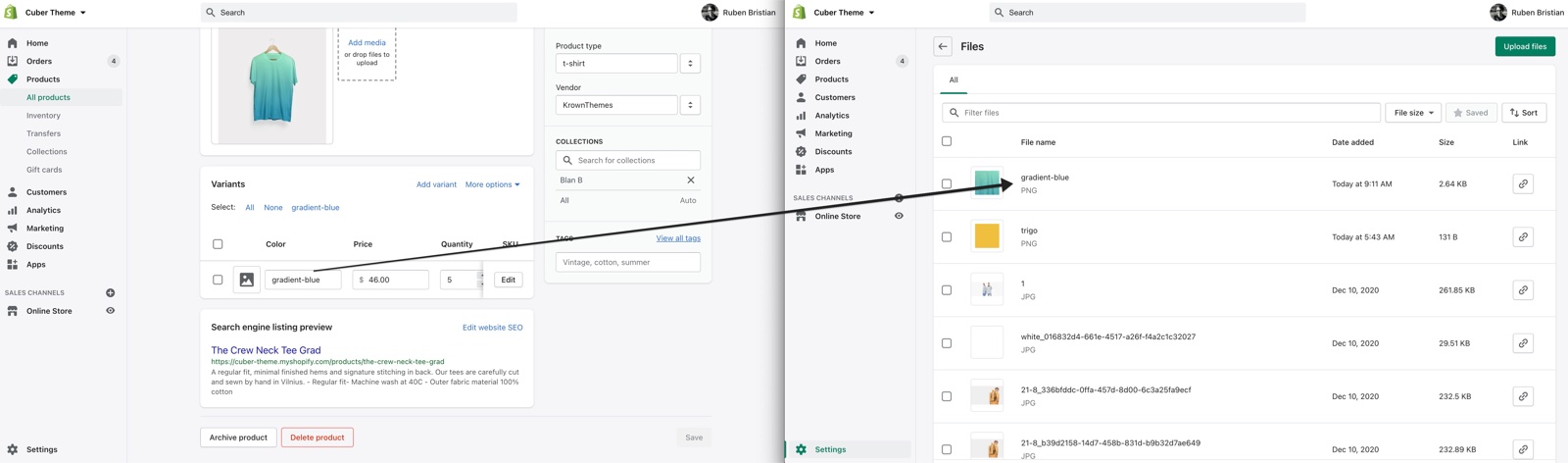
Check the option name
Open Theme settings → Product card → Color swatches. Color swatches labels must contain your option name, in lowercase, for example color. To add your own name, type a comma and the name with no space: color,colour,shade.
Give every value a swatch
For each option value, Split uses the first of these it finds:
- The swatch from Shopify's Color category metafield, connected to the option in the product editor in Shopify admin. This is the recommended way.
- An image in Shopify admin → Content → Files named after the value, in lowercase with hyphens, plus
.png. For "Dark Grey", uploaddark-grey.png, at least 60 x 60 px. - The value itself as a CSS color name, without spaces: "Dark Grey" becomes
darkgrey. Only valid CSS color names work.
Turn on swatches in product cards
Turn on Show color swatches in product card. Swatches appear when the customer points at the card on desktop, and are always visible on phones and tablets. Selecting a swatch shows that variant's image.
Turn on swatches on the product page
Open a product page in the theme editor, select the Variant picker block, set Variants selector type to Blocks and turn on Show color swatches. See Product page.
Swatch images are cached, so wait a few minutes before they show on your store. The file name must match the option value exactly: "Navy Blue" needs navy-blue.png.
Showing product ratings
Split shows a star rating badge on product cards, read from your reviews app.
Install a reviews app
Install one of the supported apps from the Shopify App Store and let it collect reviews. See Recommended rating apps.
Choose the app
Open Theme settings → Product card → Product rating and select your app in Rating app: Okendo, Loox, Judge.me, Stamped, Yotpo, Ali Reviews, Rapid Reviews or Air Reviews.
Choose when the rating shows
Set Rating display (desktop) to Show on hover, Always visible or Don't show. Turn on Show on mobile to show it on phones and on tablets held upright.
- Okendo, Judge.me, Loox, Rapid Reviews and Air Reviews: Split reads the average rating the app saves on the product and shows it as "4.5 / 5" with a star. A product with no rating shows no badge.
- Stamped, Yotpo and Ali Reviews: Split adds the app's own rating widget, which the app's script fills in. The app must be active on your store for it to show.
Third party apps may require additional steps to be properly integrated. If no rating shows, check in the app's settings that it saves ratings to your products or loads its storefront script.
Quick buy
Enable quick buy (on by default) adds a cart button to every available product card. It shows when the customer points at the card on desktop, and always on touch screens.
- A product with one variant is added to the cart at once. With Theme settings → Cart → Cart type set to Drawer, the cart drawer opens; with Page, the customer goes to the cart page.
- A product with variants opens the Quick view popup, where the customer picks the variant. See Quick view.
- Sold out products show no quick buy button.
- Cart recommendations have their own Enable quick buy in Theme settings → Cart. See Cart theme settings.
Product badges
Split shows up to two badges on a product card image:
- Sold out: when every variant of the product is sold out. A sold out product shows no sale badge.
- Sale: when the compare-at price is higher than the price. Show discount as... sets the text: Text ("On Sale"), Percentage ("-20%", the default) or Amount saved ("Save $10").
- Pre Order: when the product has the tag
preorder,pre orderorPre Order. - New: when the product has the tag
new, in lowercase. A product with a Pre Order tag shows Pre Order instead.
Colors:
- Background color, Text color and Border color under Product badges color the Pre Order and New badges, and the rating badge.
- The Sold out and Discount badges have their own background and text colors.
- Show badges hides or shows the Sold out, Sale, Pre Order and New badges on product cards. The product page has its own setting, Show product badge, in the Product header block.
The badge texts are theme texts. Change them in Shopify admin → Online Store → Themes → … → Edit default theme content.
Why does my discount badge say "On Sale" instead of a percentage?
Because the product's variants have different prices or compare-at prices. Since Split 5.0.0, product cards then show "On Sale" instead of working out a saving per variant, which keeps collection pages fast. The product page shows the exact saving of the selected variant.
How do I add my own badge?
Split has no setting for more badges. The New and Pre Order badges come from product tags, so tag a product new or preorder to show them. Any other badge, for example "Limited", needs a change to the theme code: see Custom CSS and code.
Why are my product images cropped?
Because Media aspect ratio crops every image to the same shape. Split has no "natural" ratio. Turn on Fit media inside container to show each whole image inside the shape, with Container background behind it.
All Product card settings
Every setting in this group, with its type and default.
Product card theme settings: Product thumbnail
Where to find it: Theme settings → Product card → Product thumbnail
Media aspect ratio (dropdown, default: Cropped: Tall (5:6)): Sets the shape of every product card image; images are cropped to fill it unless Fit media inside container is on. Options: Cropped: Square (1:1), Cropped: Tall (5:6), Cropped: Taller (2:3).
Fit media inside container (checkbox, default: off): Shrinks each product image to fit inside the aspect ratio instead of cropping it.
Container inner spacing (slider 0 to 15 %, default: 10 %): Sets the space around a fitted image inside its box, in percent. Shown only when Fit media inside container is on.
Container background (color, default: transparent): Sets the color of the empty area around a fitted image. Shown only when Fit media inside container is on.
Show second product media on hover (checkbox): Shows the product's second image when the customer points at the card. Desktop only; needs at least two product images. Off unless your preset turns it on.
Product card theme settings: Product caption
Where to find it: Theme settings → Product card → Product caption
Caption display (desktop) (dropdown, default: Visible): Sets where the title and price show on screens wider than 1024 px: Visible = below the image; Overlay = hidden over the image, shown when the customer points at the card. On smaller screens the caption is always below the image. Options: Visible, Overlay.
Overlay caption background (color, default: transparent): Sets the background of the Overlay caption. Transparent uses the body background.
Overlay caption text (color, default: transparent): Sets the text and icon color of the Overlay caption. Transparent uses the body text color.
Product card theme settings: Color swatches
Where to find it: Theme settings → Product card → Color swatches
This theme can show custom images for color swatches.
Color swatches labels (text field, default: "color,colour,couleur,cor,colore,culoare,farbe,색,色,カラー,färg,farve,szín,barva"): The option names that become color swatches on product cards, in lowercase, separated by commas with no spaces (for example color,colour,shade). On the product page an option with Shopify category-metafield swatches shows swatches whatever its name.
Show color swatches in product card (checkbox, default: on): Shows color swatches on product cards: on hover on desktop, always on phones and tablets. Selecting a swatch shows that variant's image.
Product card theme settings: Product rating
Where to find it: Theme settings → Product card → Product rating
To display ratings, add a product rating app. Learn more.
Rating display (desktop) (dropdown, default: Show on hover): Sets when the star rating badge shows on product cards on desktop: never, when the customer points at the card, or always. Options: Don't show, Show on hover, Always visible.
Show on mobile (checkbox, default: off): Shows the star rating badge on product cards on phones and on tablets held upright.
Rating app (dropdown, default: Okendo): The reviews app Split reads ratings from. Okendo, Judge.me, Loox, Rapid Reviews and Air Reviews: the rating saved on the product, shown as 4.5 / 5. Stamped, Yotpo and Ali Reviews: the app's own widget, which needs the app's script. Options: Okendo, Loox, Judge.me, Stamped, Yotpo, Ali Reviews, Rapid Reviews, Air Reviews.
Product card theme settings: Quick buy
Where to find it: Theme settings → Product card → Quick buy
Adds an instant "add to cart" button. If the product has variants, it will display a "quick buy" popup.
Enable quick buy (checkbox, default: on): Adds a cart button to available product cards, on hover on desktop and always on touch screens. One variant: adds to cart. Several variants: opens the Quick view popup.
Product card theme settings: Product badges
Where to find it: Theme settings → Product card → Product badges
Show badges (checkbox, default: on): Shows the Sold out, Sale, Pre Order and New badges on product cards. The product page has its own Show product badge setting in the Product header block.
Background color (color, default: #ffffff): Sets the background of the Pre Order and New badges and of the rating badge.
Text color (color, default: #000000): Sets the text color of the Pre Order and New badges and of the rating badge.
Border color (color, default: #e7e7e7): Sets the border of the Pre Order and New badges and of the rating badge.
Product card theme settings: Sold out badge
Where to find it: Theme settings → Product card → Sold out badge
'Sold out' background color (color, default: #757575).
'Sold out' text color (color, default: #ffffff).
Product card theme settings: Discount badge
Where to find it: Theme settings → Product card → Discount badge
Show discount as... (dropdown, default: Percentage): Sets the sale badge text: Text shows "On Sale", Percentage shows the saving in percent ("-20%"), Amount saved shows "Save" and the amount. Products whose variants have different prices show "On Sale" on product cards. Options: Text, Percentage, Amount saved.
Products with varying prices across variants will show a generic 'Sale' badge. Shown only when Show discount as... is not Text.
'Discount' background color (color, default: #D14545).
'Discount' text color (color, default: #ffffff).
Related pages
- Quick view: the Quick view popup that quick buy opens.
- Product page: the variant picker and its swatches, and the Product header badge.
- Collection page: the product grid and swatch filters.
- Cart theme settings: the thumbnail ratio of cart items and quick buy in cart recommendations.
- Recommended rating apps: reviews apps that work with Split.
Typography theme settings
The Typography theme settings choose the heading and body fonts of Split, their base sizes and line heights, and the corner radius of buttons.
Favicon theme settings
The Favicon theme setting uploads the small icon that browsers show next to your Split store name in tabs and bookmarks, 48 x 48 px PNG.