Split documentation
Documentation for Split, the Krown Themes Shopify theme built on a split-screen layout: theme settings, sections, page templates, blocks and release notes.
What do you want to do today?
Type it in your own words. Pages that match appear as you type; press Enter for an answer from the docs.
Applies to: Split 5.1.0 and later. Added in: Split 1.0.0. Last checked: 2026-10-13 against Split 5.1.0.
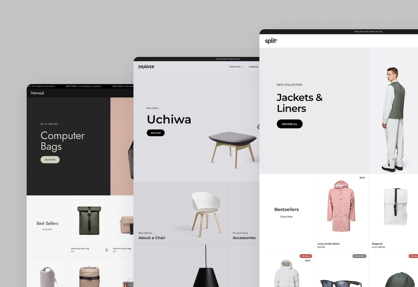
This is the documentation for Split, the Krown Themes Shopify theme built on a split-screen layout. It describes every setting in the theme editor in Split 5.1.0, the current version on the Shopify Theme Store.
On desktop, most Split sections divide the screen into two halves, and their heights follow the height of the screen. On phones and tablets in portrait, the halves stack into one column. See How Split is built.
What is in these docs
- What is Split: what the theme includes, how to update it, image sizes and the video guide.
- Split presets: the three presets Cuber, Jagger and Looker.
- Colors theme settings and the other Theme settings pages: one page per group in Theme settings, from Colors to Social.
- Header group, Drawers, Footer group and Overlay group: the parts of the store that appear on every page.
- Sections: one page per section you can add with Add section.
- Product page and the other page templates: collection, search, blog, article, cart and more.
- Cards and Theme blocks: the cards and blocks of the Flex cards and Flex grid sections.
- Split FAQ: answers to common questions, phrased as questions.
- Custom CSS and code and JavaScript events: pages for developers.
- What's new in Split: every Split release, with links to the pages it changed.
Setting names are written exactly as the theme editor shows them, in bold, for example Show badges. Editor paths use arrows, for example Theme settings → Product card. Search for the label you see in the theme editor to find its page.
Where to start
Theme settings
Colors, typography, product cards, cart and other store-wide settings.
Sections
Every section you can add to a page.
FAQ and troubleshooting
Answers to common questions and problems.
Who do I contact?
Krown support answers questions about Split's settings and fixes theme bugs at contact.krownthemes.com. Changes that need custom code are not part of theme support: see Custom work and code changes.
Related pages
- What's new in Split: what changed in each Split release.
- Update Split: how to move to the latest version.