Popovers section
The Popovers section shows small cards over the page in Seventh: newsletter, product, collection and cookie consent popovers, with timing and frequency.
Applies to: Seventh 4.0.0 and later. Added in: Seventh 1.0.0. Last checked: 2026-10-12 against Seventh 4.0.0.
The Popovers section shows small cards that slide in at a bottom corner of the screen without blocking the page. Each popover is a block: a newsletter card, a product card, a collection card or a cookie consent banner.
Where to find it: in the theme editor sidebar, open the Overlay group and select Popovers, then select Add block.
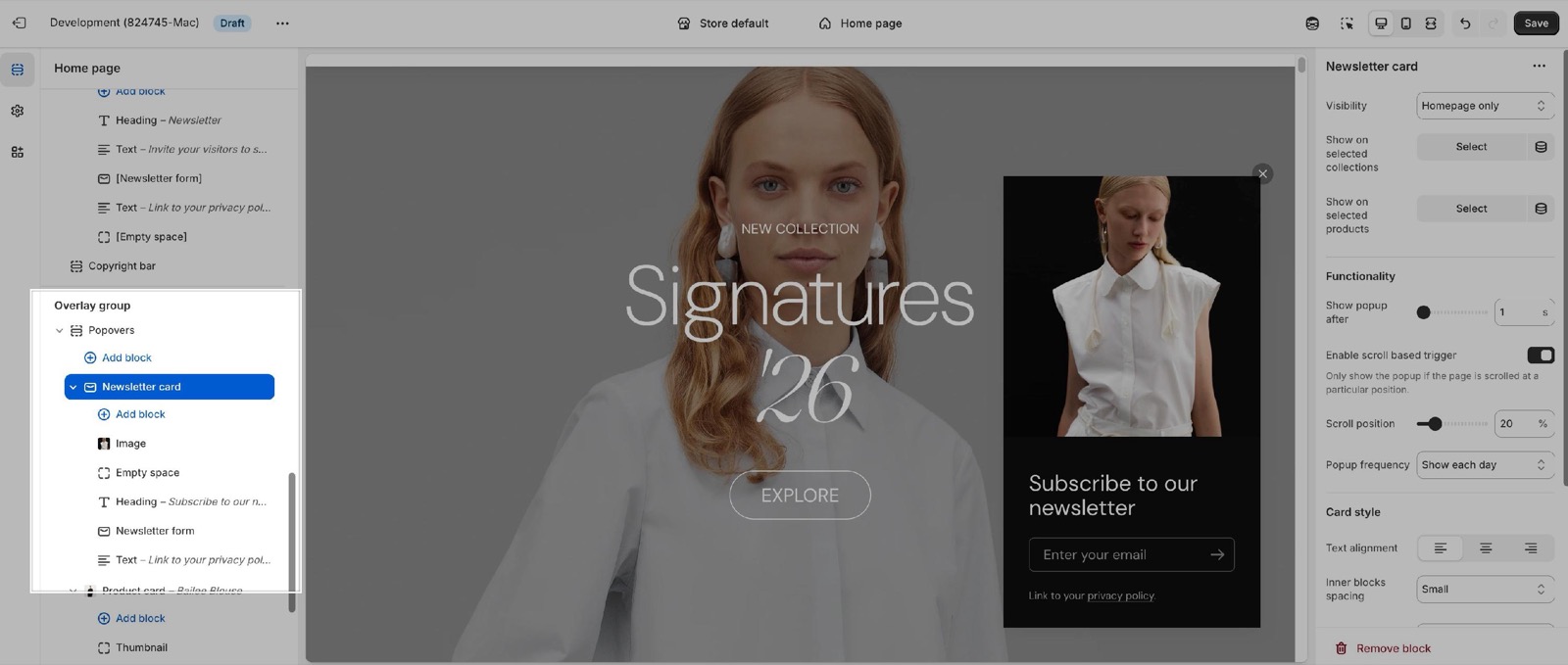
Popovers and modals
- A popover does not cover the page, so the customer can keep scrolling.
- For a centered window that covers the page, use the Modals section.
- Alignment is the only section setting: it puts the popovers in the bottom left or bottom right corner.
- When several popovers open at the same time, they stack on top of each other in the same corner.
Newsletter card
The Newsletter card holds any theme blocks and app blocks, for example a Heading, a Text and a Newsletter form block. Despite its name it can carry any content, such as a discount message with a Button.
Read more about cards & blocks in the theme's documentation:
- Seventh → Cards: any card type
- Seventh → Blocks
Where and when a popover shows
The Newsletter card, Product card and Collection card share these settings:
- Visibility sets the page types that show the popover.
- Show on selected collections and Show on selected products limit the popover to those pages. When either list has entries, Visibility is ignored.
- Show popup after sets the delay, from 1 to 60 seconds.
- Enable scroll based trigger waits until the customer scrolls to Scroll position, a percentage of the page. The delay starts counting after that point.
How often a popover shows
Seventh remembers in the customer's browser when the customer closed the popover. It shows the popover again only after the Popup frequency period:
- Show each day: again after 24 hours.
- Show each week (default): again after 7 days.
- Show each month: in Seventh 4.0.0, the popover does not show again in that browser after it has been closed.
A popover that the customer never closes shows again on the next page. A private window counts as a new browser. Duplicating a popover block creates a new popover that every customer sees again.
Note: Popovers are using the browser's local storage for the frequency setting. This means that if a customer is checking your store on different devices, the popover will show each time a new device (or browser) is used.
Product and collection cards
- The Product card shows the product chosen in Product. Its title, image, price and other details come from the product blocks inside the card.
- The Collection card shows the collection chosen in Collection. Its title, image and product count come from the collection blocks inside the card.
- Both cards also accept a Content group, theme blocks and app blocks.
Cookie consent
Since Seventh 2.0.0, the Popovers section includes the Cookie consent popover:
- It shows a short cookie message with two buttons, "Accept all cookies" and "Decline all cookies".
- Accept turns on analytics, marketing and preferences tracking through Shopify's customer privacy API. Decline turns all three off.
- After either choice, the popover does not show again in that browser.
- The title, message and button texts are theme translations. Change them in Shopify admin → Online Store → Themes → … → Edit default theme content.
Make sure that you disable Shopify's banner if you plan to use the theme's cookie popover, in order to not get a duplicate.
Shopify, not Seventh, controls customer privacy and the cookie banner rules. Turn off Shopify's own banner in Shopify admin → Settings → Customer privacy. The Cookie consent popover accepts or declines all cookie types at once. For per-category choices or regional rules, use Shopify's banner or a consent app. See Cookies popup and Better cookie popups for GDPR compliance.
Why is my popover not showing?
A visibility or trigger setting stops it on the page you are testing, or your browser already closed it. Check these in order:
- Visibility includes the page type you are testing.
- Show on selected collections and Show on selected products are empty, or include this page.
- Show popup after: wait for the delay to pass.
- Enable scroll based trigger: with the trigger on, scroll to the Scroll position first.
- Popup frequency: your browser may already have closed it. Test in a private window.
In the theme editor, a popover opens when you select its block in the sidebar and closes when you select something else. The theme editor does not remember closed popovers.
Why are some popovers cut off when I have several?
Popovers that open at the same time stack in one corner, and a tall stack does not fit the screen. Show fewer popovers on the same page with Visibility, or give each one a different Show popup after delay.
All Popovers settings
Every setting on this page, one list per section or block, with its type and default.
Accepts these blocks: Product card, Collection card, Newsletter card and Cookie consent.
Alignment (dropdown, default: Right): Sets the bottom corner of the screen where popovers appear, left or right. Options: Left, Right.
Where to find it: Overlay group → Popovers → Newsletter card.
Accepts these blocks: Content group, any theme block and app blocks.
Visibility (dropdown, default: All pages): Sets the page types that show this popover. Ignored, and hidden in the editor, as soon as products or collections are selected below. Options: All pages, Homepage only, All product pages, All collection pages, Cart page only, All pages except the homepage. Shown only when Show on selected products is empty and Show on selected collections is empty.
Show on selected collections (collections picker): Shows this popover only on the selected collection pages. When set, Visibility is ignored.
Show on selected products (products picker): Shows this popover only on the selected product pages. When set, Visibility is ignored.
Newsletter card: Functionality
Where to find it: Overlay group → Popovers → Newsletter card → Functionality
Show popup after (slider 1 to 60 s, default: 1 s): Sets the delay before the popover appears, from 1 to 60 seconds. With the scroll based trigger on, the delay starts when the customer reaches the scroll position.
Enable scroll based trigger (checkbox, default: off): Waits until the customer scrolls to Scroll position before the popover can appear.
Scroll position (slider 0 to 100 %, default: 50 %): Sets how far down the page, from 0 to 100 percent, the customer must scroll before the popover appears. Shown only when Enable scroll based trigger is on.
Popup frequency (dropdown, default: Show each week): Sets how long the browser keeps the popover hidden after the customer closes it: 24 hours (Show each day) or 7 days (Show each week). With Show each month, Seventh 4.0.0 does not show it again in that browser. Options: Show each day, Show each week, Show each month.
Newsletter card: Card style
Where to find it: Overlay group → Popovers → Newsletter card → Card style
Text alignment (alignment, default: Left).
Inner blocks spacing (dropdown, default: Small). Options: XXSmall, XSmall, Small, Regular, Large, XLarge.
Padding (dropdown, default: Regular). Options: XSmall, Small, Regular, Large, XLarge, XXLarge.
Add padding to media elements (checkbox, default: on): Keeps the card padding around images and videos inside the popover. Turn it off for media that touches the card edges.
Corner radius (dropdown, default: Rounded). Options: None, Slighty rounded, Rounded, Fully rounded.
Color scheme (color scheme, default: Scheme 1): Sets the colors of the popover card.
Where to find it: Overlay group → Popovers → Product card.
Accepts these blocks: Product title, Product thumbnail, Product price, Product vendor, Product rating, Color swatches & size, Product siblings, Product badges, Content group, any theme block and app blocks.
Visibility (dropdown, default: All pages): Sets the page types that show this popover. Ignored, and hidden in the editor, as soon as products or collections are selected below. Options: All pages, Homepage only, All product pages, All collection pages, Cart page only, All pages except the homepage. Shown only when Show on selected products is empty and Show on selected collections is empty.
Show on selected collections (collections picker): Shows this popover only on the selected collection pages. When set, Visibility is ignored.
Show on selected products (products picker): Shows this popover only on the selected product pages. When set, Visibility is ignored.
Product card: Functionality
Where to find it: Overlay group → Popovers → Product card → Functionality
Show popup after (slider 1 to 60 s, default: 1 s): Sets the delay before the popover appears, from 1 to 60 seconds. With the scroll based trigger on, the delay starts when the customer reaches the scroll position.
Enable scroll based trigger (checkbox, default: off): Waits until the customer scrolls to Scroll position before the popover can appear.
Scroll position (slider 0 to 100 %, default: 50 %): Sets how far down the page, from 0 to 100 percent, the customer must scroll before the popover appears. Shown only when Enable scroll based trigger is on.
Popup frequency (dropdown, default: Show each week): Sets how long the browser keeps the popover hidden after the customer closes it: 24 hours (Show each day) or 7 days (Show each week). With Show each month, Seventh 4.0.0 does not show it again in that browser. Options: Show each day, Show each week, Show each month.
Product card: Content
Where to find it: Overlay group → Popovers → Product card → Content
Product (product picker): Sets the product shown in the popover. Its title, image, price and other details come from the product blocks inside the card.
Product card: Card style
Where to find it: Overlay group → Popovers → Product card → Card style
Text alignment (alignment, default: Left).
Inner blocks spacing (dropdown, default: Small). Options: XXSmall, XSmall, Small, Regular, Large, XLarge.
Padding (dropdown, default: Regular). Options: XSmall, Small, Regular, Large, XLarge, XXLarge.
Add padding to media elements (checkbox, default: on): Keeps the card padding around images and videos inside the popover. Turn it off for media that touches the card edges.
Corner radius (dropdown, default: Rounded). Options: None, Slighty rounded, Rounded, Fully rounded.
Color scheme (color scheme, default: Scheme 1): Sets the colors of the popover card.
Where to find it: Overlay group → Popovers → Collection card.
Accepts these blocks: Collection title, Collection image, Content group, Collection count, any theme block and app blocks.
Visibility (dropdown, default: All pages): Sets the page types that show this popover. Ignored, and hidden in the editor, as soon as products or collections are selected below. Options: All pages, Homepage only, All product pages, All collection pages, Cart page only, All pages except the homepage. Shown only when Show on selected products is empty and Show on selected collections is empty.
Show on selected collections (collections picker): Shows this popover only on the selected collection pages. When set, Visibility is ignored.
Show on selected products (products picker): Shows this popover only on the selected product pages. When set, Visibility is ignored.
Collection card: Functionality
Where to find it: Overlay group → Popovers → Collection card → Functionality
Show popup after (slider 1 to 60 s, default: 1 s): Sets the delay before the popover appears, from 1 to 60 seconds. With the scroll based trigger on, the delay starts when the customer reaches the scroll position.
Enable scroll based trigger (checkbox, default: off): Waits until the customer scrolls to Scroll position before the popover can appear.
Scroll position (slider 0 to 100 %, default: 50 %): Sets how far down the page, from 0 to 100 percent, the customer must scroll before the popover appears. Shown only when Enable scroll based trigger is on.
Popup frequency (dropdown, default: Show each week): Sets how long the browser keeps the popover hidden after the customer closes it: 24 hours (Show each day) or 7 days (Show each week). With Show each month, Seventh 4.0.0 does not show it again in that browser. Options: Show each day, Show each week, Show each month.
Collection card: Content
Where to find it: Overlay group → Popovers → Collection card → Content
Collection (collection picker): Sets the collection shown in the popover. Its title, image and product count come from the collection blocks inside the card.
Collection card: Card style
Where to find it: Overlay group → Popovers → Collection card → Card style
Text alignment (alignment, default: Left).
Inner blocks spacing (dropdown, default: Small). Options: XXSmall, XSmall, Small, Regular, Large, XLarge.
Padding (dropdown, default: Regular). Options: XSmall, Small, Regular, Large, XLarge, XXLarge.
Add padding to media elements (checkbox, default: on): Keeps the card padding around images and videos inside the popover. Turn it off for media that touches the card edges.
Corner radius (dropdown, default: Rounded). Options: None, Slighty rounded, Rounded, Fully rounded.
Color scheme (color scheme, default: Scheme 1): Sets the colors of the popover card.
Where to find it: Overlay group → Popovers → Cookie consent.
Uses Shopify's consent tracking API. The banner will only appear if cookies have not yet been accepted or declined.
Cookie consent block: Card style
Where to find it: Overlay group → Popovers → Cookie consent → Card style
Text alignment (alignment, default: Left).
Inner blocks spacing (dropdown, default: Small). Options: XXSmall, XSmall, Small, Regular, Large, XLarge.
Padding (dropdown, default: Regular). Options: XSmall, Small, Regular, Large, XLarge, XXLarge.
Add padding to media elements (checkbox, default: on): Keeps the card padding around images and videos inside the popover. Turn it off for media that touches the card edges.
Corner radius (dropdown, default: Rounded). Options: None, Slighty rounded, Rounded, Fully rounded.
Color scheme (color scheme, default: Scheme 1): Sets the colors of the popover card.
Related pages
- Overlay group: popovers compared with modals.
- Modals section: centered windows, age verification and exit intent.
- Product card: the product blocks a Product card popover can hold.
- Collection card: the collection blocks a Collection card popover can hold.
- Newsletter form block: the sign-up form for a Newsletter card popover.
- Troubleshoot popovers and modals: more answers about popovers.
Overlay group
The Overlay group in Seventh holds the Popovers and Modals sections: popups for newsletters, promotions, cookie consent, age verification and exit intent.
Modals
The Modals section shows centered windows in Seventh: modal cards on a timer or scroll, an age verification window and an exit intent popup.