Modals section
The Modals section shows centered windows in Seventh: modal cards on a timer or scroll, an age verification window and an exit intent popup.
Applies to: Seventh 4.0.0 and later. Added in: Seventh 2.0.0. Last checked: 2026-10-12 against Seventh 4.0.0.
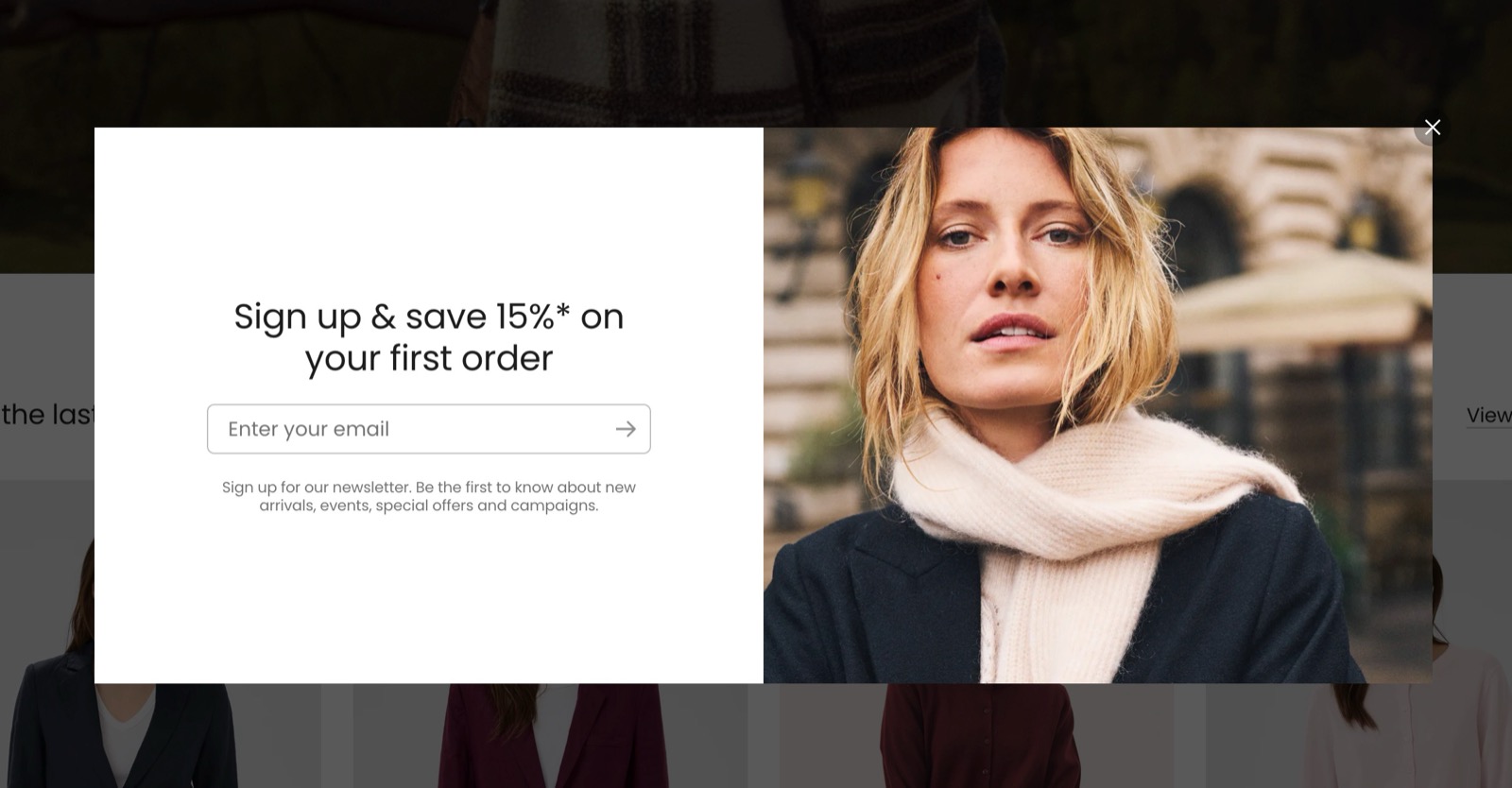
The Modals section shows centered windows that cover the page. Each modal is a block: a general Modal card for promotions or sign-ups, an Age verification window or an Exit intent popup.
Where to find it: in the theme editor sidebar, open the Overlay group and select Modals, then select Add block.
Modals and popovers
- Use a modal when the message needs the customer's attention before they continue.
- For a small card in the corner that does not block the page, use the Popovers section.
Media and layout
Every modal block has the same media and layout settings:
- Image or Video sits beside the text on desktop and above or below it on mobile.
- Media position and Media position on mobile choose the side, or hide the media.
- Minimum media aspect ratio sets the smallest shape of the media.
- Card width on desktop sets how wide the window is.
Modal card
The Modal card is the general modal, for promotions, newsletter sign-ups and announcements. It holds any theme blocks and app blocks.
- Visibility sets the page types that show the modal.
- Show on selected collections and Show on selected products limit it to those pages, and then Visibility is ignored.
- Show popup after sets the delay, from 1 to 60 seconds.
- Enable scroll based trigger waits until the customer scrolls to Scroll position before the delay starts.
The Modal card closes with its close icon, or when the customer selects the background around it. It does not close with the Esc key.
How often a modal shows
The Modal card and the Exit intent popup have Popup frequency. Seventh remembers in the customer's browser when the customer closed the modal, and shows it again only after that period:
- Show each day: again after 24 hours.
- Show each week (default): again after 7 days.
- Show each month: in Seventh 4.0.0, the modal does not show again in that browser after it has been closed.
The memory is per browser and per device, so a new device or a private window shows the modal again.
Age verification
The Age verification modal opens as soon as a page loads, on every page of the store. It covers the page with a dark background.
- The customer confirms with its button (label: "Enter"). The button is the Button close block, which is always present.
- It has no close icon and does not close with the Esc key.
- In Seventh 4.0.0, selecting the dark background outside the window also closes it.
- After it is closed, the browser remembers it for 28 days.
Add a Heading and a Text block inside the Age verification block to state the age rule, for example "You must be 18 or older to enter this store."
Seventh does not support a real age check. The modal asks the customer to confirm, but it does not verify the age or block a customer who closes the browser tab. For a legal age verification, use a dedicated age verification app.
Exit intent popup
The Exit intent popup opens when the customer moves the mouse quickly to the top edge of the browser window, as if to close the tab or type a new address. Seventh opens it once per page view, then waits for the Popup frequency period after the customer closes it.
Exit intent needs a mouse, so the Exit intent popup does not open on phones and tablets. It also never opens by itself in the theme editor: select the block in the sidebar to see it while editing.
How do I open a modal from a button?
Use the Popup button block. A Modal card from the Modals section cannot open from a button; it opens by itself, after its delay or scroll position. The Popup button shows the content of a Shopify page in a modal.
Create the page with the content
Open Shopify admin → Online Store → Pages, create a page (for example "Size guide") and save it. The page title becomes the modal heading and the page content becomes the modal text.
Add a Popup button block
In the theme editor, open the section or card where the button goes, select Add block and choose Popup button.
Connect the page
Enter the button Label and select the page from step 1 in Page. Select Save, then select the button in the preview: the modal opens with the page content.
See Popup button block for all its settings.
Why is my modal not showing?
A visibility or trigger setting stops it, or your browser already closed it. Check these in order:
- For a Modal card: Visibility, Show on selected collections and Show on selected products include the page you are on. Selected products or collections override Visibility.
- For a Modal card: Show popup after has passed, and with Enable scroll based trigger on, you scrolled to Scroll position.
- For an Exit intent popup: you are on a computer with a mouse, outside the theme editor.
- Popup frequency: your browser may already have closed it. Test in a private window.
The Age verification and Exit intent popup blocks have no Visibility settings; they apply to every page.
In the theme editor no modal opens by itself, whatever its delay. Select the modal block in the sidebar to open it in the preview.
All Modals settings
Every setting on this page, one list per section or block, with its type and default.
Accepts these blocks: Modal card, Age verification and Exit intent popup.
Each modal triggers independently.
Use different delays or triggers to avoid multiple modals opening at once.
Where to find it: Overlay group → Modals → Modal card.
Accepts these blocks: Content group, any theme block and app blocks.
Image (image): Sets the image shown beside the modal text.
Video (video): Sets a video shown beside the modal text instead of an image.
Minimum media aspect ratio (dropdown, default: Short (4:3)): Sets the smallest height-to-width shape of the media. A long text can make the card taller. Options: Wide (2:1), Landscape (16:9), Standard (3:2), Short (4:3), Square (1:1).
Media position (dropdown, default: On the right): Sets on which side of the text the media sits on desktop, or hides the media. Options: On the left, On the right, No media: Don't show media.
Media position on mobile (dropdown, default: Above the text): Sets whether the media sits above or below the text on mobile, or hides it on mobile. Options: Above the text, Below the text, No media: Don't show media. Shown only when Media position is not No media: Don't show media.
Card width on desktop (dropdown, default: Medium): Sets how wide the modal window is on desktop. Options: Small, Medium, Large.
Modal card: Visibility
Where to find it: Overlay group → Modals → Modal card → Visibility
Visibility (dropdown, default: All pages): Sets the page types that show this modal. Ignored, and hidden in the editor, as soon as products or collections are selected below. Options: All pages, Homepage only, All product pages, All collection pages, Cart page only, All pages except the homepage. Shown only when Show on selected products is empty and Show on selected collections is empty.
Show on selected collections (collections picker): Shows this modal only on the selected collection pages. When set, Visibility is ignored.
Show on selected products (products picker): Shows this modal only on the selected product pages. When set, Visibility is ignored.
Modal card: Functionality
Where to find it: Overlay group → Modals → Modal card → Functionality
Show popup after (slider 1 to 60 s, default: 1 s): Sets the delay before the modal opens, from 1 to 60 seconds. With the scroll based trigger on, the delay starts when the customer reaches the scroll position.
Enable scroll based trigger (checkbox, default: off): Waits until the customer scrolls to Scroll position before the modal can open.
Scroll position (slider 0 to 100 %, default: 50 %): Sets how far down the page, from 0 to 100 percent, the customer must scroll before the modal opens. Shown only when Enable scroll based trigger is on.
Popup frequency (dropdown, default: Show each week): Sets how long the browser keeps the modal hidden after the customer closes it: 24 hours (Show each day) or 7 days (Show each week). With Show each month, Seventh 4.0.0 does not show it again in that browser. Options: Show each day, Show each week, Show each month.
Modal card: Card style
Where to find it: Overlay group → Modals → Modal card → Card style
Text alignment (alignment, default: Left).
Inner blocks spacing (dropdown, default: Small). Options: XXSmall, XSmall, Small, Regular, Large, XLarge.
Padding (dropdown, default: Regular). Options: XSmall, Small, Regular, Large, XLarge, XXLarge.
Add padding to media elements (checkbox, default: on): Keeps the card padding around the image or video. Turn it off for media that touches the card edges.
Corner radius (dropdown, default: Rounded). Options: None, Slighty rounded, Rounded, Fully rounded.
Color scheme (color scheme, default: Scheme 1): Sets the colors of the modal window.
Where to find it: Overlay group → Modals → Age verification.
Accepts these blocks: Content group, any theme block and app blocks.
Image (image): Sets the image shown beside the modal text.
Video (video): Sets a video shown beside the modal text instead of an image.
Minimum media aspect ratio (dropdown, default: Short (4:3)): Sets the smallest height-to-width shape of the media. A long text can make the card taller. Options: Wide (2:1), Landscape (16:9), Standard (3:2), Short (4:3), Square (1:1).
Media position (dropdown, default: On the right): Sets on which side of the text the media sits on desktop, or hides the media. Options: On the left, On the right, No media: Don't show media.
Media position on mobile (dropdown, default: Above the text): Sets whether the media sits above or below the text on mobile, or hides it on mobile. Options: Above the text, Below the text, No media: Don't show media. Shown only when Media position is not No media: Don't show media.
Card width on desktop (dropdown, default: Medium): Sets how wide the modal window is on desktop. Options: Small, Medium, Large.
Age verification block: Card style
Where to find it: Overlay group → Modals → Age verification → Card style
Text alignment (alignment, default: Left).
Inner blocks spacing (dropdown, default: Small). Options: XXSmall, XSmall, Small, Regular, Large, XLarge.
Padding (dropdown, default: Regular). Options: XSmall, Small, Regular, Large, XLarge, XXLarge.
Add padding to media elements (checkbox, default: on): Keeps the card padding around the image or video. Turn it off for media that touches the card edges.
Corner radius (dropdown, default: Rounded). Options: None, Slighty rounded, Rounded, Fully rounded.
Color scheme (color scheme, default: Scheme 1): Sets the colors of the modal window.
Where to find it: Overlay group → Modals → Exit intent popup.
Accepts these blocks: Content group, any theme block and app blocks.
Image (image): Sets the image shown beside the modal text.
Video (video): Sets a video shown beside the modal text instead of an image.
Minimum media aspect ratio (dropdown, default: Short (4:3)): Sets the smallest height-to-width shape of the media. A long text can make the card taller. Options: Wide (2:1), Landscape (16:9), Standard (3:2), Short (4:3), Square (1:1).
Media position (dropdown, default: On the right): Sets on which side of the text the media sits on desktop, or hides the media. Options: On the left, On the right, No media: Don't show media.
Media position on mobile (dropdown, default: Above the text): Sets whether the media sits above or below the text on mobile, or hides it on mobile. Options: Above the text, Below the text, No media: Don't show media. Shown only when Media position is not No media: Don't show media.
Card width on desktop (dropdown, default: Medium): Sets how wide the modal window is on desktop. Options: Small, Medium, Large.
Exit intent popup block: Functionality
Where to find it: Overlay group → Modals → Exit intent popup → Functionality
Popup frequency (dropdown, default: Show each week): Sets how long the browser keeps the modal hidden after the customer closes it: 24 hours (Show each day) or 7 days (Show each week). With Show each month, Seventh 4.0.0 does not show it again in that browser. Options: Show each day, Show each week, Show each month.
Exit intent popup block: Card style
Where to find it: Overlay group → Modals → Exit intent popup → Card style
Text alignment (alignment, default: Left).
Inner blocks spacing (dropdown, default: Small). Options: XXSmall, XSmall, Small, Regular, Large, XLarge.
Padding (dropdown, default: Regular). Options: XSmall, Small, Regular, Large, XLarge, XXLarge.
Add padding to media elements (checkbox, default: on): Keeps the card padding around the image or video. Turn it off for media that touches the card edges.
Corner radius (dropdown, default: Rounded). Options: None, Slighty rounded, Rounded, Fully rounded.
Color scheme (color scheme, default: Scheme 1): Sets the colors of the modal window.
Where to find it: Overlay group → Modals → Age verification → Button close.
Label (text field, default: "Enter"): Sets the text of the button that confirms and closes the age verification modal.
Button close block: Button style
Where to find it: Overlay group → Modals → Age verification → Button close → Button style
Style (dropdown, default: Solid). Options: Outline, Solid.
Size (dropdown, default: Small). Options: XSmall, Small, Medium, Large, XLarge.
Fit container (checkbox, default: off): Makes the button as wide as the modal content.
Use custom colors (checkbox, default: off): Replaces the color scheme button colors with the Primary and Secondary colors below.
Primary (color, default: #000000). Shown only when Use custom colors is on.
Secondary (color, default: #ffffff). Shown only when Use custom colors is on.
Button close block: Icon
Where to find it: Overlay group → Modals → Age verification → Button close → Icon
Select an icon (dropdown): To see all icons, visit the Krown icon library. Options: None, Business: Earth globe, Business: Flag, Business: Helpline, Business: Like hand, Business: Map marker, Business: Security shield, Business: Star, Commerce: Appointment, Commerce: Archive box, Commerce: Box, Commerce: Checkout cart, Commerce: Currency, Commerce: Delivery, Commerce: Delivery time, Commerce: Giftbox, Commerce: Label, Commerce: Open 24 hours, Commerce: Open box, Commerce: Paper bag, Commerce: Shipping truck, Commerce: Store, Commerce: Time, Commerce: Time limit, Commerce: Wallet.
Custom icon (image): Sets your own icon for the button instead of one from Select an icon. Use a transparent PNG of 72 x 72 px.
Related pages
- Overlay group: modals compared with popovers.
- Popovers section: small cards in the corner of the screen and the cookie consent popover.
- Popup button block: a button that opens a Shopify page in a modal.
- Content group block: groups blocks inside a modal.
- Newsletter form block: the sign-up form for a newsletter modal.
- Troubleshoot popovers and modals: more answers about modals.