Layout theme settings
The Layout theme settings set the space between sections, the side padding of the page and the gap between grid columns in Kingdom.
Applies to: Kingdom 6.2.0 and later. Added in: Kingdom 2.0.0. Last checked: 2026-10-13 against Kingdom 6.2.0.
The Layout theme settings set three spaces that every page uses: the space between sections, the padding on the sides of the page and the gap between the columns of grids.
Where to find it: Theme settings → Layout
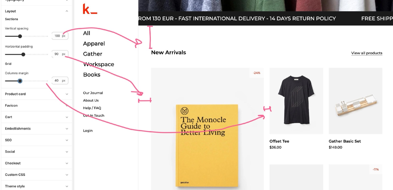
All three values are responsive: the value you set is used on large screens, and Kingdom makes it smaller on smaller screens.
Section spacing
- Vertical spacing is the space between two sections, from 50 to 200 px. On screens 948 px wide or less it shrinks to 70 percent, and to 50 percent on small phones.
- Horizontal padding is the space on the left and right of the page content, between the sidebar and the content and between the content and the edge of the screen, from 25 to 180 px. It shrinks step by step below 1920 px, to half the value at 1280 px. On screens 948 px wide or less it is always 25 px.
Grid spacing
- Columns margin is the gap between the columns of product grids and other grids, from 20 to 80 px. It shrinks below 1600 px, to 40 percent of the value on screens 948 px wide or less.
Why is there no space between two of my sections?
Because one of them is an image or media section with Enable inner content spacing off, or both have a custom background color. Those sections run up to their neighbours by design. Turn on Enable inner content spacing in the section to bring the space back. See General section settings.
Why is the side padding smaller on my laptop than in the editor value?
Because Horizontal padding is responsive. The full value is used on screens 1920 px wide or more. On a 1440 px laptop screen the padding is 70 percent of the value, and at 1280 px it is half.
All Layout settings
Every setting in this group, with its type and default.
Layout theme settings: Sections
Where to find it: Theme settings → Layout → Sections
Vertical spacing (slider 50 to 200 px, step 10, default: 100 px): Sets the space between sections on desktop. It shrinks to 70 percent on screens 948 px wide or less and to 50 percent on small phones.
Horizontal padding (slider 25 to 180 px, step 5, default: 90 px): Sets the padding on the left and right of the page content on screens 1920 px wide or more. It shrinks on smaller screens, to half at 1280 px, and is 25 px on screens 948 px wide or less.
Layout theme settings: Grid
Where to find it: Theme settings → Layout → Grid
Columns margin (slider 20 to 80 px, step 2, default: 40 px): Sets the gap between grid columns, such as product cards. It shrinks below 1600 px, to 40 percent on screens 948 px wide or less.
Related pages
- Colors theme settings: the colors of the sidebar, body and footer.
- General section settings: sections that turn the spacing off with Enable inner content spacing.
- Product card theme settings: the cards that sit in the product grid.
Typography theme settings
The Typography theme settings choose Kingdom's heading and body fonts, their base sizes, the sidebar menu text size and the button corner radius.
Product card theme settings
The Product card theme settings set how Kingdom shows products in grids: image ratio, hover image, featured products, caption, badges, ratings and quick buy.